Tuesday, February 1st, 2022 by Julian Karsunky
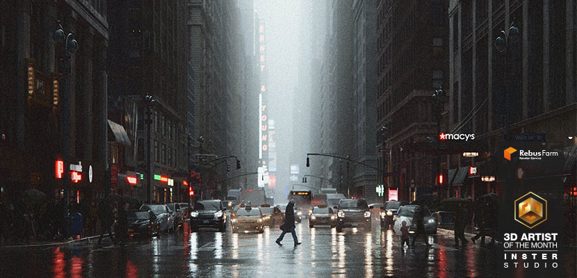
Architectural visualization is a global phenomenon in the truest sense of the word. Kirill Chernyy, our 2022 February 3D Artist of the Month, chaperones us from a small Kaliningrad town all the way to the heart of the Big Apple, where he shows us the bustling city life on the streets of Manhattan through the moody lens of a seriously talented archviz artist. To accompany the recent launch of his own studio, Kirill wanted to create something special for his personal portfolio and set his sights on fabled New York City.
In our interview, Kirill takes us behind the scenes of what he considers the supreme discipline of his craft: the city streetscape.
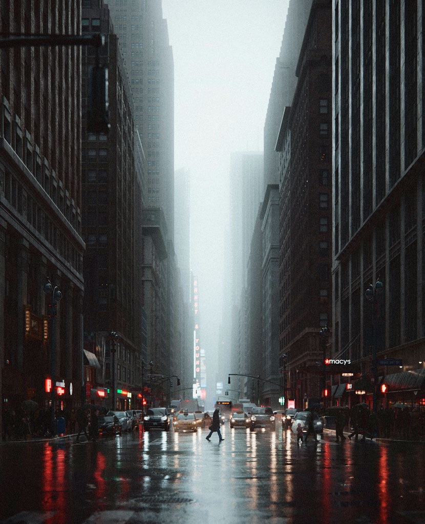 Kirill Chernyy, 'Once Upon a Time…in NYC'.
Hi Kirill, thanks for joining us! To start things off, please introduce yourself to our readers.
Hi everyone, my name is Kirill Chernyy, I am a 32-year-old archviz artist from Chernyakhovsk, a town in the Kaliningrad oblast of Russia. Just recently, I launched INSTER, my own creative rendering studio.
Do you recall when and how you first consciously encountered CGI?
Yeah, I do, it was approximately seven years ago. At the time, I was working with my father, who ran a mom-and-pop furniture store. Since we also did custom-made furniture, my father used 3D renderings to visualize the designs for our clients. One day, I decided to try my hands at it – and I really liked it. That's how my journey in this field began.
What training or education do you have?
In terms of traditional education, I have a technical background. As far as CGI is concerned, I am mostly self-taught and would cite the courses by Grant Warwick and VisCorbel as particularly influential in my understanding of 3D rendering.
Please tell us about your studio INSTER, its history, field of work and overall philosophy!
INSTER studio was founded very recently, towards the end of 2021. I chose the name in honor of the history of my hometown: as you may know, Kaliningrad belonged to Germany as part of East Prussia before the Great Patriotic War, which began in 1941. Before that, all cities in the region had different names; Kaliningrad, for example, was known as Königsberg, and Chernyakhovsk, my mother city, was called Insterburg.
What services do you provide and who are your clients and target markets?
INSTER studio specializes in high-end architectural visualization. Our services range from interior and exterior 3D renderings to animation, 3D product visualization, photomontages, and floor plan renderings.
Our clientele includes architectural and design firms, developers, manufacturers of furniture and similar goods, and real estate brokers and agencies from all over the globe.
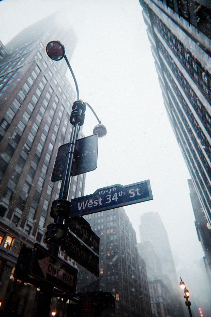 Inspired by a reference photo, Kirill set his scene at West 34th Street in downtown Manhattan.
Let us talk about your work in more detail, namely, the New York City streetscape you submitted to our campaign, titled 'Once Upon a Time…in NYC'. Can you first tell us a bit more about the origins of the project? How did you come up with the original idea?
Back in 2017, I began working with an architectural studio. For the entire three years that this partnership lasted, I wanted to create something special for my personal portfolio. But as I was still involved in the family business as well, I never could find the time. This of course changed when I left the studio, and I did not have to think too long or too hard about what I wanted to do. From my perspective, a photorealistic streetscape that properly conveys the atmosphere of a big city like New York is the pinnacle of our industry! In terms of complexity, you cannot aim much higher, and it definitely was a challenge, albeit a welcome one.
What parts of the image were especially important to you, both from a visual/design as well as from a technical point of view?
Honestly, all of them were important. Instead of creating renders, I wanted to use 3D tools to create photos, and in order to achieve this, I had to properly focus on all details equally. Camera view, lighting, models, textures – all of these aspects had to be set up perfectly, otherwise, it would be "mere" renders.
What were some of the challenges you had to overcome and how long did it take you to complete the project?
Looking at the image should feel like looking at a pretty photo. So the biggest challenge was to capture and realistically convey the atmosphere of the city in all of its urban liveliness. As it turns out, this is not an easy feat to accomplish, especially when there are a lot of tall buildings around. I used Corona Renderer, and from what I can tell from working on this project, this engine does not like poorly lit spaces. It took a ton of effort to compensate for this and overcome this facet of photorealism. Completing the project took about one year of spare time work.
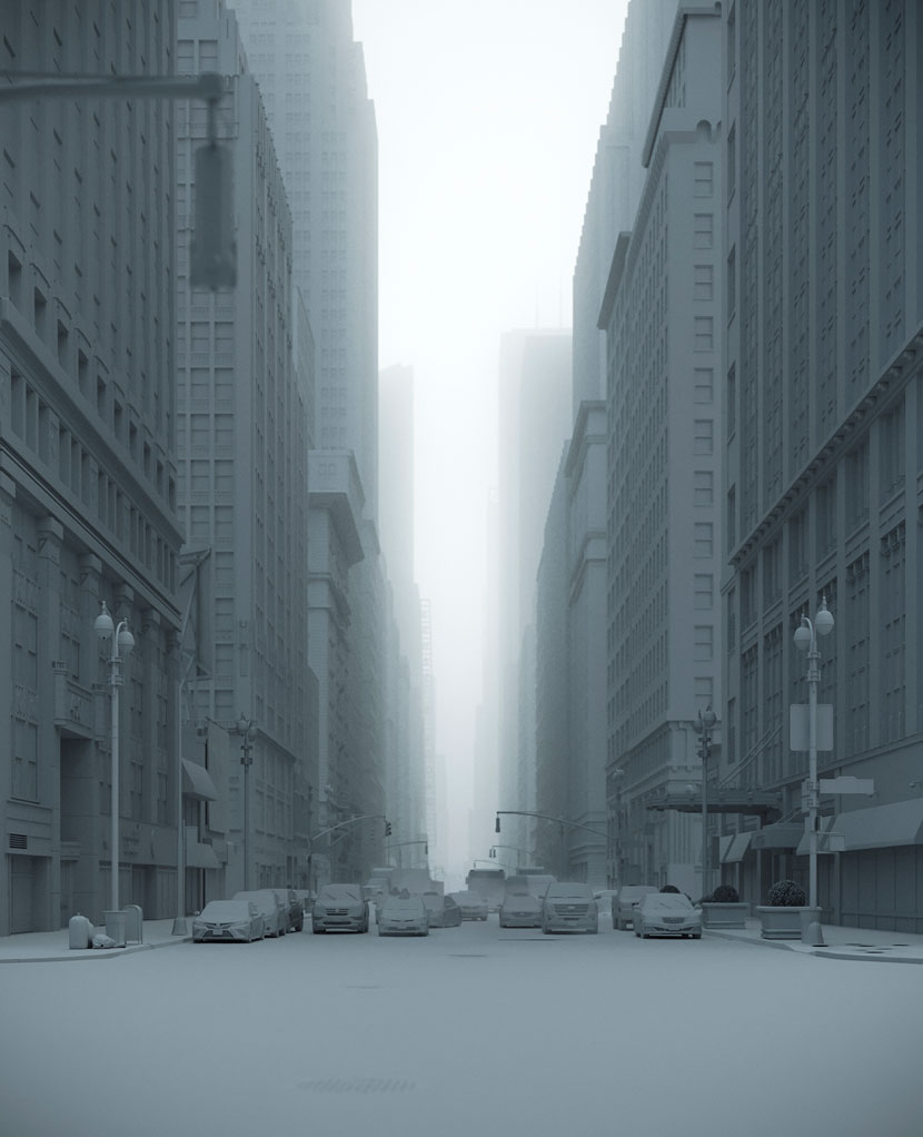 'Once Upon a Time…in NYC', gray render.
Talk to us a bit about your choice of subject! Why New York? Have you ever been to the Big Apple yourself?
Big cities have always fascinated me, all this continuous motion, the hustle and bustle; probably because I am not accustomed to that, living in a small town. I am especially crazy about New York, although I have never been. Hopefully, one day I'll find the time and means to visit myself. Until then, I have at least immortalized this beautiful city through my renders!
Of all the streets in the city, you chose to portray a section of West 34th street. Why was this particular location the right fit for your scene?
Easy: I had this really cool photo depicting the street, and initially, I just wanted to replicate it, with only slight changes to the mood and maybe a few other minor alterations at best. I never intended to make more than one image. However, the more I got into it, the more I deviated from this plan, changing the composition, lighting, colors, and so on, until very little remained from my original reference photo except for the location. Ultimately, I ended up creating five images; you can find the fifth one on my website or my social media, it shows just the street by itself.
Between the looming skyscrapers, the fog and rain, and the blurred shots, this is a very moody and melancholy depiction of a usually bustling metropolis. Can you tell us about the atmosphere you created and your reasons for doing so?
I just love gloomy atmospheres. In fact, it can never be gloomy enough for my taste. It is just so immersive, it makes you dive headfirst into the scene and completely absorbs you. I guess this preference stems from my love of horror movies; or any other film with this kind of atmosphere, for that matter, and it extends to paintings as well.
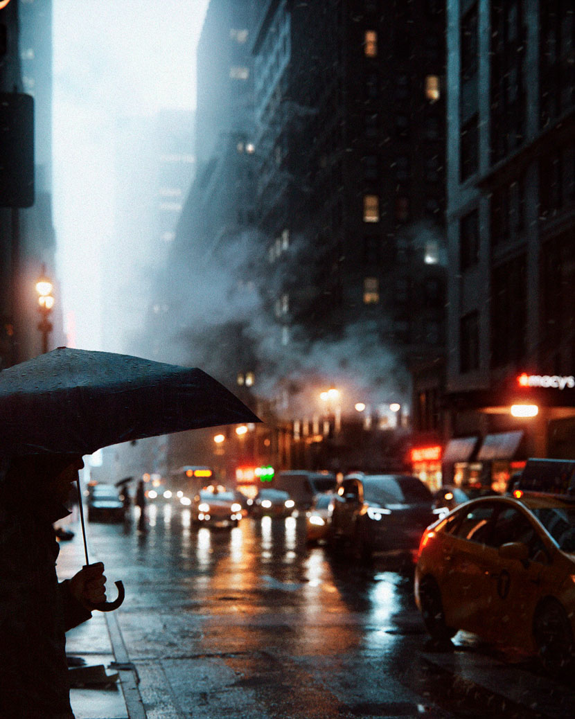 The typical New York weather perfectly aligns with Kirill's fondness for moody atmospheres.
How did the mood influence your use of colors, materials, lighting and the overall composition?
The color palette that I picked up works great regardless of the mood you are trying to convey. Warm and cold colors are a standard for a reason, they just compliment each other so well. For the composition, I was inspired by a lot of reference photos. I researched around 50 photos from different photographers on the internet, but the most influential photographer for me was Lerone Pieters, he does great work. Check him out and see for yourself, you definitely won't regret it.
Once you had a basic concept in mind, how did you go about realizing it? Can you briefly walk us through your production process step by step?
My process for this project didn't differ too much from my regular work. I started by modeling all the buildings from scratch, I just went on Google Maps and went to work, more or less eyeballing what I saw. The only exceptions were the buildings half-hidden in the fog, I took those from my 3D library, and I did the same for the lampposts and the cars.
Next was lighting, texturing, and post-production. The basic textures either came from Quixel Megascans or from my own library. Post-production didn't take long, I just did some color correction regarding color balance, curves, brightness, and contrast, that was it. A bit more time was spent adding the pedestrians. Using Photoshop, I cut them out from various online sources myself and inserted them into the scene.
What software did you use to create this scene? Any plug-ins you found particularly helpful?
My main toolset consisted of 3ds Max, Corona Renderer, and Photoshop. I used Quixel Mixer for texturing the asphalt.
What has the feedback been like so far and how satisfied are you with the results yourself?
I am completely satisfied with how the project turned out. I have received a lot of positive feedback from many different people as well as numerous accolades for this project, which I deeply appreciate. Thanks to everybody for their support!
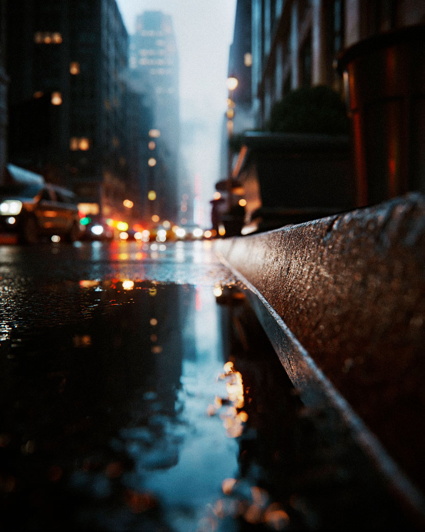 From the puddle next to the sidewalk to the towering skyscrapers, Kirill wanted his images to look like authentic street photography.
What is one thing you have learned from this project that you can share with us?
While I did not learn it just from this project alone, I would say 'Once Upon a Time…in NYC' strongly confirmed my belief that as long as you do what you love, everything will work out fine in the end, no matter the difficulties you might face along the way.
Have you used RebusFarm before? If so, please tell us about your overall experience. Is there anything you especially like about our service?
I have not. The need simply never arose so far, mostly because I have a powerful enough machine myself. But I am sure to use my RenderPoints soon and am eager to try it out.
In closing, is there anything else you want to say? Any plugs, shoutouts or upcoming projects you would like to mention?
I have said enough already, I think. I would like to thank RebusFarm for choosing me as '3D Artist of the Month', and you for reading this interview to the end, I really appreciate it! You can follow any other projects on my website interstudio.com, and on my social media channels. Again, thank you so much, and take care!
Kirill, thank you very much for taking the time and all the best in the future!
---
Keep up with Kirill Chernyy and his work here:
HOW TO JOIN OUR MONTHLY CONTEST
Do you want to be our next featured 3D Artist of the Month and win 250 RenderPoints? Just visit our 3D Artist of the Month competition page and submit your entry. We'll choose the best image and contact the winner.
>> Read more articles on our blog
