Friday, December 14th, 2018 by Julian Karsunky
Take a deep breath as we once again dive deep into the realm of architectural visualization! Our latest ArtWanted! feature explores the ethereal works of Oxygen, a boutique studio based in Braga, Portugal. Founded and managed by long-time friends and associates Leandro Silva and Pedro Silva, Oxygen provides visual support for architects, designers, real estate developers and marketing agencies around the world.
Check out our interview with Leandro to learn more about the company’s history, the everlasting influence of LEGO bricks and the newest in bioclimatic window-technology!
Hi Leandro, thank you so much for taking the time! To start things off, please introduce yourself to our readers.
Hi everyone! My name is Leandro Silva, I’m 32 years old and I live and work in Braga, Portugal. Together with my partner Pedro Silva, I’m the co-founder of Oxygen, a creative studio that specializes in architectural visualization.
Do you recall when and how you first consciously encountered CGI?
Yes, I still remember. My first contact with the 3D world happened in 2005, while working towards my master’s degree in architecture at EAUM. During a class on Computer Aided Design, we students had the opportunity to experience some modeling, texturing and rendering tasks by digitally reproducing an architectural building in Maya. The results were peculiar, to say the least!
When did you decide to pursuit a professional career as a 3D artist?
Well, I probably made that choice unconsciously as a child. Back then, I played a lot with LEGO and was fascinated by the possibility of creating almost anything from scratch. As I grew up, I developed a keen interest in architecture, arts, photography and later in CGI, mainly influenced by the images of Alex Roman, Bertrand Benoit, DBOX and MIR.
Becoming a 3D artist was something that happened organically along these years and, besides all the daily difficulties we have to deal with, I couldn’t be happier with how things turned out: When you do what you’re passionate about for a living, it never feels like a regular job.
What training or education do you have?
In those days, there were no designated training centers or even courses available in Portugal. If I recall correctly, the only accessible information was through a few blogs and some magazines, which were hard to come by at the time. So most of my current knowledge was self-taught and acquired through years of experience while working on personal projects and smaller projects commissioned by friends.
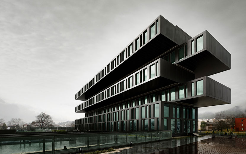 Axis Viana Hotel represents one of the most significant works of LS.ROOM and an integral step towards Oxygen’s founding. Architecture developed by VHM, photographic reference by Nelson Garrido.
Can you tell us more about Oxygen, the company’s history, its field of work and general philosophy?
We established Oxygen in July 2015, when Portugal’s economy was struggling following a financial crisis. Pedro and I knew each other since university, so the launch of Oxygen was something that we both knew would happen eventually, especially considering we had already been working together under the umbrella of LS.ROOM for three years at that point. After this period, our imagery started getting more exposure and positive feedback, particularly after the publication of the ‘Axis Viana Hotel’ project in 2014.
In 2015, we decided to rebrand LS.ROOM and find a new name and concept. ‘Oxygen’, which curiously came up in a conversation with my brother, seemed a suitable brand name: not only because it sounded really strong, but more so because of its meaning and the concept behind it. The name obviously stands for something that has existed in our world since the very beginning, the vital breath inherent in all of us, but it also refers to the production of something that could take your breath away.
How many employers does Oxygen have currently?
While most of our clients think we employ a bigger team, we are in fact a small boutique studio, composed of two lead artists (Pedro and myself) and three freelancers.
What services do you provide?
We mostly produce images and animations for the real estate market. Occasionally, we are commissioned by architecture studios to collaborate in various competitions as well.
As of late, we began including interior design proposals in a couple of projects. We also are trying our hand at different work strands by, for example, helping clients in the development and marketing of new products.
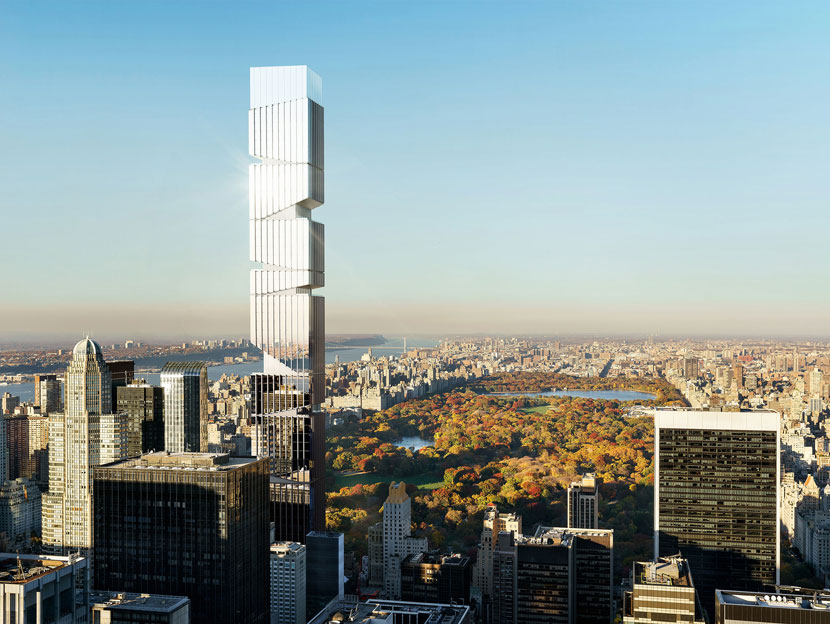 Still in development, the ‘5th Avenue Tower’ is one of Oxygen’s most sophisticated designs and has been featured on the cover of 3D Artist magazine (issue 123, October 2018).
Is there a specific design philosophy or architectural school of thought Oxygen adheres to? What inspires you and your team as 3D artists?
Generally speaking, we’re inspired by the photorealistic side of the architectural visualization field, as in great exterior shots or even fine details in the interiors. We always try to both explore and express our unique identity as studio in each project, striving for a bigger, more sophisticated and more mature visual production.
What does your usual workflow look like when working with a client?
After receiving all the elements required to begin the project, we usually start by creating some clay renders, so the clients can evaluate the camera angles, lighting and composition stages. Then, we add the textures and start polishing edges based on the client’s feedback, usually along two rounds of comments before the final images.
What is your main goal when doing architectural visualization scenes? What is your personal standard as a studio?
Starting out, it’s next to impossible to produce outstanding visuals without going through a continuous learning process. There’s the technical side, where you explore different tools to find what works best for you, but more importantly, there’s the mindset. You not only have to train your brain and your eye to firmly internalize basic concepts about lighting, photography or composition, but then also develop a routine to the point that you’re able to artistically implement these concepts in your daily work.
In my opinion, what really matters is our commitment and persistence as studio to build a good portfolio and make the best use of new opportunities as they arise.
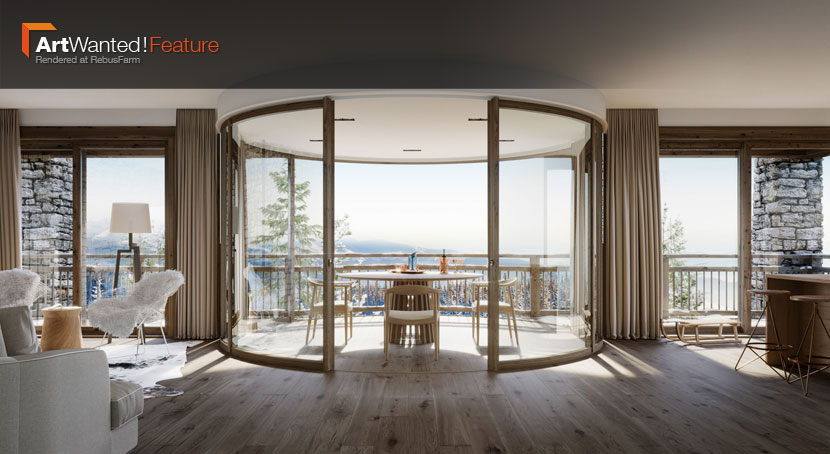
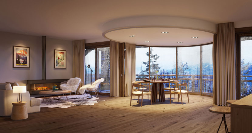
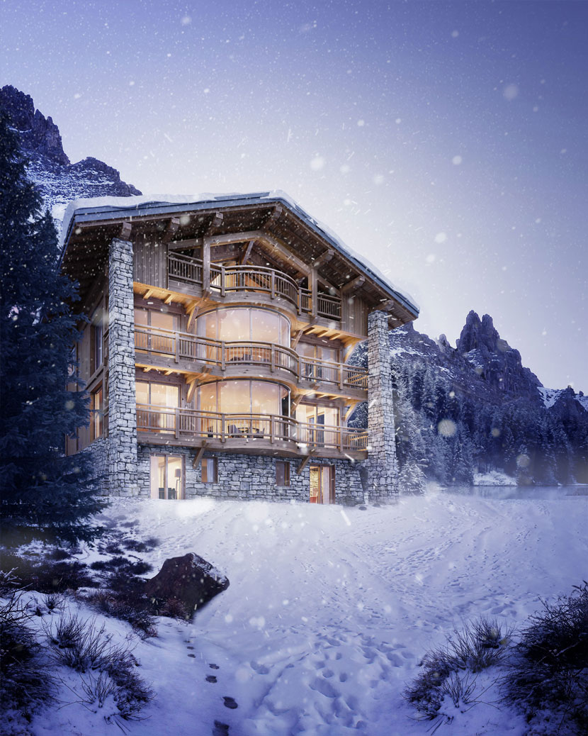 To showcase the versatile design of the bioclimatic ‘Lumicene’ window, Oxygen was tasked to create this cozy mountain lodge.
Let’s talk about your work in more detail, namely your latest submission to our ArtWanted! campaign, the ‘Lumicene’ mountain lodge. Please tell us all about the project and the story behind it!
Lumicene is a new window concept based in Lyon (France) that redefines the relationship between the inside and the outside, optimizing the use of space and sunlight. Made of curved glazed panels, it’s by default a convertible extension of the interior space, which can be turned into a balcony with a 180º panoramic view towards the exterior. It’s the first bioclimatic window on the market that brings light and comfort, allowing the creation of a new, “low-energy" habitat.
The ‘Lumicene’ projects started in February 2017 when we were first introduced to Clément Salvaire, managing director of Lumicene. Since then, we have established and maintained a strong personal connection and fruitful work relationship, sharing ideas, concepts and different approaches during our numerous collaborations.
For this particular project, the main concept was to integrate the Lumicene in a traditional mountain environment: “The snow continues to fall and a ski lodge can be the perfect hideaway to warm up and unwind after a strenuous day on the mountain. It’s time to close the Lumicene and snuggle up inside next to a roaring fire.”
What software did you use to create this scene?
The software used in this project was 3ds Max, Corona Renderer and Photoshop.
What were some of the challenges you had to overcome?
The ‘big’ challenge for this project was to build a classical ski lodge building based only on a few references that would be perfectly representative of this type of architectural archetype: wooden beams, inclined slopes, first floor in stone and so on. However, this rather challenging aspect was probably simplified significantly by the fact that we are both architects and thus can easily translate this demanding brief into drawings and 3D models.
Once we had defined the building, the process became a lot more fluid. Overall, it took us around four to five weeks to complete this particular project.
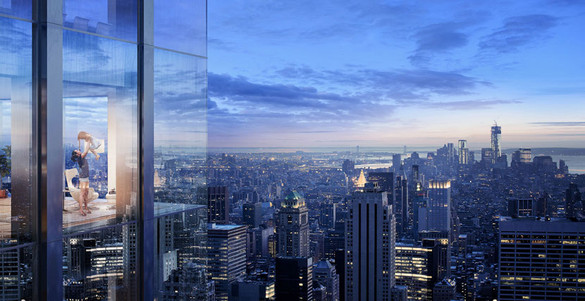 There is still more to come in terms of visuals for the breathtaking ‘5th Avenue Tower’.
Please tell us about your overall experience with RebusFarm thus far. Is there anything you especially like about our service?
Our overall experience has been overwhelmingly positive and we truly recommend it to everyone that is looking for a user-friendly, stable and reliable rendering platform. We found RebusFarm in 2015, and since then it has become an integral part of our studio workflow due to the excellent balance between price, rendering times and quality standards.
In closing, is there anything else you want to say? Any present or upcoming projects you’d like to mention?
While I can’t give away too much for now, we expect to publish new visual content of our skyscraper project ‘5th Avenue Tower’ in the upcoming months. Furthermore, we aim to make the other services and valences of our company more visible during the next year.
That sounds intriguing! Once again, thank you so much for the interview and all the best in the future.
Keep up with Oxygen here:
How to join ArtWanted!
You want to get featured in our ArtWanted! campaign and win 50 RenderPoints on top? Submit your work, rendered at RebusFarm, to This email address is being protected from spambots. You need JavaScript enabled to view it.! Visit our Art Wanted! page for more information.
>> Read more articles on our blog
