Wednesday, February 24th, 2016 by Nadine Obst
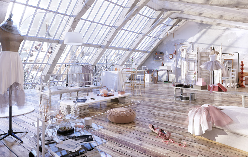
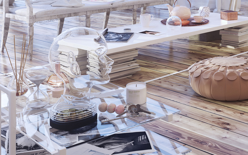
Elena Valeria Nedelcu gave us an interview on her work for the Evermotion Challenge 2015 "Whola Lotta Loft". She won second place with a feminine picture all in pastel. We think she more than deserved it!
Final Image
Hi Elena, thanks for taking the time. Please tell us more about yourself and your work in general.
First of all, thank you for giving me the opportunity to do this interview on your blog - it's very flattering. I am a 3D artist now but I have a very diverse background in the visual domain in general. Starting with the study of fine arts during my childhood and youth - I have a BA in Painting - then working in graphic design for 10 years, illustration and art direction in the editorial field and eventually getting into 3D during my master's degree in Illustration and Animation at Coventry University in 2011. Since then I've been completely focused on using 3D tools and steadily working on further improving my skills. I currently work as a CGI artist and Creative Director of my own studio, EVNvis. I try not to make plans too far into the future as I like being able to make the most of what the present brings me, but I am always keen to discuss interesting new projects and collaborations with potential clients and fellow artists.
What made you enter the Evermotion Challenge 2015?
Up until last year the idea of participating in an Evermotion Challenge alongside some of the best artists in the world would have intimidated me but I loved the subject of the challenge, I read the brief description and just felt the urge to jump into it - I think what eventually made me enter was following my instincts. :-)
What's the idea behind your image? Why did you choose this kind of look?
Looking for inspiration, I found an article on an interior design blog called "How to live in the sky" by DECOsash. I thought that it sounded so poetic and romantic and the editorial was perfect in terms of aesthetics but also had the potential to express the character of the person living there. I decided to develop my own concept and story around the idea that a ballerina lives in this space and making the viewer feel her presence in the room. The general look of the editorial is the trendy Scandinavian style of loft design, which I love. But I wanted to go past the arranged look of an editorial and create a natural look - a bit messy but at the same time delicate and feminine. I wanted the viewer to almost smell her perfume in the air while having a sense of what that space means to her - letting go of the stress accumulated during the long hours of practice and being able to rest her hurting feet, read magazines and drink tea. I think research is the key to any project so I looked paintings by Degas - the master of the ballerina's depiction- watched films and studied many, many photos with ballerinas during this time. It's more accurate to say I attained that look rather than choosing it deliberately as it was an ongoing process to get there.
I read you made most of the models yourself? What motivated you to do so?
Yes, I modeled all the elements that were relevant to the scene and helped to tell the story. I think that no matter how brilliant the libraries of models are that you can find now, when you try to make something personal, modeling is one of the ways you can express yourself. Even if you try to make things look realistic, each person will see reality in his or her particular way. I enjoy modeling for this reason as an image can still have that human touch even though the render is produced using a computer. I also use ready-made models but, when I do, I always modify something even if it´s only the texture or adding small personal touches to turn that model on my own.
Tell us, which software did you use?
I used Autodesk 3D Studio Max and plugins for modeling, scattering and mapping, Marvelous Designer and ZBrush for modeling, Corona as the renderer and Photoshop and plugins for the post-production.
Can you give our users an insight in how you made the picture? Maybe you want to show us a little step-by-step making of?
I´ll try to give a brief step-by-step, but it might not be clear as I chose to work on lots of aspects of the image at the same time. When painting, after drawing the shapes, you start applying the main shades of light as well as dark paint in thin layers so that the colour circulates all across the canvas, resulting in unitary composition. That´s what I tend to do with CGI as well - I start modelling but also begin texturing, lighting and making early render tests to check the overall result throughout the project. Having the composition in mind, I start setting the camera and the lights even if I don´t have models ready yet - I block out the main shapes quickly to catch that moment I have in mind and the feel of the scene I´m going to develop.
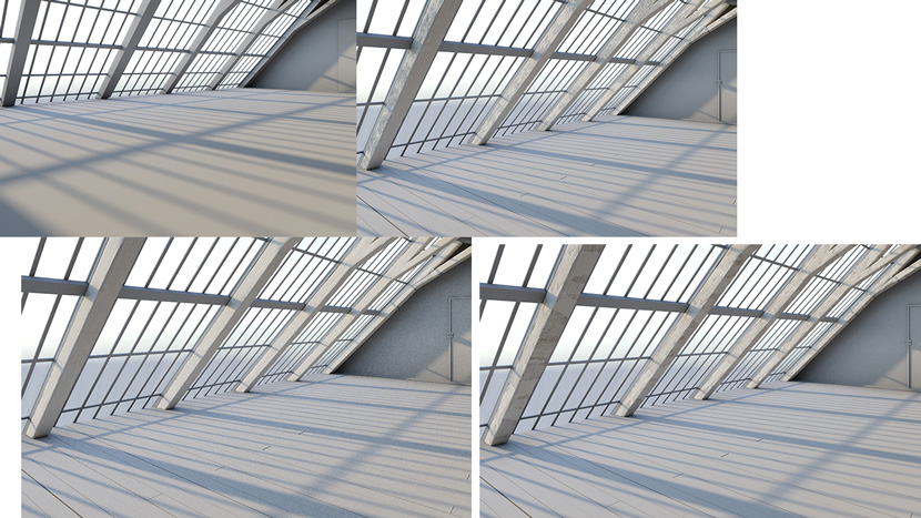
The structural woodwork being the most important elements defining the architecture, I brought them into ZBrush to make them look realistic, like old solid wood with cracks and imperfections.
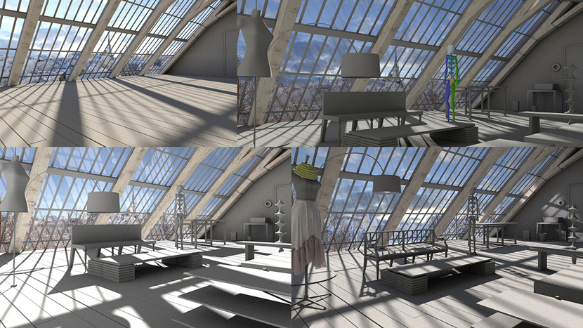
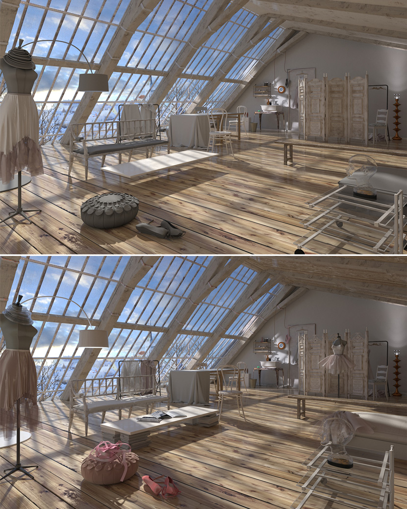
I continued blocking out the main objects with basic shapes, placing them roughly in the scene and started to set up basic lighting to give me an idea of how to move ahead with the overall composition.
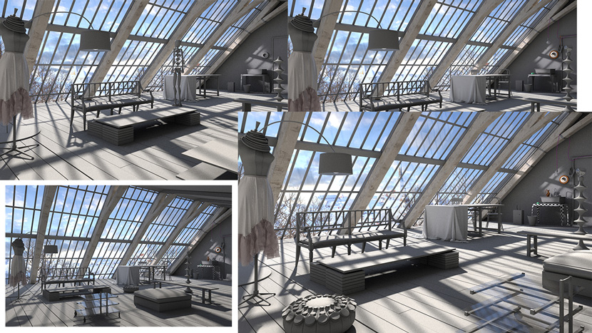
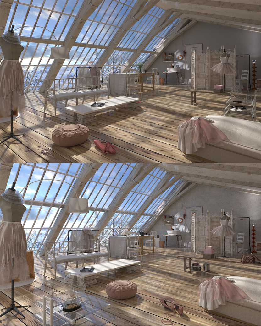
Quick render tests.
Raw render.
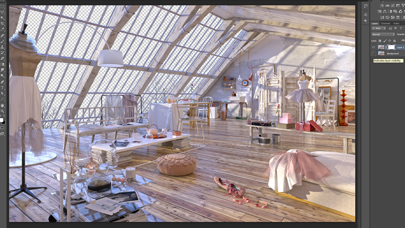
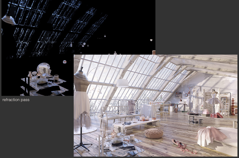
For the final render, I used photographic exposure in Corona renderer with the DOF enabled but set to a very low aperture. I also saved the refraction pass.
This is just an example of 100% render detail without the DOF
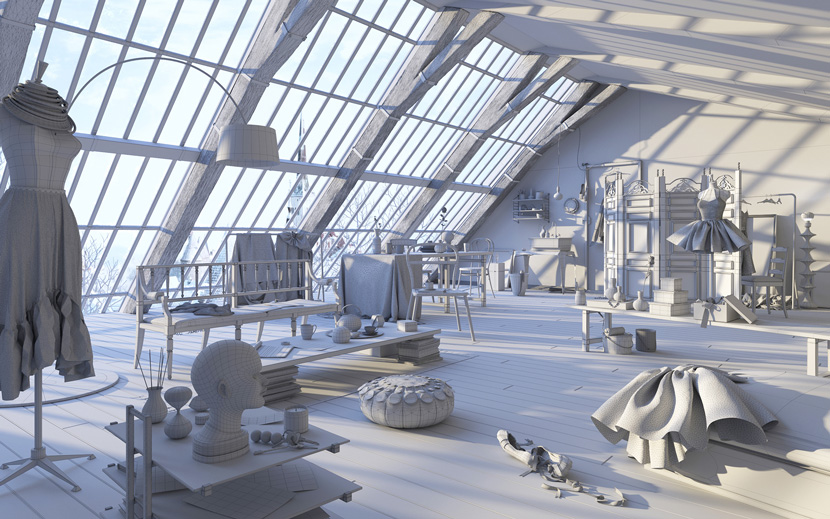
Wire render.
And what was the biggest challenge about this project?
First of all using Corona. I´m used to rendering with VRay but I only recently started using Corona. I learned more about the lighting, materials, and settings in Corona while experimenting with my image. I think that lighting is the key for anything you do visually because the light gives life to everything and sets up the composition. Lighting was a big challenge as I wasn´t happy with the result at the beginning and I kept changing it throughout the project, perhaps dozens of times. I had to take advantage of the potential a physically-based renderer gives you, so I kept pushing the limitations that I was used to having with the biased render to achieve better results.
How long did it take you to finish your project all in all?
It took about two months (December and January). Throughout the entire duration of the contest I also kept updating my thread on the Evermotion Forum, which helped me reflect on my project. I also modelled a bed in another area of my loft and rearranged the assets in a few new compositions that I rendered during this time. Another time consuming issue was rendering twice at 5000x8000 pixels (with DOF and without) on only one machine. I played with this scene a lot and I was lucky to have been able to set aside all of this time for it without pressure, although I did have to turn down a number of paid projects just to have time to work on my loft.
You´ve won Renderpoints to use our service. Congratulations! Have you used RebusFarm before?
Thank you. I have previously used RebusFarm while working as an employee for a studio and although I can´t talk about what was being done, I can say that it was always saving the day!
What are you planning to render next using your free Renderpoints? Any upcoming projects you can talk about?
It´s hard to say right now - it will probably be client work but it would be nice to have enough time to create another personal project that I was able to talk about or promote - most of the time the client work is confidential. I will definitely keep trying to find time for personal stuff because, for me, this is the only way to experiment and to have true creative freedom. It´s also the best way to show my skills and build a portfolio.
Thanks a lot Elena and all the best for your future!

