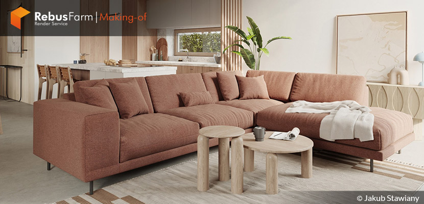
"The Devil is in the details". With this motto in mind, the polish 3D artist Jakub Stawiany from Minimore Studio explains to us how he manages interior projects for his clients.
About me.
Hello everyone!
First of all, I would like to thank RebusFarm and VWArtclub teams for inviting me to write this making of this article and share my work with the community.
I’m Jakub Stawiany and a one-man army in Minimore Studio based in Lodz, Poland. Since 2013 I’m working in the ArchViz industry and I’m mainly focusing on interior and product visualization.
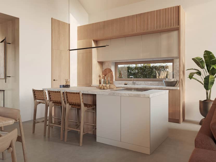
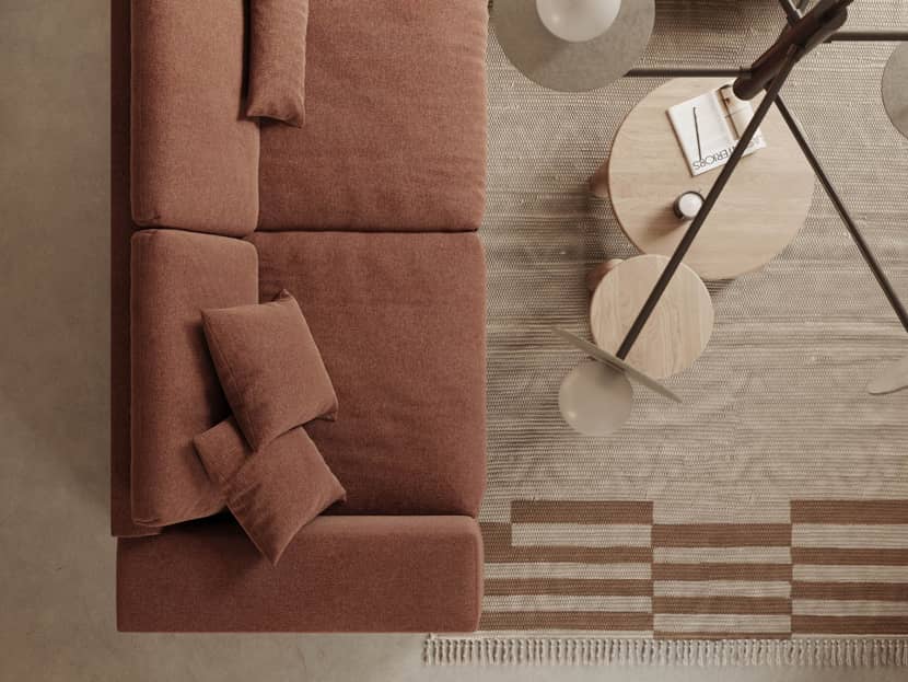
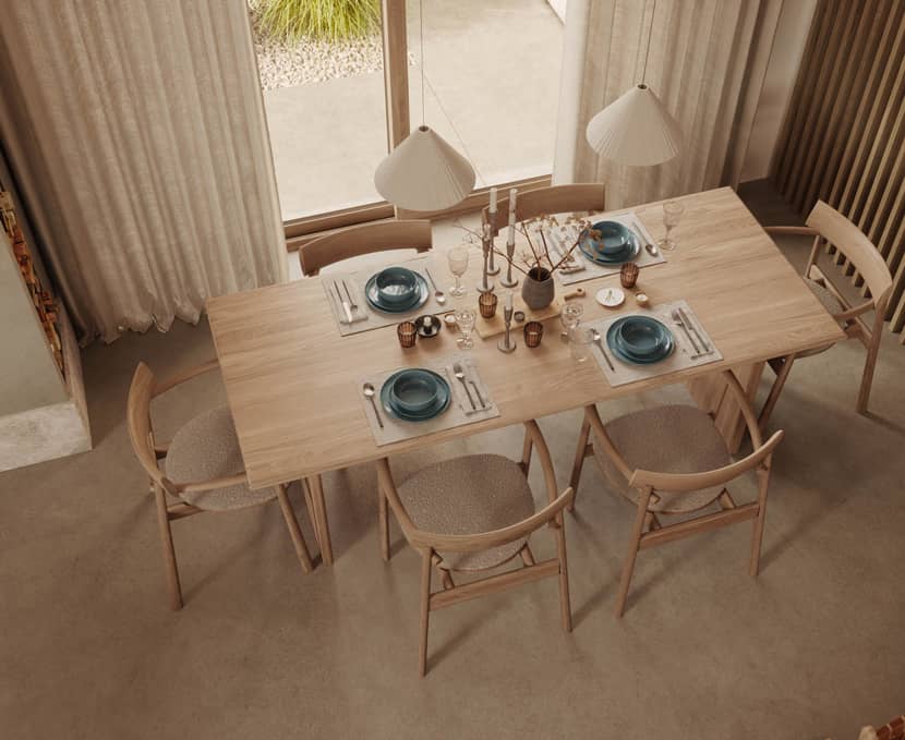
Today, I want to share with you my knowledge concluded in a commercial project of 67 square meters of a living room area in a 2 floors house. The main mission was to sell this project and present its homely and warm interiors. "The Devil is in the details", and I always try to add something special, which at the same time shows better my skills and passion for my work. This is how I keep my interest in 3D art active and I feel good to continue with my evolution as an artist.
Software & Hardware used.
My main tools are 3ds Max and FStorm renderer which I deeply loved from the first project I did with it.
References.
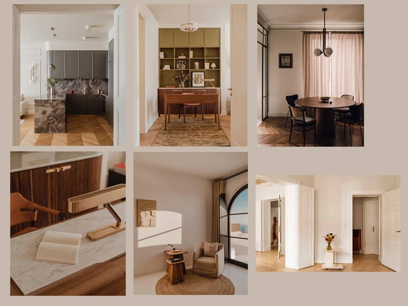
The most important thing is good inspiration. Of course, the best sources are those from real life – not CGI. But we cannot forget awesome 3d artists who are worth following and learning from them.
PION Fotografia is an amazing Polish photography studio with great interior photographers as they have a very individual way of shooting. Looking at their photographs you can immediately know that it's their work, and not someone else's. Below you can check out the references I had close to me while working on this project.
Modeling.
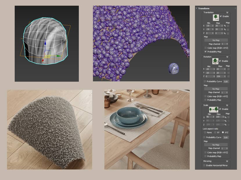
From the interior designer, I got a sketch with a modeled interior and a list of furniture, materials, and some accessories. I had to remodel it in 3ds Max. Keep in mind that high-quality models with all the possible details are absolutely necessary in order to deliver photorealistic images. Those are my fundamentals: good 3d models, high-resolution textures for materials, good lightning, and tone mapping. Below is an example of a chair made of boucle fabric:
 Click on the image to enlarge it.
To create this fabric I used one boucle knot and scattered it using iToo Forestpack with big randomization on a chair surface. To add more details I used Ornatrix Plugin, actually for the small hair. I like to add a lot of small hair on the fabrics, it always gives a smooth feeling!
Another “Fury” object I used was the armchair. This time, I used the FstormFur modifier. It’s awesome how little memory from VRAM has been used (which is very important when you are rendering on GPU) and how fast was the rendering!
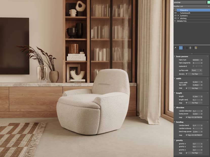 Click on the image to enlarge it.
Below you can also watch this pretty nice tutorial to learn the basics. Even if it's in the English language, it's pretty easy to follow and understand how it works.
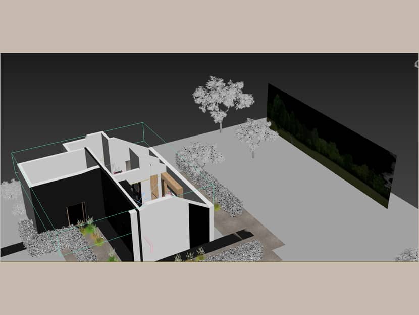
Another important thing for me about modeling is the environment. To make the image more realistic, it is important to model also what you see outside the windows. In the foreground are models, and then is plain with opacity and tree texture.
Lighting.
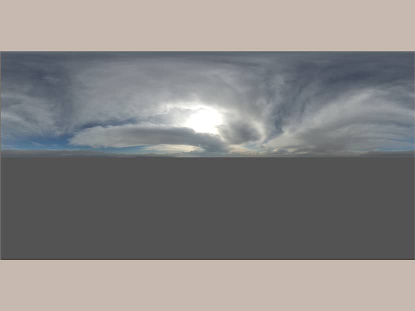
I always try to use the lights in the same way we use them in the real world. Just Hdri and in a corridor some spotlights with IES files. For HDRI, I mostly use cloudy skies with a little bit of sun. In this scene, it was the 0953 from PGSkies.
Materials.
Very important, if not the most important part of every project. To deliver the highest quality images we need also the highest quality textures. Most of my textures are from TextureSupply. I love how simple is to use them and get very realistic effects. In most cases, I use 8k resolution images or even higher when I focus on details. If it’s a problem to find such big textures, I’m using Topaz Gigapixel to enlarge images and it works great! Another thing is to keep the materials as simple as possible.
Most of the downloaded models from the web have very extensive materials, with a lot of nodes, maps, etc. If you don’t know what the reason is to use this material – you don’t need it! For that reason, most of the materials I’m using are made or remade by myself.
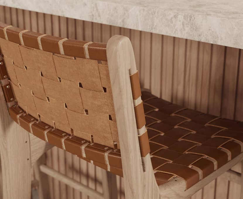
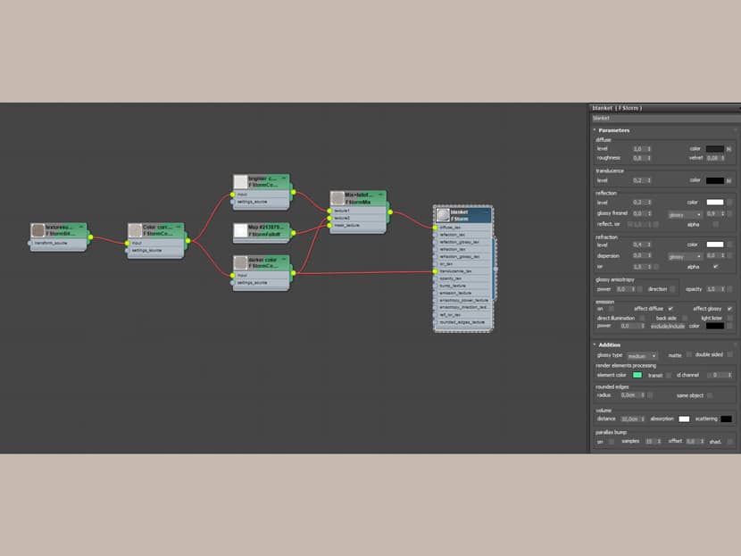
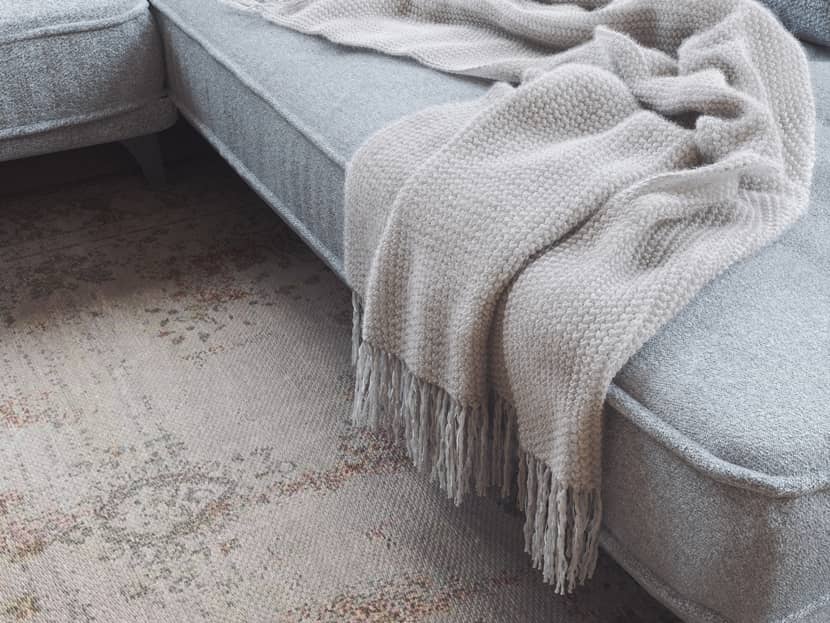
Here is a little tip with a preview from another project. If you want to have more cozy, fuzzy, and nice looking, with soft filling textiles add little refraction with no glossiness in your materials.
 Click on the image to enlarge it.
Effect.
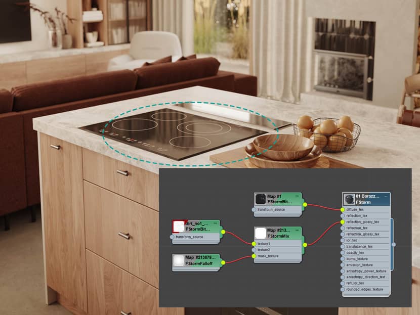
The next step was to make the project even more realistic by adding imperfections, dust, and so on. Especially it gives nice results on glossy surfaces even when are almost invisible. I recommend the RenderRam YouTube channel. Vjeko explains it very well!
 Click on the image to enlarge it.
Framing.
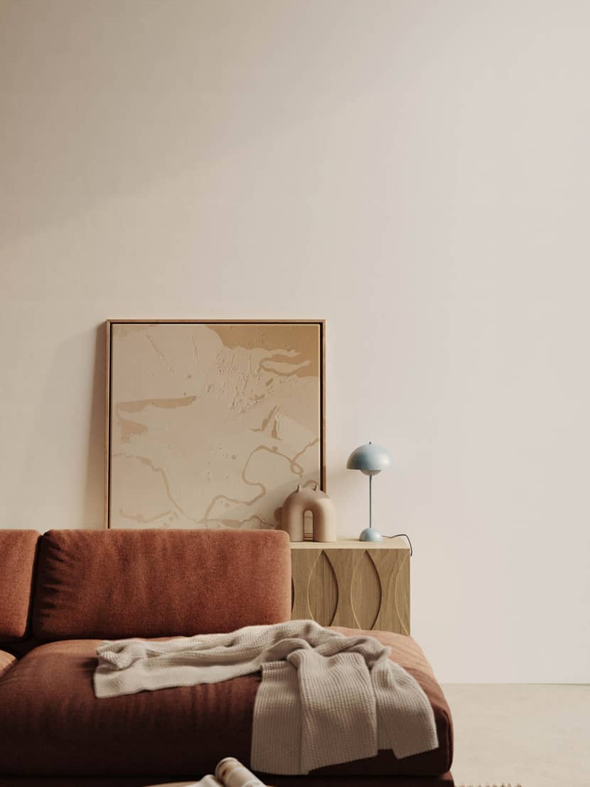
In my work, I’m trying to avoid wide angles for the several cameras. I know... everyone wants to show the entire space in one image, but it never looks good. Usually, I’m not going under 30mm of focal length in camera options. If the space is too small to insert a camera, or some objects near the camera are corrupting the composition, I’m using near clipping. ImageCompHelper script is very useful to define the strong points of the images. If it is possible, I always try to use frontal and straight angles. Also, the depth of field is very helpful to show what is important in the image, even if it is almost invisible, it adds realism to the images.
I hope you have enjoyed the lecture and found some new techniques to improve your projects. Keep rendering!!!
With warm regards,
Jakub Stawiany.
Check more of Jakub's work on these channels:
Want to share your work with our community too?
Contact us at This email address is being protected from spambots. You need JavaScript enabled to view it. and tell us about your favorite project.
