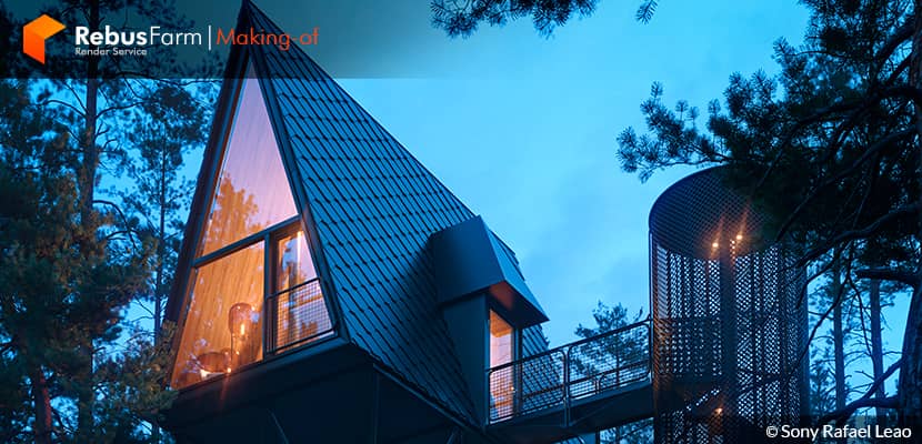
Sony Rafael discovered his passion for 3D photography while working as an architect and decided to become a 3D Photographer. He studied a lot, and he improved himself through continuous experiments. Today, he talks to us about one of his best projects, giving very nice tips, especially on how he learned to compose images. Enjoy!
About me.
Greetings to all the artists from the ArchViz community!
First of all, I want to thank the RebusFarm Team and everybody who allowed me to publish this Making-of article. My name is Sony Rafael and I'm a Brazilian 3D artist. I’ve been working as an architect for 6 years and as a 3D artist for only 1 year. After all these years that I was working in architectural design, I realized that my passion for architectural visualization had surpassed my pleasure in designing. I'm used to investing hours in the creation of 3D models and rendering images, composition techniques, lighting studies, photography, shapes, colors, and textures. All seem to me like a composition of harmonic musical notes or like a painting on my digital canvas. It’s the artist’s prime responsibility to create digital worlds which transmit feelings.
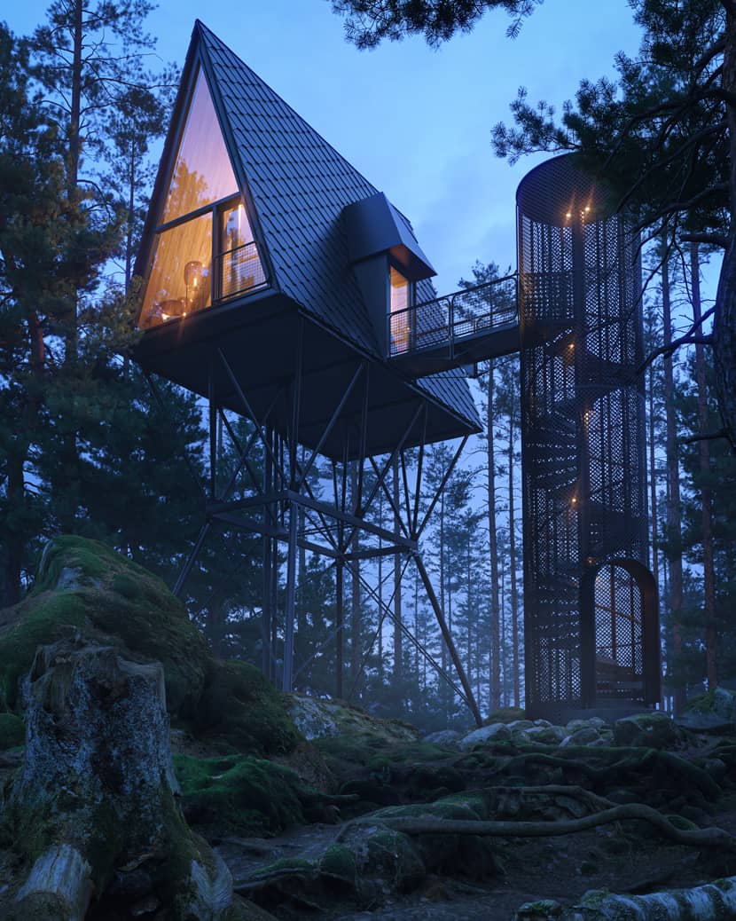
Reference.
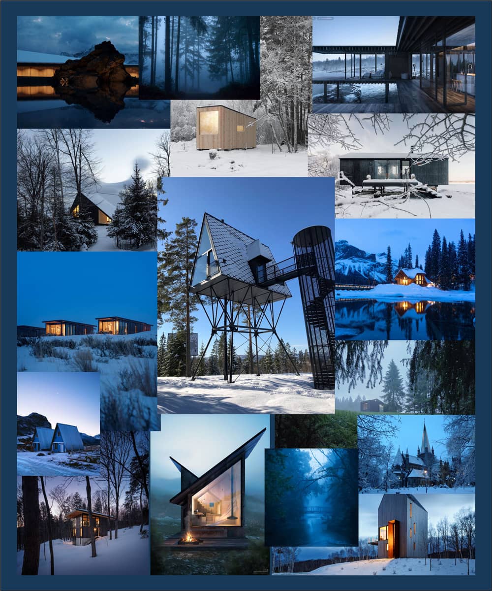
For this project, I honestly spent a long time searching for a perfect reference, and I’ve reunited all the ambient pictures and elements that transmitted chilliness, snow, cabins, forests, and horizons, with a highlight to the Blue Hour, in a mood board.
The reference that most drew my attention was the “Pan Treetop Cabins”, in Norway, designed by the Norwegian architect Espen Survenik who received many awards for his unique and bold design in black steel.
Modeling.
First, I downloaded the pictures of the architectural design on ArchDaily for modeling. Then, I uploaded the pictures to AutoCad because it was easier for me to bring them to the correct scale. I redrew the main lines and imported them to 3DS Max. Considering my little experience with modeling in 3DS Max, this is the best and more comfortable way for me.
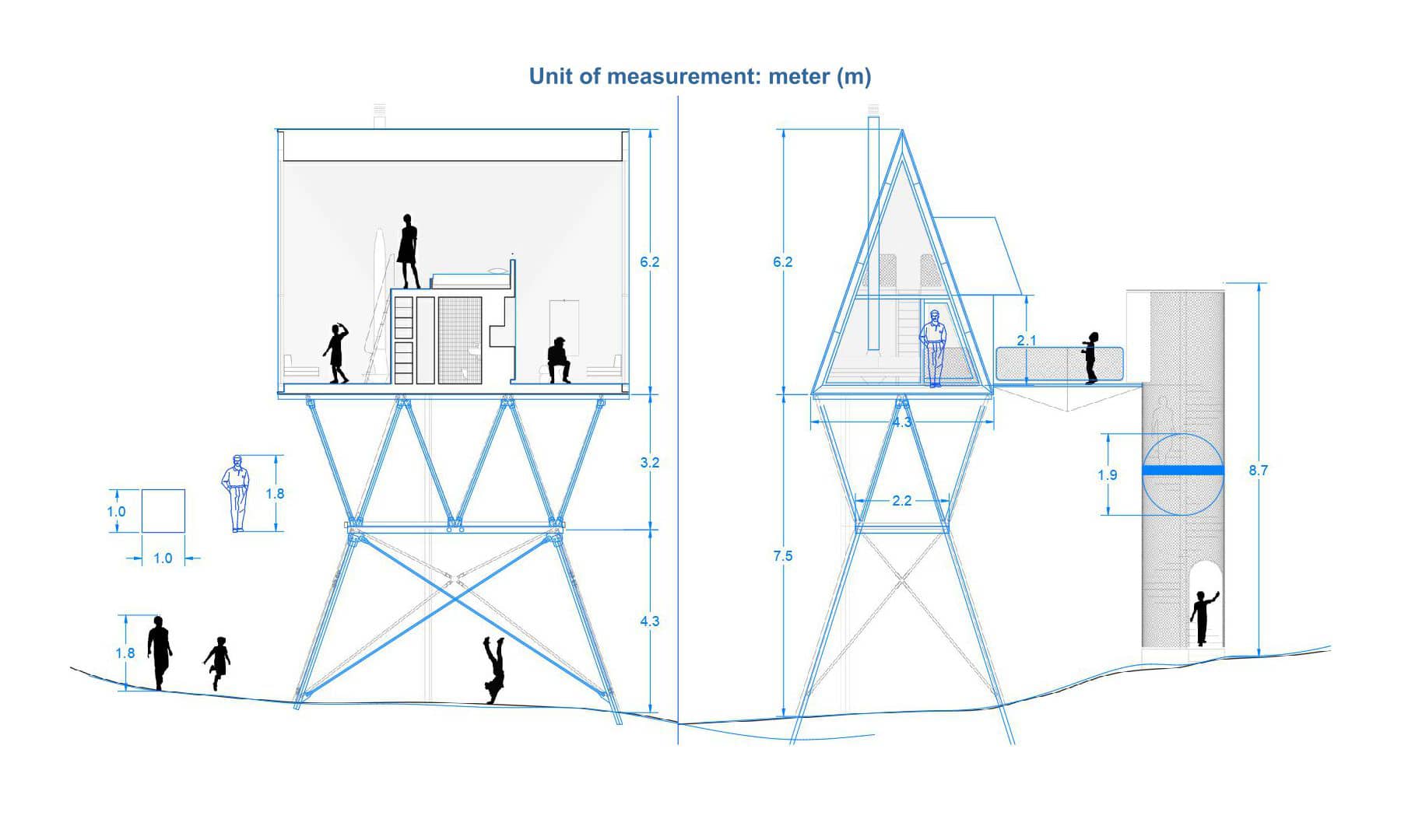 Click On The Image To Maximize it.
For modeling the stair railing, I followed the tips from a YouTube video: “Gfx Total Tutoriais CG - Como Criar Painéis com Topologia Procedural no 3ds Max”. The steps were made with the spiral staircase, 3DS Max basic command, and configured according to the reference.
Assets.
I used the assets from the Quixel Megascans website. The most interesting thing in this scene is that it didn’t need any land, I just added the rocks, wood logs, and roots covered in moss assets, positioned in a point of view where the framework itself would connect them as one. The high-quality tree blocks made all the difference and they were found on the CGMOOD website. The trees positioned in the foreground were more detailed and heavy blocks (Pinus Sylvestris 05 – with 2 variations). The ones on the background were less detailed and lighter (Pinus Sylvestris 12 – with 4 variations).
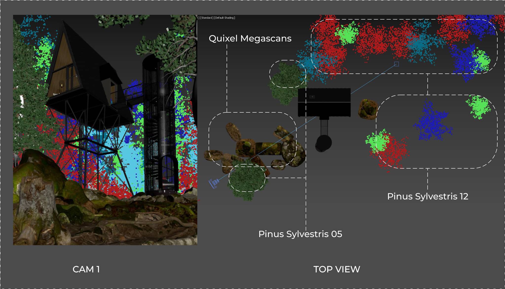 Click On The Image To Maximize it.
Composition & Photography.
I usually watch tutorial videos about the art of photography because, after all, 3D artists are “three-dimensional photographers” and need to be assertive when photographing their work. In addition to the rule of thirds, other basic rules were used in the composition.
Frame: consists of creating a scene framing with the elements of the scene itself, the trees in this case. As a result, it draws the observer’s attention to the key elements of the image.
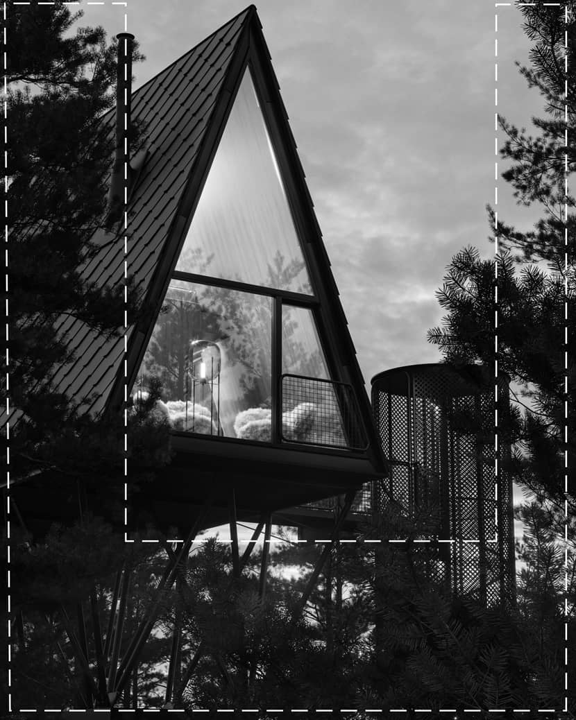
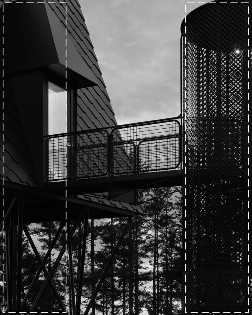
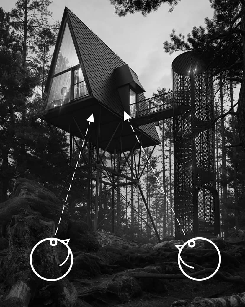
Contre-Plongée: it’s a framing French technique that allows us to observe the scene from the bottom to the top. Doing so leads the observer’s attention upwards and gives a sense of grandeur.
Environment Blue Hour.
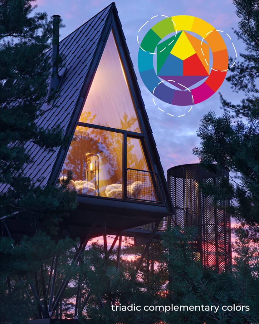
The Blue Hour technique is used a lot by artists and photographers, and it allows them to photograph the scene after sunset or right before sunrise, when they can register a cold and very soft light, a gorgeous sky with a thin orange or pink line on the horizon. For these results, I used the HDRI from the 3dcollective website. It’s always a good idea to use warm light to complement the blue color so that you can have a balance according to the chromatic circle.
Materials.
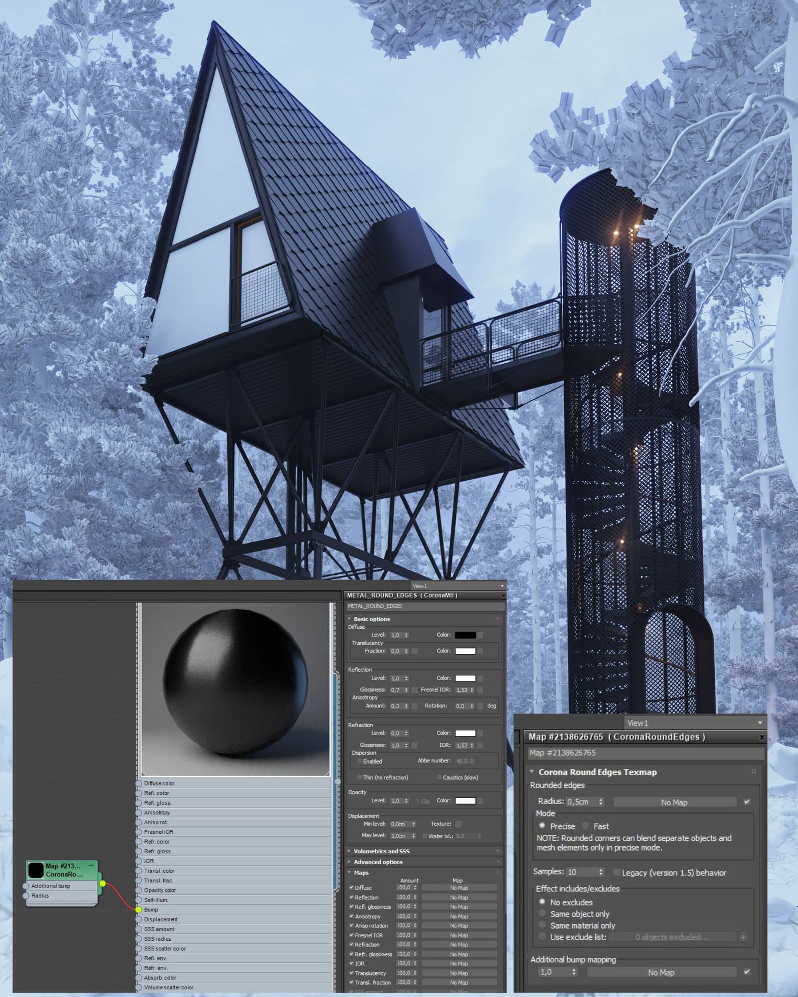
There was no concern with the materials, I just set a simple one taught by professor Ander Alencar, using Corona Material without Diffuse Map, no bump map, and no displacement map, only Corona Round Edges, and reflection. On the other elements of the scene, the Assets Quixel Megascans presets did the trick.
 Click On The Image To Maximize it.
In order to create the fog environment, I used the technique taught by professor Ana from the Arch Viz Artist YouTube channel. I thought it was interesting the technique of creating a big fog box on the scene, with a simple setting.
Post-Production.
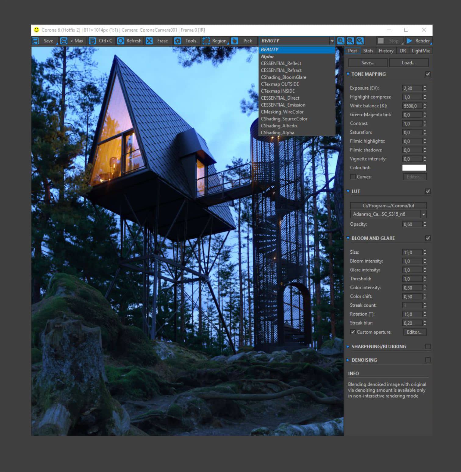
The post-production starts on Interactive Rendering, with the following settings:
 Click On The Image To Maximize it.
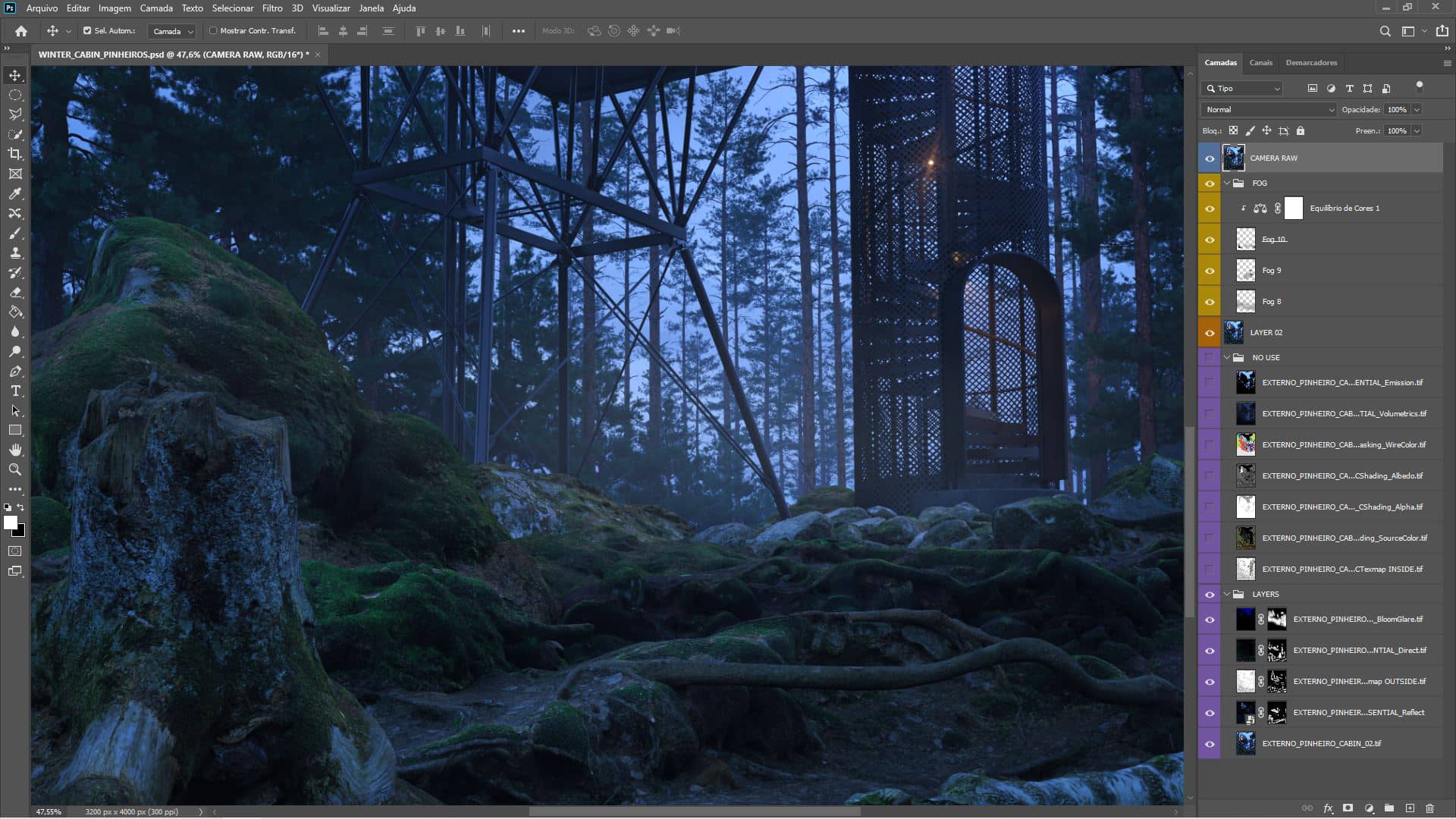
Then, I uploaded all Render Elements on Photoshop and worked with the Layer Masks putting the most important layers on the top, for example:
The layer Ctexmap_OUTSIDE evidences the contact of the material and create more marked shadows between the elements.
The layer CESSENTIAL_Reflect values the reflection of glass and metal. Finally, following this sequence to the other layers.
The next step was working with the insertion of some FOG images in PNG, found in the Lens Distortion website, and then completing with some little adjustments in the Camera Raw Filter setting:
Reducing the color temperature a little, increasing the exposure and the texture intensity, working on the balance of contrasts, and completing with a little vignette effect.
 Click On The Image To Maximize it.
Interior Scene.
Finally, I created an interior scene of the cabin, with some modifications from the original layout and replacing the environment. A radical change in the work was to replace all exterior assets with a simple HDRI map, found on the PolyHeaven website. It is evident that we lost the height of the cabin, but I understood it as another place, with similarities.
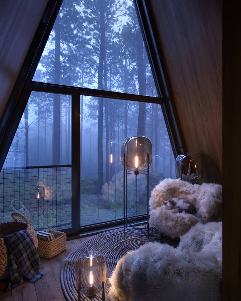
Disregarding the cabin modeling, we can observe that creating the scene is a relatively fast and simple process, and you can reach a powerful result. I was extremally happy when I looked at the final scene and particularly shocked by such quality I had reached.
Here is my gratitude to RebusFarm for the opportunity and for valuing the works of the artists. Congratulations to you all!
Sincerely,
Sony Rafael Leao.
Check more of Giuseppe's work on these channels:
Want to share your work with our community too?
Contact us at This email address is being protected from spambots. You need JavaScript enabled to view it. and tell us about your favorite project.
Get started with your own renderings
