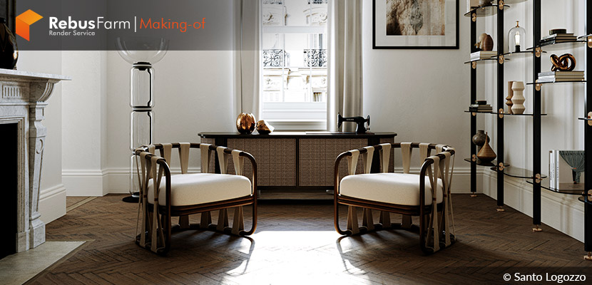
In this makin-of article Santo Logozzo, an Italian architect and 3D artist, explains how to conquer the proper mindset when you try to do it photorealistic. A beautiful and harmonic interior living room painted with nicely combined earth tones and properly placed decorative objects give this interior shot a unique and pleasant style. Additionally, some basic photography knowledge could finally be one of the keys to successfully presenting a beautiful 3d project!
About Me.
Greetings 3D Community!
My name is Santo Logozzo, and I am an Italian architect and 3D artist based in London. Originally from Gioiosa Jonica, a small town in the province of Reggio Calabria (South Italy). Right here in Reggio Calabria, I began studying Architecture. During my studies, I undertook work experiences in Spain, particularly Madrid and then Barcelona, and it was precisely in this period that I interfaced with the world of 3D and visualization, developing a real passion. As soon as I graduated, I moved to Milan, where I lived for five years, working as an Architect and 3D Artist. For years, my main focus and objective has been to create images with high visual impact in the Real Estate field.
I have been in London for two years, working for The Boundary. Arriving here was a great satisfaction, a goal, and an environment that enhanced me. I like working on exterior and interior images, and especially on the environment. I prefer composition, light management, detail, and photorealism.
Software Used.
The project was created in full CGI with 3ds Max and Corona Render.
About The Project.
"Living Room in London" is a project I recently completed. The project wants to describe a space, a living room, in a detailed way and various forms. I used post-production a little, just a light Camera Raw, which involves balancing the image. An effect in Camera Raw that I usually use is "Texture" to highlight the subject in the image or, for example, a noticeable floor, as in this case, giving more detail.
However, I recommend using it sparingly to avoid distorting the image. Addressing the Lut theme, I don't use it, or at least it depends on the objective I have in the image. Basically, when I aim for photorealism, I avoid it. I think it impacts the image, but at the same time, for this very reason, in an image that is a competition or a concept, I think it can help a lot in emotionality.
In this short video tutorial, Brendan Williams explains how to use this simple feature to enhance your images:
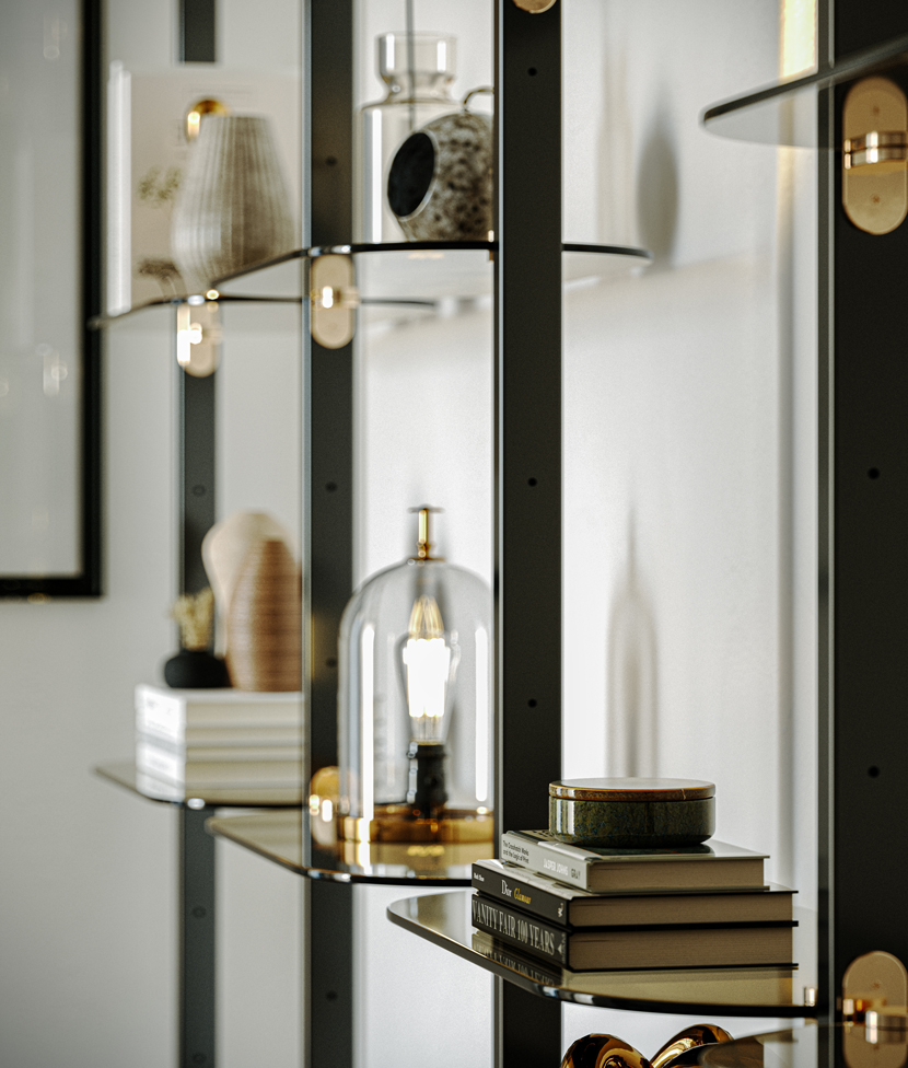
The project's approach was to start from a scheme I had in mind, so I decided to follow some good references. Mainly, these are photographs; if interior, they can be catalog images, just like in this case. Having a real image close to me allows me to understand and compare composition and how a material is made. Those who aim to give a high level of photorealism in their images know very well how glass is made, the details of a window frame, and so on. The achievement of a good image is given by multiple factors, from a faithful reproduction of the materials to a well-calibrated light. Adding details to the models certainly helps a lot in the perception of the achievement of photorealism.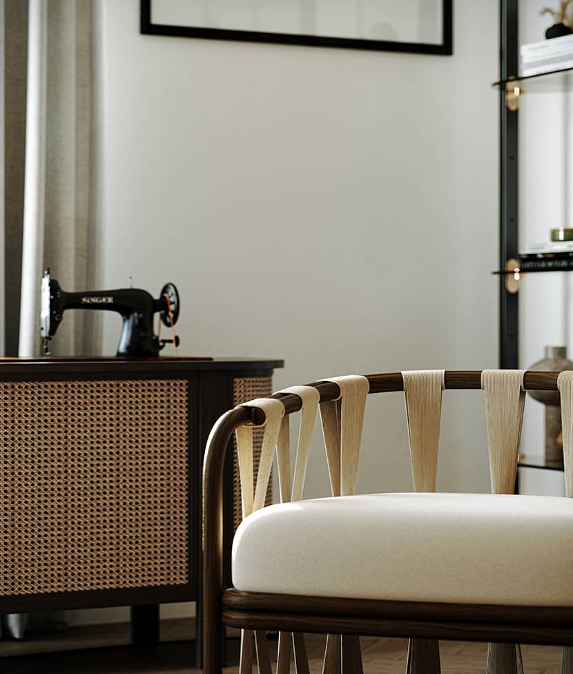
Framing & Aspect Ratio.
At the beginning of the project, I started to set up my room and, consequently, the camera. The point of view can be the dog's eye and give immersion to the image or a greater height to better describe the environment. I help myself with the basic rules of photography, which help me for composition purposes.
The image aspect ratio is clearly conditioned by what I want to produce on stage. The aspect ratios I usually prefer are 1.20 and 0.85. In this video tutorial, Charles Cabrera explains nicely several aspects and how to select them in order to enhance your composition:
The focal length used in interiors ranges from 24 to 30; I go below 24 when I want to highlight architectural lines or give the perception of a larger space. When I want to present details, I go from 65 to 85. In this video, Balan Madhavan explains the ins and outs of interior photography. The video elaborates on the factors a photographer must pay heed to while shooting within the confines of a house or a physical structure. He also covers technical information on the camera's distance, the focal length of the lens, the placement of the subject, and all relevant details to aid a photographer. Enjoy!
According to my personal taste, I recommend that it is certainly important in a project when you make many images with the point of view at the same height to avoid that "up and down" when scrolling through the images.
Lighting.
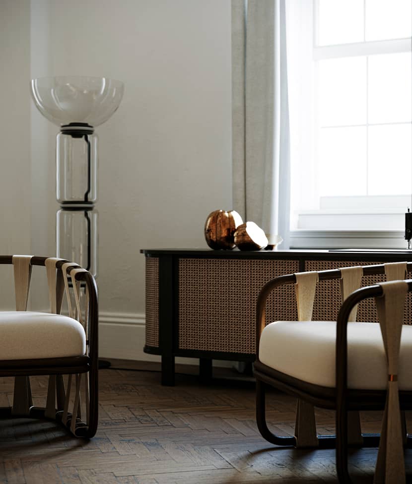
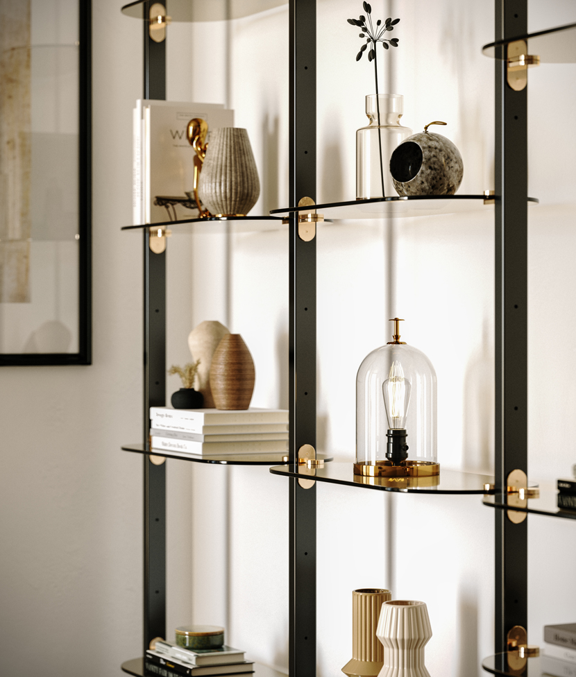
In this scene, I used an overcast HDRI and Corona Sun. Generally, I like diffuse lighting, but sometimes I need a light that identifies the subject; in this case, I found Corona Sun the perfect choice. As you see below, the frame of the furniture and all the decors beautifully write some noticeable soft shadows on the white wall, giving depth, lines, and shapes that are very pleasant to the viewer.
If you don't know how to use these two light sources together, watch this nicely explained video tutorial below on "How to link a Corona Sun to an HDRI in 3dsmax" by ArchViz Explained.
Materials.
Materials have a major importance in a successful image. What I do is carry out checks for each object in the scene and use correct and good-resolution maps. This is the most important, as, without high-resolution textures, you have no chance to create a convincing photorealistic material.
Well-made assets also enrich the image and give an important glance. A particular reflection in a painting, in short, small attention, finally makes the difference. For that reason, it is important to carry out tests and make the perfect selection. Don't hesitate to fail, delete, and try again with a better 3d model or material. This is the only logical way to improve yourself and get the best possible result. For example, in this corner shot below, even if the relaxed space/armchair is the protagonist, the very good 3D plant model with an improved material that makes its reflections look very photorealistic "can steal the show."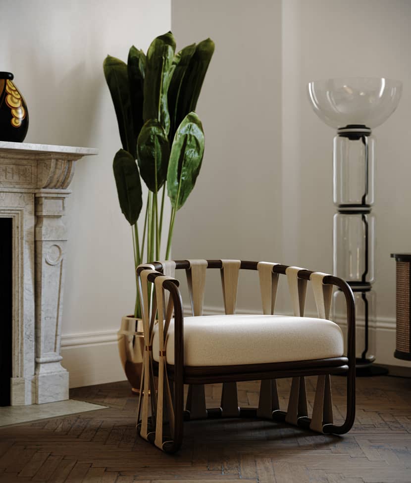
Vignettes.
As I said before, for details, I use a focal length that mainly goes from 65 to 85. I center my subject in question, and I see whether to place it on a third or in the center. I like that each detail indicates a different characteristic, perhaps with a blurry foreground that introduces the image, another that highlights a material in which I put a lot of effort, and so on. The important thing is not to fall into repetition. Once the main scene was composed, I gave the go-ahead to shoot, hence the challenge of reproducing it as intended. And if you succeed, it is truly satisfying.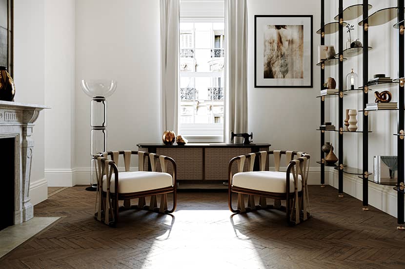
Conclusion.
My intent in every project is to convey something to myself and the public. I hope I have succeeded in the latter, and I also hope that my brief description and approach to the project may have been of help to you.
Kind regards,
Santo Logozzo.
About the artist
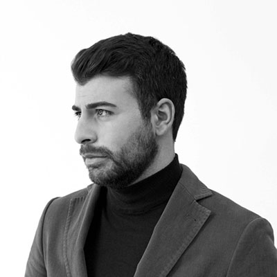
Santo Logozzo is an Italian architect and 3D artist based in London and working for The Boundary studio. His main focus and objective is to create images with high visual impact in the Real Estate field. He enjoys working on exterior and interior images, especially on the environment. He prefers composition, light management, detail, and photorealism.
