Wednesday, May 1st, 2019 by Julian Karsunky

Architectural visualization is truly a global industry. Thanks to the wonders of modern technology, we are free to digitally explore cityscapes and buildings from all over. Our 3D Artist of the Month campaign is one opportunity to connect with artists worldwide and highlight their work. For May 2019, our journey takes us to the city of Novosibirsk in Siberia, Russia. Here, we meet Stas Vergasov, a talented 3D archviz artist, specializing in exteriors.
When Stas submitted a series of visuals he produced for a shopping mall, we were immediately intrigued by the dense and unique atmosphere of the scene. To get the full story behind the image and learn more about his unique approach, check out our interview!
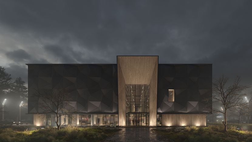
 Considering the façade of this beautifully lit shopping mall, it should come as no surprise that Stas specializes on exteriors.
Hi Stas, glad to have you! To start things off, please introduce yourself to our readers!
Hello everybody! My name is Stas Vergasov, I’m a 29 years-old freelance 3D artist from Novosibirsk, Russia, specializing in architectural visualization.
Do you recall when and how you first consciously encountered CGI?
Of course! I first used CGI as a student at Novosibirsk State Architectural University, to present my projects. My skills were rather low at the time, but I have always loved to draw by hand and thus immensely enjoyed learning new techniques using CG technology.
 This futuristic pencil sketch is one of Stas’s very first forays into architectural visualization.
Please tell us a bit more about your work. What services do you offer and who are your target markets and clients?
I’ve been working as an archviz freelancer for about three years now, mostly working with studios and developers. To me, the artistic component is the most important part of my job, which is why I prefer clients and projects that are on the same wavelength, creatively speaking. As for my services, I exclusively focus on exteriors, it’s what I’m most comfortable with and I’d rather specialize in a specific area instead of spreading out too much and risk watering down the results.
Is there a specific design philosophy or school of thought you adhere to? What inspires you as a 3D artist?
During my studies, I drew a lot inspiration from the works of Jonathan Gales and his studio Factory Fifteen, the ‘Megalomania’ project in particular. When I entered the industry, my tastes and sources of influence naturally evolved and diversified.
Working on the ‘Scandinavian House’ by Anton Podnebesnov was a defining moment in my professional career in terms of influence. It was based on the ‘Carey House Tutorial’ by The Boundary, which was very useful back then and is still as relevant and recommendable today!
 Just a shopping mall in a small Siberian town…or is it?
Let us talk about your submission in more detail, namely your visualization of a shopping center in a small Siberian town, designed by architect Anton Podnebesnov, whom you already mentioned.
Right, me and Anton have known each other for a long time. The shopping center is not our first time collaborating, so when Anton came to me with this particular project, he fully trusted me with realizing his vision.
The atmosphere of some of the scene seems unconventionally moody compared to run of the mill archviz work.
Well, shopping malls are not always what they seem! Since Anton trusted me with the project and a lot was left to my discretion, it turned out somewhat atypical for the shopping center environment and atmosphere. Aesthetically, I was also inspired by David Lynch’s ‘Twin Peaks’, which might further explain your perception. Above all, our main goal with this project was to create very lively and memorable visual content. To that extent, I put a lot of time and effort into the lighting.
How long did it take you to complete the project?
There was no precisely defined deadline for this project, so I ended up working on it on and off over a longer period of time. Finding and deciding on the perfect camera and lighting set up took quite a while!
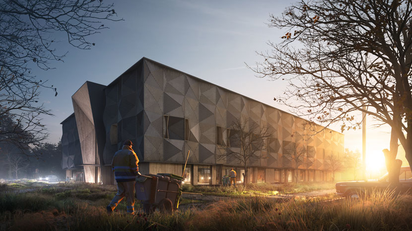
 Stas created this shot as a visual introduction to the project.
In how far did you deviate from the initial design?
Barely, if at all, honestly. The only change worth mentioning is the vegetation. As an artist, I naturally strive to only improve what can be improved, all within reason, of course.
In terms of landscapes, trees and other objects, how much of what is seen in the final animation did you create from scratch?
For the most part, I work with ready-made assets, but I do try to customize them according to the goals of each individual project.
Once you had a rough concept in mind, how did you then go about realizing it?
My first step consisted of setting the camera, lights and materials. From there, I worked through the details, adjusting and finetuning the settings along the way. All in all, I mostly adhere to the golden rule and work “from general to specific”.

Personally, I was surprised by the overhead shot of the biker with the yellow umbrella, not only because of its artistic quality, but more so because the actual building is barely visible in the scene. Please tell us more about this particular shot and its purpose!
Initially, we produced a series of three images with the building as the focal point. But when I reviewed the images before uploading them publically, I felt inspired to create additional framing to better present the project. So, I came up with two more images to act as an introduction and a conclusion respectively. The first image shows the mall at the dawn of a new day. For the second image, the one you mentioned, I went for a more artistic approach.
Generally speaking, is it more enjoyable or more challenging to work outside of the typical limitations set by a client?
That’s hard to say, there are pros and cons to both type of jobs. Working without clear limitiations is a huge responsibility. It generally also is a lot more time-consuming. At the same time, it can be extremely liberating, creatively speaking. While quality usually takes time, sometimes pressure can really fuel your productivity and you might find yourself creating exceptional work in very little time!
 Shopping mall, raw render.
What software did you use to create this project? Any plug-ins you found particularly helpful?
For the majority of the project, I used 3ds Max in conjunction with Corona Renderer. I found Corona to be a great and reliable instrument when working on a soccer arena a while back and have been using it ever since. Also, I used Photoshop for post production, but that almost goes without saying. While my work regularly might look ordinary before post, it’s both easier and faster for me to achieve the desired results in a 2D environment, instead of foreseeing the outcome and adjust everything in 3D.
Regarding plug-ins, Forest Pack is my uncontested favorite, I make use of it in every project I work on.
Have you used RebusFarm before? If yes, please tell us more about your overall experience. Is there anything you especially like about our service?
Up to now, I’ve only used RebusFarm once before. But now that I have the chance to try it out extensively, I look forward to use it more frequently in the future!
In closing, is there anything else you want to say? Any present or upcoming projects you’d like to mention?
This was actually the first interview I ever did, so I’d like to thank RebusFarm for giving me this opportunity! I’m very pleased and grateful to be featured as your 3D Artist of the Month.
The pleasure is all ours! Stas, thank you very much for taking the time and all the best in the future!
Keep up with Stas Vergasov and his work here:
HOW TO JOIN OUR MONTHLY CONTEST
You want to be our next featured 3D Artist of the Month and win 250 RenderPoints? Just visit our 3D Artist of the Month competition page and submit your entry. We'll choose the best image and contact the winner.
>> Read more articles on our blog
