Monday, January 3rd, 2022 by Julian Karsunky
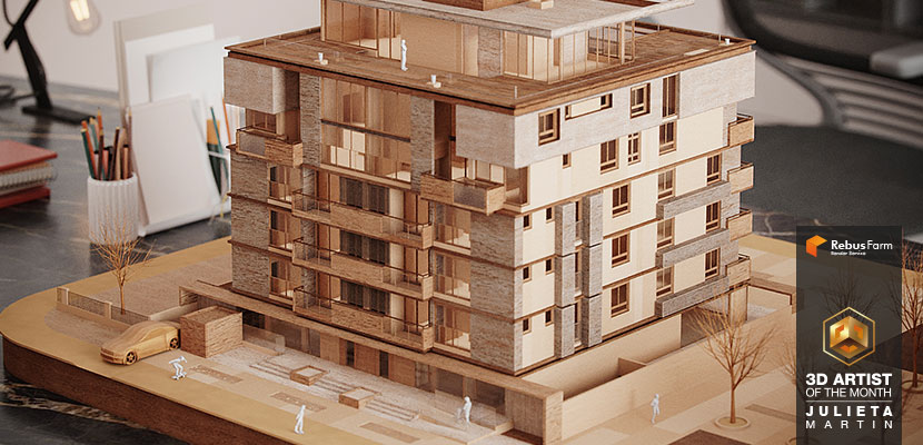
The new year is upon us, and we are thrilled to announce the continuation of our 3D Artist of the Month campaign! Our 2022 is off to a great start, thanks to Julieta Martín. Artistically inclined since early childhood, the Argentinian architect used her recent move to Europe to fully commit to her dream of a professional career in archviz. While still in a self-proclaimed studying phase, Julieta is already making waves, winning a prestigious challenge during her mentorship program and producing renderings of impressive quality.
Check out our interview to learn more about Julieta's design philosophy, past and present inspirations, and her glorious CG revenge on architectural models.
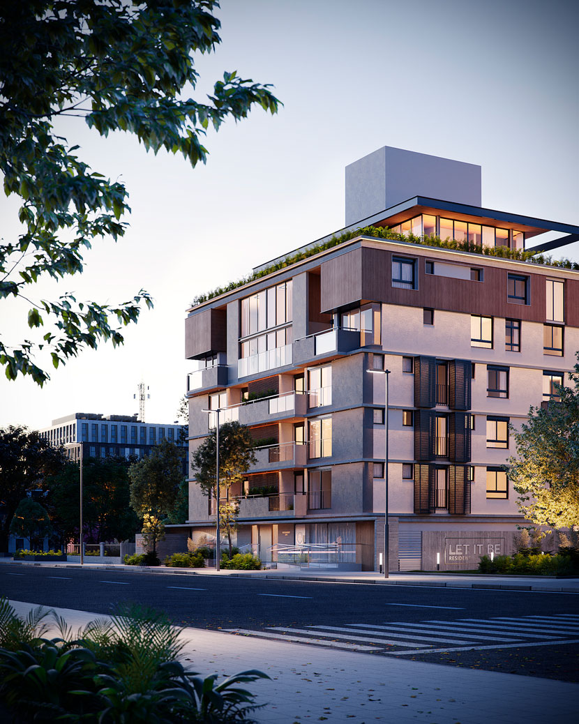 As part of her mentorship program, Julieta's guided real estate portfolio consists of a whopping 42 exterior and interior images.
Hi Julieta, thanks for joining us! To start things off, please introduce yourself to our readers.
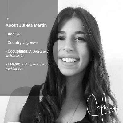
Hello! My name is Julieta Martín, I am a 28-year-old architect and CG artist from Mar del Plata, Argentina, currently living in Belgium together with my husband and our dog. I am thrilled to be part of this interview!
Do you recall when and how you first consciously encountered CGI?
Yes, I still remember my first time using 3D software! During my second year of college, back in 2012, I did some basic modeling in SketchUp and V-Ray. As I recall, all I knew about V-Ray was pressing the "R" key. Still, it was love at first sight, and I immediately began spending the little free time I had to learn how to produce decent renderings. Since then, for every school project I had, the renderings were always my favorite part!
What training or education do you have?
I graduated from Mar del Plata's National University in 2018 with a degree in architecture. Regarding CGI, although I had been exploring different software since 2012, it was only in 2019 that I decided to study it more formally. I started by absorbing every tutorial I could find. Then in 2020, I took the Rendermind course by Brazilian artist Ander Alencar. After finishing that course, I fell even deeper in love with the industry and decided to keep studying. When Ander launched his mentorship program and his new Oficina3d training in June 2021, I enrolled right away!
So your decision to pursue a career in 3D is rather recent! Please tell us about your professional history beforehand.
After graduating as an architect, I immediately went to work as a project architect for a small architectural office. Since we were a small team, I was involved in pretty much every step of any given project – from client meetings to budgetary planning and of course, the actual design process from start to finish. While I really enjoyed my job overall, I realized that what I loved doing most was producing 3D renders. Unfortunately, I rarely had the chance to do so, as we regularly outsourced this particular task to freelance artists.
It was around 2019 that I began considering shifting the focus of my career, but I had no idea how to go about it. I only became aware that there is a dedicated archviz industry when I came across an interview of Italian CG artist Lucia Frascerra during my research. She talked about having to choose between working as an architect or as a 3D artist. This resonated with my own situation, and I was stunned by her amazing work and successful career. Reading that interview gave me the motivation I needed to pursue my passion. I dream of one day being as talented as Lucia!
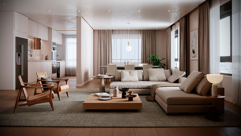 A look at one of the building’s many interiors. Julieta adhered to the same neutral color palette for all of her scenes.
Where do you stand right now and what are your plans for the future?
When I quit my job as an architect preceding the move to Belgium, I decided that, once there, I would not immediately look for similar work. Instead, I wanted to focus on CGI. And I figured that to eventually stand out as an artist within a very competitive industry, I first needed to take some time off to study and further develop my skill set. For the past six months, I have been studying full-time, around eight to ten hours a day.
I consider myself quite lucky that I had the chance to do so, and I am thankful for my husband’s support and encouragement. I feel like I have improved a lot, and now I can rightfully call myself a CG artist rather than "an architect who occasionally does renderings". I hope that all this effort will open new opportunities for me in the near future, be it working as an artist for a studio or going freelance.
Why and when did you relocate to Belgium in the first place?
My husband and I moved to Belgium seven months ago following a job offer he received. Living abroad is something we had wanted to do for a long time, so after giving it some serious thought, we decided to take the chance. It has been an amazing experience so far! I am totally in love with Belgium, its amazing culture, cities, and landscapes.
South America has a thriving CG scene. What can you tell us about the current state of the Argentinian CG industry and community?
The South American CG scene is indeed thriving! I am totally amazed by the amount of talented South American artists who are coming up each day and I’m proud to be part of this movement. I think Brazil is at the forefront of this development. Since I speak fluent Portuguese, I was able to study online at a Brazilian academy, and I can personally attest that the community is very generous and supportive of each other!
While I am not as familiar with the Argentinian scene, I think that it is still in its infancy, at least compared to Brazil. I know of a couple of studios and artists here and there, but there is still a lot of room for growth and consolidation.
On an unrelated note, Lilian Alves (editor’s note: our December 2021 3D Artist of the Month) is a classmate of mine; I was super thrilled when I saw she had been chosen!
Describe your profile as a CG artist! What are your main areas of expertise?
I believe that composition and everything related to it (from picking the right assets to textures, and color schemes) is one of my biggest strengths. This is mainly due to my background as an architect, I think.
Is there a part of CG-related work you particularly enjoy? For what reasons?
I absolutely love working on the cameras and the lighting. These are the key elements that bring a scene to life, and I can spend hours upon hours looking for new angles, moods, and setups.
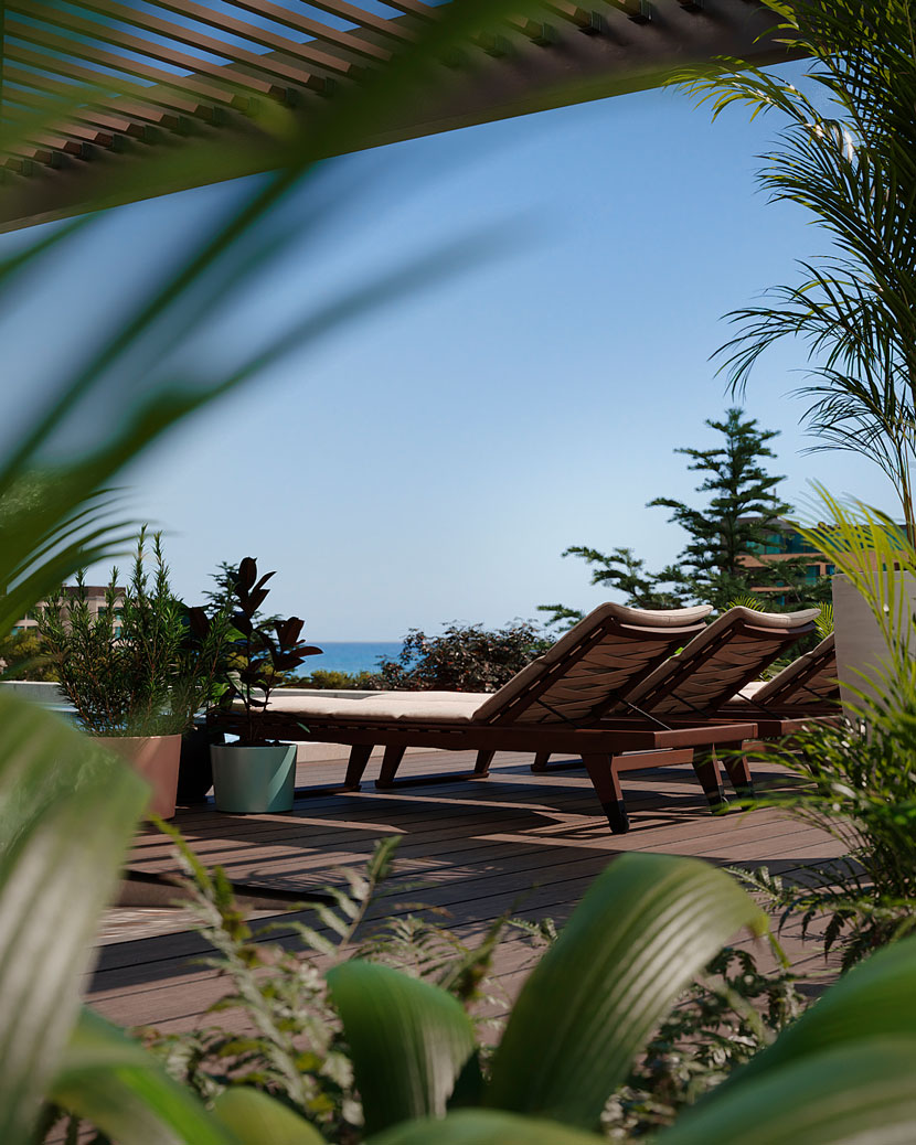 The rooftop area, with the sea visible in the background.
Can you tell us a bit about your personal history with architecture and architectural visualization? Where does your fascination stem from?
I have enjoyed visual arts for as long as I can remember, whether it was drawing and painting as a child, then later designing. The high school I went to had a focus on arts and visual communication as well, so I learned about the history and theory of design from a young age. I do not recall the exact reason I chose to study architecture over all other creative disciplines, but I know it felt like a no-brainer at the time. And once in college, I truly fell in love with it.
Architectural visualization then gives me the creative freedom that goes far beyond the limits of architecture itself; in fact, you are only limited by your own imagination. With 3D software, you can create virtually anything – I find that amazing!
Are there specific design principles or architectural schools of thought you adhere to? What or who inspires you as a 3D artist?
My favorite architect in the whole world is Mies van der Rohe. I love the history of architecture, and when I first learned about Bauhaus as a young student, I became obsessed with it. What I appreciate the most about Mies’ work is how simple and pure it seems, despite being extremely conceptual and complex. I greatly enjoy architecture that follows similar criteria, that is both honest and well-thought-out. Let’s just say that flamboyant shapes and colors are not necessarily my cup of tea. Or, as Mies would say: less is more.
In terms of archviz, the artists that I admire the most are Lucia Frascerra and Ander Alencar. I love the way Lucia Frascerra manages to tell a story through her images, not to mention her amazing post-production skills. Regarding Ander, he is not only a terrific teacher, but he is a master of immersion. His images make you feel like you are right there inside the scene.
More generally speaking, I find inspiration everywhere. Architecture is the main source, of course, but I am also frequently inspired by photography, art, and (industrial) design. The latter was the case for 'Scandinavia' and 'BKF', two scenes of mine that prominently feature furniture.
You also have a background in graphic design, having worked freelance on the side for multiple years. Does this experience translate to your archviz work?
I believe the common ground between architecture, graphic design, and archviz, is that they share a certain design process. This process is never linear, it is a constant back and forth, and it never truly ends either, it only stops because fortunately, there are deadlines we have to meet. But no project is ever fully finished or perfect, there is always room for improvement.
Independent of the discipline, my creative process looks something like this:
Research ←→ Conceptualization ←→ Development ←→ Refining and adjusting.
As I said, there is a lot of jumping around between these stages. To me, research is the most important part of any project, as it allows me to establish and build upon a clear concept.
Let us talk about your work in more detail, namely the residential building you submitted to our campaign, titled 'Let it be'. Can you first tell us a bit more about the origins of the project? I understand it was part of an online mentorship program?
Exactly! 'Let it Be' was a challenge issued during the 'Guided Portfolio Program', a component within the mentorship I am doing with Oficina 3d. The main goal of the challenge was for us participants to create a solid portfolio, with the five best portfolios winning a contract with Oficina 3d.
We were given a residential project and the task was to create a minimum of 16 images portraying the exterior of the building, a rooftop with a deck and swimming pool, a party room, a fitness area, the main bedroom, and the living room.
Please describe the basic concept and central idea for your submission to the challenge in more detail.
As the name of the program implies, we received a lot of guidance, that is tips and suggestions to create a successful portfolio for the real estate industry. For example, we were encouraged to use neutral palettes, certain camera angles, moods, and lighting settings. But these were only recommendations, and we had total freedom regarding the composition of the scenes, the interior design of the rooms, the environment in which the building was situated as well as the materials used. The only thing that was not allowed was to modify the architectural elements of the project.
I decided to follow most of these suggestions but took it a step further with my color scheme: the neutral palette became a key factor for the entire project and is consistent all throughout the different scenes. In fact, the only bright colors I included are those found in nature, such as the sky or the vegetation.
Can you explain the name and how it ties into the design?
The title ‘Let it Be’ was chosen by Ander Alencar. I understand that he is a Beatles fan, so it is a safe bet to say that is where the inspiration came from. I like the Beatles too, but I refrained from using imagery that was too on the nose and cliché. Instead, I tried to reflect on how letting it be would translate to a design concept. For a residential building, I figured it would mean peaceful and quiet spaces that invite you to be yourself and just relax.
What parts of the scene were especially important to you, both from a visual/design as well as from a technical point of view?
The camera angles and the composition of the environment. Even if everything else is perfect, failing one or the other is a deal-breaker in terms of photorealism.
How long did it take you to complete the project?
The challenge ran from September 27th to November 26th. We had two project deliveries in between, each followed by a group meeting and general feedback from Oficina 3d’s art director Dan Bachmann. These meetings were incredibly helpful, Dan has an expert eye and he taught us a lot along the way.
What were some of the challenges you had to overcome?
Working under a tight schedule was tough and required good time management. Failing to meet a deadline meant you were out of the running. Since I was taking the online lessons of the course and doing the accompanying exercises at the same time, I was constantly juggling. It was an equally intense and educational experience; during the three months of the challenge, I definitely spend too much time in front of the computer.
But I stuck through, and for my final presentation, I showcased around 42 images and an animated video. In the end, I was selected as one of the top five portfolios, which is a great honor and a point of pride!
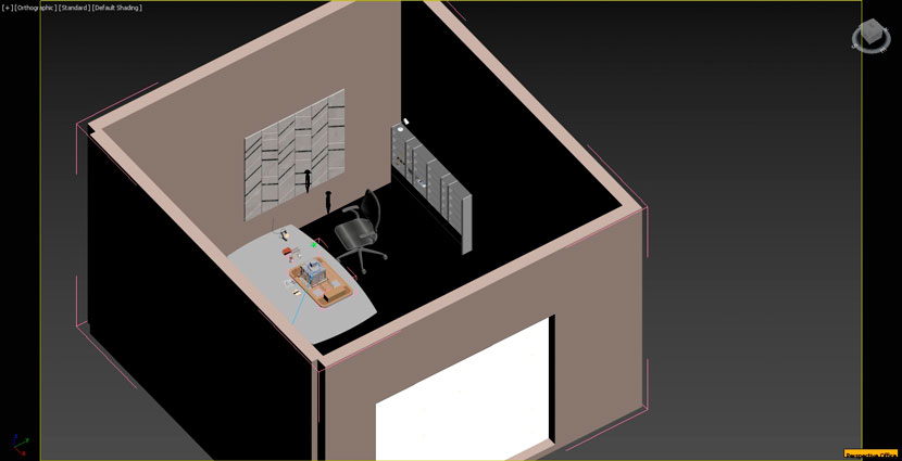 A behind-the-scenes look at the wooden model and the office environment.
Talk to us a bit more about the building and your choice of colors, materials, lighting, and overall composition.
The facade was my jumping-off point: I started by developing the exterior, as I strongly felt that I had to first establish the essence of the project as a whole. The different interiors then are reflections of that essence.
For all of my projects, I try to envision a fitting backstory and come up with a little narrative. This approach helps me to enrich the scene with details and make it more realistic. In the case of this building, I imagined the potential residents as young professionals who are looking to buy their first apartment, and that premise guided the whole composition. I chose the materials and the colors based on this idea as well, as I wanted the building to look modern and fresh both inside and outside. Since we were free in choosing an environment, I decided to compose an inviting and quiet neighborhood that would suit the people I had created in my mind.
I wanted to portray the building at different times of the day, so I needed different light settings and backgrounds for multiple cameras and angles. HDRI was the most efficient way to achieve this.
You also created and animated a wooden architectural model of the building. Tell us about your 'Revanche'!
It's funny, but back in college, I was never any good at making real-life models for my design class projects. It required a level of patience far beyond me, and, as a result, my models always looked horrible! Considering I had people laugh at my efforts numerous times, I guess my models were comically bad. And I certainly would have laughed too, if only they had not been my models! (laughs)
So, this project is my personal revenge on my previous failures as a model builder. Thanks to CGI, I was not only able to finally nail an architectural model, but I also spared myself the mess that comes with cutting cardboard, wood, and foam. Once I had finished the still image, I decided to take it a step further and create an animated video of the model assembling itself. I bet no real-life model could ever do that (laughs)!
Assuming you made the model first, how did this initial design translate to a fully-fledged exterior? Can you briefly walk us through your production process?
Actually, it was the other way around: I had already completed the renderings of the exterior for the actual challenge, the wooden model came later as an extra. What I did was downsize the 3d model of the building to a scale of 1:50. Then, I started simplifying the model by deleting all elements that would not be feasible to make in a real-life architecture model of that size.
For every object, I tried to imagine how I would represent it were I to build the model with my own hands and chose the materials accordingly: balsa wood, cardboard, wooden sticks, and 3D prints for the people. I also used photo references of real models – though not of my own models, obviously (laughs).
I wanted the background to not stand out too much, so I designed a simple, yet believable office environment. The lighting was rather simple as well: I used a rectangle light with a temperature of 6500 °K to make it look as if it was coming from a window on an overcast day, and some warm spotlights to replicate an artificial light source.
What software did you use for this project? Any plug-ins you found particularly helpful?
I used 3ds Max, Corona Renderer, and Photoshop for the post-production. Adobe Color Palette was a key tool, I designed the color schemes for the whole project with it. Finally, Pure Ref allowed me to keep staring at my photo references while working in 3ds max.
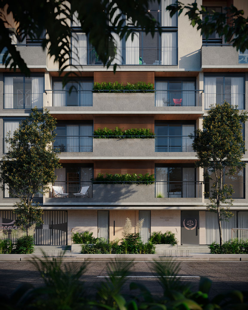 A frontal view of the building’s façade, which served as Julieta's jumping-off point for the entire project.
What has the feedback been like so far and how satisfied are you with the results yourself?
When I first showed the image of the wooden model to my friends and family, they did not believe that it was a render! For a 3D artist striving for photorealism, that is among the best reaction you can ever hope for.
I received a tremendous amount of positive feedback from the CG community as well because Ander Alencar posted my picture on his Instagram feed. I was overwhelmed by how many people liked and commented on the picture. I also published the image on CGArchitect, and promptly was awarded a board feature, which made me feel really proud.
And now I have been chosen as RebusFarm 3D Artist of the Month! Overall, I am extremely humbled and thankful for everything that has happened since completing the project.
What is one thing you have learned from this project that you can share with us?
I learned that it is all about setting a goal and seeing it through. Before starting the project, I had no idea about how I would make things happen…the animation especially, I had never done anything like that before. With the deadline approaching fast, I did not have time to familiarize myself with any fancy new plugins, so I decided to make the best use of the tools I already knew. The assets I got for free from 3D Warehouse for the same reason. Whenever any questions arose, I resorted to the internet; both the 3ds Max and CGArchitect forums were extremely helpful in that regard. So, the main point I’d like to share is that you do not always need the latest software or the most expensive assets to achieve good results!
Have you used RebusFarm before? If so, please tell us about your overall experience. Is there anything you especially like about our service?
Yes, after I learned about it during the Rendermind course, I used it a couple of times at my old job. It was a real time-saver whenever we were pressured for time, especially since we had older computers that could never render that fast. That is what I like the most, the reliability of the service: when a deadline approaches, you can always count on RebusFarm!
In closing, is there anything else you want to say? Any plugs, shoutouts, or upcoming projects you would like to mention?
I feel I have already said too much! But I want to say that I had an amazing time doing this interview and that I am so very grateful for being chosen as your 3D Artist of the Month! As to how I will spend the 250 RenderPoints I won, I am already coming up with ideas for a new animation!
We can hardly wait to see the results! Julieta, thank you so much for taking the time and all the best in the future.
--
Keep up with Julieta and her work here:
HOW TO JOIN OUR MONTHLY CONTEST
Do you want to be our next featured 3D Artist of the Month and win 250 RenderPoints? Just visit our 3D Artist of the Month competition page and submit your entry. We'll choose the best image and contact the winner.
>> Read more articles on our blog
