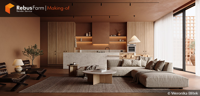
In her latest project, "Terra Cotta," interior designer Weronika Blitek draws inspiration from the sun-drenched shores of the Mediterranean. Yearning for a space that embodies tranquility, warmth, and a connection to its natural surroundings, Weronika crafts a living space that seamlessly blends natural materials – focusing on terra cotta – to capture the essence of the region's rich cultural and earthy charm. Join us as we delve into Weronika's creative process, from mood board musings to the final, inviting design!
About me.
Hello,
My name is Weronika Blitek, and I graduated from the Faculty of Interior Architecture at the Jan Matejko Academy of Fine Arts in Cracow, Poland, where I earned a Master of Arts degree and received numerous distinctions, awards, and scholarships.
My artistic background ignites unconventional thinking, blending diverse styles, forms, and textures to pioneer innovative solutions.
Driven by boundless creativity, I founded a boutique design studio where I can evolve and explore new design fields.
I specialize in photorealistic 3D imagery, collaborating with various professionals. I have worked on diverse projects, from simple product visualization to complex architectural scenes.
My priority is building solid, long-term client relationships and offering multidisciplinary solutions through continuous growth.
About The Project.
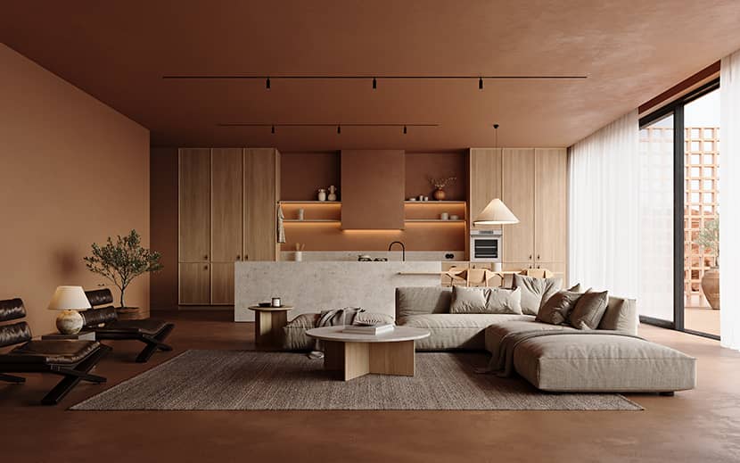
Terra Cotta draws inspiration from the Mediterranean region's rich cultural and natural heritage. Nestled within the heart of this idyllic setting, the design encapsulates the essence of tranquility, warmth, and authenticity. The project focuses on seamlessly blending natural materials, particularly terra cotta, to create a harmonious and inviting living space.
The design concept celebrates natural materials' inherent beauty and the Mediterranean surroundings' earthy charm. The primary objective was to create a space effortlessly connected to its environment, with earthy tones dominating the color palette to reflect the Mediterranean landscape.
Software Used.
I've been utilizing 3ds Max since the outset of my 3D journey, which began in 2015 at the Jan Matejko Academy of Fine Arts. Over time, my passion for 3D eclipsed my love for interior design, pushing me towards digital design. Initially, I worked with V-Ray, which may not be the most beginner-friendly tool. However, during my Bachelor’s Thesis, I switched to Corona Render, a decision that significantly enhanced my rendering experience. I've been using 3ds Max with Corona from that point onward exclusively. It’s the perfect tool for interior visualization!
References.
As an Interior Designer, I begin every project with a mood board. I collect and organize references from Pinterest and Instagram in PureRef*, a unique and helpful tool.
I focus on the general feeling, lighting, and materials at this stage. I also research design trends and architectural details that I want to include.
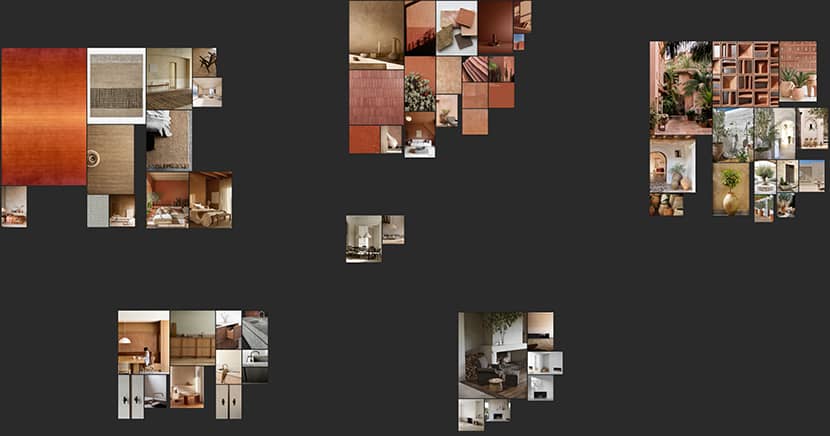
For those interested in this software, I recommend watching “Lesson 03 - Color Analysis I - Tonal Range” by CommonPoint (if you’re tight on time, just skip to 32:58).
Modeling.
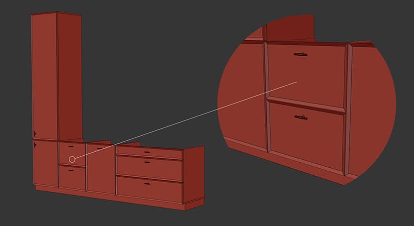
As an Interior Designer, I approach each project with an unwavering commitment to authenticity and precision. I pay meticulous attention to technical nuances and details, even those imperceptible to others. I craft every kitchen design from scratch, creating a standardized module measuring 60x60 cm, serving as the foundation. I replicate real-world dimensions to ensure the design’s realism. The countertop is always 90 cm high, the cabinets are 60 cm wide, and the drawers are 60, 90, or 120 cm wide.
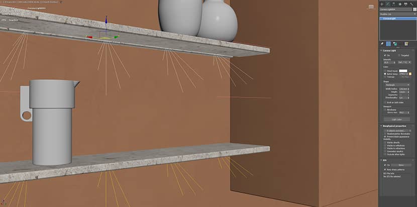
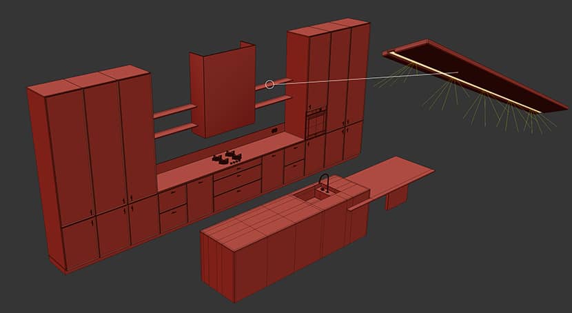
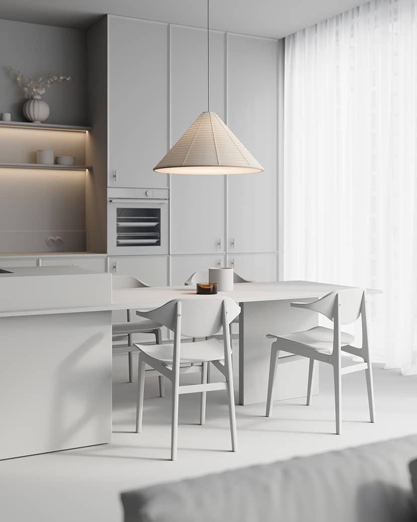
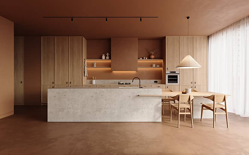
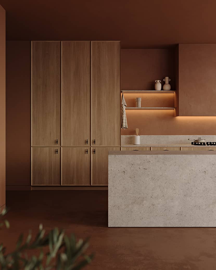
The kitchen hood is discreetly masked with a simple plasterboard, and a small niche is created at the back of the shelves to hide the LED strips. This technique, which comes from my experience as an Interior Designer, ensures a more comfortable viewing experience by hiding the light source.
A noteworthy tip for kitchen modeling is incorporating small, irregular gaps between cabinet doors or drawers. The presence of these imperfections adds depth and realism to the images. Also, make sure to leave a gap between the kitchen furniture and the ceiling.
Lighting.
After modeling the base elements, I focus on general lighting. I start by overriding all the materials (except for the glass and light sources), adjusting the light intensity, and then playing with the shadows.
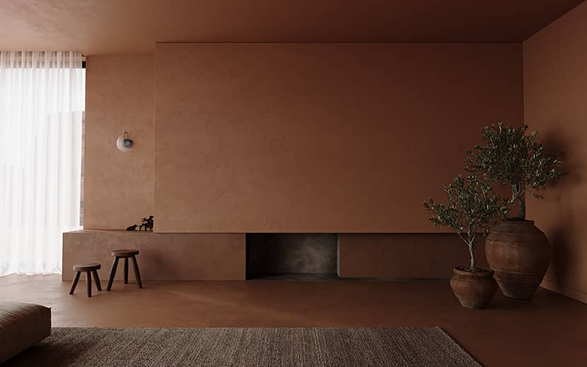
For general lighting, I used Mediteranean HDRI to recreate the climate accordingly. However, artificial lighting makes the interior more impactful. Thoughtfully placed lighting fixtures draw attention to critical design elements. Here is the same image with and without artificial lighting to show you the difference it makes. Look at the beautiful and soft shadow the olive trees cast.
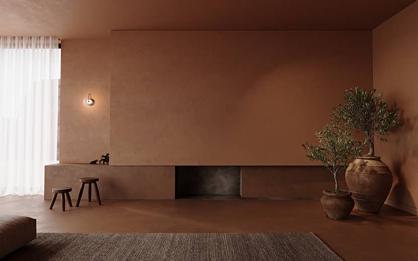
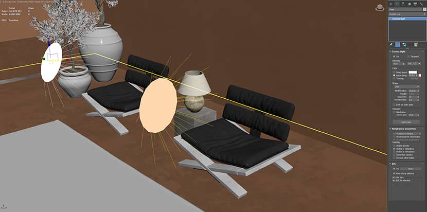
Some accent lights are not visible directly because they’re “fake lights” that emphasize particular objects. I used this technique to lighten up the leather lounges, which are pretty dark and need an extra touch.
One great trick I would like to share with you is directionality. I never leave the default setting; I always try to find the perfect angle to lighten the wall. It makes the light so much softer. Be careful with the settings, and don’t exceed the value of 0.5; it will increase the rendering time!
Materials.
Terra cotta takes center stage in this design. Its warm, earthy tones and textured surface are incorporated into flooring, walls, and decorative elements. Complementing materials include natural stone, warm wood, worn leather, and burnished iron, creating a cohesive and timeless aesthetic that resonates with the Mediterranean spirit.
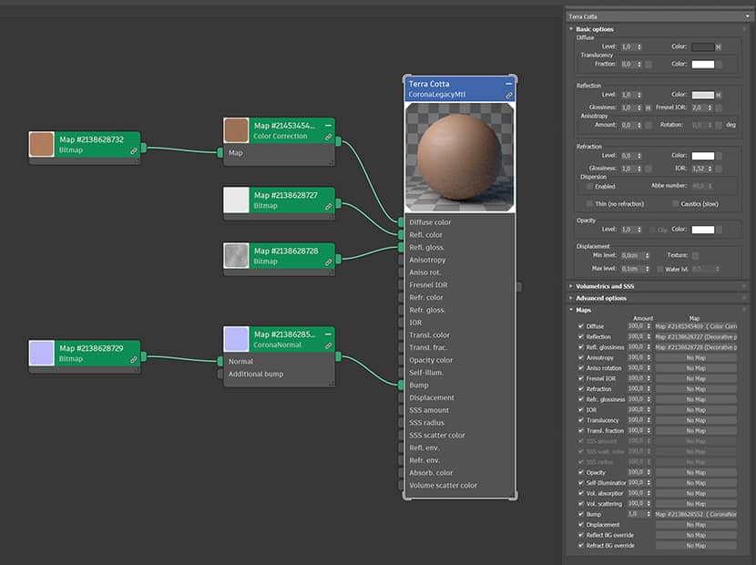
For this project, I deliberately minimized the selection of materials to prevent diverting attention from the terra cotta while emphasizing its significance. The material is relatively simple; I avoid unnecessary complexity. After all, it's the final effect that genuinely matters.
Composition.
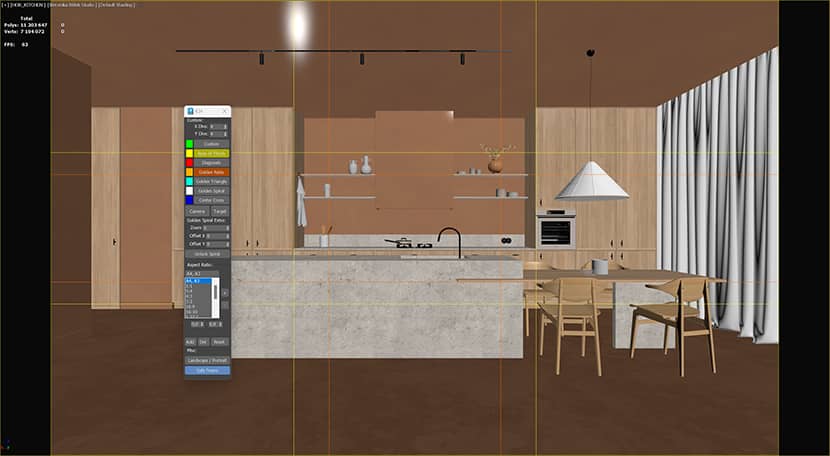
When crafting my scenes, I rely on tools like the Image Comp Helper script to assist me with the composition. I often apply composition principles such as the rule of thirds, the golden ratio, and the golden spiral to elevate visual appeal and enhance storytelling.
Given that Instagram serves as my primary platform for showcasing my personal projects, I use aspect ratios of 4:5 or 9:16 to ensure the best presentation on the platform.
When I require a horizontal frame, I utilize an aspect ratio of 8:5 (2x 4:5), which ensures a seamless display when swiping through image carousels.
Assets & Styling.
Furniture selections are carefully chosen to reflect the comfort and simplicity synonymous with Mediterranean living. Upholstery in a soft, neutral tone and wooden furniture with a rustic feeling create an atmosphere of unpretentious authenticity.
Accessories and decor items draw inspiration from the Mediterranean culture, featuring handcrafted ceramics and natural materials. These details infuse the space with a sense of history and tradition, creating a rich tapestry that tells a story of the region's heritage.
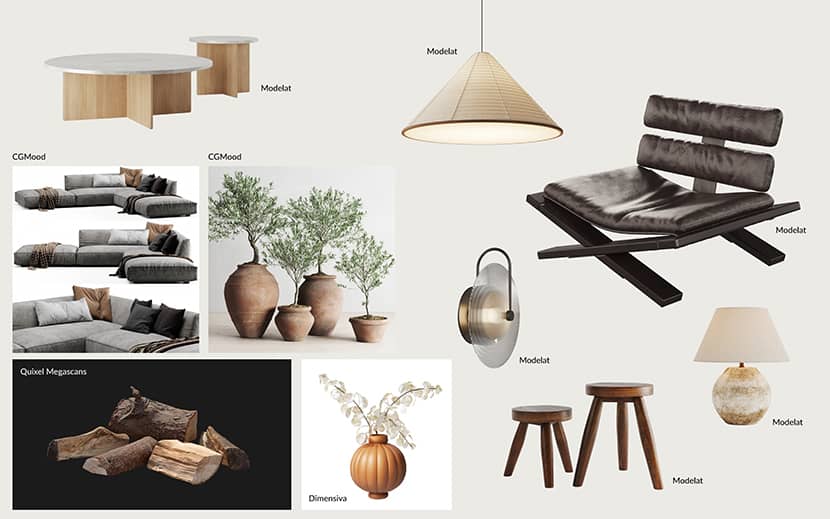
When it comes to acquiring assets, I follow a systematic approach. First, I select particular furniture, lamps, or decor items from my mood board. Then, I searched for top-quality models across 3D asset stores. Occasionally, when time allows, I take on the modeling task myself.
As you can tell, Modelat is my favorite store for high-quality models. Their range never fails to meet my standards and elevate my projects.
Tone Mapping.
To streamline my workflow, I often skip traditional Photoshop post-production. I prioritize building high-quality scenes from the beginning to minimize the need for unnecessary fixes later on.
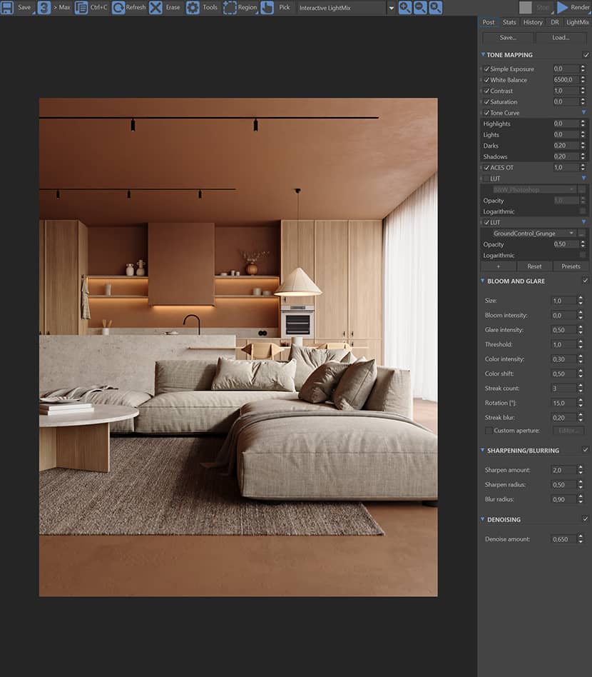
I use the “ACES OT” workflow to ensure balanced highlights, followed by experimentation with LUTs to enhance the scene's mood. As you can see, I use two LUTs in my workflow.
The first is a black-and-white LUT created in Photoshop, which aids in fine-tuning values and comparing them with reference images. The second, such as Corona's "GroundControl_Grunge" LUT used in this project, is chosen to achieve the desired overall mood. However, I always adjust the opacity of the LUTs to around 0.5-0.6 to avoid an overly visible effect.
When necessary, I turn to Photoshop for additional tweaks, typically refining details and sharpening images using tools like Unsharp Mask.
Final Images.
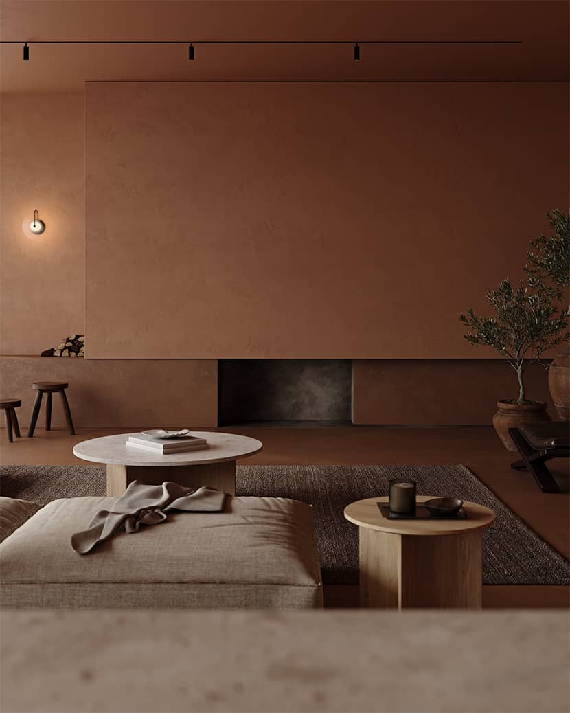
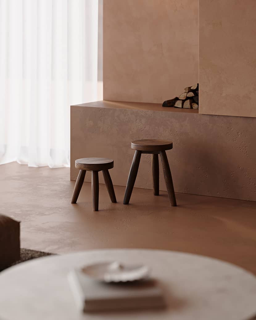
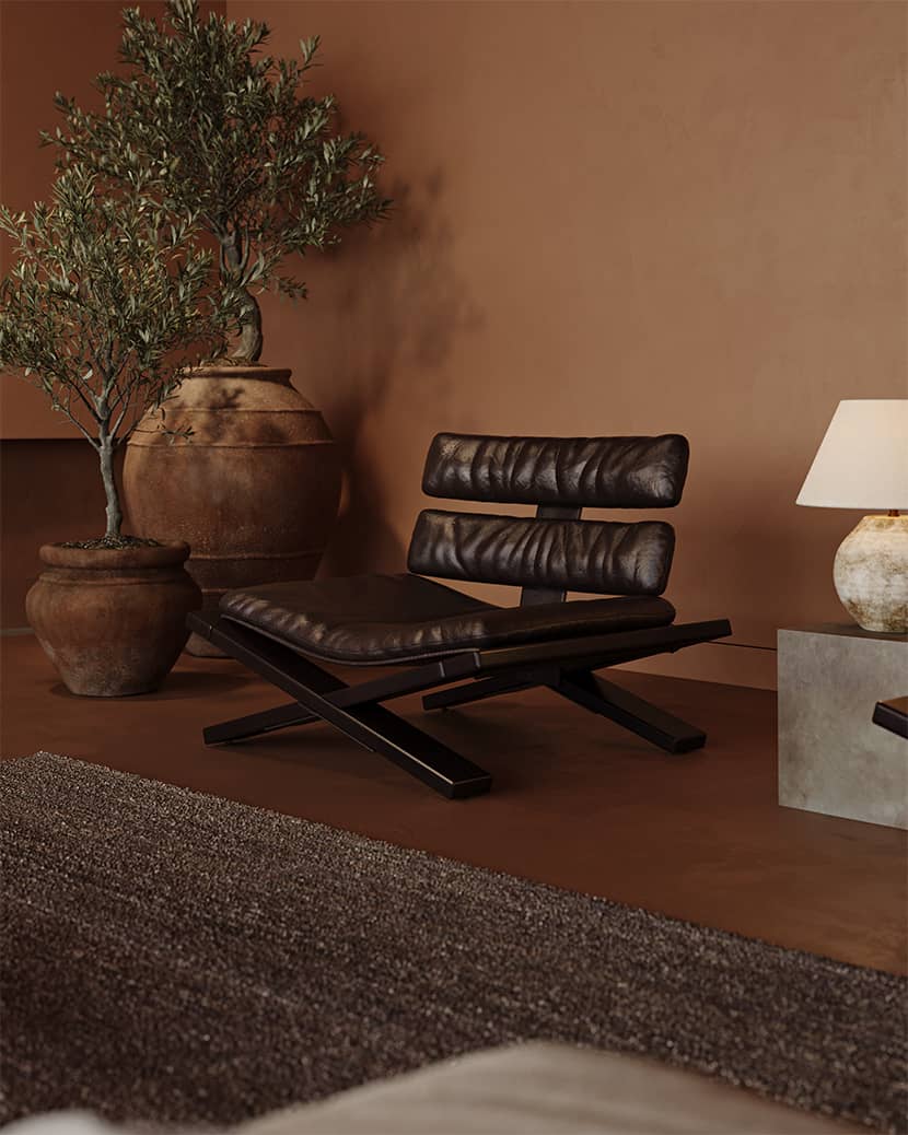
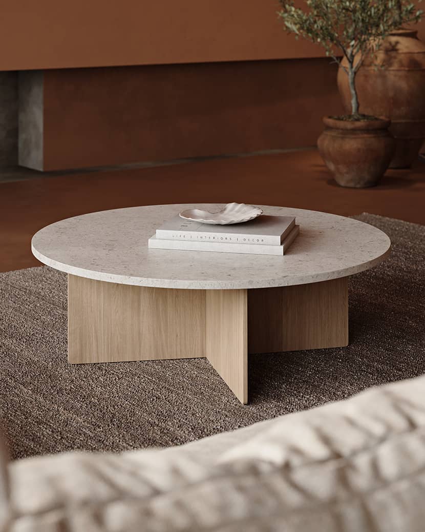
Bonus. How do you create a viral reel to attract new clients?
As a bonus, I'd like to encourage you to explore the creation of your own Instagram Reel to showcase your projects to a broader audience. Presenting your portfolio as a video can be an engaging way to captivate potential clients from around the globe.
As of this article's writing, my Viral Reel has gathered an impressive 944k views, getting closer to the 1 MILLION mark.
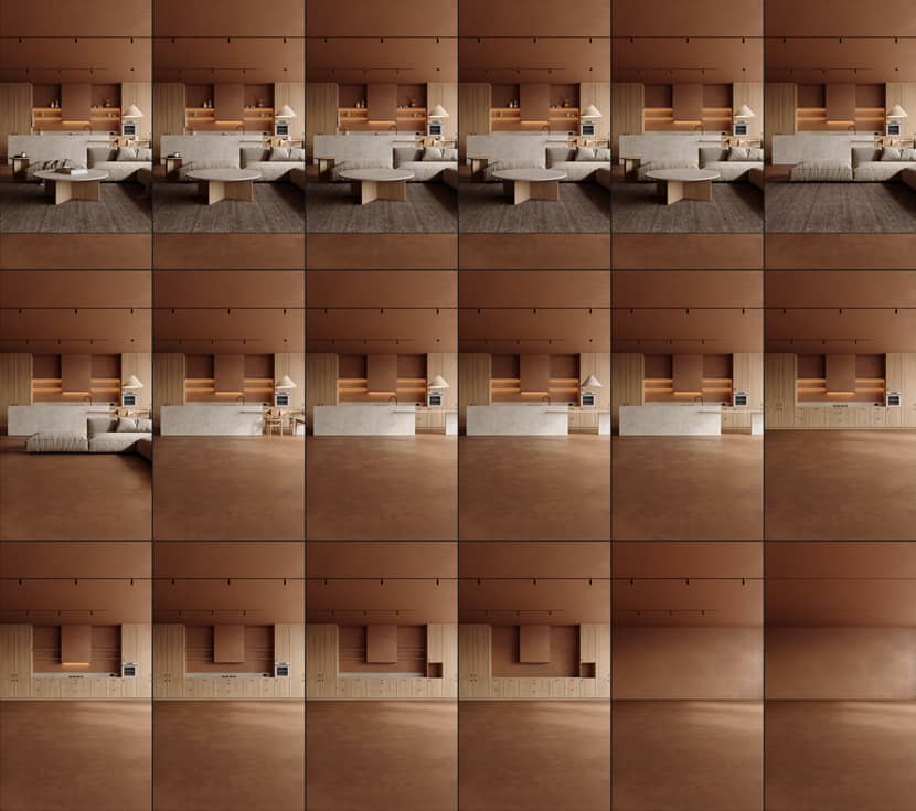
The critical technique I employed involved selecting a short audio (3 seconds) to create a looped video. This strategic choice encourages viewers to watch the Reel multiple times, expanding its reach.
For the particular sound I chose, I needed 18 frames, corresponding to 18 images. Beginning with the empty interior scene, I consecutively unhid elements, from more oversized furniture to small decor. Feel free to check out my Instagram account to see the result!
Final Thoughts.
I hope you found my article helpful. Please follow me on my social media below!
Kind regards,
Weronika Blitek.
About the artist
Weronika Blitek graduated from the Faculty of Interior Architecture at the Jan Matejko Academy of Fine Arts in Cracow, Poland. She earned a Master of Arts degree and received numerous distinctions, awards, and scholarships. Her artistic background ignites unconventional thinking, blending diverse styles, forms, and textures to pioneer innovative solutions. Driven by boundless creativity, she founded a boutique design studio where she can evolve and explore new design fields. She specializes in photorealistic 3D imagery, collaborating with various professionals and she has worked on diverse projects, from simple product visualization to complex architectural scenes.

