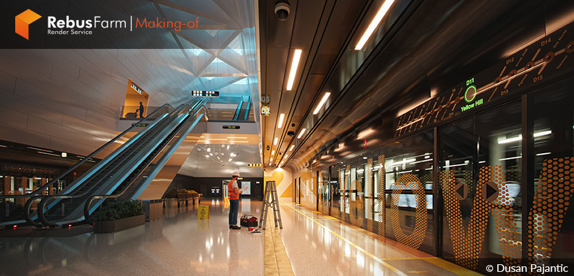
The Copenhagen metro station was the core of inspiration for the Serbian artist Dusan Pajantic to create something different but with similar elements. A sense of serenity and calmness will help you to get inspired and learn some really useful tips while working on personal projects for your portfolio. Enjoy the article!
About Me.
Hello, my name is Dusan Pajantic and I am an Arch Viz artist and architect. Specialized in architectural visualization with over a decade of experience, I have worked on many various architectural projects for clients worldwide, helping them visually present their projects in the best light possible.
After spending 6 years in a studio as an expert CGI artist working on still images as well as managing walkthrough animations, I decided to turn another page in my career, so I founded Dream Visual, a small architectural visualization studio dedicated to creating carefully crafted, top-notch quality visuals for our clients.
Software Used.
I use the well-known workflow in architectural visualization, 3ds Max for modeling, Corona Renderer for lighting & rendering, and Photoshop for post-production.
Inspiration & References.
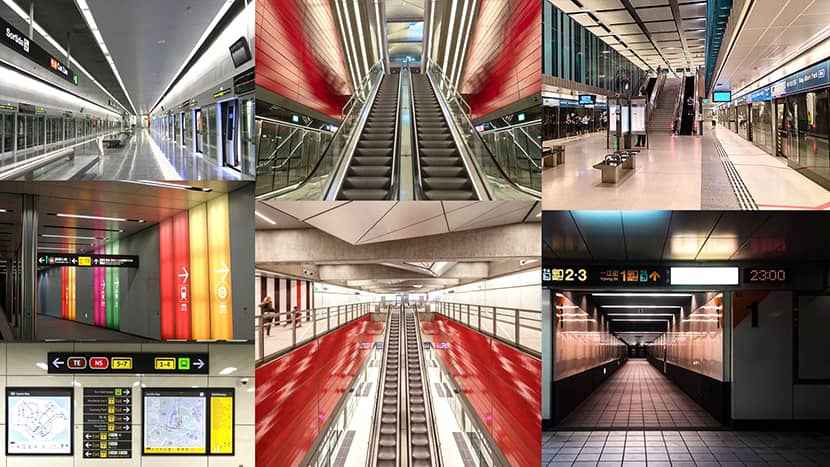
The idea for the Yellow Hill Station project was born while scrolling through ArchDaily / Pinterest websites where I stumbled upon the Copenhagen metro station. The perspective in the photographs inspired me to think about creating something similar in the future and search for more references. So, I saved a few images for later. Pretty much a lot of time passed until I finally started modeling the Metro station scene. The usual thing is when you have very little or no time at all for portfolio work. But as soon as I started creating the scene, I decided not to stick to Copenhagen station at all but to create something different with similar elements.
Goal.
Unlike the usually crowded metro stations full of people hurriedly going in various directions that we see in almost every metro station photo, I was aiming and was driven with a sense of serenity and calmness. I usually seek to weave the serenity in most of my renderings. I wanted to showcase this frequent public space differently, so I chose to make an early morning atmosphere during the maintenance time.
Modeling.
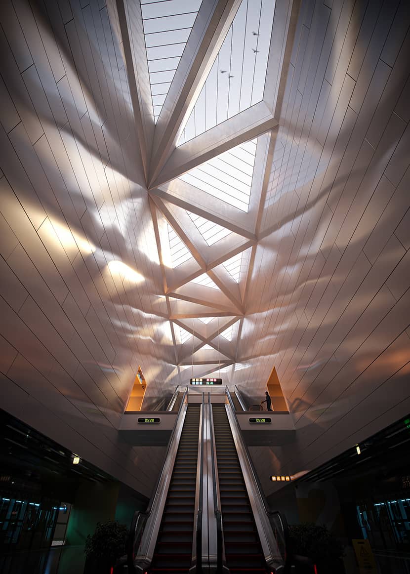
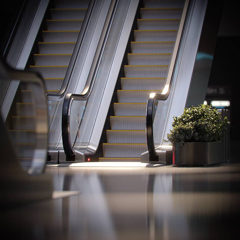
A few factors guided me from the beginning, setting the direction for the modeling process, composition, atmosphere, and later colors. Primarily, I aimed to maximize the space on the x and z axis to achieve a captivating perspective and depth in the visuals. Thus, I modeled a narrow and elongated multi-story central part, symmetrical in form, connected with escalators across floors. This added a substantial depth to the space. Additionally, the 18-meter-high skylight with long side walls and triangular-shaped roof openings seemed to be an effective way to introduce natural light into the station, casting geometric shadows. Walls are done with the Floor-generator script. The trains, as a horizontal element, were placed at the bottom to contrast with the vertical elements such as escalators and walls.
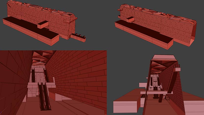
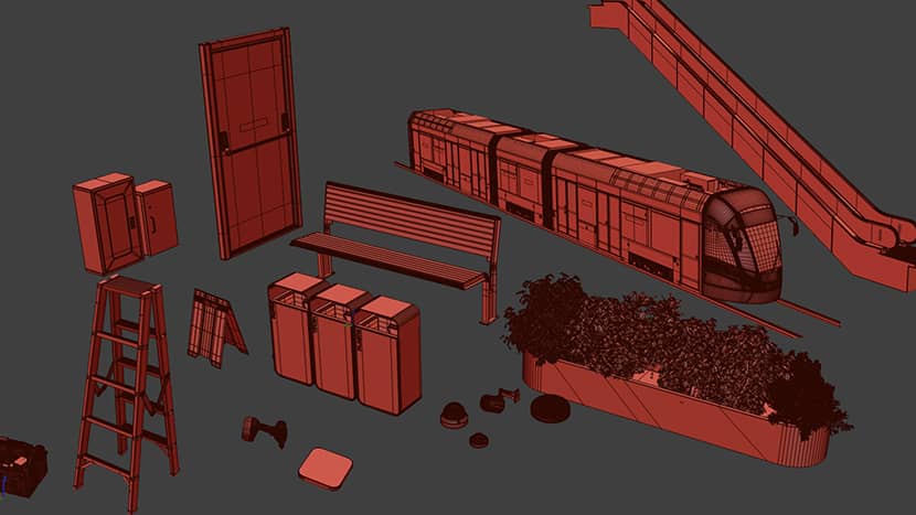
After completing the modeling of the outer shell, I started creating elements at the bottom that would be visible in the first plan, walls, glass doors, lower ceilings, and train entrances. I generated several element variations and multiplied them into instances to create the wall on both sides of the station. Following this, I added more details, props, and space fillers to give some life into space. Imported models used are mostly sourced from 3Dsky and Evermotion.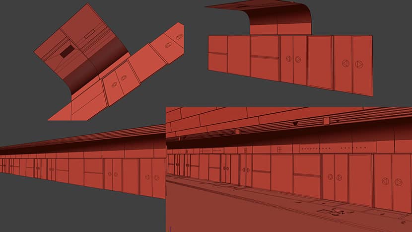
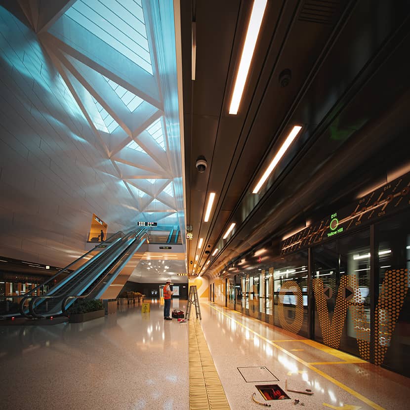
I also enjoyed incorporating focal points into the scene, such as the worker who washes the floor on level C, an open shaft on the floor with some pipes, or our technician electrician friend reading the manual to change a broken LED sign. 2D people are downloaded from Mrcutout and are simple planes placed in the scene masked with opacity maps.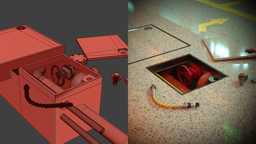
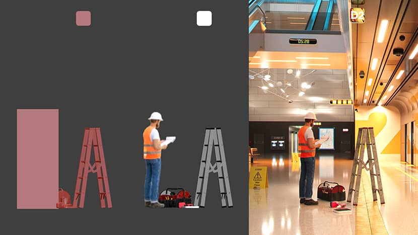
It is important to note that before the entire process started, a lot of time was invested in studying various metro stations worldwide and examining different aspects of these spaces, such as maps, signage, materials, and general functionality – all the small details contributing to scene realism and dynamism.
Materials.
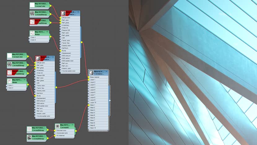
Concerning the materials, some maps are imported from Megascans or Poliigon, while the rest are created from scratch. Most materials in the scene are basic corona materials or layered materials masked with either corona AO or random dirt or procedural maps to add some weathering and realism, as seen in this roof material example.
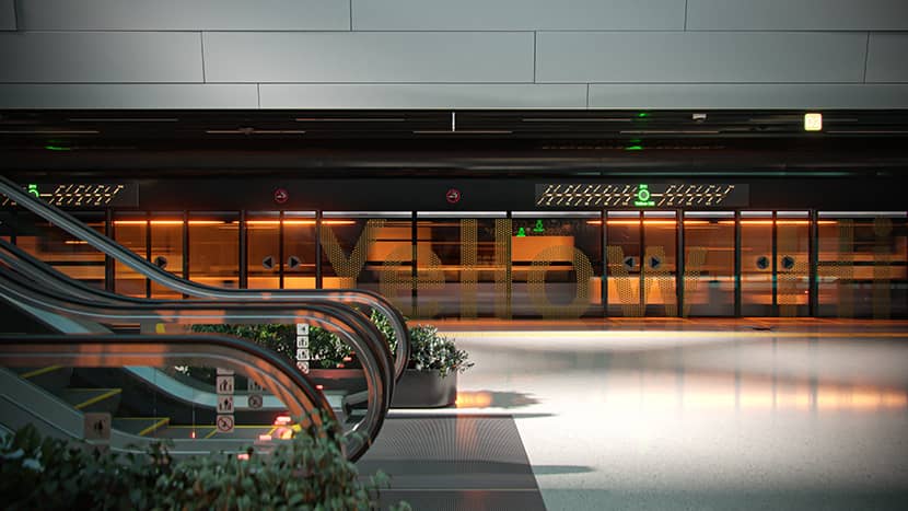
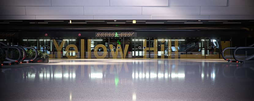
I use a lot of corona distance texture in my workflow. A simple yet effective example is the glass wall with the “Yellow Hill Station” letters. It’s a simple combination of regular glass and yellow plastic material masked with a corona bitmap. I used an inverted opacity map, typically used on metal fences and perforated metal sheets. The object included in the distance texture map is the modified text object “Yellow Hill letters”.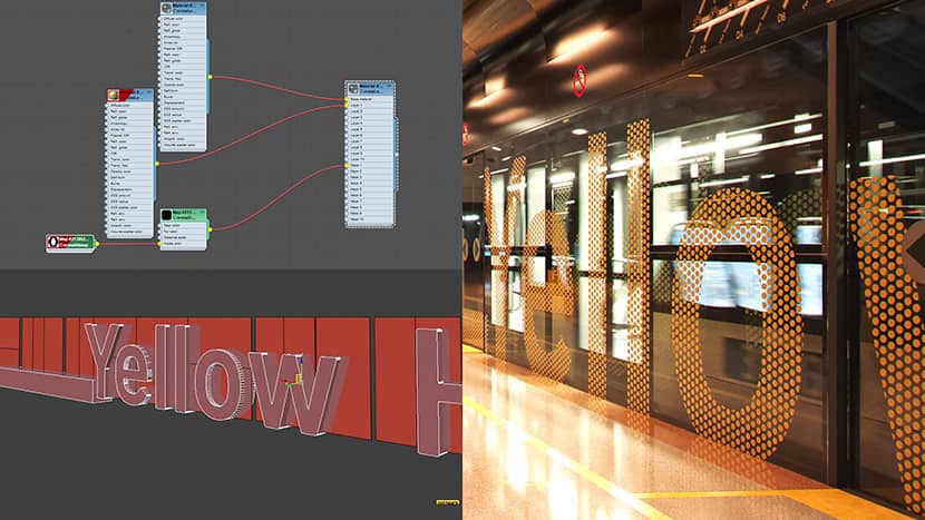
I had a lot of fun time modeling the signage and creating textures for directions, levels, warnings, etc. I dedicated special time to creating metro map material with diffuse, light, and reflection maps as well as adding non-existing names for other stations on that route.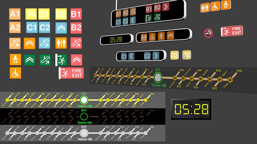
Lighting.
The good old Corona sun and sky introduce natural light into the station while rectangular lights contribute additional atmospheric lighting with different colors. Remaining light sources, such as motion-blurred train lights, escalators, or signage lights, serve to infuse more life and realism into visuals. All these light sources will be packed and generated into Corona LightMix, one of my favorite phases of the rendering process. I love the possibility of changing the color and intensity of any light in the scene directly changing the atmosphere and visualizing the same space differently. Each variant evokes different feelings in the viewer, evident in the final visuals.
Post-Production.
For this particular project, I liked the raw renderings that came out of the light mix. Post-production was kept minimal, involving only minor color correction adjustments, levels, and camera raw filter modifications. Additionally, I combined standard render elements, including reflection, refraction, bloom, and source color channel, which makes most of the post-production work.
Summary.
I hope I have brought this project closer to you, and I hope you enjoyed the article. A big thank you to RebusFarm and VWArtclub for allowing me to publish and share this article with our awesome community. All the best and keep rendering!
Kind regards,
Dusan Pajantic.

About the artist
Dusan Pajantic, an Arch Viz artist and architect, specializes in architectural visualization for over a decade and he has worked on many various architectural projects worldwide, helping his clients to visually present their projects in the best light possible. He is the founder of Dream Visual, a small architectural visualization studio dedicated to creating carefully crafted, top-notch quality visuals.
