Monday, March 15th, 2021 by Julian Karsunky
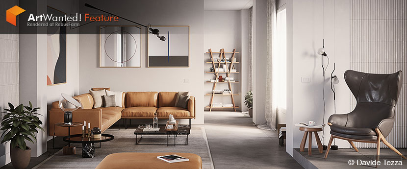
Staring at the wall is usually indicative of a creative drought. For Davide Tezza, it’s a never-ending source of inspiration. Where others might stare mindlessly into the void, the Italian architect and 3D artist sees only potentiality. His minimalist designs are the result of a deep understanding of form and composition and deliberate self-restraint, generating meaning out of thin air.
In our interview, Davide talks about the challenges of running a one-man-studio, designing emptiness, and how to avoid the perfectionist trap.
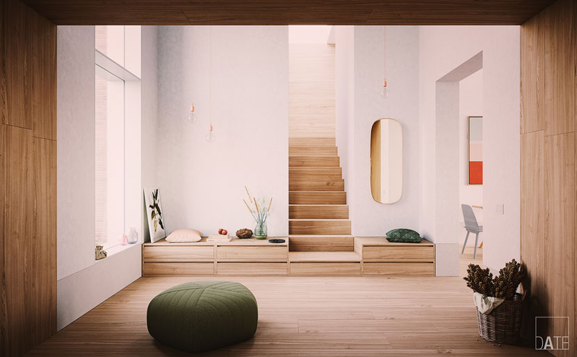 A harmonious blend of simple materials and pale colors, as seen in this ‘Rural Bench Concept’ are a staple of Davide’s interior design work.
Hi Davide, thanks for joining us! To start things off, please introduce yourself to our readers!
Hi guys, thanks for having me today! My name is Davide Tezza, I’m an Italian architect and 3D artist based in Milan.
How did you initially get started as a 3D artist?
I took my first steps in CGI at Università Iuav di Venezia during various architectural and design workshops and seminars. My first software, besides Autodesk AutoCAD, was Google SketchUp. However, at the time, I still preferred to work with maquettes, because creating rendered images takes a lot of time, even if they’re small!
After receiving my degree in 2009, I continued to work for several architectural firms in Vicenza as a landscape artist. One year later, I moved to Milan, where I worked as a 3D visualizer for a while. In 2012, I became self-employed as an architect. Although I was fully qualified to practice my profession, I decided to switch gears and fully focus on a career as a 3D artist shortly after. Since then, I try my best to keep up with my field and learn something new every day, participating in courses, masterclasses and events whenever possible.
Please tell us about your 3D architectural visualization studio DATE, the company’s history, its field of work and general philosophy?
I founded my own studio in 2013 here in Milan. The name DATE is simply a fusion of my first and my last name; I was looking for a short and sweet name, that was both easy to remember and to communicate. That’s one more mystery solved!
Over the years, I’ve specialized in describing architectural spaces through high-quality still images for architectural and interior design projects and furniture catalogs. I also provide architecture and interior design consulting services. A couple of years ago, I started a personal in-depth study on storytelling within the bounds of the artistic direction.
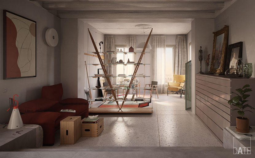 Mimicking the city outside, this Venice studio elegantly combines classical and contemporary elements.
What part of your job do you enjoy the most?
As far as architectural visualization is concerned, I generally like all parts of my job – from inception to final completion and everything in between. But if I had to choose a single aspect, I’d say that I love to insert small details or blemishes into a scene the most; to create connections and tell tiny stories within every image is my favorite way to involve the viewer in the project!
How are you holding up in these trying times? Has the current crisis impeded your work?
Life’s journey takes us to peaks and valleys, with our jobs being no exception. I honestly consider myself quite lucky, because although there haven certainly been low points during these challenging times, there were lots of good moments for me too, both from a professional and personal point of view.
In your opinion, what does it take to be a good archviz artist?
Those of you that know me, know that I consider myself a “one-man-studio”, because being your own boss means you have to take care of everything!
When I first started working freelance, I thought that being a good architect and 3D artist, having passion and strong work ethic were the only things that mattered. But, as time went on, I realized these are only the basic requirements, a mere starting point, if you will. Today more than ever, there are other aspects that are equally, maybe even more important: you must have a decent understanding of IT, HR, marketing, and psychology, and you need technical and fiscal knowledge. Furthermore, you must be able to read and pen basic work contracts, work both with and for people, entertain clients and be a good storyteller…and that is just the tip of the iceberg!
As both an architect and a 3D artist, what role does architectural visualization play in your approach to architectural design? Is it primarily a useful tool or does it enhance your scope and potential beyond that?
I firmly believe that architectural visualization should not be limited to the final phase of a project, though unfortunately more often than not, people treat it as if it were a ribbon on an already packaged gift. Architectural visualization is more than just a rendering: it’s about people and spaces, experience and perception, reality and fiction. Without storytelling, no project - even if it’s just a single image – will ever trigger emotions. It won’t work, plain and simple.
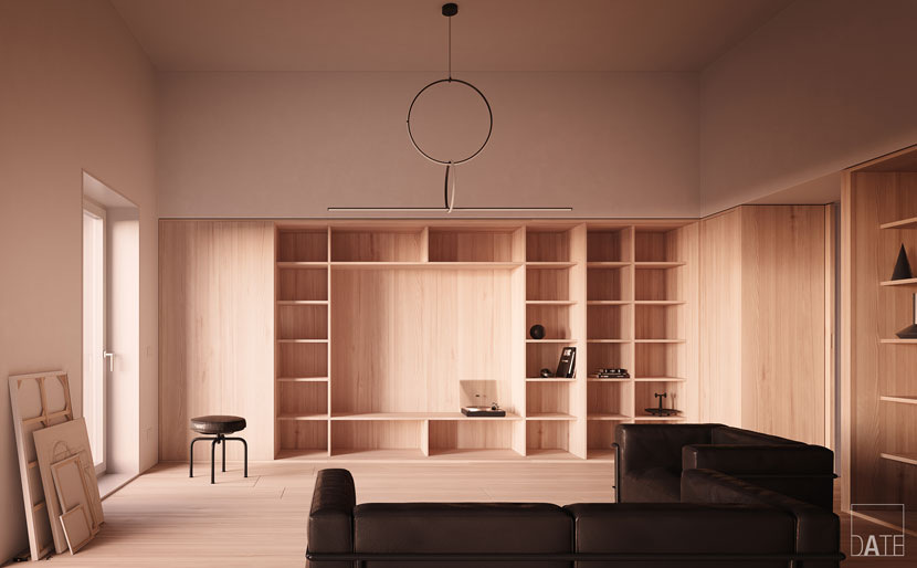 To Davide, developing empty space is an integral part of every design process. This ‘Home Office Concept’ is the result of achieving meaning through self-restraint.
Is there a specific design philosophy or architectural school of thought you adhere to?
When it comes to architecture, design and style, I think that the dictum, “less is more” is still as relevant as when Mies van der Rohe first popularized it. To be exact, I think it was actually Peter Behrens, an important mentor to young Mies, who said it first, although probably in a different context…regardless, the principle still stands today and I personally prescribe to it as well: less is more!
Consequently, a lot of your own interior designs feature a minimalist aesthetic, sometimes to a surprising degree. In one particularly striking example, you left an entire bookcase almost empty.
You are right! I firmly believe that nothing in a scene should be random; every object is in its position and has that particular color for a specific reason. I always try to design everything myself, so naturally, I also design empty spaces.
Emptiness is just as important as fullness; the effect of any image lies as much in the void as in the tangible. It may sound strange, but it’s true! Just think of a glass: doesn’t its usefulness as an object lie precisely in the void, in the fact that it can contain a liquid? I believe that rather than filling an image with unnecessary information, it is better to leave room for the observer's imagination.
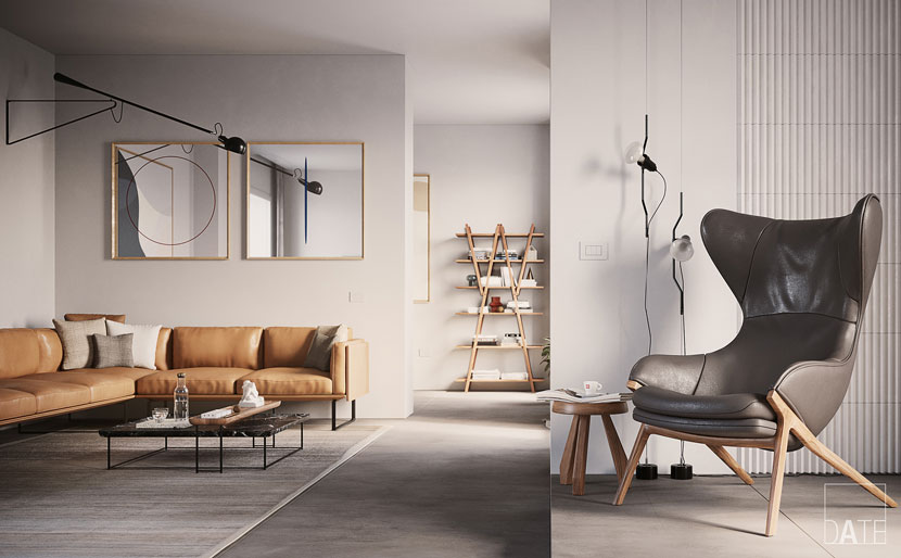 This ‘Contemporary Living Room’ arose from just plain white walls and grey flooring.
Let’s talk about your work in more detail, namely the ‘Contemporary Living Room’ you submitted to our campaign. Can you first tell us more about the origin of this project?
’Contemporary Living Room’ is a personal project of mine, a tiny one in the grand scheme of things, but with a lot of meaning!
Until recently, my design process frequently went as follows: whether I attempted an original design or a recreation, I always started with the space. Then, I iterated upon this first draft, modifying and improving it in terms of lighting and inner space, changing materials and details. But ultimately, most of these rooms or “studio models” remained empty, awaiting further inspiration – in fact, I still have several models just like that!
Then one day, I began thinking how I would like to develop an interior from a neutral base (white walls with concrete flooring, for instance) and really highlight the furnishings. Thus, the project was born!
What parts of the scene were especially important to you?
The key points of this concept are clean lines in the design of its furniture pieces, as well as the choice of simple materials with a neutral color palette. These expressions, as part of an ever-present minimalist approach, create a curated aesthetic that's thoughtful, but not fussy.
Once you had a basic concept in mind, how did you approach realizing it? Can you briefly walk us through the development process step by step?
As I’ve mentioned, I always start with an empty room, to study its light and think about the atmosphere, the overall mood I’d like to achieve – defining sort of a short script.
Then, I try to select some materials that I’d like to use, perhaps already preparing one or more color schemes with different combinations. Later, I begin to pick furniture and furnishings that have a recognizable style without being too bulky or an end in themselves.
Once a base is defined, I start adding details very carefully and clearing the scene by removing distracting elements. When I’m satisfied, I move to the final rendering phase, finishing with the ever-important post-production process.
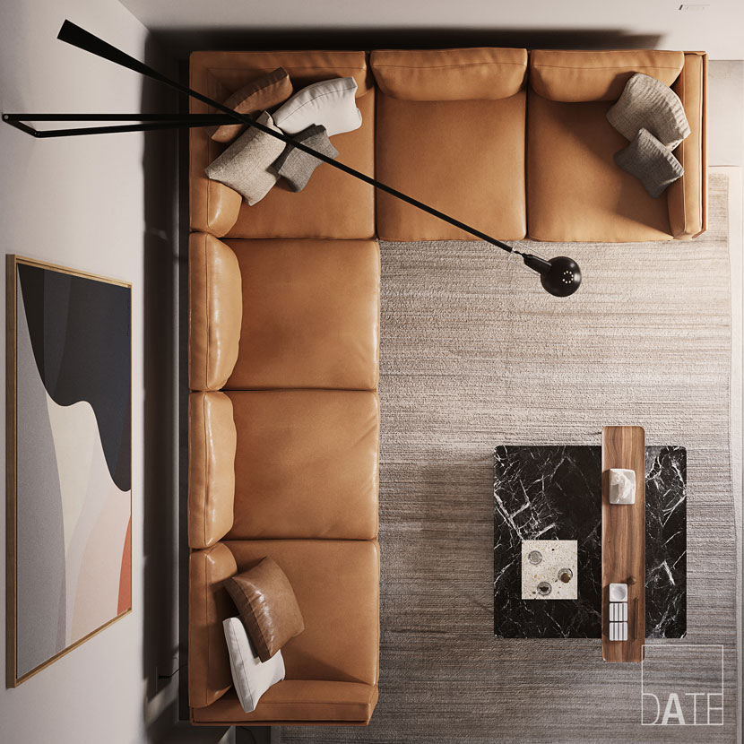 This overhead shot highlights Davide’s use of clean lines and colors.
What software did you use to create this piece? Any plug-ins you found particularly helpful?
Since I’m a Mac user, I’ve used my usual blend of Cinema 4D, Corona Renderer and a touch of Photoshop!
Are you satisfied with the results? What has the feedback been like so far?
Yes, I am quite satisfied with the final result! Though to be fair, I’m hardly ever fully satisfied: most of the time, when I look at the final images a few days after completing a project, I notice some small adjustments I’d like to make. However, perfection is unattainable by definition, so at some point, I am forced to stop!
Please tell us about your previous experience with RebusFarm. Is there anything you especially like about our service?
Recently, I have used RebusFarm for the majority of my personal projects. From the very first moment, I found it to be very intuitive with Cinema4D and MacOS: easy to set up, easy to use, and, last but not least, fast! I must confess that RebusFarm has saved me on a few occasions in the past, especially when having to render under tight time constraints!
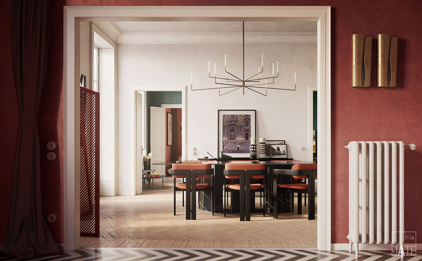 Davide Tezza, ‘Milanese Home Concept’. Be sure to follow the links for more of Davide’s work and insightful commentary!
To wrap things up, what is some advice you would give to aspiring artists out there?
Please note I do not consider myself a “guru” or anything of the sort. All of the following advice is solely based on my personal experience as an architect and a 3D artist. That said, here are my tips for those who want to pursue a similar path or are just getting started in the world of 3D:
Be flexible!
Learn to adapt, and even bend yourself to a certain degree if necessary. Don’t compromise yourself, but don’t stick to convictions to the point of self-sabotage either.
While the difficulties can be many, try not to think of them as impediments, but as tools to improve. Facing a challenge will not sever you from your dreams, but bring you closer to it.
Don't look too much at others!
It’s only natural to be curious about your peers, especially those who are successful. Remember that you can’t compare yourself to others, since you don’t know the path they took. don’t do so from a point of envy or malice, but with kindness and understanding.
Go your own way!
Rather than judging yourself in comparison to others, be competitive with yourself. Set your own goals and try to reliably meet them instead of emulating what others are doing.
Work for yourself!
Whatever work you do, do it well and give it your best, not for the sake of your boss or a client, but for yourself.
The feeling of a job well done will justify everything you went through up to this point, all the hours you spent studying, learning, working, and the sacrifices you had to make along the way.
Don’t be afraid to make mistakes!
Errors are not synonymous with inability; they are an essential part of learning and improving.
Do not hesitate to take risks every now and then – stepping out of your comfort zone can be more thrilling than you might imagine!
Most importantly, give up any and all notions of achieving perfection, it’s a losing idea. Chase beauty, pursue your dreams, and your passion.
Those are some inspirational words! Davide, thank you so much for taking the time and all the best in the future!
Keep up with Davide Tezza and his work here:
How to join ArtWanted!
You want to get featured in our ArtWanted! campaign and win 250 RenderPoints on top? Submit your work, rendered at RebusFarm, to Questo indirizzo email è protetto dagli spambots. È necessario abilitare JavaScript per vederlo.! Visit our Art Wanted! page for more information.
>> Read more articles on our blog
