Wednesday, April 1st, 2020 by Julian Karsunky
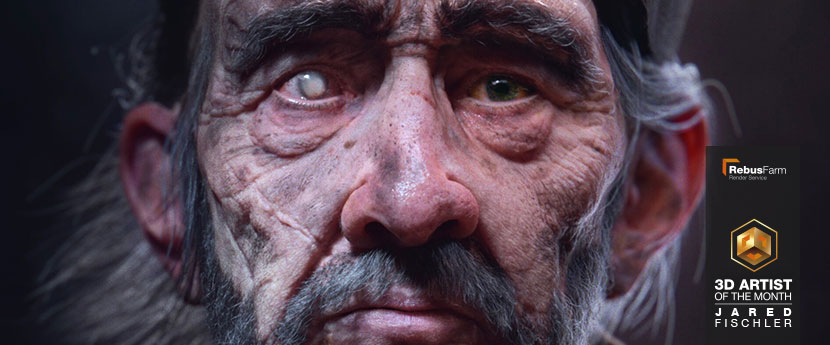
Hail to the king, baby! Everyone please, as we crown Jared Fischler our April 2020 3D Artist of the Month. A student at the prestigious Gnomon, Jared has blessed us with an outstanding original character artwork. ‘The Nothing King’ earned him a well deserved Best of Term award at his school and stands as a shining example of highly evocative, yet subtle visual storytelling.
In our interview, Jared shares valuable insight in his creative process and talks narrative-driven design, the importance of balance, and graduation plans.
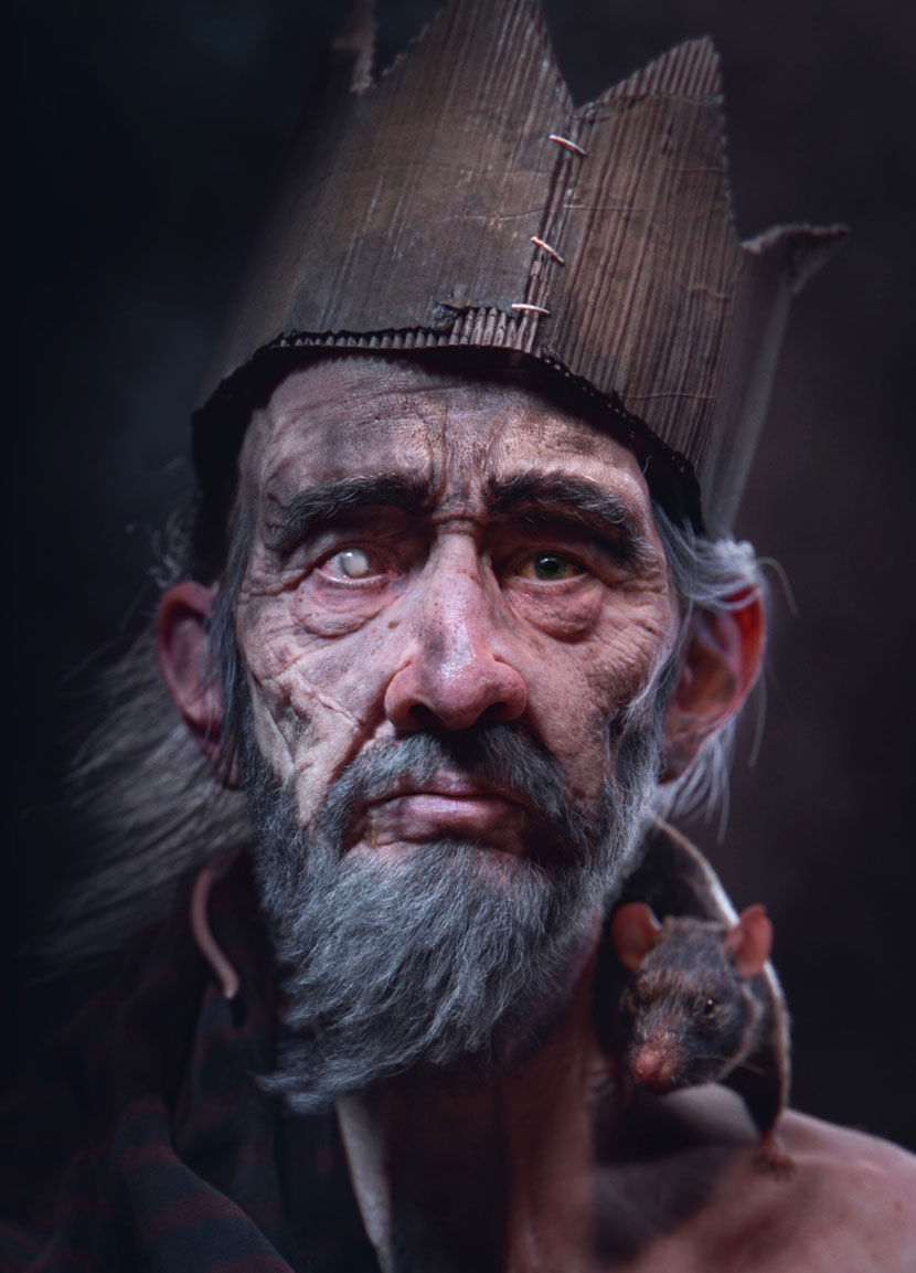 Jared Fischler, ‘The Nothing King’.
Hi Jared, thanks for joining us. To start things off, please introduce yourself to our readers!
Hi RebusFarm readers! I’m Jared Fischler, a 25-year-old 3D artist currently attending Gnomon in Los Angeles.
Do you recall when and how you first consciously encountered CGI?
As important as it is to me now, I actually don’t think I consciously thought about CGI until pretty late in my adolescent life. Sophomore year in high school, I was playing Uncharted 3 and realized I was spending more time looking at the textures on the walls than actually playing the game. They looked amazing! I realized this quality was a huge reason for the storytelling in the game being so engaging. This is the first moment I consciously registered 3D as a legitimate storytelling tool.
However, it wasn’t until college where I discovered 3D tools at UCONN’s Digital Media and Design program. This was a spectacular experience, because our program was closely tied to the fine arts school.
Why did 3D become your medium of choice? Have you always been artistically inclined?
Having friends in both the digital and traditional art worlds challenged me to think on both sides, and eventually caused my creative tendencies to land somewhere in between. Admittedly, that process started far earlier with my mother being a painter and my father being a psychologist. My parents have played a huge role in challenging me to think deeper and more abstractly.
Having a balanced creative mindset is super important, because traditional art is full of abstract work, while CGI more often tends to chase realism. My lightbulb moment was realizing how attainable photorealism is now in CGI. Here is a thought that passes through my head quite frequently: If I have the tools to essentially create reality, I can pick and choose where to pursue realism, and where to abstract. This versatility makes CGI such a powerful storytelling tool.
As a student at Gnomon, please tell us more about your curriculum, the school community and your overall experience!
Gnomon has been absolutely amazing thus far. While the curriculum is certainly great, the true power of the school is in the passion of the students and the instructors. You’d be hard pressed to find another program so full of staff committed to the success of their students, and students who care so much about the success of their peers. While I’m on this subject, I want to give special thanks to Oded Raz and Tran Ma, two of my personal mentors and teachers at Gnomon. They both have taught me so much and helped me to conquer some of my greatest creative fears.
Do you already have career plans after graduation? Is there an industry branch that is particularly appealing to you?
I do have career plans after graduation! I’m really interested in game cinematics; the cinematic trailer is such a great conduit for a story. You take all the intense drama of a movie trailer and stretch it out into a slightly longer form, allowing it to breath a bit and giving the audience an opportunity to connect with the story and characters. The result is much more personal and lasting than a standard 30 second trailer.
I currently have my eyes on studios like Blur, who, to me, have mastered that particular art form.
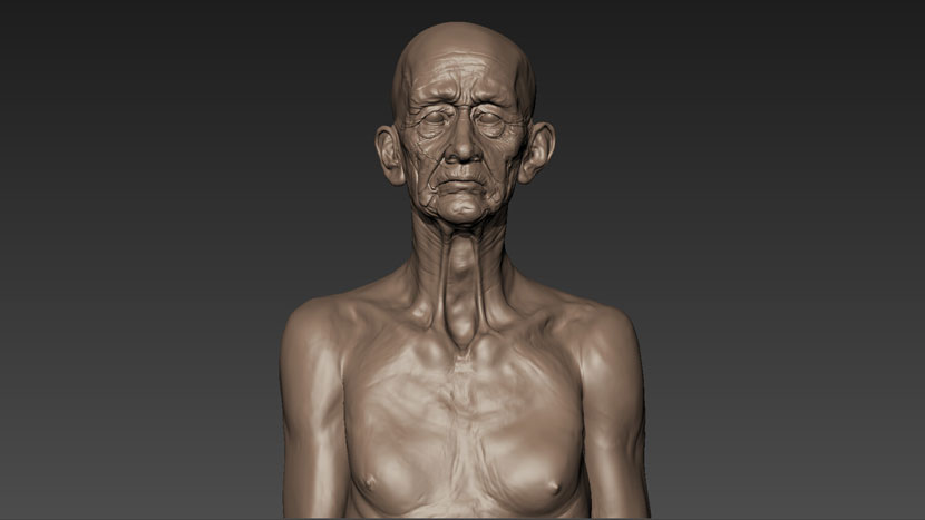 A king in the making: even at this early stage of production, every scar and wrinkle on ‘The Nothing King’s body seems to tell a story by itself.
Is there a specific design philosophy you adhere to?
I’ve never really thought about a specific design philosophy, but I can definitely speak to some design tendencies I have. The most prominent of these being “narrative first”. While I know telling people about the importance of storytelling might sound cliché, I think it’s one of those things every artist needs to be consistently reminded of throughout their creative life. For character artists, knowing anatomy would be an equally obvious, yet true equivalent.
On a higher level, you need to be some sort of storyteller to be a successful artist. My method is as simple as this: think about the story. Always.
Can you elaborate on your own approach to visual storytelling?
Now, say I was to design a sinister character. I could just make his shirt red to signify as much on a very basic level, but that would be a little too blatant for me. Instead, let’s think about how the narrative affects the character or the scene he is in. Maybe my sinister character is a little bit OCD? Let’s make his hair groomed perfectly. It’s shiny and stiff because there’s about half a tube of gel in there, and we can still see the path of the bristles from when he meticulously combed it that morning.
In terms of build, my process would only be slightly different. If I’m grooming in XGen, I’d make some tweaks to the hair clumping, make the hair material a bit shinier, and my overall groom would be a bit more informed.
In the end, I’ve made a subtle change that only half of my audience will notice. I think this is why people shy away from subtlety, but herein lies the beauty of storytelling. If I use this method on every asset in the scene, my piece is going to be rich with detail! It won’t be overpowering either, because I’ve done it in an unobtrusive way.
The ultimate challenge of the artist is to make something that requires meticulous care and attention to detail, hundreds of hours, and traumatic levels of self doubt look totally and completely effortless.
The result is this: each person who looks at your work will see something different. We all want different things and seek out different stories. They will look around the image and build their own narrative. They’ll feel like they had a part in constructing what they believe to be the intended story. Then, they’ll turn to their friend and realize that they took away something completely different! Now you’ve started a dialogue, and your work will stick with them long after they leave.
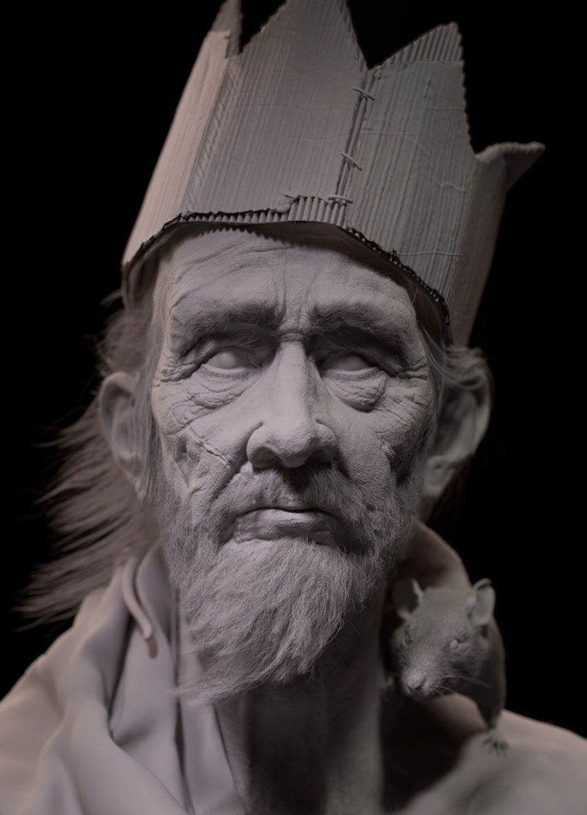 ‘The Nothing King’, clay render. Are you a brave enough soul to withstand his piercing gaze?
Now let us talk about your work in more detail, namely ‘The Nothing King’. Can you first of all describe the circumstances that lead to the creation of this piece?
‘The Nothing King’ is a piece I made while taking Tran Ma’s Texture 4 class at Gnomon. The purpose of this class is to learn the proper Sculpt -> Paint -> Lookdev -> Render workflow.
My main goal for this piece was to create a portrait that really felt like a person. I think many CG portraits are technical feats, but nonetheless still don’t feel like people.
It is always a particular pleasure to see original character artwork! Please tell us more about your original idea and how you came up with the concept.
The concept went through many, many changes. The first concrete thought was to capture the essence of the Don-Quixote-type character, but to let my mind tell the story as it wanted. Here’s a look into how I envision this character:
The Nothing King would, to most, seem everything but a king. Parading around with his silly cardboard crown, making obscene gestures, and yelling gibberish at anyone who crosses his path. To most, he’s a crazy old fool. However, those curious souls who venture close enough will not see the eyes of a crazy man. Instead they’ll find one eye possessing a clarity beyond our own. The other eye, seemingly blind, is far from unseeing. Not present in our world, but in another.
Those brave enough will realize he sees more than any one of us will ever see. Those brave enough to ask the right question will be imparted with the truth, a truth they can use to restore order to their world. The Nothing King is aptly named, as he reigns over no kingdom or subjects. The King of Nothing’s purpose is to speak the truth to those worthy enough to wield it and restore order and balance to the world. Thus, the King of Nothing becomes the king of everything.
How did you go about realizing this concept? How did the character’s backstory influence the design and production process?
While working, I always had one foot dipped in the story, and the other in the production process. Each decision I made, down to the opposing directions of the crown versus his beard, had to support both compositional balance and story. Nothing could be random. This is extremely challenging, the hardest part of creating an image is striking a balance. We want everything to tell a story, but not too loudly, as that can detract from the focal point.
A really helpful way to balance your image is to make it black and white, zoom out really far (or take a few steps back from your monitor), and then squint! See where your eye goes and how clear the focal point is. While still in black and white and zoomed out, use something like photoshop or your IPR renderer to quickly adjust values of various objects. Do this until the image feels more balanced. Remember, our eyes will be drawn to things like bright areas, complex areas, and areas of high contrast. Use your values to direct the eye and curate the order in which your viewer sees things in your scene. That’s how you’ll tell your story!
A quick tip: start your lighting and lookdev as soon as you have a blockout. I start testing composition, lighting, and shaders in the first week of my projects. This allows me to see what’s working within the context of the whole, which is easy to lose track of when working on individual assets. If you level everything up simultaneously, you ensure everything’s working well together, rather than putting everything together at the end and realizing you don’t need half of your objects anymore. Personally, I feel blind texturing and modeling objects without any sense of how the lighting will look.
What software did you use to create this piece? Any plug-ins you found particularly helpful?
I used many, many pieces of software for this piece. Fortunately, at Gnomon we have access to everything we need in this regard. To break it down, for modeling, I used ZBrush, Maya, Mudbox, for texturing and painting, Mari and Substance Painter. Everything else, including scene assembly, lookdev, and hair was done in Maya using XGen and V-Ray plugins. Rendering was done in V-Ray and compositing was done in Nuke.
I think it’s really important to master as many tools as you can. While there are tools that can do most things, there’s no single tool that does everything the best. To achieve the best possible results, I feel it’s necessary to go back and forth between whatever software according to the individual task at hand.
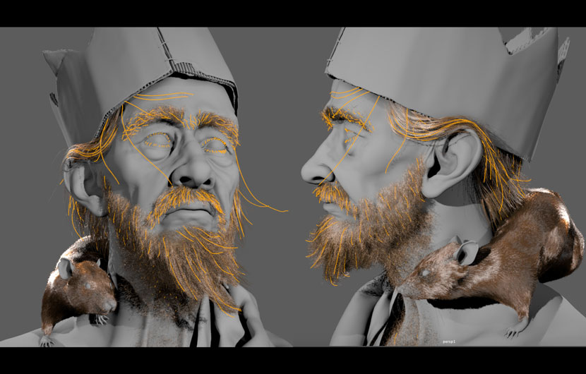 Guiding the viewers eyes: these perspective tests highlight Jared’s carefully curated composition.
Looking back, how satisfied are you with the results? What has the feedback been like?
Looking back, I’m extremely proud of this project. I was in awe to see conversation about the piece grow online, and how people engaged with the character. A user on reddit wrote a lovely piece about the king. It's a beautiful experience to find that someone was so inspired by your work that they wanted to add their own vision to it. I feel like I've been able to establish a connection with people who have engaged with my work.
The piece also did a few rounds on various CG websites and Instagram accounts, and was awarded a Gnomon Best of Term, which I am incredibly thankful for. It’s currently on display at the Gnomon Gallery, alongside a ton of other beautiful Gnomon student work. It looks really cool at 30x40 inches so if you’re in the Hollywood area, definitely come check it out!
Have you used RebusFarm before? If so, please tell us about your overall experience. Is there anything you especially like about our service?
I haven’t actually used RebusFarm yet! Part of the reason I signed up for the contest was to give myself an excuse to try it out. I love the idea of sending my renders out to the cloud and leaving my workstation free to work on. I can’t wait to put my points to use!
In closing, is there anything else you want to say? Any present or upcoming projects you’d like to mention?
I just want to say thanks for choosing me to be April’s RebusFarm 3D Artist of the Month! The contest always features spectacular work, and I’m really proud to be part of that. Definitely stay tuned for future work. I’ll be mostly posting updates on my ArtStation and Instagram.
Thanks for having me!
The pleasure is all ours! Jared, thank you so much for taking the time and all the best in the future.
Keep up with Jared Fischler and his work here:
HOW TO JOIN OUR MONTHLY CONTEST
You want to be our next featured 3D Artist of the Month and win 250 RenderPoints? Just visit our 3D Artist of the Month competition page and submit your entry. We'll choose the best image and contact the winner.
>> Read more articles on our blog
