Saturday, December 1st, 2018 by Julian Karsunky
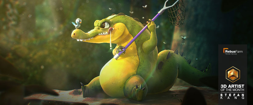
As the year draws to an end, we are thrilled to close out strong with the amazing Stefan Kang Chun Yih, our December 2018 3D Artist of the Month. While not immediately apparent by looking at his submission, Stefan stepped out of his comfort zone and went above and beyond to try his hand at a cartoonish scene. A highly accomplished VFX generalist usually prone to a more realistic aesthetic, he is a fervent proponent of self-improvement and a shining example of how far dedication can get you.
Check out our interview to find out what happens when a VFX artist learns to sculpt and learn about Stefan’s creative journey across the globe.
Hi Stefan, thanks for taking the time! To start things off, please introduce yourself to our readers!
Hello everybody, my name is Stefan Kang Chun Yih, I’m a VFX generalist from Malaysia currently residing in Los Angeles, CA.
What made you pursuit a career in the CG industry?
I’ve always been a big fan of science fiction and Disney movies and always wanted to be a part of the creative process that goes into making these films.
You recently graduated from a two-year digital production program at Gnomon. However, you have been actively involved and working in the industry much longer. Can you give us a brief overview of your education/training so far?
I first started working in the industry about four years ago as a motion designer, creating creative content for fashion shows and projections for events in Asia. Most of my early work was in projection mapping, where I worked alongside other artists to create large-scale projections for events.
When I came across a podcast called ‘The Collective Podcast’, it gave me the courage to come to L.A. and invest two years into strengthening my VFX skills at Gnomon. I stepped out of my comfort zone and surrounded myself with talented artists working in the film and gaming industry. At the end of the two years, I was able to combine my design skills with the technical skills I learned from industry experts and now I’m working as a VFX generalist at The Mill in Los Angeles.
 At the beginning of his career, Stefan created projections such as these as a motion designer.
Please tell us more about your time at Gnomon, your studies there and your motivation for relocating to Los Angeles, CA.
Gnomon trained us not only to become 3D generalists, but also to specialize in one field. While they made sure we had a firm grasp on modeling, texturing, lighting and rendering, they really wanted us to stand out in specific areas.
Taking classes at Gnomon was an intense experience. Everyone who started the two-year program had a tight schedule and we had eight classes each term with only a two-week break every three months. At the end of each term, the school runs a competition to showcase the best works of its student body. These End of Term contests are quite prestigious, as they tend to receive a lot of attention online and from industry experts. Therefore, everybody is motivated to present their best work. In total, I’ve won 11 best of term categories during my two years of study.
Each month, the school invites industry experts and software developers to come and give presentations to the students. As students, we were always receiving the latest information and updated software. Additionally, almost every teacher at Gnomon is currently working in a senior or supervisor position in the industry. They are very aware of the talent pool at the school and are always keeping their eye on students to hire for junior positions at their companies.
Looking at your resume, you are quite the cosmopolitan, having lived and worked in Malaysia, China, the UK and now the US. As a lot of work in the industry is done remotely, how important is it to still travel and link up physically?
In the short time that I’ve been working, I’ve seen the industry change and grow so much! Back when I was working in Asia, we had very limited resources available to us. Everyone on the team had to wear many hats to finish the job on time. These days, the internet just makes everything so much more convenient. I use the cloud to collaborate with artists from around the world.
The cloud render farm is one of the main tools in people’s pipelines, especially for those of us who do computer rendering. Thinking back to three years ago, I was involved in a project to create some projection mapping content for a fashion show in China. Having access to a cloud renderfarm would have saved us so much time and we could have pushed our content so much further. We ended up taking a week just to render out the projection and had to deliver the actual content via a hard drive to the location.
Let us talk about your work in more detail, namely your 3D rendition of a hungry crocodile, based on a sketch by Samuel Suarez.
This particular piece of artwork was actually one of the images that won me one of the aforementioned best of term awards at Gnomon and was created under the mentorship of James Schauf. He gave me a lot of feedback and really helped me through the process. Despite originating as an assignment, for me, this project was less of a technical exercise and more about conveying the emotions of the characters to the audience.
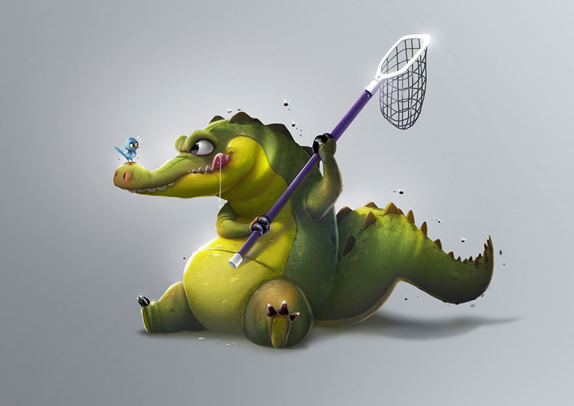 Original sketch by Samuel Suarez.
What initially drew you to the original 2D sketch?
The concept art by Samuel Suarez really resonated with me on a personal level. If you carefully focus on their eyes, you can clearly see the difference in their intentions. On the crocodile’s part, it’s an expression of failure that we all can relate to, but also embodies the spirit to never give up. With the little bird, in contrast, you can feel a humble and very safe position, even in light of the danger in front of it. Both of these archetypes strongly reflect my life as a creative individual, which is why I wanted to recreate it in 3D.
How did you then go about transposing a 2D sketch into a 3D environment?
For the reasons mentioned above, the expression between these two animals was the key to truthfully recreating the artwork.
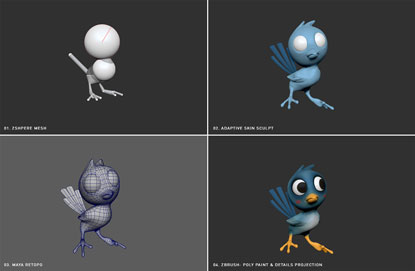
Although there are always small challenges along the way, the process itself was quite straightforward. I used ZSphere mesh to block up the overall shapes and then sculpted through it on adaptive skin mode in ZBrush. The process varies depending on the project, but for this piece, I focused more on getting a still of this dynamic moment rather than animating the characters. So I didn’t really apply the “T-pose” rule while sculpting.
Once I sculpted the mesh, I used the Maya quad draw tool to re-topo both of the characters and to make sure they both had UVs so I could apply the textures using the ZBrush poly painting tool to paint the colors and textures on the surface. Even though this is a highly stylized piece, I also put a lot of time into the camera lens and perspective from a realistic point of view. Finally, I rendered in Maya and V-Ray, then composited in After Effects.
 |
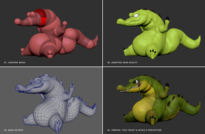 |
Character breakdowns, from mesh to detailed projection.
You created an entire backdrop for the scene not present in the original drawing. What was your thought process behind this decision?
At first, I only took this piece to the point of the basic characters as laid out in the concept art, but I felt there was something missing. It needed an environment. To me, the environment was a key visual because it represents the backstory of the crocodile and the blue bird. It’s where they grew up and how they ended up in this predicament.
Can you tell us more about the various effects you deployed while designing this environment?
Composition and environment is so important especially on this type of stylized 3D work. The lighting and everything in the scene is connected and must be a reflection of these characters. For example, the god rays (volume lighting) represent a sense of hope. The subtle glow on the bird is meant to give it somewhat of an angelic quality, indicating that it acts as a mentor who will guide the crocodile and teach it a lesson. If you look carefully at the net catcher, it is very clean and looks brand new. For me, this signifies that it’s the first time the crocodile is trying to catch the bird.
The trees in the background are tilted to give a sense of imbalance in the composition and to show that something bad is about to happen. The leaves and plants in the foreground guide the viewer’s eyes toward the characters.
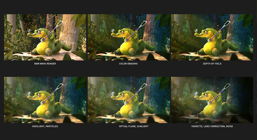 Background development.
Compared to the rest of your portfolio, this project stands out both in terms of style and subject matter. Most of your work seems to be more realistic, even gritty, featuring subdued colors and a more somber tone. How far were these cute, cartoonish characters outside of your comfort zone?
Yeah, most of my work looks realistic and more in line with a cool, cinematographic aesthetic. However, as an artist, I constantly strive to reinvent myself. I was heavily inspired by designer Michael Cina, who said:
“I have a check-in point with myself and my work every six months to make sure I’m still taking risks and moving forward. Even though I’m an older designer, I feel like my career is starting again […].”
This quote inspired me to step outside of my comfort zone and find out what happens when you give a VFX artist the knowledge to sculpt. Would I still be able to perform well in a different medium? As it turns out, I ended up working so much harder than I could have ever imagined. I learned that if you are truly dedicated to studying and implement the 10,000 hours rule, you will succeed. Nothing can beat the passion of an eager heart.
Earlier this month, you managed to add yet another award to your already extensive collection as one of the winners of the ‘Dark Future contest’ held by Motion Designers Community and Behance. Can you tell us more about the contest and your submission?
Sure! The contestants were tasked to create either an animation or an image pertaining to the theme of a dark future within just two weeks. I teamed up with two artists from India and Brazil and together we worked remotely on our entry for the video category. My friend Santhosh Koneru helped modeling and texturing the character while Vztudio did the audio. I was responsible for the concept, camera movement and motion design. We rendered the entire project online through RebusFarm, which was integral to meeting the tight deadline.
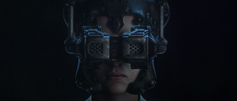 Stefan cites RebusFarm as instrumental to the success of his ‘Dark Future’ short.
Please tell us more about your overall experience with our render service.
Compared to other cloud renderers, we found RebusFarm particularly stable and reliable. RebusFarm has a built-in tool that helps setting up the render immensely. In terms of rendering, the main challenge on this short was the character. It was set up in V-Ray, and there were many micro details on the face. We actually found that the displacement broke on other cloud render farms. Once we realized we didn’t have any issues with RebusFarm, we were on board 100%.
Each of the character frames took an hour per frame to render. If we hadn’t used RebusFarm, we couldn’t have finished the project within two weeks. Everything is just so reliable: from uploading our project and textures to downloading the render file. The tools are all carefully explained on the website and in the video tutorials as well.
Thanks for the kind words and congratulations on your win. We wish you all the best and look forward to see more of your work in the future!
Keep up with Stefan Kang Chun Yih and his work here:
HOW TO JOIN OUR MONTHLY CONTEST
You want to be our next featured 3D Artist of the Month and win 250 RenderPoints? Just visit our 3D Artist of the Month competition page and submit your entry. We'll choose the best image and contact the winner.
>> Read more articles on our blog
