Tuesday, June 1st, 2021 by Julian Karsunky
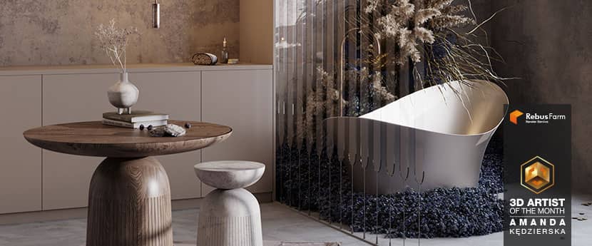
Rules and creativity are fickle companions: there is a fine line between helpful guidelines and crippling restrictions, as Amanda Kędzierska, our June 2021 3D Artist of the Month, can attest to. When the work on her master thesis left her feeling too limited in her creativity, she decided to completely rework the project after graduating. No longer bound by the confines of academic demands, she unleashed her full artistic potential. Encouraged by the positive feedback, Amanda committed to her newfound passion, and is now pursuing a career as a professional archviz artist.
In our interview, Amanda discusses the emotional impact of colors, wabi-sabi and the joys of subtle aesthetic disruptions.
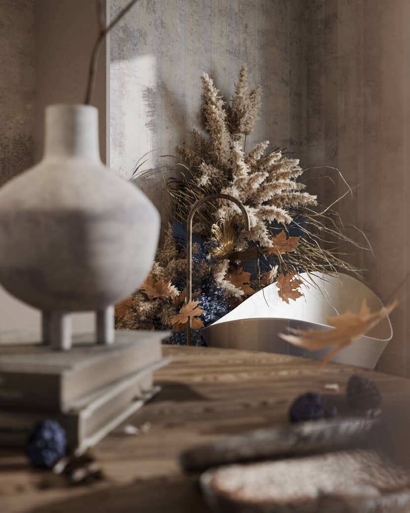 'In Bloom': The title of Amanda's breakout project might not only refer to the floral arrangement in the scene itself, but to her own artistic awakening.
Hi Amanda, thanks for joining us! To start things off, please introduce yourself to our readers.
My name is Amanda Kędzierska, I'm 25 years old and I currently live in Poland. My journey with CGI started while I was in college studying interior design. 3D visualization was a pleasant and much welcomed change from the highly technical executive designs I was dealing with every day.
Please tell us more about your academic background. How does architectural visualization relate to interior design?
In both academia and industry, visualizations generally are of minor importance when assessing project success. The final image is only the endpoint of a longer and complex design process, most of the time is spent beforehand, on functional layouts and technical issues related to the space. However, even the best ideas can be conveyed much more effectively with beautiful visuals; and since ideally, you want your image to showcase all of the hard work that went into the entire design process, an accompanying visualization should not just be carelessly churned out.
After graduating, you opted for a career change and are now working as a professional 3D artist. What led to this decision?
It was in fact this very project that gave me the final push to switch from interior design to working full-time as a freelance 3D artist. Still, my degree is far from useless, and the years I spent studying and practicing design translate to a lot of valuable experience.
My main focus at the moment is on architectural visualization, what sets my designs apart is a strong emphasis on mood and atmosphere.
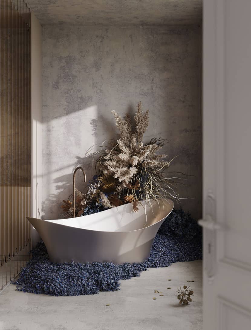 Leaving the door wide open: Amanda's designs aim to unlock the full range of human emotions.
What exactly is 'Makoya', the branding of your online presence?
Makoya refers to Calathea makoyana, a tropical houseplant also known as 'peacock plant' due to its striking leaf patterns. When I first decided to start working as a professional, I wanted to come up with a name that would serve as a reminder to always follow your passion. Well, besides CGI, I'm very passionate about nature and plants – after work, I take care of more than one hundred plants – hence, Makoya!
Is there a specific design philosophy or school of thought you adhere to? What inspires you as a 3D artist?
There are no rules I follow strictly, but the ideas of surrealism are close to my heart. Adding a surreal touch to an otherwise perfectly realistic interior is extremely satisfying to me. Even the slightest disruption of logic and reality can stimulate the viewer's imagination to a surprising degree.
After all, my goal is to create visuals that will stay in people's minds a little bit longer, and this way of thinking leaves the door wide open for creativity, and the possibilities that flow from it are endless.
Let's talk about your work in more detail, namely 'In Bloom', the interior you submitted to our campaign. This project originated as part of your master thesis, so can you first tell us more about your initial idea.
My thesis was a study of the perception, interpretation and emotional impact of colors, and the application of my findings into interior design work. Besides extensive research and analysis, the project involved the conversion of an abandoned factory into a hotel facility, in consideration of historical and cultural values. At the same time, it was a departure from conventional solutions and an example of an interior that was specifically designed to stimulate the viewer's senses.
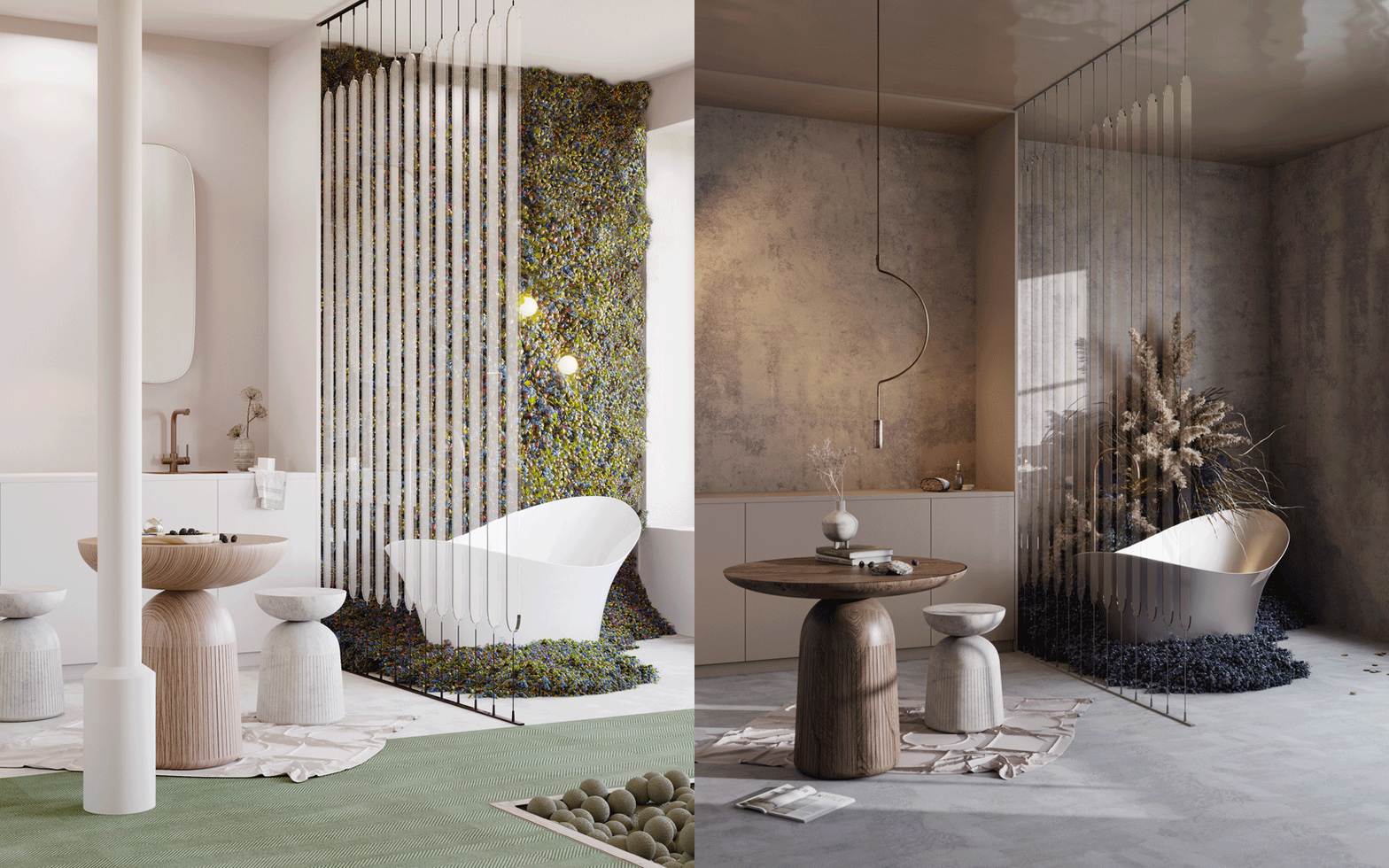 Once more with a feeling: this GIF contrasts the revised image with the original scene from her master's thesis.
How did this concept then evolve following your graduation and what motivated you to return to this scene at all?
While the subject of my thesis promised so many possibilities, I was ultimately severely limited by technical specifications and other formalities. The completed project left me with mixed feelings, but the space still called to me. So, after graduating, all I wanted was to come back and recreate at least one room, leaving all of the rules behind.
I ended up completely reworking the scene, basically changing everything besides the existing models in the process. My second attempt was exclusively focused on the visual. This led to the realization that the work of an interior designer and a CG artist can differ greatly, and that it was time to choose which path I wanted to follow.
What parts of the image were especially important to you, both from a visual/design as well as from a technical point of view?
The floral arrangement, which I wanted to form one coherent and seamless composition with the bathtub, without interfering too much with its usability.
The floral arrangement seems to both complement and contrast the rest of the room, which barren look almost seems surreal.
That is precisely the effect I was hoping to achieve: just a subtle hint of the surreal instead of turning the whole image into a fantastic space. This space was to neither fully belong to the real world nor to the unreal, but to exist in balance in between.
The main assumption of my thesis was that interiors should evoke the full range of emotions, including those commonly considered undesirable, such as anxiety, instability, doubt, and risk. I firmly believe that emotions are the key to creating unforgettable spaces. Consequently, this hotel room appears unusual and but cozy at the same time.
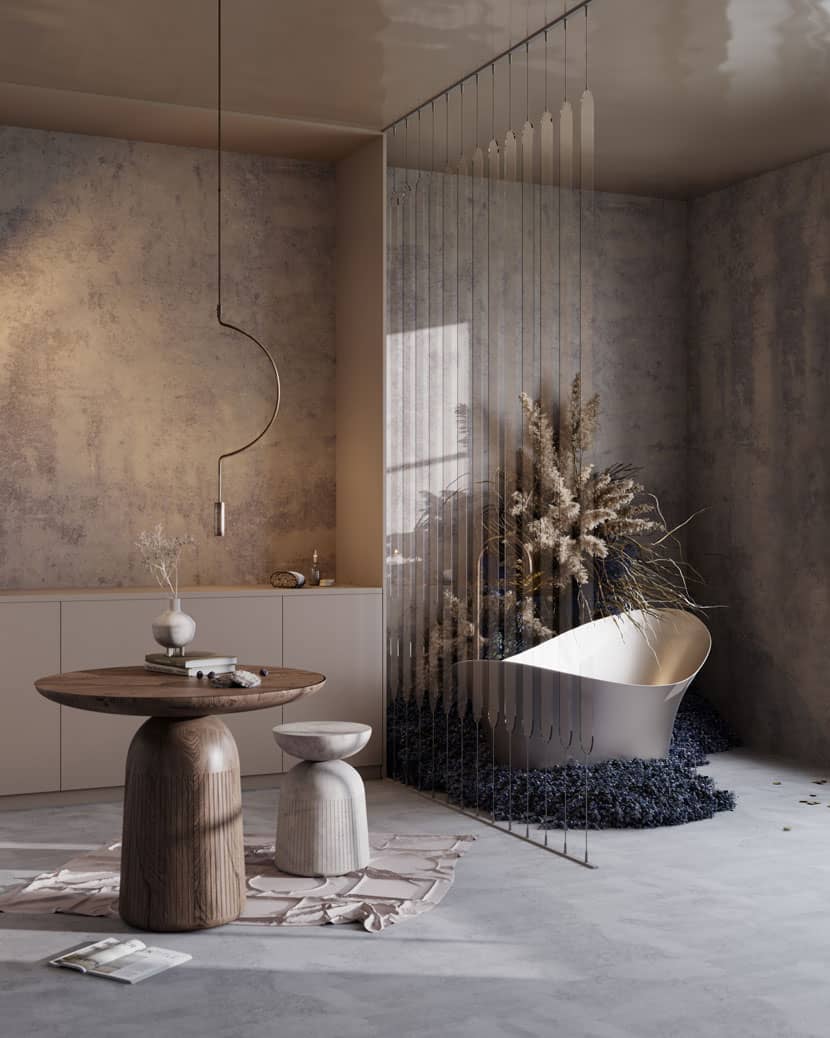 Amanda's color theory blends ancient Eastasian ideas with contemporary psychological findings.
In describing the project, you made mention to wabi-sabi, a Japanese aesthetic principle closely linked to Zen Buddhism. Can you elaborate on this concept and how it influenced your design?
Wabi-sabi is the acceptance and embrace of imperfection. For me, it means the integration of nature into the world of design in a non-literal way.
Following wabi-sabi made me heavily use earth tones, but since I didn't want to limit myself to only one color palette only, I also added some navy blue tending towards purple. Purple is said to be the rarest color found in nature, and psychologically it is linked to sensations related to mysticism. This choice of colors is mirrored by a mix of warm (earth) and cold (navy blue) lights to illuminate the scene. The overall composition is tidy, yet natural, as if someone had just left the room in a hurry.
Once you had a concept in mind, how did you go about realizing it? Can you briefly walk us through the development process?
I usually start with a composition of the few main objects that I'm least likely to move or delete later. Then I work around this base, experimenting with other models, lighting and materials, until I achieve a proper balance.
What software did you use to create this piece? Any plug-ins you found particularly helpful?
I used 3ds Max, Corona Renderer and Photoshop.
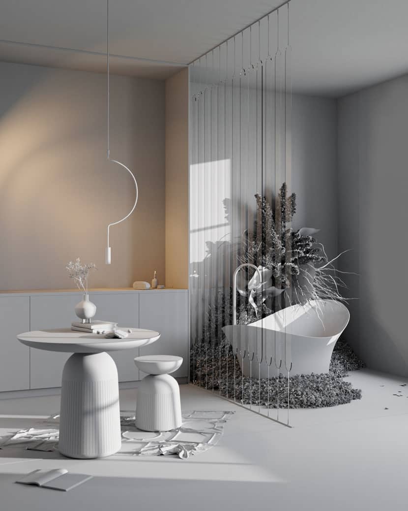 ‘In Bloom', clay render.
Are you satisfied with the results? What has the feedback been like so far?
The project was welcomed warmly by people who have worked in the industry for years, which feels amazing, even more so considering this was my first serious artistic attempt to create CG imagery!
Have you used RebusFarm before? If so, please tell us about your overall experience. Is there anything you especially like about our service?
While I have not used RebusFarm yet, it has been repeatedly recommended to me by professionals in the past, and I'm thrilled to finally try it out myself!
In closing, is there anything else you want to say? Any plugs, shoutouts or upcoming projects you'd like to mention?
I hope everybody enjoyed this project! If you want to stay in touch, please find me on social media.
Amanda, thank you so much for taking the time and all the best in the future!
Keep up with Amanda Kędzierska and her work here:
HOW TO JOIN OUR MONTHLY CONTEST
You want to be our next featured 3D Artist of the Month and win 250 RenderPoints? Just visit our 3D Artist of the Month competition page and submit your entry. We'll choose the best image and contact the winner.
>> Read more articles on our blog
