Wednesday, February 9th, 2022 by VisEngine
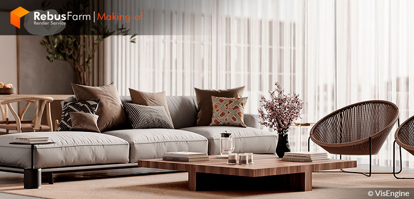
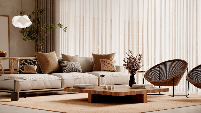
We all know that making beautiful projects in short amounts of time can be a challenge. VisEngine talks to us about how they achieved such impeccable quality of visualization in a limited time. Proving that amazing detail in lighting and materials can be fastly done, VisEngine gives us the most important steps on how they did 'Ancient Hill'.
Let's dive deep into the process of this beautiful and versatile space.
VisEngine
Hello everyone! We are VisEngine Digital Solutions. For more than 10 years, we have been making it possible for people around the world to literally see their dreams with the help of computer graphics. Therefore, we are pleased to present one of our projects - Ancient Hill to all who are interested in 3D visualization. We hope you enjoy it as much as we do.
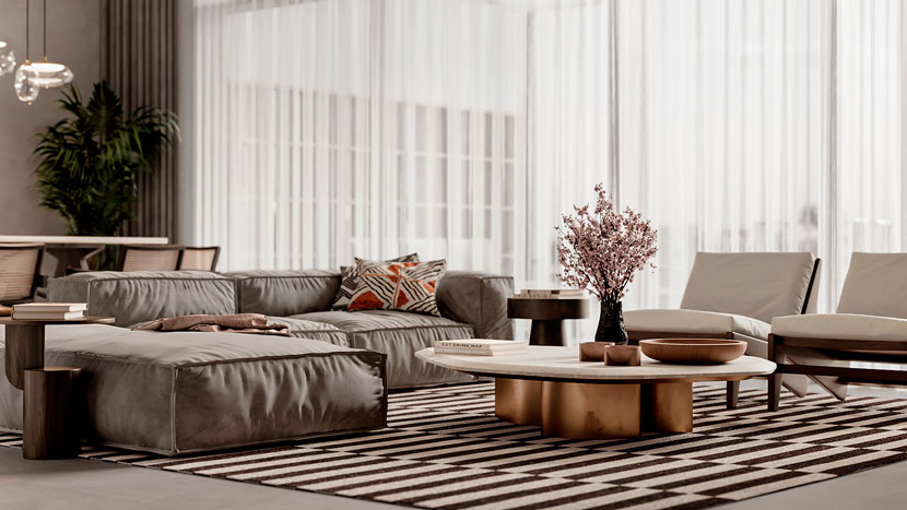 Variation of Ancient Hill.
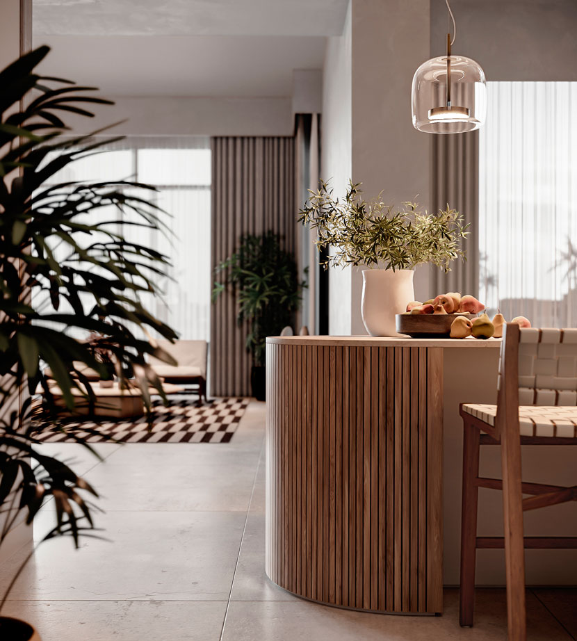
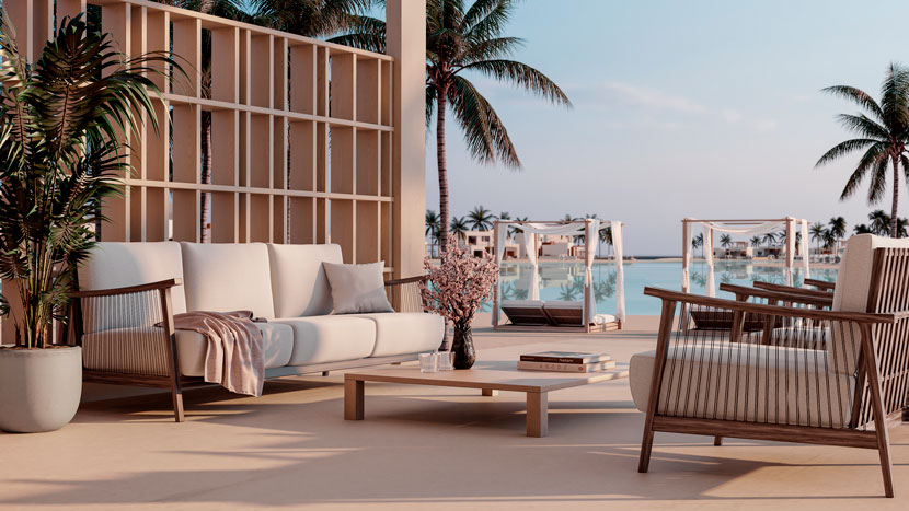
Ancient Hill is a commercial project commissioned by an interior design studio. Our task was to visualize the interior design of the villa, as accurately and photorealistic as possible to convey the ideas of the designer. and, of course, to meet the deadlines, because the project was (as always :)) urgent.
Lighting
In accordance with the terms of reference, we decided that the best option for this project would be to use a lighting scheme that will be quite neutral in visual perception. This would give a good feeling of space and versatility, as well as harmoniously and accurately convey color design solutions. The settings are described below:
Lighting scheme Corona Sky + Corona Sun.
We added HDRI only to simulate the sky
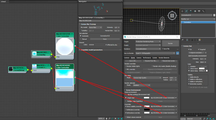
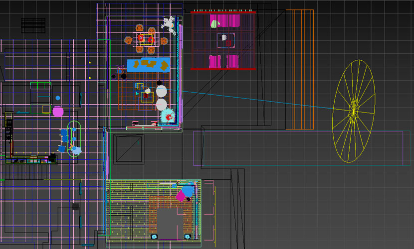 Settings Corona Sky + Corona Sun
Also, to achieve a neutral effect in the lighting, it was necessary to achieve the softness of the shadows on the renders. The larger the diameter of the Corona Sun, the softer the shadows, which adds realism and helps to simulate the light in a slightly cloudy sky.
This is the HDRI that we used.
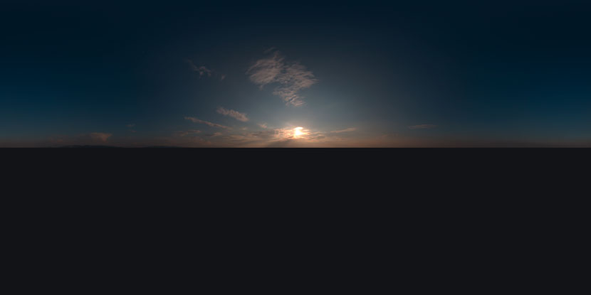 HDRI used to achieve the lighting desired effect.
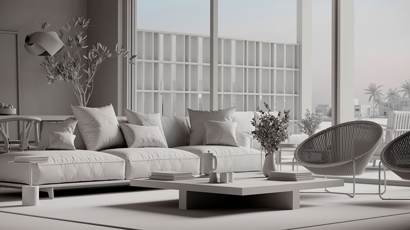
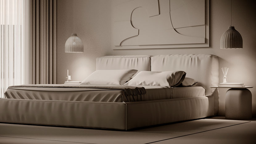
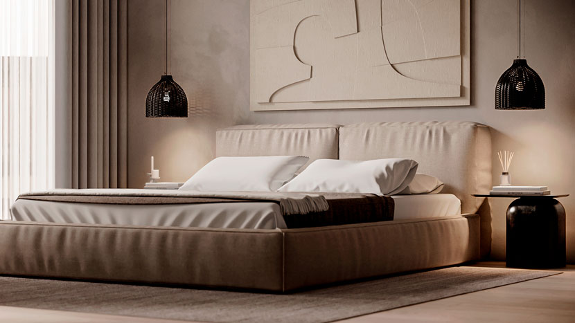
A good picture requires an individual approach. Therefore, for each angle, we individually adjusted the light, choosing options that would be most suitable in each case. For each image, the sun is set exactly so that the picture looks artistic and, at the same time, natural. This helps to more accurately control the direction of the incident light from the window and to achieve the volume and micro-contrast of objects at each angle.
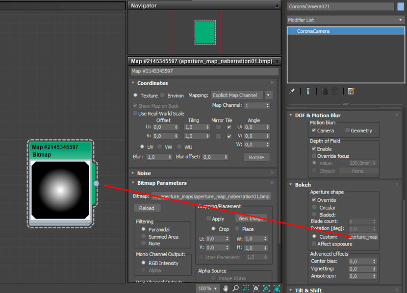
We implemented the slight DOF effect through the Corona camera settings.
 DOF effect with Corona Renderer.
To provide realism and get a soft bokeh, we additionally used a gradient map as in the screenshot:
 Gradient map.
Materials
Because we had a limited amount of time to complete the task, simplified methods of materials creation were used to optimize the process. This reduced the time for image development but did not lose the desired photorealism in the end.
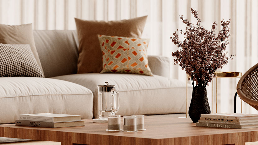
For example, as in the case of these pillows material:
 Pillow material settings.
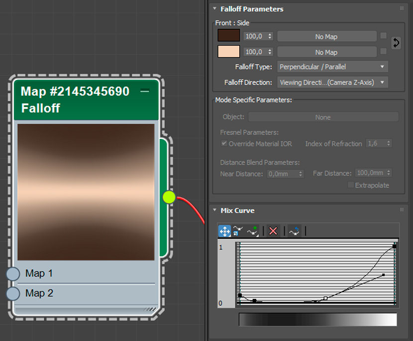
We used a falloff card to adjust the color of the texture and soften the fabric.
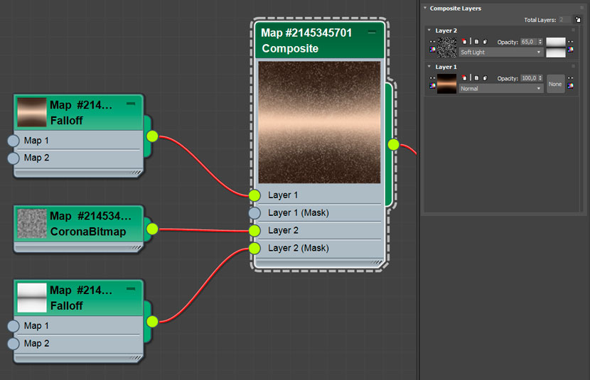
Also, we mixed colors with texture through the Composite card.
 Adding volume to the fabric texture via the Corona Norma map with selected values.
Below there are the settings for some more materials.
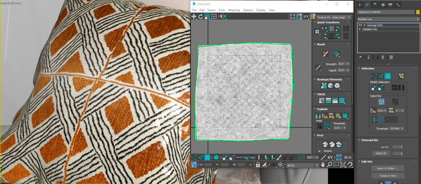 Development drawing for correct texture overlay.
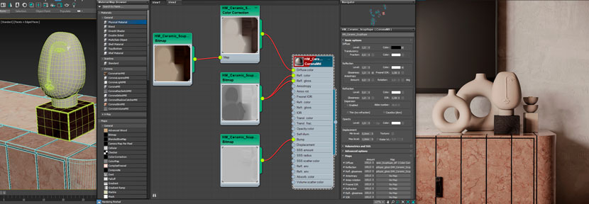
 Settings for vase material.
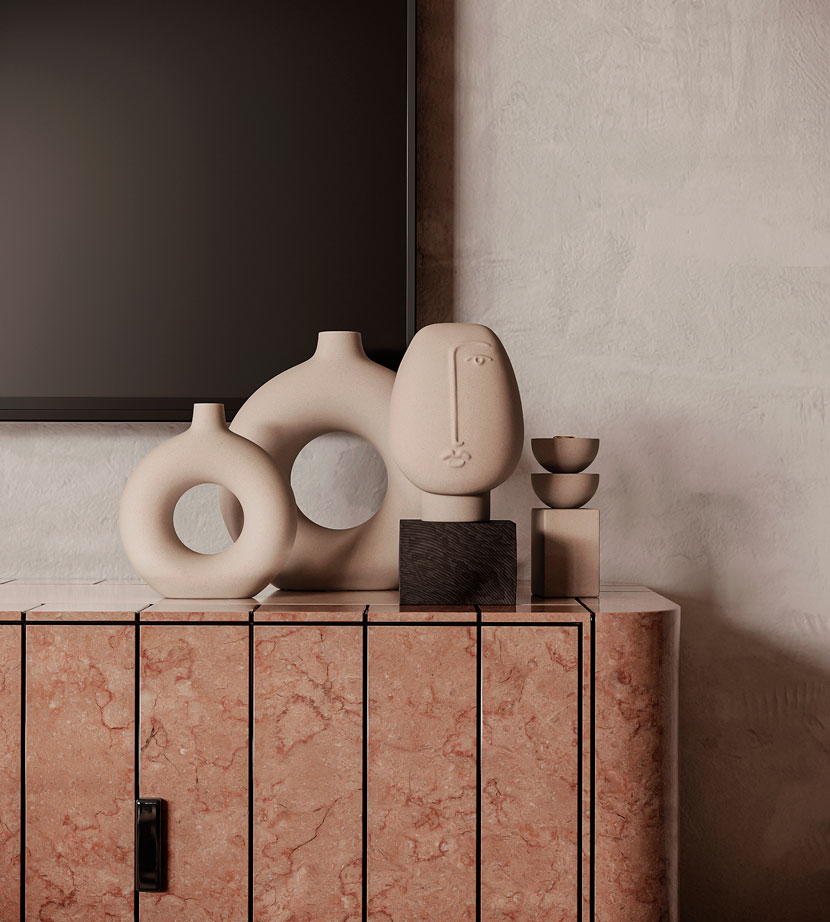
The material of the vase is also quite simple. The important point is a small bump and displacement with a qualitative texture to give volume to the pattern.
Post-Production
Ideas that had not been implemented during the development of the rendering, were finalized in post-processing. In general, we tried to get a good result directly at the rendering stage, to make only a minor correction in Photoshop and add a few final touches to enhance photorealism.
Typical Render Elements that we use in post-production.
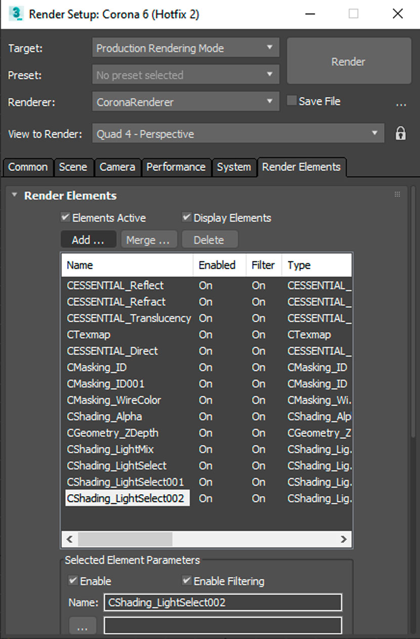
The use of Render Elements for post-processing gives extra volume and photorealism to the image.
For maximum color harmony and 100% compliance with the materials, we used CMasking_ID for fine adjustment of the color, contrast, and saturation of each item.
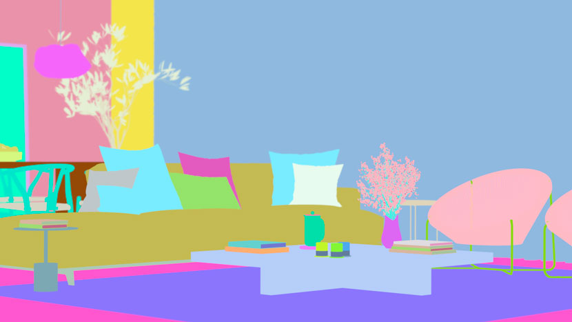 Color settings
In the end, we received bright images, which met all the requirements of the customer in terms of design, as well as were highly appreciated by colleagues, which is even more pleasing. And given the short deadlines for the task fulfillment, we can safely say that we are also satisfied with the result.
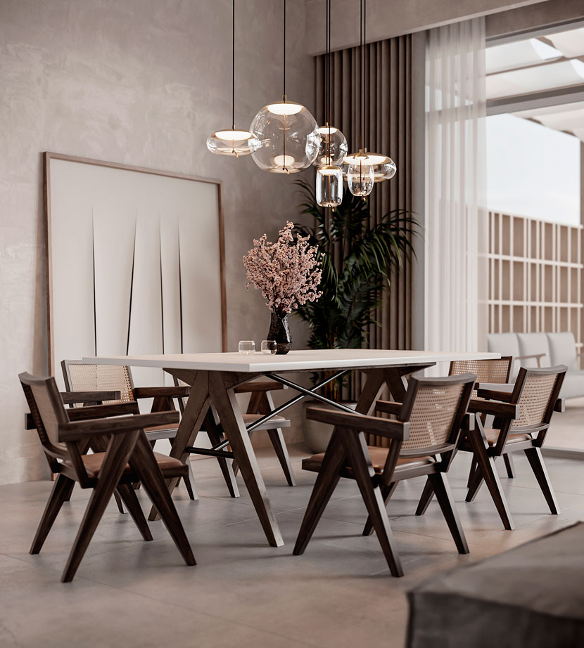
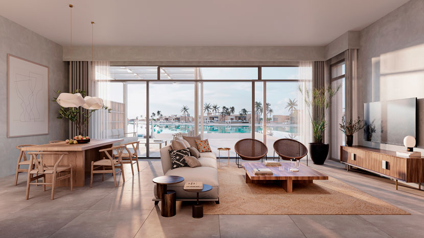
Thank you, VisEngine team, for sharing your beautiful work and your process with our Rebus community. Check out more of their work on their different channels:
Want to share your work with our community too?
Contact us at Diese E-Mail-Adresse ist vor Spambots geschützt! Zur Anzeige muss JavaScript eingeschaltet sein!and tell us about your favorite project.
>> Read more articles on our blog
