Tuesday, October 15th, 2019 by Julian Karsunky
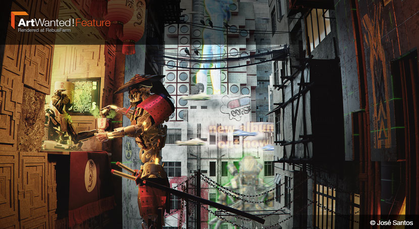
For our October 2019 ArtWanted! feature, José Santos takes us on a culinary journey…straight into the future! You better have a head for heights, though, as the ‘Best Noodles in Town’ are not exactly found at ground level. His cyberpunk depiction of a noodle stand, an impressive demonstration of his cinematic approach to architectural visualization, just won the Portuguese CG artist first place in a Kitbash3D design competition.
In our interview, José discusses his broad artistic influences, his love for the CG community and the creative allure of the mundane.
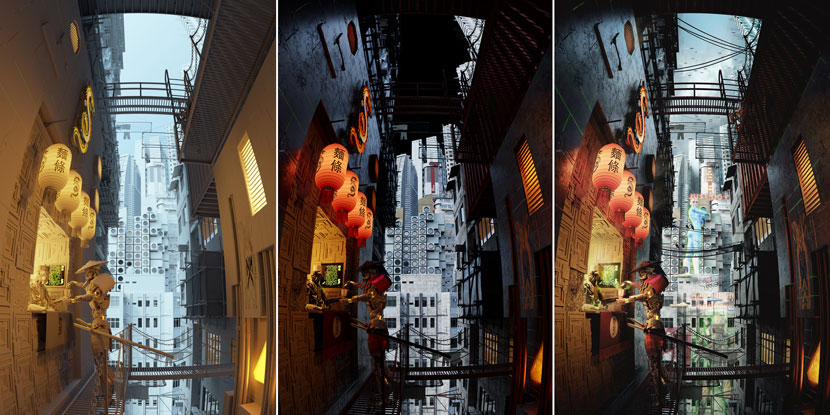 José Santos, ‘Best Noodles in Town’, from clay render to final image.
Hi José, thanks for joining us! To start things off, please introduce yourself to our readers!
Hey everybody, my name is José Santos, I'm a 39-year-old archviz artist. I was born and raised in Portugal, but have been on the move ever since I started working. Currently I reside and work in Germany.
Do you recall when and how you first consciously encountered CGI?
While I can't pinpoint the exact moment, I know that my love for it stems from comic books and sci-fi and fantasy movies. It all goes back to my grandpa taking 7-year-old me to the movies for the very first time to see ‘Masters of the Universe’, this I’m absolutely sure of.
When did you decide to pursuit a professional career as a 3D artist?
Around 12 years ago. I was working as an architect and it just wasn't fulfilling enough for me anymore. I simply missed being creative and telling stories.
What training or education do you have?
I studied architecture in Coimbra, Portugal. Apart from that, I also did a six months training course on archviz in Barcelona, Spain. This minor jump start aside, I’m pretty much self-taught.
Of course, in this context, I have to shout out Roberto Valls Domenech, a badass visualizer and a good friend of mine, who took me under his wing and had the patience to guide me when I was just a rookie.
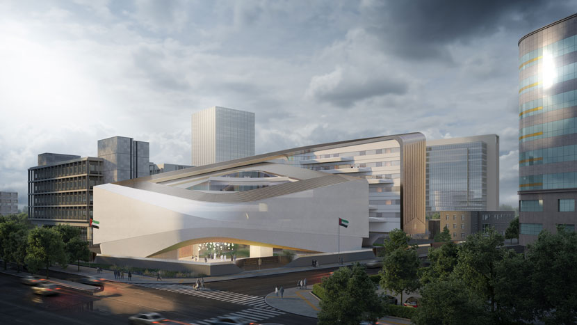 While this interview heavily focuses on José’s personal projects, he is an accomplished archviz artist in the more conventional sense as well.
Please briefly summarize your professional career thus far!
My archviz career began at an architectural office in Barcelona called Pinearq. In hindsight, I feel like I had very little idea of what was going on, being completely new to the scene and all, but it still was a great first experience. My next step was moving to Germany, where I started working at a company called Rendertaxi. I stayed there for almost nine years and just recently changed jobs. Currently, I’m still in Germany, working for loomn, an archviz studio based in the town of Gütersloh.
Can you tell us more about your current employer?
Loomn Visualisierung is a German archviz studio providing a vast array of visualization services for an international client base, ranging from photorealistic 3D to conceptual rendering, animations, VR and more. I am working there as a senior visualizer.
Besides that, you recently also became involved in a more personal business venture!
That’s right, a couple of month ago my friends and I started a collective of sorts. The idea is to push ourselves harder and realize our own ideas and projects, ranging from illustration to product visualization, all under one roof, free from any third-party constraints. Hopefully, I’ll be able to share more information with all of you soon!
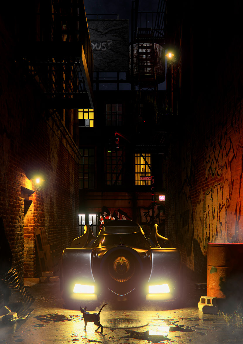 José likes getting up close and personal! Just as in this encounter between bat and cat, titled ‘On Patrol’.
How would you describe your fascination with architectural visualization?
To me, archviz is the logical next step for someone who loves both architecture and cinema. Being able to portray a building or a situation through the lens of your own eyes, then sharing your vision with other people is just wonderful.
Back when I was working as an architect, I became fed up with the time and politics it took to get anything done. Archviz, on the other hand, allows for much more immediate results, which I find more satisfying. Creative control and immediacy, these two factors are what initially drew me in and still keep me going!
What do you like most about this particular field?
I would have to say the community. Not only just archviz, but the entire CG community is just awesome. I think it continuously evolves and pushes its members further and further. So many people go out of their way to help others – whether it’s through the making of tutorials or sharing free assets – you don't find that kind of cohesion too often nowadays.
Is there a specific design philosophy or architectural school of thought you adhere to? What inspires you as a 3D artist?
Architecturally speaking, I love Modernism. I'm a huge fan of Mies Van der Rohe and the Case Study Houses program. The cleanliness of those lines and materiality really speaks to me. The re-creation of Case Study House #21 by Pierre Koenig was actually one of my first big personal projects and one that I am still very fond of. That house is simply sublime.
Regarding archviz, I tend to go wherever the project needs me to go. I’d say that what really attracts me in general is portraying up-close and personal situations, just like ‘Best Noodles in Town’, or ‘On Patrol’, another recent image of mine. Witnessing interactions happening right before our eyes give a unique sense to our spatial awareness.
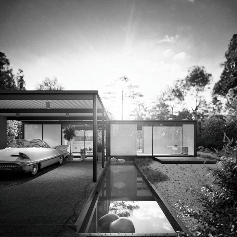 As an outspoken fan of the Case Study House line of architecture, recreating Pierre Koenig’s ‘#21’ was a passion project for José.
Let’s talk about your work in more detail, namely your submission to our ArtWanted! campaign, a futuristic scene set in an East Asian inspired metropolis, simply titled ‘Best Noodles in Town’.
This image just won you first place in the concept category in the Kitbash3D #KB3Dcontest: Cyberpunk competition - congratulations! Please tell us more about this contest and what motivated you to enter!
Thank you! I‘ve been closely following the various Kitbash3d competitions for a while. The quality of submissions is always top notch and the possibilities with their kits are endless. Now for the cyberpunk theme, I think this imagery is very much imprinted into everyone's subconsciousness. For me, it was the perfect opportunity to play with concepts and images that have been with me since I saw ‘Blade Runner’ and ‘Akira’ for the first time. As in the noir aesthetic, in cyberpunk, the cities always act as a silent character, defining the characters and stories as much as they are defined by them. One cannot exist without the other, and I find that utterly fascinating.
I understand you were required to make use of one of several premade kits as part of the contest. Can you elaborate on this process and how it worked out for you?
Actually, it was just one kit every contestant was given, the Mini-Kit: Cyberpunk. My idea was to use these buildings for the distant background and the area in between, so that I could detail the foreground to my liking. For instance, I wanted to use the Ennis house tiles designed by Frank Lloyd Wright for the facade of my little restaurant. The same tiles were prominently featured in Blade Runner by the way.
How did you come up with the original idea for your image?
From the beginning, I wanted to portray a regular, everyday situation set in a futuristic world. The title also helps to further emphasize this idea. I wanted to focus on a mundane exchange, such as ordering a bowl of noodles at your favorite restaurant. I think most of us sometimes go out of our way just to get a dish from our favorite place. That is just a very human thing to do.
At the same time, I wanted to avoid some of the visual tropes commonly associated with the cyberpunk styles. That is why I refrained from using a foggy atmosphere and set the scene at daylight, as I thought that would be more relatable.
How did you approach your submission in terms of theme and aesthetics?
For every personal project of mine, I always start with a specific emotion or feeling that I want to convey. In the case of ‘Best Noodles in Town’, that feeling was normalcy, an ordinary situation in an extraordinary setting. For the cyberpunk aesthetic, I knew which elements I wanted to use right away. So, my work actually started with the creation of a moodboard, consisting of pictures of back alleys and paintings by Edward Hopper referencing situations and use of color.
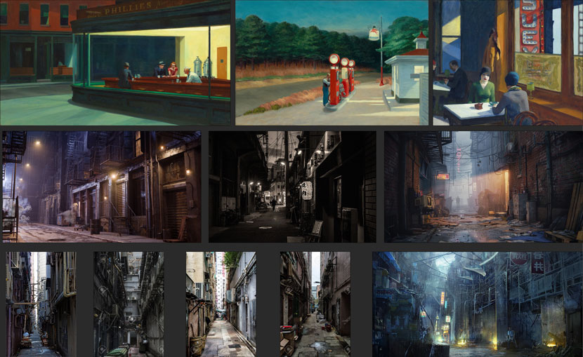 ‘An ordinary scene in an extraordinary setting’: this moodboard contains the corresponding visual references.
By design, world-building is inherent to every cyberpunk setting. How much did you think about the world the scene is set in and how did you relay these ideas visually?
The basic concept was always to mix familiar and fictitious design elements, such as the aforementioned Ennis House tile versus the flying cars and the neon billboards in the distance. Same for the slicker buildings and the more rundown facades and shipping crates. We live in a world that constantly mixes the future and the past to create its present, so it's only natural to conceive a futuristic world based on the same principle.
As an archviz artist, can you tell us more about how you designed the cityscape?
I always had imagined it as a very vertical city, similar to the sprawling metropolis in Luc Besson's ‘The 5th Element’. This verticality ended up influencing every aspect of the image. The aspect ratio became vertical, the camera tilted up instead of being completely horizontal, with a fish eye lens further contributing to that exaggerated, vertical look. At first, I planned on setting the scene at street level, on a back alley with the city’s skyline rising up in the background. I eventually gave up on that idea when I understood that the ground floor approach wasn’t working as I had hoped. Elevating and suspending the entire location instead made the whole composition feel that much stronger.
To further define the mood of the scene, I contrasted the fore- and the background through a clear chromatic distinction, with warm colors for the inside, and cold colors for the more open outside. This obvious contrast between traditional elements and the run-down look of the buildings framing the image and the futuristic skyscrapers is a recurring sci-fi and cyberpunk theme, I guess. The dichotomy between your immediate and shabby surroundings and the seemingly unattainable shiny city in the back also highlights the idea of different classes within a society.
Surprisingly, you decided to prominently place two characters in the scene. What exactly are these creatures, are they cyborgs? What made you include characters in the first place?
Initially, I thought of having normal people instead of robots. But along the way, I just thought that it would be much more non-sensical and funnier to have these non-organic humanoid beings which really have no biological need to eat – least of all noodles – partaking in food consumption. Though, considering the green smoke rising from the cup, I’d say it's a different sort of food they have.
Were these models part of the Kitbash3D kit or did you make them yourself?
These were premades from Daz 3D that I posed and then imported into my scene in Cinema 4D. I am a firm believer of the kitbashing process: Sometimes you have the time to do your own modelling, but other times you simply don't. In the latter case, I gladly choose to support the great artists that make a living creating models and assets, making all of our lives easier.
Once you had a rough concept in mind, how did you then go about realizing the idea? Can you briefly walk us through the development process step by step?
The first thing I usually do is create a rough block out of shapes and object, building, and character positions in the scene. This tends to work out for me very well, because overall image composition is already laid out in my head. Since I know whether I’m going to go with a vertical, a panoramic or squared image, most of the time, I just place my camera accordingly and start moving the objects to my liking. Though to be fair, this approach works because I work on a single camera setup, of course. Working with multiple camera setups, the approach would obviously be different.
As soon as I have a rough composition, I start working the scene lighting on a clay model, while further refining the geometry block-out. Depending on my lighting configuration, the object composition might change or evolve as I progress.
What were some of the challenges you had to overcome?
For me, when doing personal projects, the biggest challenge is always time management. Finding the time to put the work in to achieve the desired results while balancing a full-time job as well as being dad to two very young and very active munchkins is not an easy task! All in all, it took me around two weeks working on my submission during nights and on the weekends.
What software did you use to create this piece? Any plug-ins you found particularly helpful?
For the most part, I kept it very simple. I used Cinema 4D with Corona Renderer, Marvelous Designer for some cloth creation, and the characters were done in Daz 3D. For post-production part I used good old Photoshop. Also, I used the RebusFarm Farminizer plugin, which works flawlessly; I can't wait to try the 3.0 version.
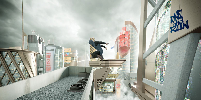 ‘Best Noodles in Town’ wasn’t José’s first foray into futuristic CG cities nor his first participation in a Kitbash3D competition. Pictured above is ‘Run’, his submission for a previous, utopia-themed contest.
Generally speaking, how important are personal projects and competitions such as this one to you as a 3D artist?
Personal projects are a really important creative outlet for an artist to grow and find himself. When working in an office or a comparable professional environment, it is very easy to get caught up in certain routines. In a similar vein, as a freelancer, you might get overwhelmed by your workload and deadlines. Things become stale and you end up feeling cornered.
Personal projects, then, present a tabula rasa of sorts. It’s just you and your imagination imposing the limits, you can reinvent yourself as much as you want. And this just allows you to grow so much more as an artist.
What has your experience with RebusFarm been like so far? Is there anything you particularly like about our services?
RebusFarm has become a staple at my work to the point it is now as ingrained in my workflow as a tool like Cinema 4D. I tend to use it a lot due to the simple fact that it eliminates hardware limitations for rendering, taking away a lot of the stress of finishing projects on time. On top of that, it's very user-friendly and has great support.
While these might not be the most original talking points, there is a reason why this point has been made in pretty much all the interviews.
In closing, is there anything else you want to say? Any present or upcoming projects you’d like to mention?
Well, I’ve been following your ArtWanted! campaign for a long time now and I’m very humbled and honored to be featured alongside so many great artists myself! Also, to everybody that took the time to read this far: thank you very much.
Speaking of upcoming projects, there is a smaller and more personal project of mine that I’m quite proud of. The main image has already been rendered at RebusFarm, so please keep an eye open for the release coming very soon!
Sounds like we have a lot to look forward to this year! José, thank you very much for taking the time and all the best in the future!
Keep up with José Santos and his work here:
How to join ArtWanted!
You want to get featured in our ArtWanted! campaign and win 250 RenderPoints on top? Submit your work, rendered at RebusFarm, to Esta dirección de correo electrónico está siendo protegida contra los robots de spam. Necesita tener JavaScript habilitado para poder verlo.! Visit our Art Wanted! page for more information.
>> Read more articles on our blog
