Wednesday, October 13th, 2021 by Paco Barruguer
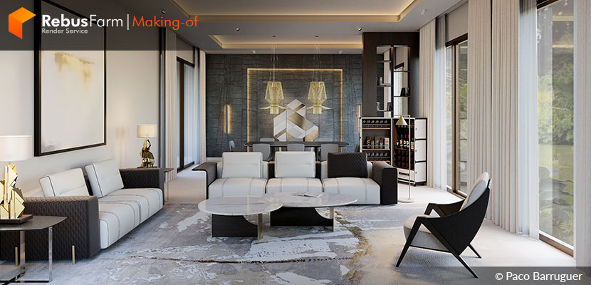
It’s tips and tricks time for all Blender users out there. In this 'Making-of' edition, Spanish 3D artist, Paco Barruguer, gives us an insight into the process of visualizing the interior design of the exclusive Bellagio living room for the luxury furniture 'Colección Alexandra' company.
Let's take a close look at what Paco has to share with us.
About myself
Hi, I'm Paco Barruguer from Burriana, Castellón, Spain. I've been a 3D artist and Blender user since 2017.
In the last two years I combined two jobs—I worked at a ceramic tile company called Porcelanosa as a 3D artist and I also worked as a freelancer, but some months ago I left the company and now I'm only freelancing.
When I discovered Blender, I began my 3D experience. I loved Blender from the first moment I laid hands on it and I began to study 3D with it. My passion and obsession with 3D led me to study every day since then. I took hard surface modeling and cycles courses and specialized in arch-viz because it was the only way to integrate 3D into my work as a graphic designer. Finally, two years later my chieftains decided to promote me to 3D artist.
Now I work for architecture studios, builders, interior designers, etc. I basically work for everyone that uses 3D in the architecture or construction world. Occasionally I make other types of projects for furniture or marketing companies.
The Bellagio Living Room project
The original project was born a year ago as an interior design project for the 'Colección Alexandra' company. They designed an interior living room for a private house and I made the visualizations.
When I make projects for this company I am not usually able to share the images because they offer a luxury service and their clients usually want confidentiality around it, but a year later I received an e-mail from their marketing department saying they wanted to readapt the original project with new furniture for a catalog. This readaptation gives me the option to share this work with you and here it is.
The project
Before I begin to speak about the project, you need to know that when we work for an interior design and furniture company they provide us all about the renders: furniture, blueprints, how they want the lighting, etc. Our work in these cases is to get photorealism always taking their requirements into consideration.
How I said before, the client gave me the blueprints, and the first step is to make the architectural structure.
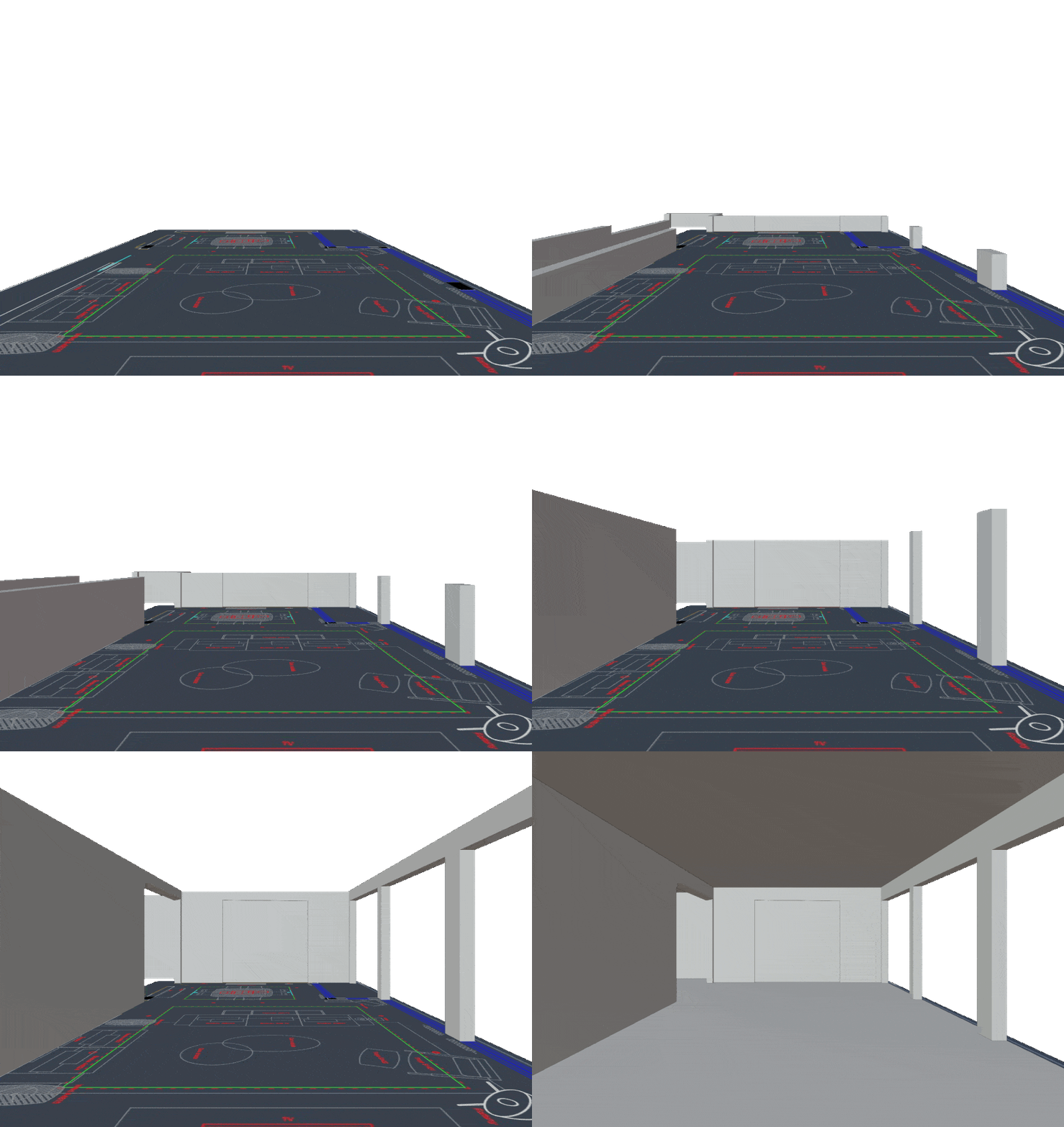 Initial architectural structure.
In this case, as it is a relatively simple living room it was an easy step. After I had the structure, I went to configure the exterior light, but before, I created the materials for the structure and the windows.
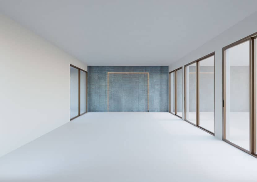 Window structures and materials in Blender.
Normally I use HDRI files to illuminate the exteriors, but in this project, I used the "new" cycles node 'sky texture'.
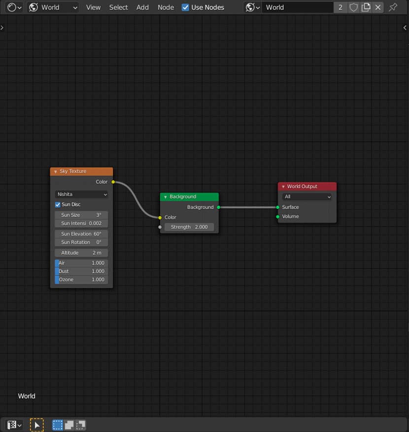 Blender's 'sky texture' node for lighting.
With the materials already applied, I can see how to affect the exterior light to the floor and walls and avoid typical mistakes like over-burning some areas.
When the exterior light is okay you can make the other objects that influence illumination, like curtains or interior light.
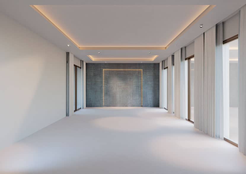 Interior lighting and illumination details.
I used area lights for the ceiling and wall LEDs and spotlights for the other lights. These spotlights are not definitive because their power and orientation will depend on the furniture.
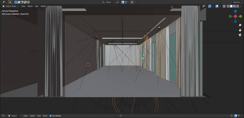 Preliminary lighting with spotlights.
Now that we have the illumination and the base materials applied, we only have to place the furniture.
The swap formats
The client delivered the furniture for our render. In the best scenario, they provide the files in the same format we work on, but I work in Blender + Cycles and there are very few companies that have their products in blend format. For this reason, I ask for swap formats like fbx. or obj. and normally I have no trouble with them but I still need to adapt the assets to my workflow and to create the materials.
Normally we can get the asset done with a few adjustments like changing the scale or moving some objects.
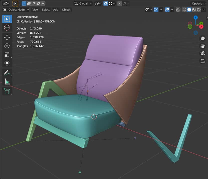 Furniture asset in swap format - the creation of materials.
In this case, this is the result of the import of the fbx. file for this armchair. I had to move the leg and delete the thread stitches. In this concrete asset, each thread stitch acts as an individual object and I didn't need this render detail, so I deleted them all.
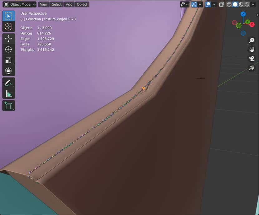 Adapting the furniture assets.
For the sofa something similar happened, just moving some objects and deleting the thread stitches gave me the final asset.
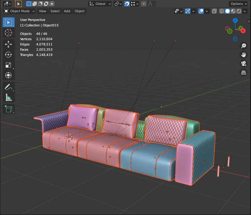 Finalizing furniture assets in an asset management addon for Blender.
For working in archviz, I especially recommend using an Asset management addon.
I have all types of models in my personal assets library, either purchased or made by me. The same goes for the materials. Whenever I make a material, I save it in my library. This way, my workflow gets faster each time. All this furniture I edited, is optimized for Blender and saved in my personal library for future works.
Finishing the project
When we have all the assets placed, it’s the moment to adjust the spotlights to focus on the furniture and make sure that it looks fine.
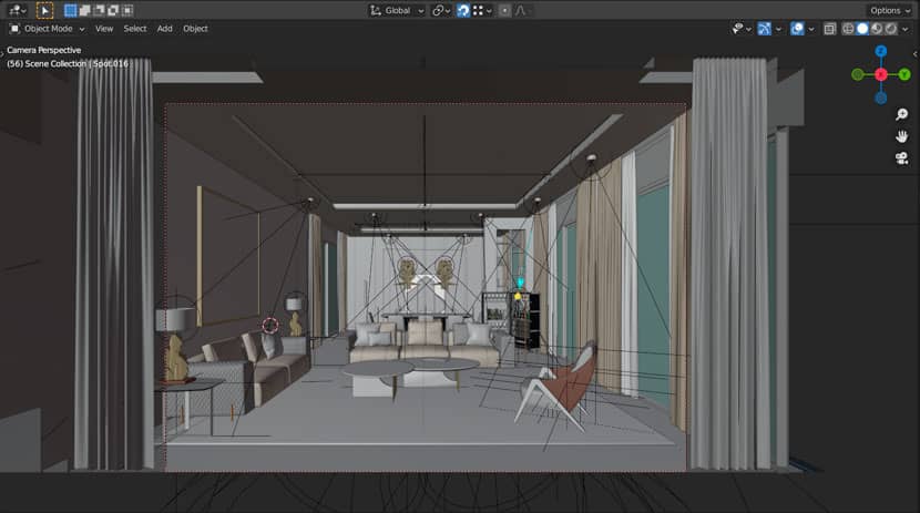 Adjusted spotlights for lighting in consideration of the furniture.
With the viewport in render mode, it's very easy to adjust the light power or rotation. At this moment and when we launch the render, is when a good computer is most valuable.
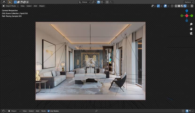 Preview of the render with viewport mode.
When it's all okay, we render a low-resolution image and then the time for "client changes" arrives.
Post-production
I want to give a little post-production tip for the Blender users.
A lot of clients ask me for the ID passe or Mesh passe. Well, in Blender we have the Cryptomatte node in composition to do this passe, but the result of this passe is an image with very similar colors for each material, object, etc. This method is very useful if you work with the Blender composition and to make a black and white mask of a determinate object or material, but our clients want the image result of the pick node output and this one does not work well in Photoshop, Affinity Photo or other image editors. To solve this, I use a very simple material, like an override material with one sample and without denoising.
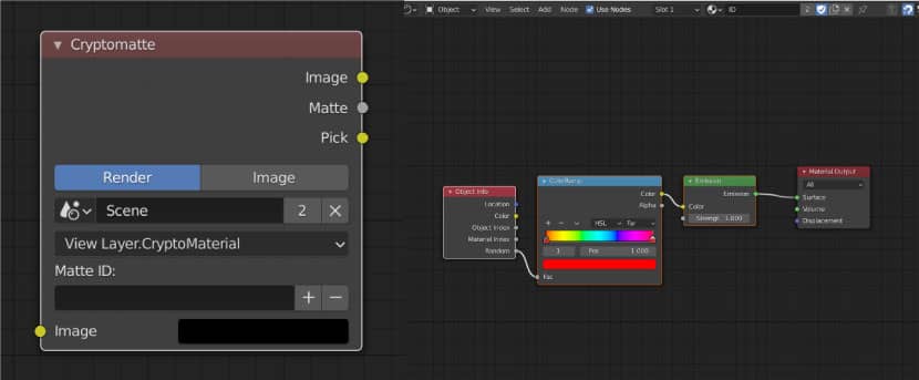 Simple material configuration.
With this simple material, I obtained a useful ID image to be used in post-production by my clients.
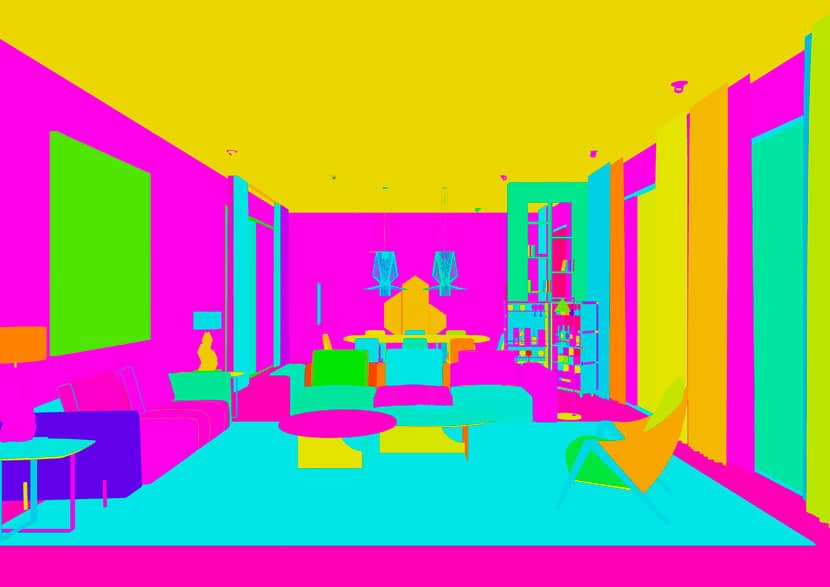 Material ID image.
After all, and with a little levels adjustment and putting a background, I get the final image.
I hope you liked the article and the final render.
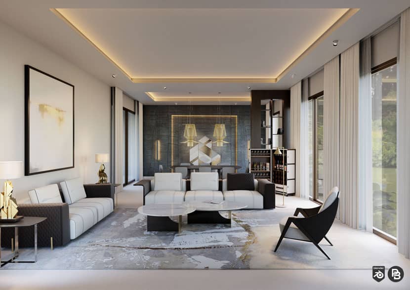 Bellagio living room, Paco Barruguer.
Thank you, Paco, for sharing your personal work and your knowledge with our Rebus community. Check out more of Paco's work on his different channels:
Want to share your work with our community too?
Contact us at Questo indirizzo email è protetto dagli spambots. È necessario abilitare JavaScript per vederlo.and tell us about your favorite project.
>> Read more articles on our blog
