Wednesday, October 20th, 2021 by Ilya Galinsky
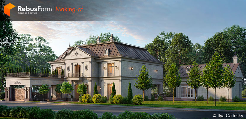
The perfect mixture of classic English architecture with just a touch of Middle Eastern aesthetics, brought to life by talented 3D artist and visualizer, Ilya Galinsky. In this Making-of edition, Ilya himself sheds some light on the process and inspiration for the 'Classic House'.
Let's dive into the story of this Russian architect and his beautiful and elegant project.
Hi, my name is Ilya Galinsky. I am an architect and 3D visualizer and I have been doing 3D visualization for over 16 years. I decided to make a 'Making-of' on the 'Classic House' project's third version. For this project, I received from the architect some drawings that were used to make the 3D model of the house, got a selection of references and the landscaping was developed by me, on all versions of this project.
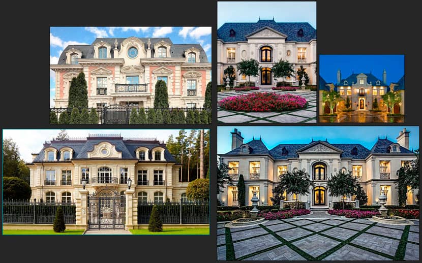 Reference images for the project.
Versions
In the first version, the house had a large area on a small plot.
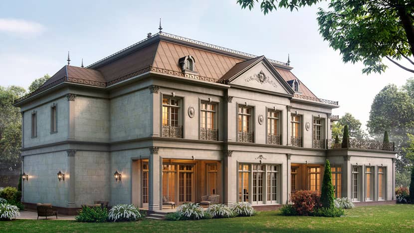 The first version of the 'Classic House'.
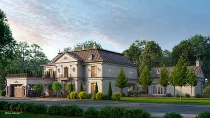
The second version was an adaptation of this house in a different environment - it was now my version of the project and I wanted to see it in a completely different environment. The initial emphasis was English architecture but with a little touch of the East, and this is what prompted me to add a bit of fairy-tale atmosphere to this second version of the project. Incidentally, this version was selected for publication in the Art of 3D Graphics exhibition in 2020.
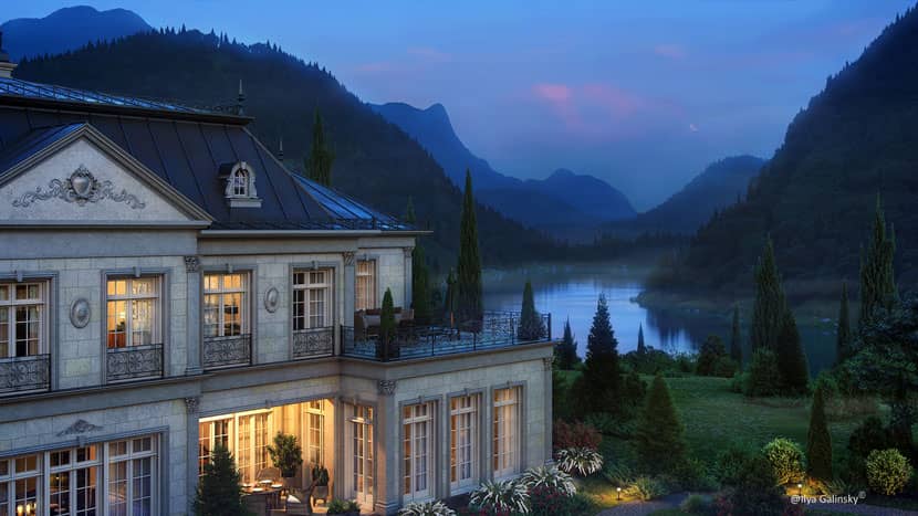 The second version of the 'Classic House'.
When I started the third version of the project, I already had a large set of references but I did not want to repeat the mood of the picture itself. The previous versions were analyzed and a compromise between the two was chosen. The architects of the house and the client himself put their complete trust in my sense of the mood of the pictures for this last version.
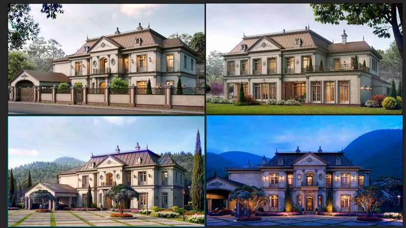 Different versions of the 'Classic House'.
Modeling
The model of the house was built in 3ds Max, from the drawings. When working with classics, there is a lot of attention to detail.
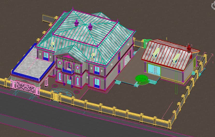 House modeling in 3ds Max.
In order for the picture itself to look 'alive', not only does the house need to be complete, but the interior also needs to be readable. This gives the picture a finishing touch.
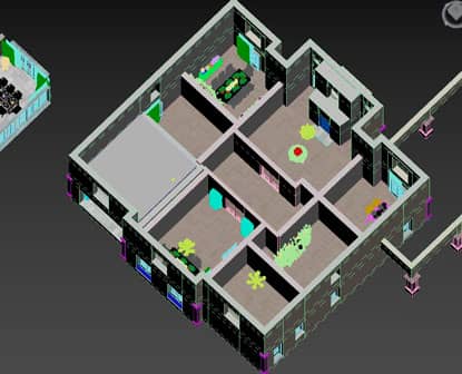 |
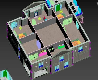 |
Interior modeling of the house.
 House modeling in 3ds Max.
Lighting and landscaping
For the lighting, I basically did this: a combination of a Corona Sun and HDRI. Here I applied, CoronaSky sun with CoronaSky.
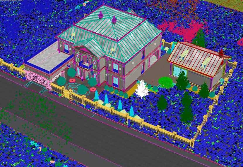 Lighting with CoronaSky.
All trees, bushes and other vegetation are translated into proxies. This makes it much easier to work with the scene in the future.
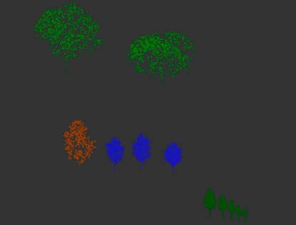 |
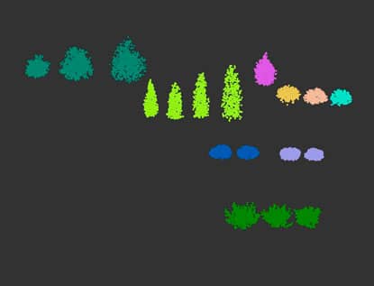 |
Vegetation proxies.
Post-production
First let's take a look at the clean rendering and the end result, after processing.
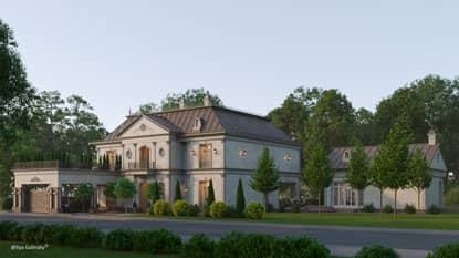 |
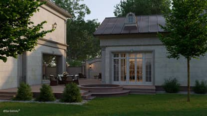 |
Clean rendering, before processing.
 |
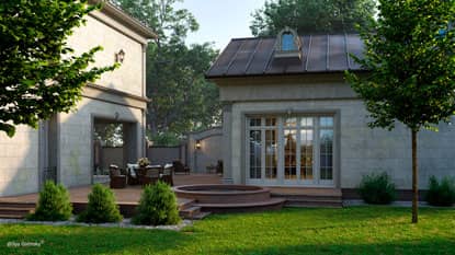 |
End result, after processing.
In order to do post-processing, I use additional render passes. The main ones are:
- CMasking_Mask - here I try to highlight facade walls, roofs, windows. For landscaping, I also apply masks, roads, paving and lawn. I also make masks for vegetation.
- CMasking_WireColor - if necessary, to select some object of the project, where I did not apply masks.
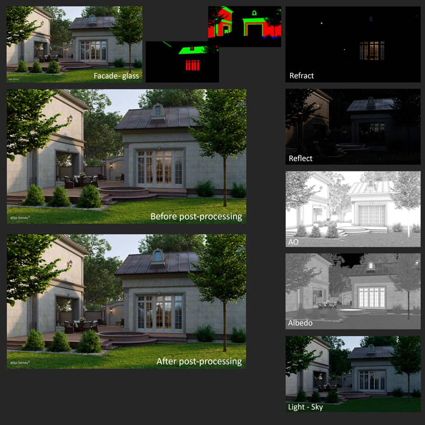
- CESSENTIAL_Refract and CESSENTIAL_Reflect masks
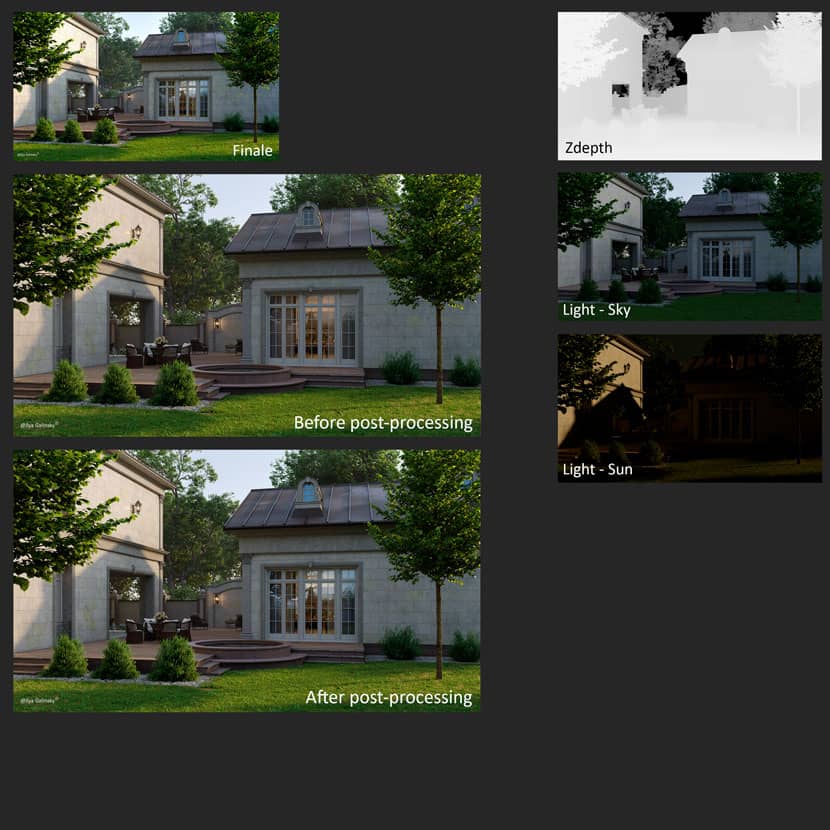
- CESSENTIAL_Volumetrics - for atmosphere, and I additionally do CGeometry_ZDepth, in order to manage the depth in post-processing.
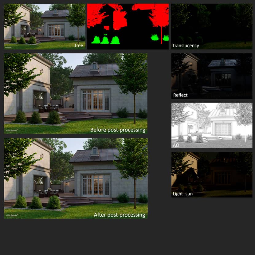
- CESSENTIAL_Translucency - for vegetation.
- CTexmap - to add AO effect.
- CShading_Light_sun - this is where the corona sun is located CShading_Light_env - this is where CoronaSky or HDRI is located.
- CShading_Light_01 - This is the pass I use for interior lighting.
In general, any light is better to be divided into groups, so that then it can be easily adjusted. Lately, I have started using the CShading_Albedo mask in post-processing. With it, you can enhance the texture of a stone facade (for example).
Now a little bit about my stages of rendering in Photoshop.
When I was still at the architecture academy, I was taught that you have to draw from the greater to the particular. I use this principle in post-processing.
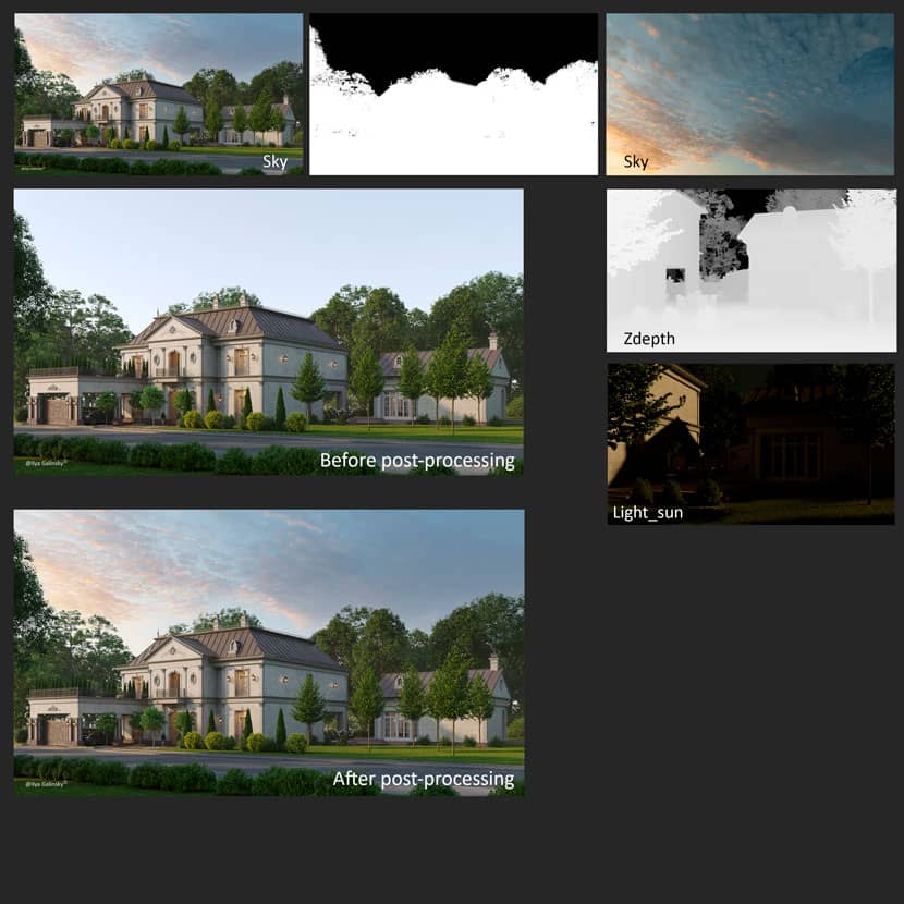
My first step is to start with large masks, in this case, the ground. I select the desired areas on the mask and start working with them. Accordingly, I use almost all the above-mentioned passes for grass, for paving and roads, all except 'Translucency'. All the passes in Photoshop are used through different overlays, these are mainly Screen, Soft_Light, Hard_light, Color_Dodge, Multiply. You can see the difference, as the grass has become juicier and more pronounced.
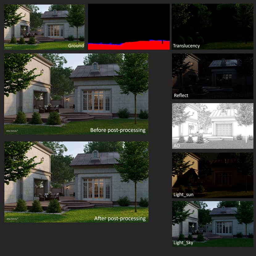
In this project, I found a suitable sky and applied it in post-processing. I've adjusted it a little bit in relation to the picture itself. I used Z-depth and Light_Sun masks to dilute the background a bit.
Once the ground and sky had been corrected, I proceeded with the vegetation. The working principle is essentially the same as with the lawn. You can see the result.
Next, I come to the façade. Here I paid more attention to the glass and the roof. The masonry itself on the façade is fine with me, I enhanced it a bit with CShading_Albedo. In each project, I try to pay special attention to the windows as they give a realistic picture. For processing, I used two masks, Reflect and Refract.
In the last stage, I add depth, atmospheric effect and you can also tweak the light.
I was now quite happy with the result. Thanks for reading. Have a good rendering!
We thank Ilya for sharing his knowledge and work with our Rebus community. Check out more of his work on his different channels:
Want to share your work with our community too?
Contact us at Questo indirizzo email è protetto dagli spambots. È necessario abilitare JavaScript per vederlo.and tell us about your favorite project.
>> Read more articles on our blog
