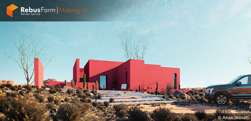
When the colors are well combined and the architecture matches the nature on which is placed, when the 3d artist is passionate about a beautiful image and he searches a lot for how to create it, then it's impossible to avoid an eye-catching creation. In this way, Anas Shinati showcases a beautiful piece in the middle of nowhere, in a virtual world where ideas can easily come to life. Enjoy the article!
About Me.
Hello, 3D artists!
I’m Anas Shinati, a Libyan architect and ArchViz specialist. I’ve been working in the Architectural visualization industry for almost a decade and I cooperate with more than 40 architectural companies in Libya for the Rendering and visualization of their designs.
Since Lumion 8 came out, I started to look forward to real-time rendering engines because they give you great results and are faster than the path tracing engines. For that reason, I've been using Lumion for more than 5 years until the revolutionary D5 render came out with improved speed and quality. I’m currently using both of them, Lumion and D5 Render, as my main render software and I can guarantee that they produce very high-quality 3D images.
Today, I'm going to share with you the making-of article of my project called: "The Canyon House".
About The Project.
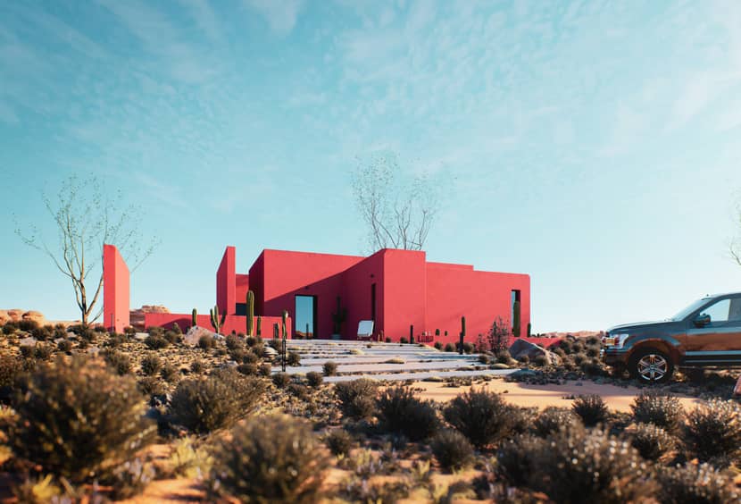
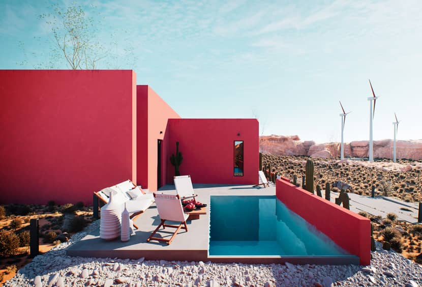
"Canyon House" is a project that reflects contrast, a contrast between the sky and the clay-colored reddish building, a contrast between the blue pool and the desert's yellow sand and dry bushes, and a contrast between the civil and country calm life.
The form is simple, clean, and minimal. It can blend and dominate the scene with its color and at the same time materials are simple, hand-applied plaster brushed with a reddish clay color, concrete slabs, concrete pool, hand painted with blue waterproof paint and the furniture is all handmade so it can represent the simplicity of country life.
Software Used.
"Canyon House" was designed and rendered in D5 Render 2.4. 3DS Max was used for editing models and then importing them to D5 Render, SketchUp for modeling the mass, Lightroom for editing raw images and some color corrections, and Photoshop for improving lighting and the addition of vignette effects.
Inspiration & References.
It is worth mentioning that this project was inspired by "La Muralla Roja". You can have a taste of this astonishing project in the following video:
I really liked the contrast between the colors of every single shot. The building and the design that is quite simple with straight lines. You can easily notice the brush marks when the wall and floor meet together, I spotted that and made it my main focus to make the images as realistic as possible.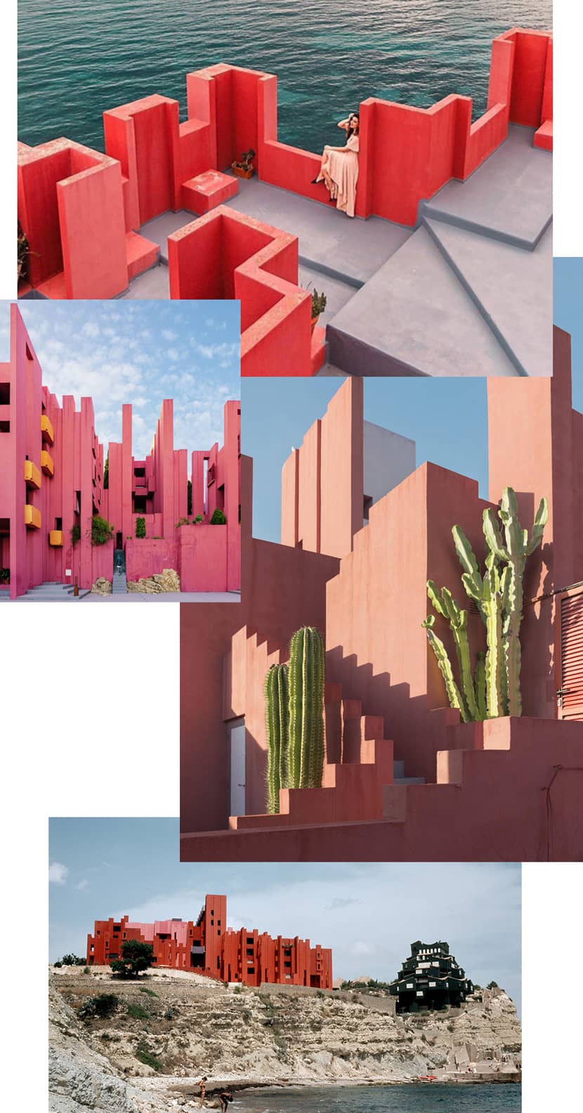
Modeling.
I always use SketchUp as my main modeling software for simple architectural forms. Sometimes, I use Sandbox to create terrain and this is what I did in this project. Below a video tutorial related to this handy tool:
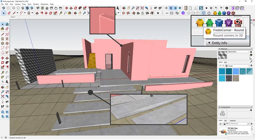
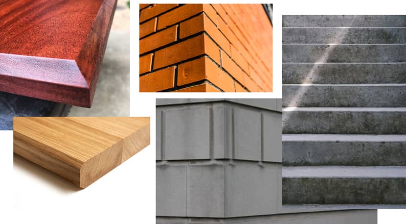
I also used a very nice addon to SketchU called "Fredo Corner" that lets you modify the edges of any object in an advanced way to get nice round edges as shown in the image below:
In the real world, there is no 100% sharp edge unless it’s a knife or a Katana! If you absorb everything around you, from furniture to buildings, you will never find a 100% sharp edge. My main goal here was to reach realism and thus I added this to my to-do list.
3D Assets.
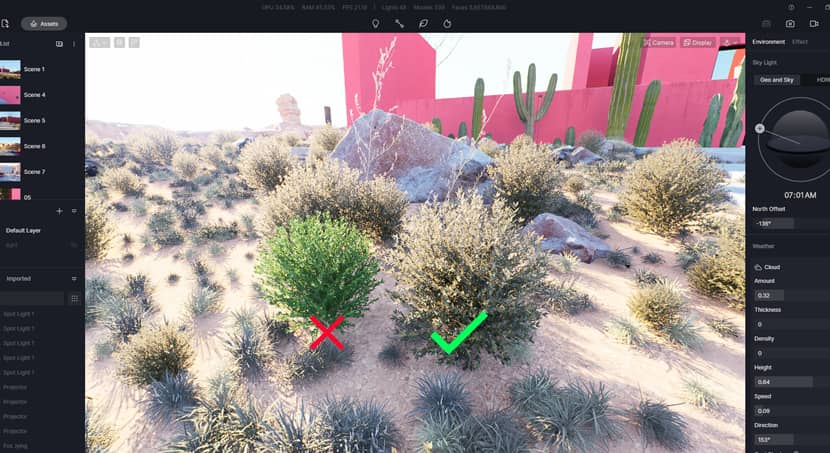
Before I start any project, I always look for inspiration and reference images. It's difficult to create something from nothing and you always need to see what stuff looks like in real life, so I started to look for canyon desert images to see what kind of bushes should I use to reach a realistic ground look.
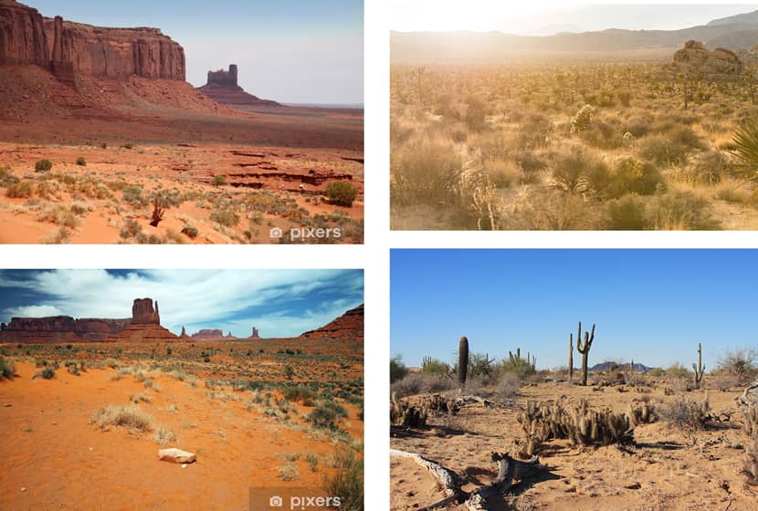
I found references for the bushes and started to look for them in the D5 asset library. If you want to know how to use the D5 asset library check this video below:
After a while, I found some but they were very bright green, thank god D5 lets you edit the models that are from the library so I edited them to make them look more dry and yellow.
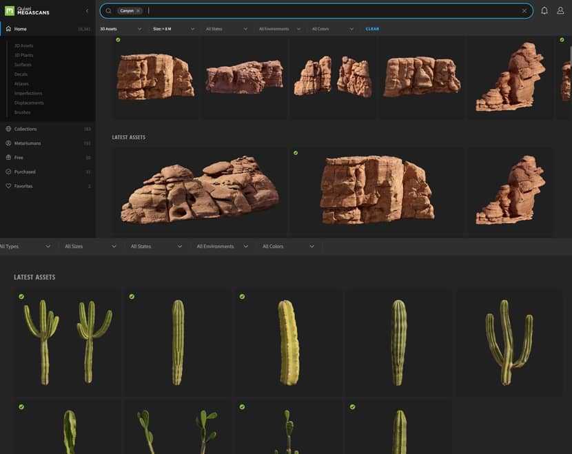
After editing the material I scattered them all around with the scatter tool and then started to build the canyon mountains. At this point, I started to use Quixel Megascans/assets for mountains and cactus.
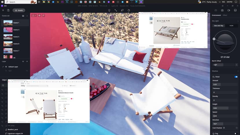
I've recently started to use EXTETA Furniture because they provide 3D models on their website, their designs are amazing and they are all handmade. I downloaded the chairs from EXTETA and found that they lacked some details, so I had to look for the detailed ones on several 3D model websites and I was lucky! I found the same models on 3DSky with high quality and fine details; I additionally found some very nice-looking vases and used them as well.
I was also looking for something "moving" just to give a scene of life and I found some wind generators and dropped them in the back of one of my shots. I animated them too in 3DS Max so they give life to the scene in the animation video.
Here is the animation for this project:
Materials.
I didn’t use any complex material, just some PBR ones with their regular known maps (Diffuse/Normal/Roughness/Displacement). Most of the materials are from Polyhaven, SketchUp Texture, Polligon and some of them are from the D5 Asset Library.
Details & Final Touches.
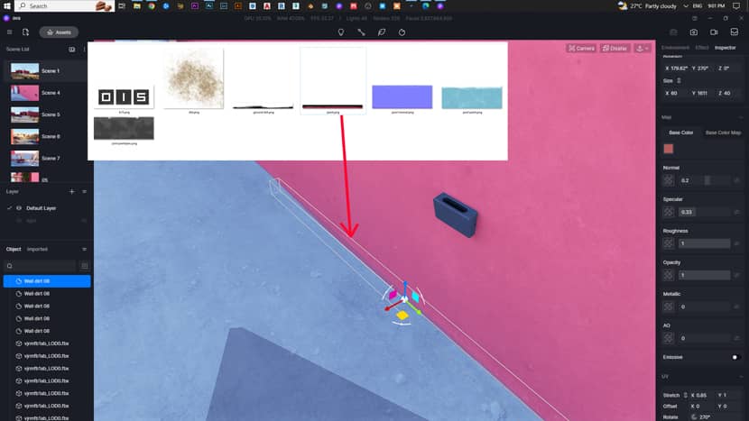
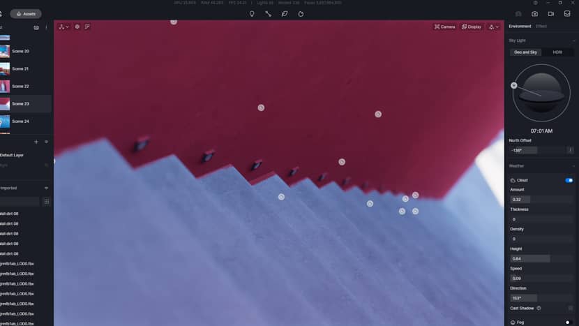
After putting all the models together I hid it all and started to paint the ground with the color of the building and I did that with decals. I used Photoshop brushes to create the brush decal and saved it as a PNG then imported it in D5 as a decal then scattered it all over the floor edges of the building.
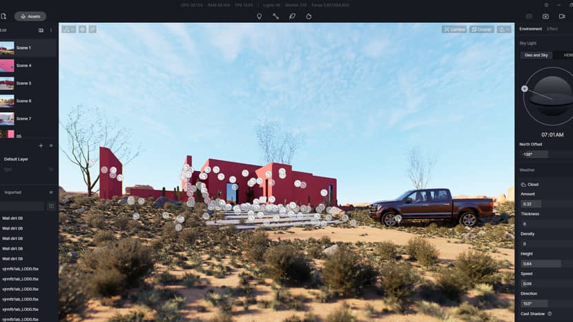
You can see how many decals I used here:
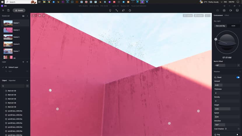
I used the decals from the D5 asset library and made a few ones by myself for the wall dirt and scattered them on the top of each wall.
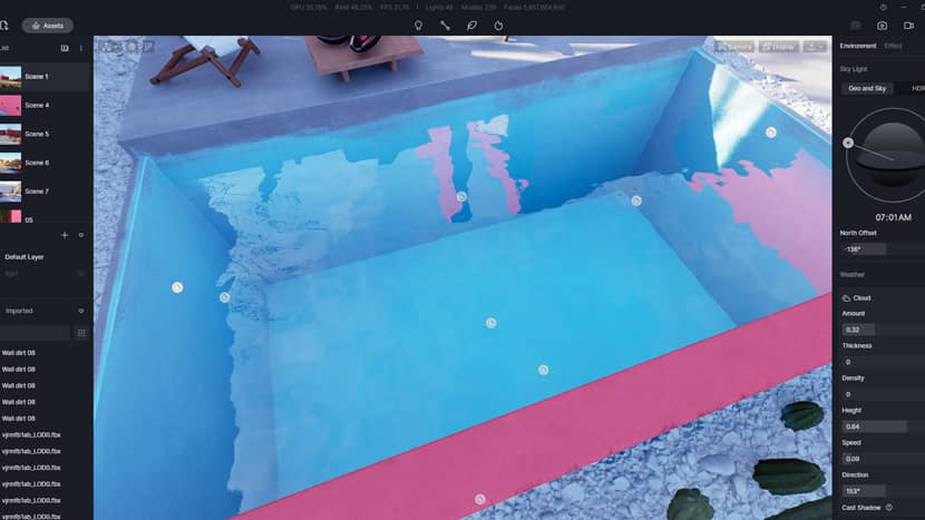
Made a custom blue brush decal for the pool with Photoshop then imported it in D5 as I did with the dirt and wall paint.
You can notice the brush splashes covering the pool and a little bit of the concrete edge that gives a more realistic look. A human can make mistakes while painting especially if he isn’t a true expert at work so I made some extreme mistakes on the stairs and I think that turned out very well looking.
Capturing Shots.
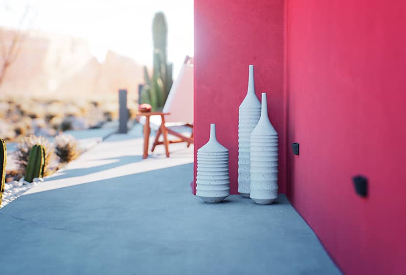
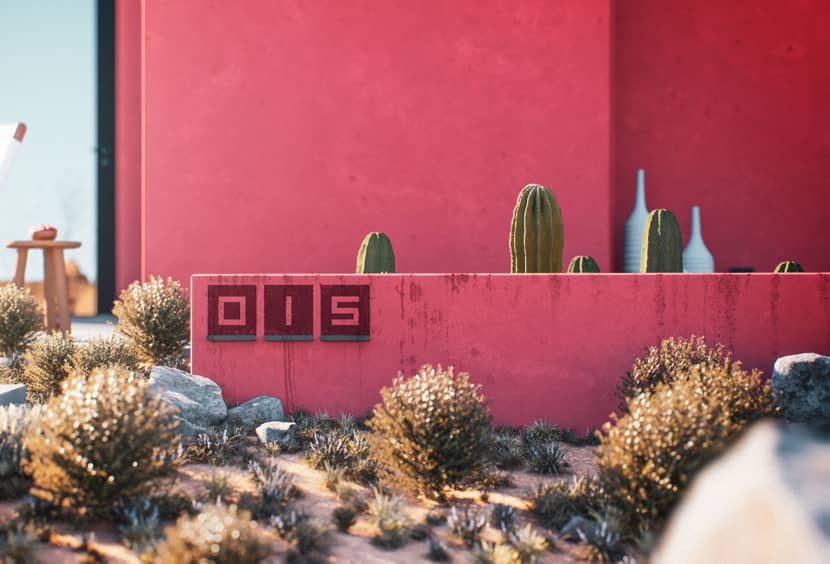
After finishing the final touches I started "shooting" the project a part of the job that I really love and enjoy. I use the rule of thirds/balance/leading lines a lot in all of my projects and believe me these three rules will never let you down.
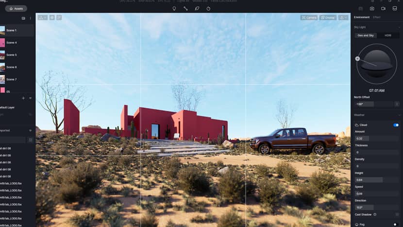
Capturing shots always gets more fun when I get close-ups. Close shots always give your project a high-quality presentation even if the object that you are focusing on isn’t that important in the design. It just works! Just don’t go far away and take a shot of a bird flying away :)
Post-Production.
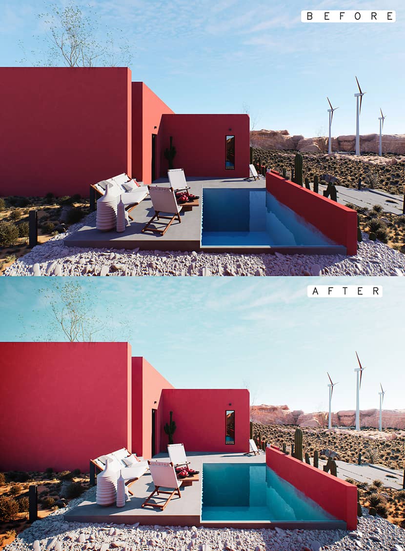
Post-processing is one of the main things that an ArchViz artist needs to master. Raw images don’t always look cool so I always use Adobe Lightroom to tweak exposure and correct some colors, brighten up some others, add more vibrance if needed, and the most important thing is grading.
Grading means that you need to make the color of this shot look harmonious like they are all in the same mood. After doing the grading by tweaking colors I always add a handmade vignette, I don’t do an edge-to-center black fade but I do it manually with a brush in Photoshop, and this way you can get a higher quality vignette than other regular vignette effects.
That's all and thanks a lot for taking the time and read my article. You can follow me through the links below!
Kind regards,
Anas Shinati.
Check more of Anas's work on these channels:
|
Want to share your work with our community too?
Contact us at Questo indirizzo email è protetto dagli spambots. È necessario abilitare JavaScript per vederlo. and tell us about your favorite project.

