Wednesday, February 23rd, 2022 by Antonio Kort
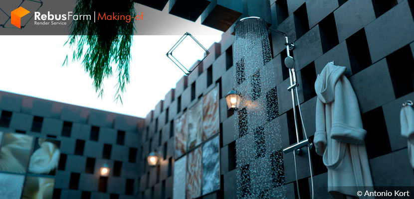
Projects that start as experiments can turn out to be your most interesting work. Antonio Kort names this project 'It was just a test', starting on the concept of building something minimalist out of cubes, ended up on a beautiful interior design for a very special bathroom without even knowing it.
Let's hear about the details of this coincidental yet perfect process.
About me and my project
My name is Antonio Kort, I started making 3D visualizations in 2003 using 3ds Max at first.
Then I was introduced to V-Ray and since 2006 I am using mostly V-Ray as my main rendering Engine. This project that I want to talk about today is made in 3ds Max and V-Ray.
As of today, I work with much more software since technology is moving so fast these days and I am trying to find the best software that helps me create my visions. My main focuses are animations and VR/Walkthrough projects so it's very important which tools I choose to create my visions.
When I create my projects I really don't think about if they can be made in the real world or not, the concept makes people think beyond reality and this can ease people's minds. That is all what this project is about and it was just a test to see how we can make an entire house made by small cubes, I didn't even know it was going to be an interior design project, I just wanted to make an environment based on a minimal cubic design and that's why the name of this project is 'It Was Just A Test'.
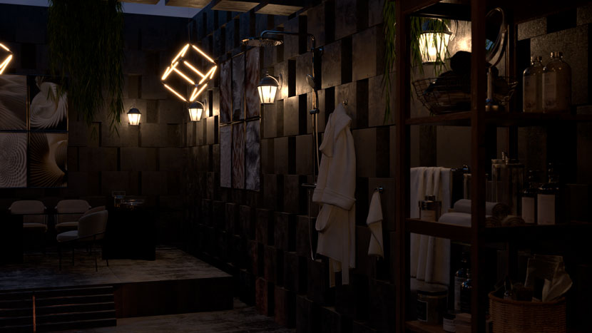
The theme color of this project is grey because I believe this color is minimal and this was a minimal design as most of my projects are, so I used furniture's fabrics and also bed sheets with different shades of grey so they could match with the walls (the main concept was the room and cubic walls).
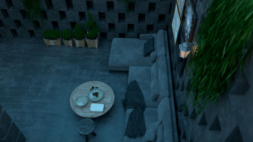
This color is challenging regarding the lighting of the scene because in rendering everything will be dark and it would be hard to show the details.
In this case, my vision was a scene without a ceiling so I first started to add sun but it didn't match the scene so I changed it to overcast lighting using an HDRI which I downloaded from Polyhaven.
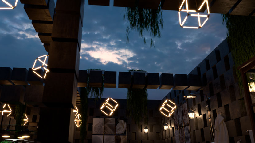
Then I decided to add other areas like a bedroom area, kitchen, shower, and dining area.
For me, adding life to projects is very important and greens are the best choices. I usually use them in my designs so I started to add some decorative grass on some cubic lines which I use to connect the walls on top of this area.
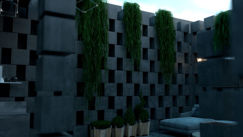
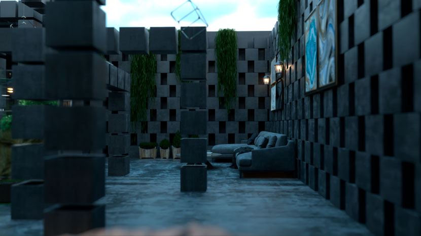
So, basically, the scene was done and I was satisfied with the result but I wanted to make another scenario of lighting which was night mode.
I knew I needed some interior lighting and I started to search for some minimal design chandeliers, so I found some pictures on Google and I started to create them in 3D and I turned the night mode on.
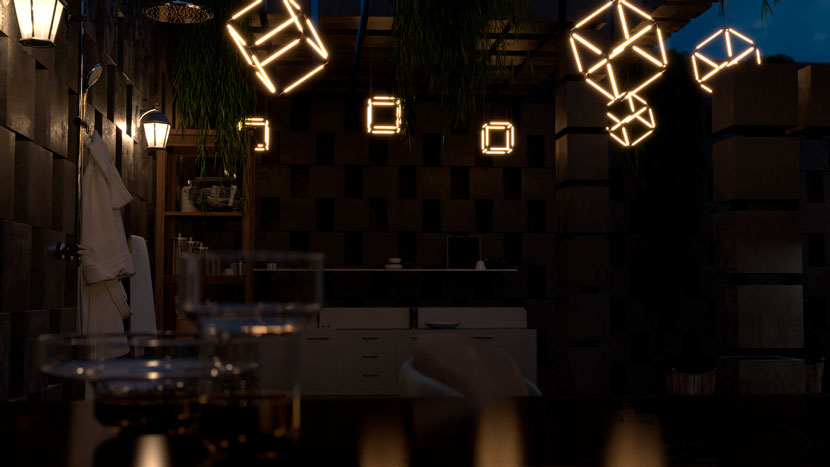
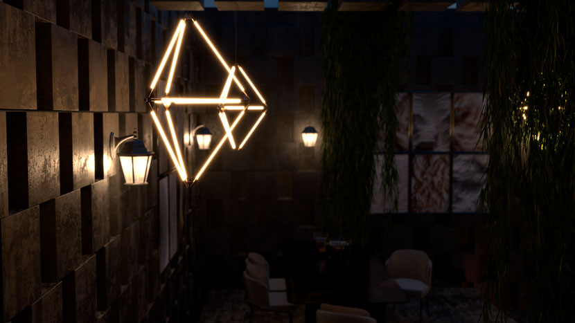
When everything was done it was time to render.
Because I wanted to create an animation, I used V-Ray GPU so I could speed it up a little. I didn't want to see a huge difference between pictures and animations so I rendered everything with V-Ray GPU.
I hope I helped you to learn something new and it can be useful in your future projects.
Don’t let reality limit your mind! Thanks to Rebus Farm for letting me share this story with you guys.
Thank you, Antonio, for sharing your project and your knowledge with our Rebus community. Check out more of Antonio's work on his different channels:
Want to share your work with our community too?
Contact us at このメールアドレスはスパムボットから保護されています。閲覧するにはJavaScriptを有効にする必要があります。and tell us about your favorite project.
>> Read more articles on our blog
