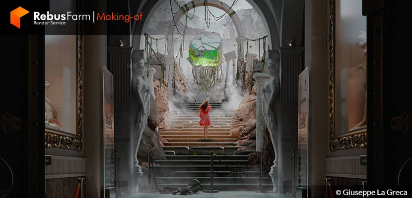
Giuseppe La Greca, an Italian 3D artist with almost 20 years of experience in CG Arts uses a pretty nice narrative discourse to explain to us how he feels and thinks while working on personal storytelling projects.
About me.
Hello everybody!
I am Giuseppe La Greca, an Italian construction engineer - architect, and 3D Artist.
Before telling you about me, I would like to thank Rebusfarm and VWArtclub for the great opportunity to present my work to some of the biggest communities worldwide.
Now a constant reference for me. We all know that in every great love there is always a beginning and in my case, this is the one with 3D Computer Graphics, which began in the 90s, on the desk of the school laboratory, when in Italy there was 56k internet!
Today, I can say that it is a boundless love that I cannot live without it. My career, with over 18 years of experience and together with the development of private works in the fields of architectural and product visualization, ranges from teaching positions, thesis co-supervisor, and technical/artistic manager of VR projects, making Computer 3D Graphics my current job.
Concept & References.
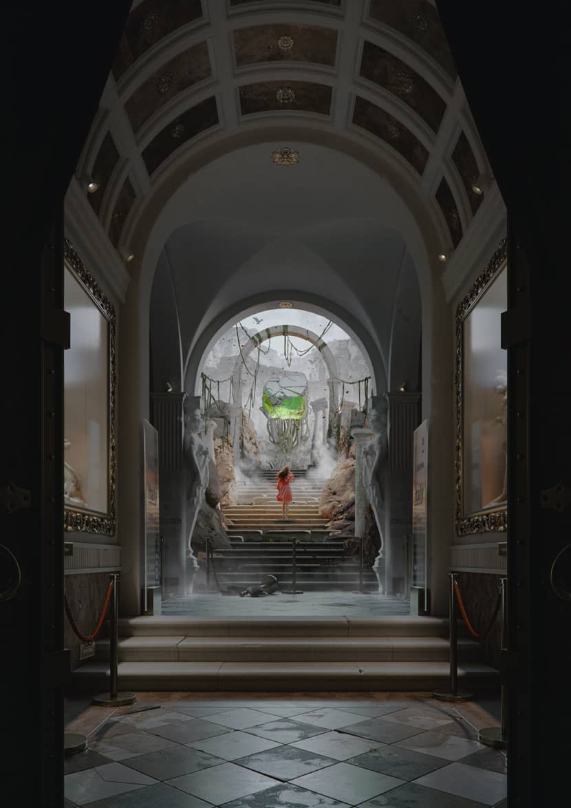
I have always been fascinated by the soul of beautiful and obsolete things, as well as by the irresistible way they use to speak to us through their shapes. I find in them a very powerful narrative power and for this reason, when I try to represent something similar, what actually seemed simple turns out to be more complex than expected. In these 2 months of work, it was interesting to find the right balance between elements, colors, lights, and narrative power.
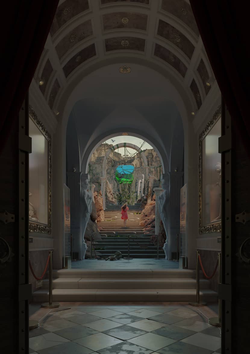
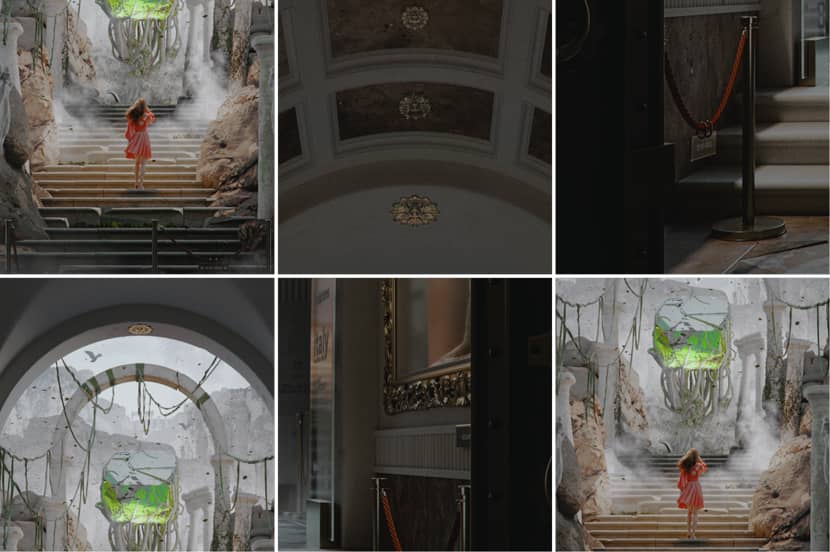
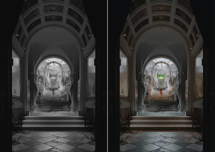
The idea came to me in a moment of introspection, when I was meditating on the common circumstance in which we are focused on pursuing a dream or a project but remain blocked/conditioned by the binary of imposition and rules. I wanted to represent this idea by making architectural visualization the dominant element of the scene, in its elegance and sobriety, while remaining faithful to the idea of creating an almost fantastic scenario, obsolete but in harmony with a modern-day environment: a museum.
They are wonderful places that enclose the deafening silence of art but which, for obvious organizational needs, determine what the user can visit or not, in some cases through barriers. Right there, in those places that cannot be visited, is the beating heart of the project. The woman's willingness to cross the barrier and climb the stairs to reach the gem embedded in the branches of the tree perfectly represents the concept of chasing one's dreams, breaking the rules of imposition.
Despite clear ideas, I make extensive use of references in all my projects. They help me anticipate strategies and mistakes, as well as reshape the composition of my initial idea. The reference, in addition to having the sole purpose of helping me understand if the idea works, allows me to have a preview of the emotional impact.
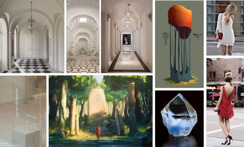
I like to mix, in a single table and with an intelligent organization, the references in their themes: lights, color palettes, environments, and shapes. I wanted a sober museum setting, a woman walking flashy stairs, and an almost dramatic/nostalgic mood.
Framing & Perspective.
Through the sketch, I immediately define the image format and the perspective. Establishing limits and compositional guides to control randomness is essential. In this case, the vertical format gives me just the right amount of elements to show and the central perspective works masterfully. The focus is on the gem that lies undisturbed in a museum place.
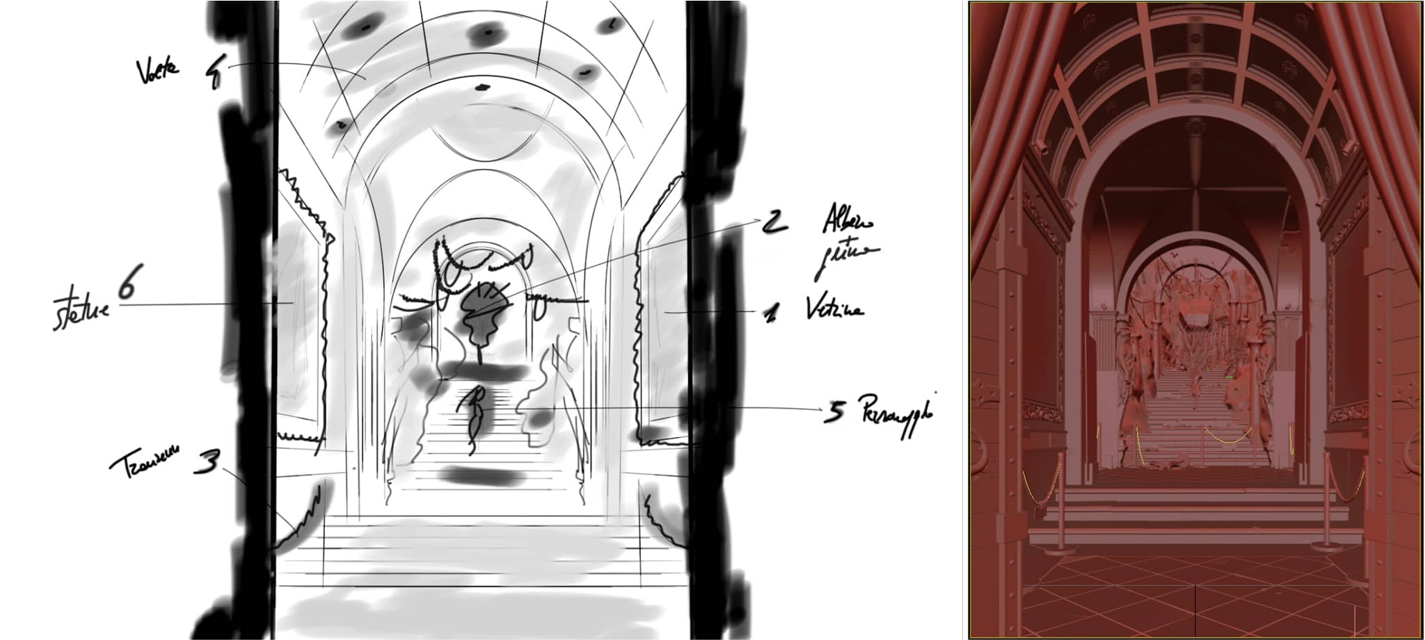 Click On The Image To Maximize it.
Modeling.
"Detail" means "quality" and I don't discount with modeling. It is well known that 50% of the quality of a rendering is given precisely by modeling. It ensures that the light (excluding the physical component of the materials) bounces perfectly so as to accurately return the shapes of the elements. Everything that the human eye can perceive must therefore be modeled with care. Almost all models in Quadpoly except for the elements can be developed without this type of modeling as they are distant and show little detail.
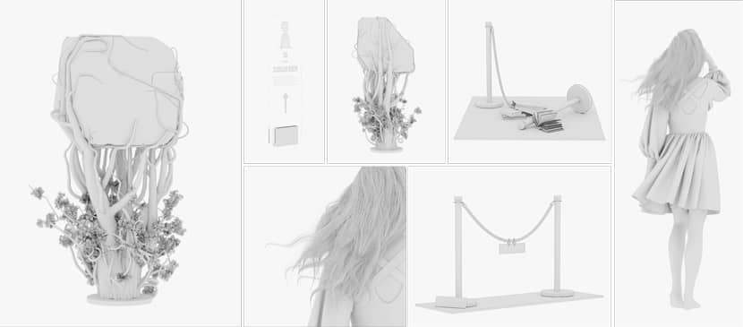
In this phase, I used Blender (for the gem and to damage certain objects in the scene) and 3DS Max for everything else. For the natural environment, I made extensive use of Quixel Megascans bookcases (columns, mountains) while for the simulation of the dress I used Marvelous Designer, using a "wind" component to give dynamism to the scene. Check out the video below:
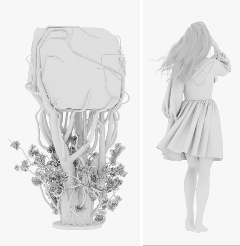
The tree was created with SpeedTree, inserting the bud as an attracting element on which the branches have been magnetized. This is a fast and nice official tutorial from which you can learn a lot:
Lighting.
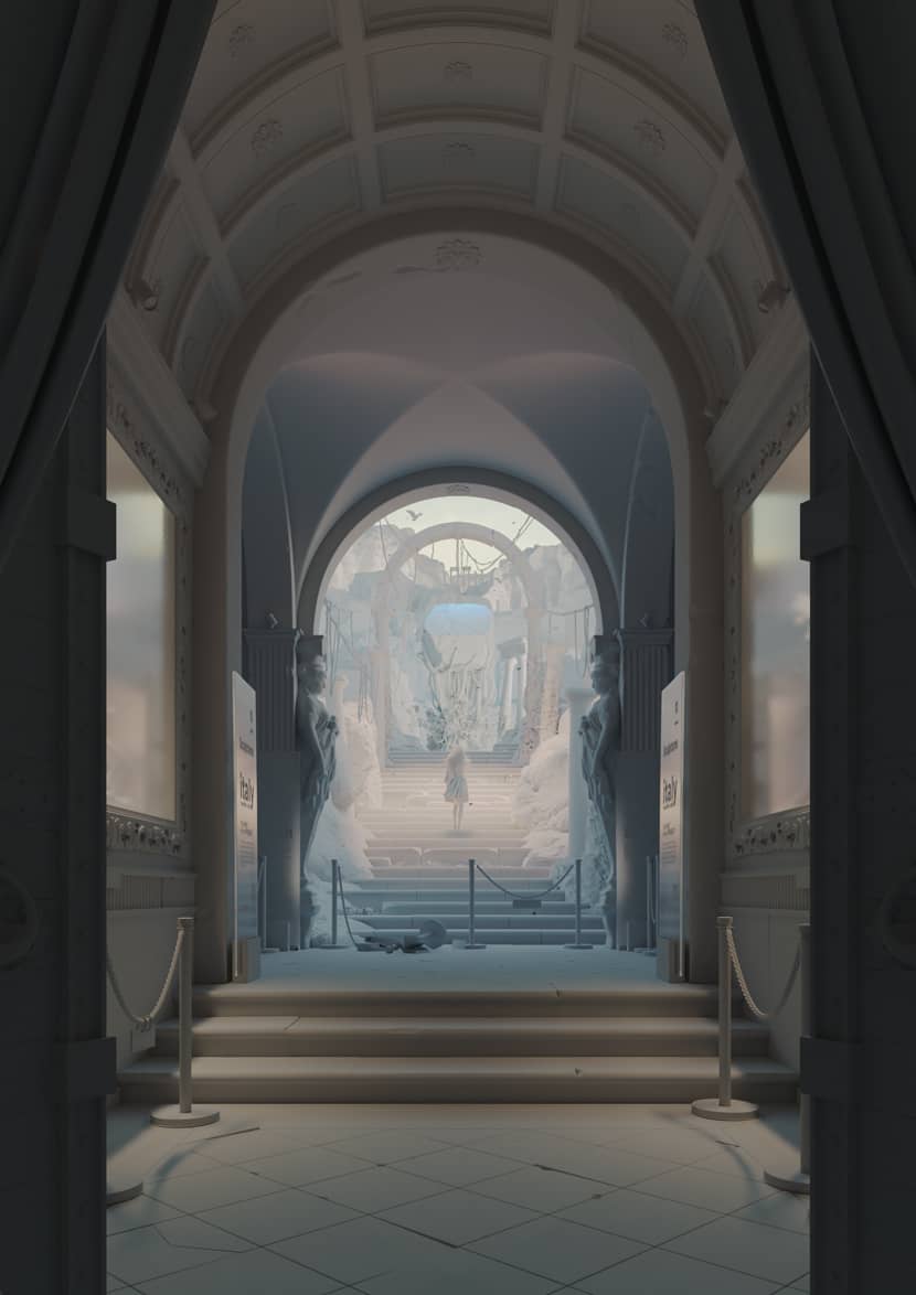
I always find it difficult to express the importance of light and its role in defining the emotions of the scene. Respecting natural lighting guarantees a realistic result but very often the key elements are not emphasized. It is therefore necessary to insert additional lights (sparingly) to better express the narrative power of the scene. Depending on the case, I develop the lighting of the scene twice: the first set by balancing the lights without materials (gray) to adjust the depth of the spaces and the play of lights. A second adjustment with the materials to regulate and control the material component and its reflections. In detail, The Refuge of Limits is illuminated by a dome light with an HDRI map, two rectangular lights in the windows, and a square light near the character. For the rendering I used Vray.
Materials.
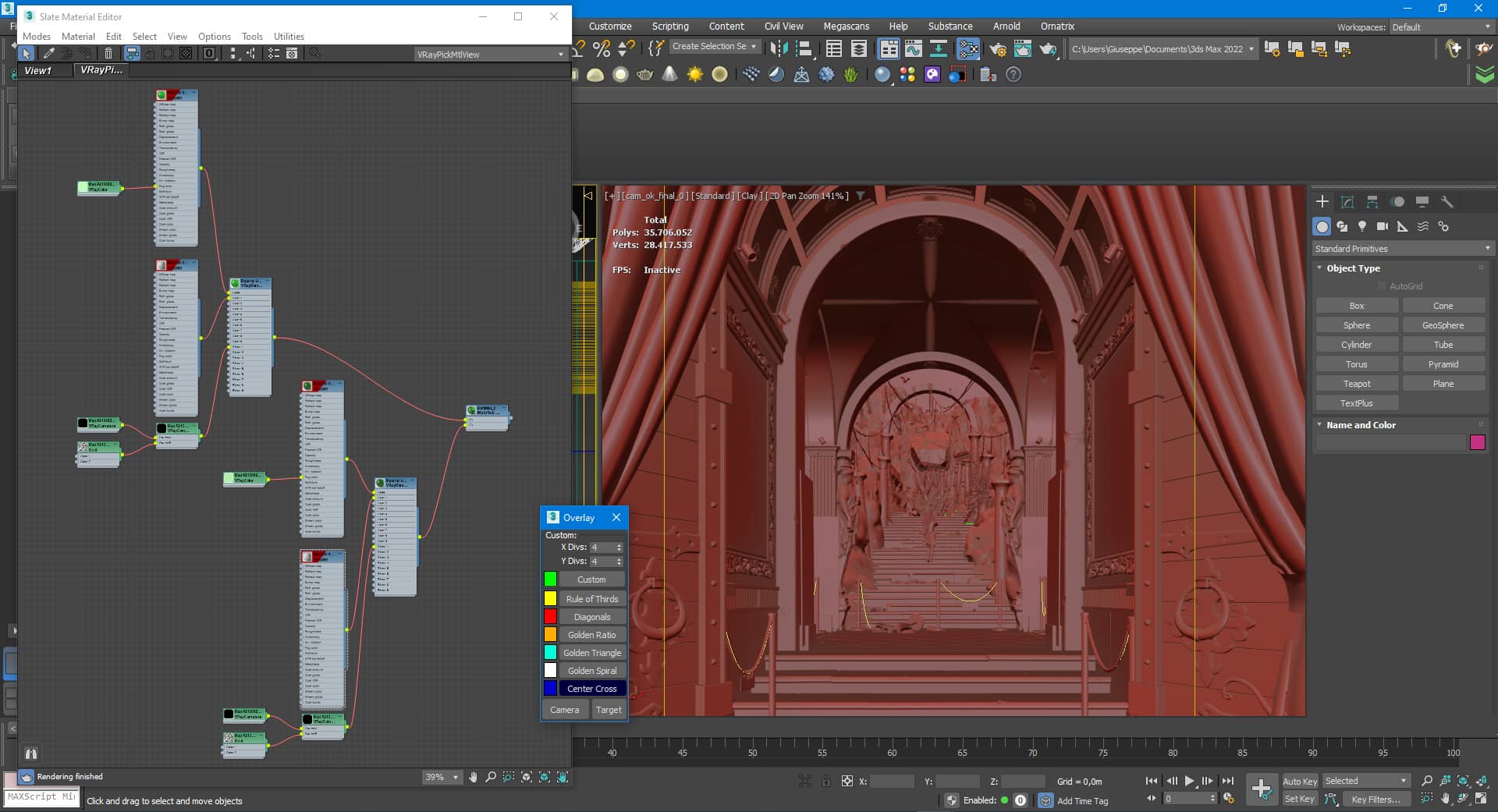
In the study of colors, I set my choices on what the eye should immediately perceive. As the gem is the key element and the character is the element connected to it, I chose Green (main color), Red (complementary color), and Brown / Yellow / White for the whole scene. The result is a harmonious play of colors with a direct narrative power that guides the eye to the elements: gem-character-environment. The physical development of the shader has a very simple but articulated structure as it mixes the dirt with the material through a “VrayCurvature” map. Here is the gem material.
 Click On The Image To Maximize it.
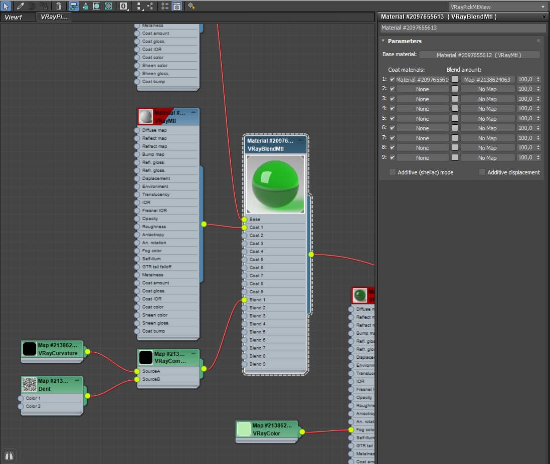 <Click On The Image To Maximize it.
Rendering.
Here are the settings used to render the image.
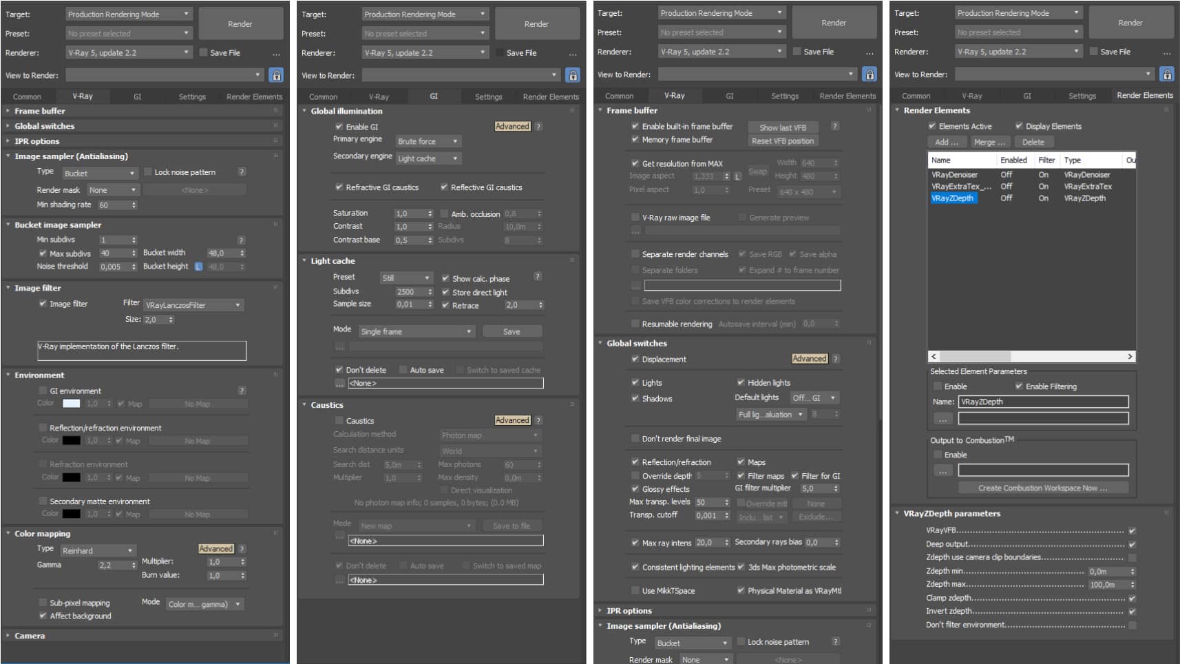 Click On The Image To Maximize it.
The raw render has no fog and no depth of field. This step was designed to be developed in post-processing by using the Z-depth channel. The detail has been increased by overlapping the ambient occlusion channel.
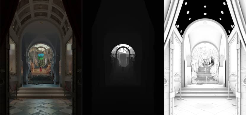
Post-Production.
The development of post-processing, especially in these projects that have a lot of shadows, took longer than usual and has developed from white balance, tonal correction, depth of field adjustment, fog insertion, color grading, and finally to the sharpness of the image.
That's all! I hope that you enjoyed my article and it was a bit useful and informative for you! I'm always open to any possible questions you might have. Just connect with me using the links below!
Sincerely,
Giuseppe La Greca.
Check more of Giuseppe's work on these channels:
Want to share your work with our community too?
Contact us at このメールアドレスはスパムボットから保護されています。閲覧するにはJavaScriptを有効にする必要があります。 and tell us about your favorite project.
Get started with your own renderings
