Friday, April 16th, 2021 by Julian Karsunky
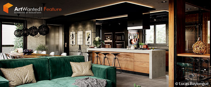
Life takes unexpected turns, and sometimes, what initially appears to be a setback turns out to be a blessing in disguise. When Brazilian archviz artist Lucas Baylongue was temporarily out of work during the pandemic, he used the opportunity to rebuild his entire portfolio from scratch, returning to years-old projects in the process. Encouraged by the feedback of his peers and his own sense of improvement, he now stands determined to kickstart his long-lasting dream of establishing his own studio.
In our interview, Lucas discusses his love for details, plans for the future and the difference between exterior and interior scenes.
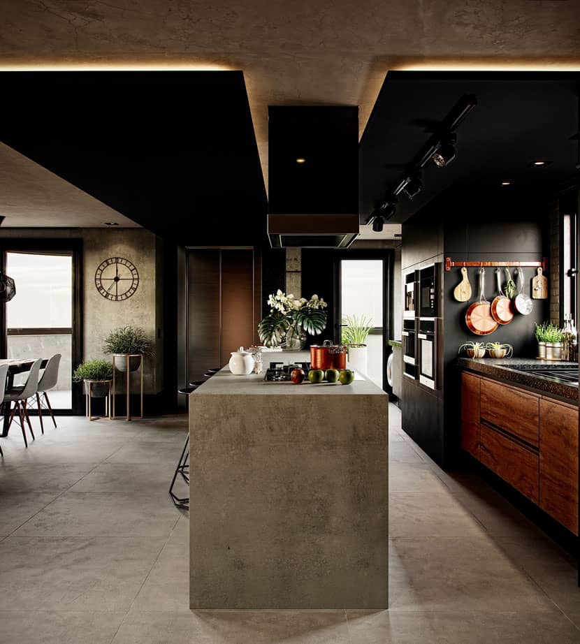 The reimagining of a reimagining: As part of his reworked portfolio, Lucas returned to this ‘Cozy Loft’, originally inspired by a design of Leonardo Ciotta.
Hi Lucas, thanks for joining us today. Please introduce yourself to our readers!
My name is Lucas Baylongue, I am a 25-year-old Brazilian 3D artist with a passion for archviz. Currently, I’m working on my dream of breaking into the industry with my own studio.
Starting at the beginning, when and why did you decide to pursue a career as a 3D artist?
Well, I was properly introduced to the world of archviz at the age of 17, when a civil engineer and friend of the family recommended that I take a course in 3D architecture. As it turned out, this perfectly aligned with my interests, as I had already been drawing buildings and houses ever since I was a child. In later years, I had a lot of fun with various 3D building games. Soon after discovering 3ds max, I knew this was what I wanted to do.
What training or education do you have?
Over the years, I have completed numerous in-depth online courses from learning platforms such as Cadritech, LearnVray, Rendermind, Vinametal Archvanish, and VrayGuide. I very much enjoy studying new and different techniques and hope to take SOA Academy's archviz masterclass eventually.
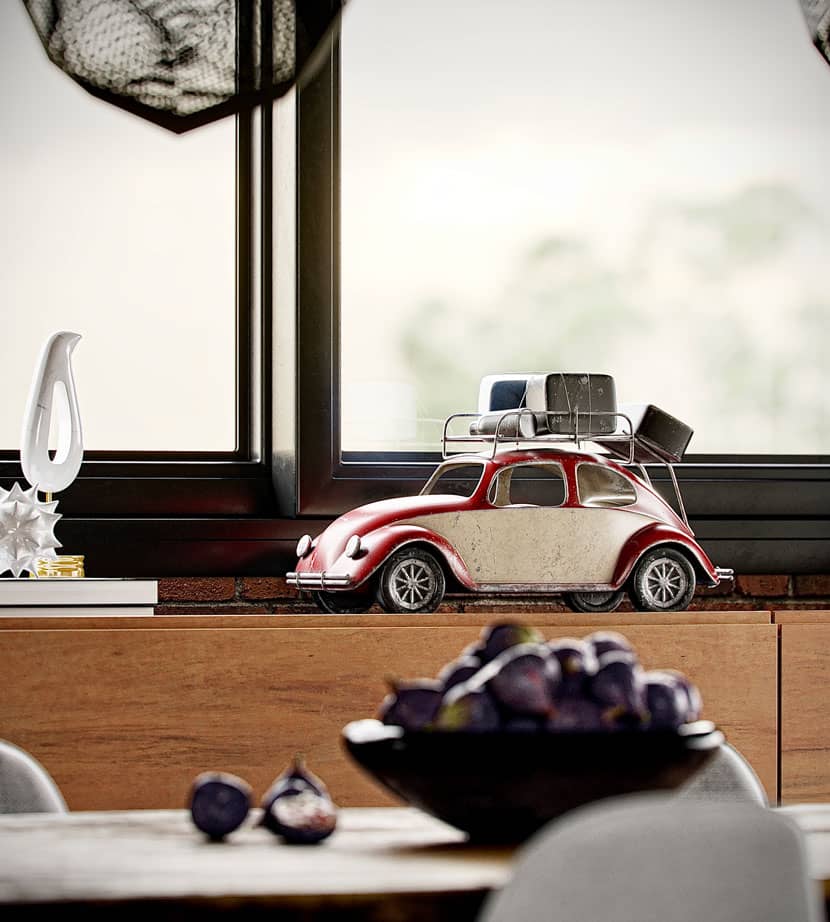 The devil is in the details? Thankfully, Lucas provided plenty of close-up shots for us to inspect every nook and cranny of his ‘Cozy Loft’.
Please tell us about your current job situation.
For these last four years, I have been working for a major studio that serves some of the biggest construction companies in the country. Unfortunately, I was out of work for a while due to the pandemic, but I tried to make the best of the situation and used the time to continue my studies, hone my skills and prepare for the launch of my own studio.
You are referring to ArtViz Studio, right? What can you tell us about this business endeavor of yours?
ArtViz Studio, yes! The idea of establishing my own company actually dates all the way back to the days of my first architectural rendering, and now, after all these years of working in the industry, I feel I have what it takes to finally make it a reality!
ArtViz Studio aims to provide illustrative imagery, animation and 360° tours for real estate launches. Our philosophy is to lend quality to each project that goes beyond a simple showcase of the architecture itself – we want our work to tell stories and evoke feelings. Our goal is to be part of reeducating the market to recognize and favor strong concepts and excellency.
Since I made the decision to seriously pursue the studio idea in the middle of last year, I have spent a lot of time building a suitable portfolio, which includes reworking most of my previous works. Meanwhile, my partner is taking care of business administration and working towards acquiring clients.
Describe your profile as a 3D artist and your general approach to architectural visualization.
My artistic vision is firmly rooted in hyperrealism - I want every image to look like a photograph! Throughout my entire life, I’ve always aimed to achieve a level of immersion that draws the viewer in and elicits an emotional response; my current work in 3D is just a continuation of an approach that can be traced back to my pencil drawings.
Since I enjoy losing myself in the details – and the details of the details – my strongest points are in lighting, detailing and texturing. Vegetation is one of my favorite subjects in all of CGI, which is why I like exteriors so much. There’s just something very special in lighting a scene which unites architecture and nature in perfect harmony!
Is there a specific design philosophy or school of thought you adhere to? What inspires you as a 3D artist?
Hard to say, I like the modern, minimalist and realistic styles. Among the professionals I really appreciate are Adán Martín, Ander Alencar, Vasilis Koutlis, and Ciro Sanaino. I'm a big fan of SOA Academy too, a dream of mine would be to teach my own masterclass there one day!
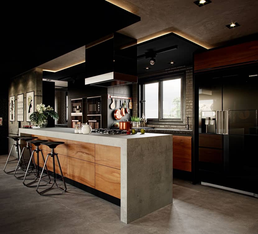 The kitchen area emphasizes Lucas' use of contrasting colors and materials.
Let’s talk about your work in more detail, starting with the ‘Cozy Loft’ you submitted to our campaign. Please tell us all about the scene and the origin of the project!
This scene is a reinterpretation of a personal project of mine from about five years ago, it is part of my reworked portfolio. The ‘Cozy Loft’ is based on a project titled ‘Apartamento GZT’ by Leonardo Ciotta Arquitetura, which I came upon ArchDaily at the time. I really liked the general aesthetic and wanted to put my own spin on it, so I just did the architecture accordingly and adapted the interior design to my taste.
My main goal with this project in particular was to impress with the details, I ended up working the materials a lot. I used soft lights to highlight the contrast between light and dark tones, looking to strike a balance that was most pleasing to the eye. The kitchen is my favorite part, the design and lighting came out exactly as I wanted!
Of course, I wanted the scene to look as realistic as possible. It took me around two weeks to complete the project, although with more than 20 cameras in place, the render process by itself took around 40 hours. However, time was of no concern to me, thanks to the pandemic.
Can you briefly walk us through the production process step by step?
As with most of my projects, my workflow looked as follows: modeling -> references -> composition and camera -> lighting -> texturing -> humanization and detailing -> rendering, and finally post-production.
Talking software, I mostly used 3ds Max, Corona Renderer, Forest Pack, and Photoshop.
What is something that you have learned from this project that you can share with us?
The importance of lighting references: instead of simply eyeballing the lighting, I based it on a reference and carefully adjusted the settings accordingly, which made all the difference. Furthermore, I was quite impressed how much having complex materials affected the scene.
What has the feedback been like and how satisfied are you with the results yourself?
Not only has the feedback been amazing, but it also had an immediate and tangible impact on my career in the form of multiple work proposals and many new opportunities – it was unlike anything I experienced before! To be honest, the quality I managed to achieve even surprised myself. The overwhelmingly positive response to the project ultimately encouraged me to take the next step and work towards establishing my own studio.
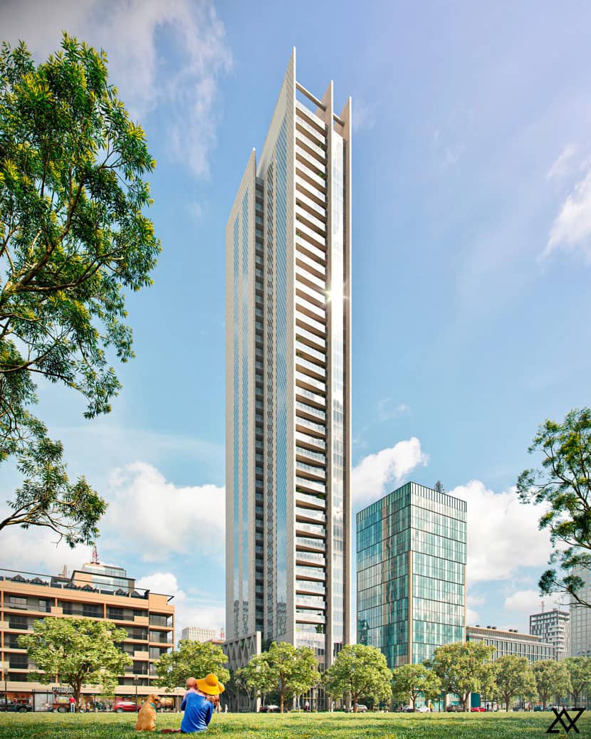 Lucas Baylongue, ‘Treasure Garden’.
Another project of yours you finished just in time for this interview is ‘Treasure Garden’. What can you tell us about this most recent work of yours?
As with ‘Cozy Loft’, ‘Treasure Garden’ is a new and improved version of an older project. The inspiration once again came from ArchDaily and is based on a residential skyscraper in Taiwan, designed by architects Antonio Citterio and Patricia Viel. For the purpose of my portfolio, this set of images serves to highlight my artistic vision when applied to commercial contexts.
Your portfolio contains both interiors and exteriors. How different are the skill sets required to design a building from the outside versus its interior?
I’d say the biggest differences are lighting and attention to detail. While details are often lost with exteriors due to the distance from the observer, for interiors, they are crucial to achieve any sense of realism. With lighting, it obviously depends on the setting a lot, but again, interiors usually pose a different challenge, as they tend to require a perfect blend of natural and artificial lighting.
Do you have a personal preference?
Although I prefer exteriors, this interior ended up being one of my best images. Generally speaking, I really like images with soft and elegant lights, especially daytime settings.
Please tell us about your previous experience using RebusFarm! Is there anything you especially like about our service?
This project was my first time using RebusFarm, though it certainly won’t be the last, as I plan to make regular use of your service for my company. I especially liked the ease of use and the technical support was exceptionally attentive, friendly and helpful at all times. In fact, the quality of the technical support alone is reason enough for me to keep rendering through RebusFarm!
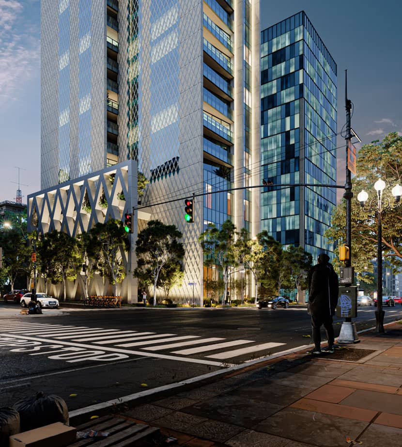 “A perfect blend of natural and artificial lighting”: this shot of the base of the building is set at twilight.
In closing, is there anything else you want to say? Any present or upcoming projects you’d like to mention?
First, I want to thank RebusFarm for giving me this opportunity to talk about me and my work – this sort of recognition means a lot to me! As I’ve mentioned before, a while back I made the decision to rebuild my entire portfolio from scratch, so right now I am working on a set of images.
Lucas, thank you so much for taking the time and all the best in the future!
Keep up with Lucas Baylongue and his work here:
How to join ArtWanted!
You want to get featured in our ArtWanted! campaign and win 250 RenderPoints on top? Submit your work, rendered at RebusFarm, to 이 이메일 주소가 스팸봇으로부터 보호됩니다. 확인하려면 자바스크립트 활성화가 필요합니다.! Visit our Art Wanted! page for more information.
>> Read more articles on our blog
