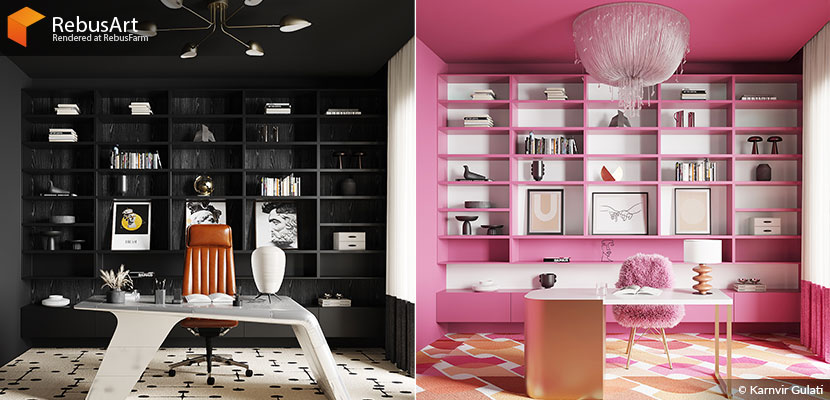
“Show me your room, and I’ll tell you who you are.” As a potent visual language, interior design can be used to effectively communicate any number of concepts and idea – a fact that we at the Rebus render farm are only too familiar with, thanks to the limitless creativity of our wonderful community! Still, when our old friend Karnvir Gulati reached out to us and presented his latest project, we were amazed: demonstrating a profound understanding of compositing and visual identity, the Indian 3D artist has created a faithful archviz representation of the viral sensation that was ‘Barbenheimer’.
Continue reading to learn more about how Karnvir manifested two distinct movie aesthetics within a single interior space.
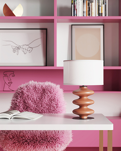
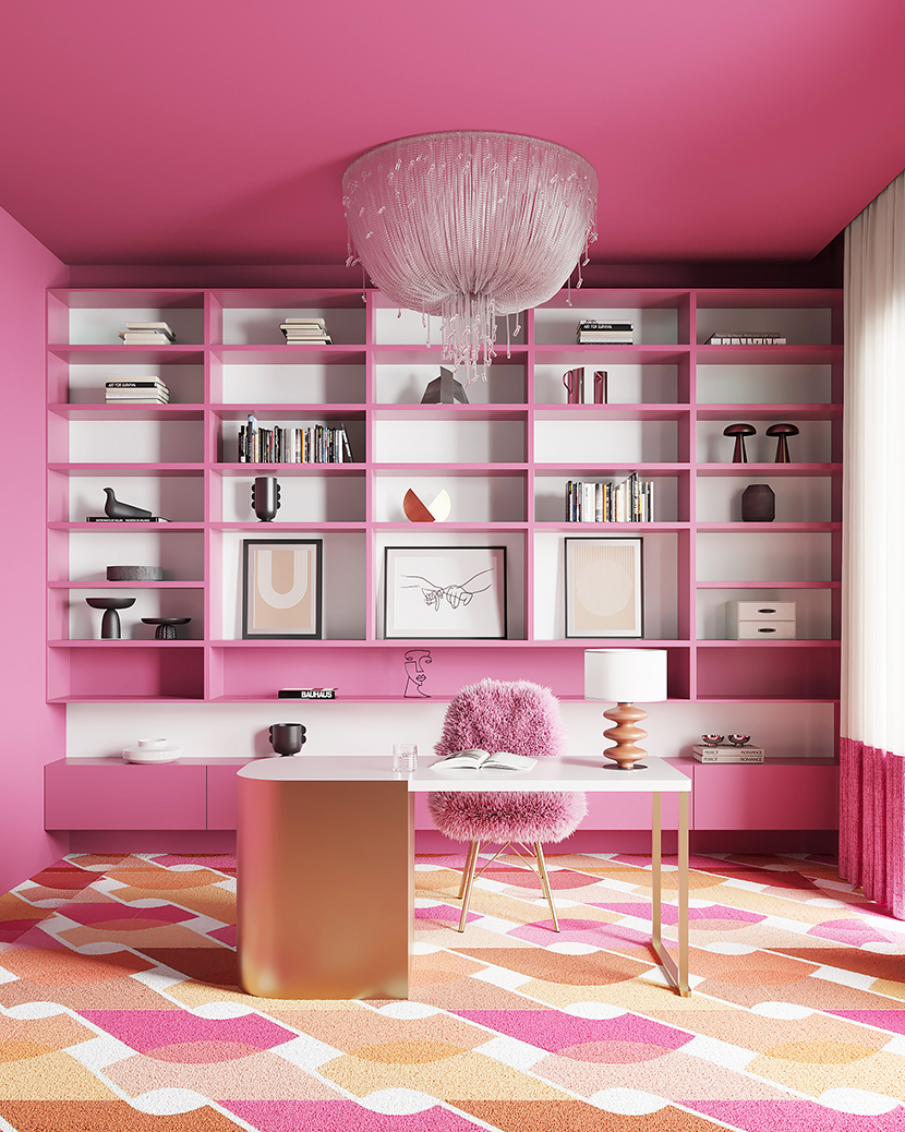 One interior, two scenes: this Barbie-themed office space is more than pretty in pink.
Hi Karnvir, and welcome back! For everybody who might have missed our previous feature, would you kindly introduce yourself once more?
Hi everyone, I am Karnvir Gulati, a 27-year-old architect and archviz artist form New Delhi, India. I am a freelance architect and architectural visualizer.
What have you been up to since the last time we spoke in December 2022?
I have been mostly focusing on my freelance work and brushing up on as well as expanding my skills. Lately I have been trying my hands on animation.
Without further ado, let us talk about your recent submission to our campaign, a two-piece office interior inspired by “Barbenheimer”, a playful amalgamation of the two biggest blockbuster movies of this summer. How did you come up with the idea of turning this phenomenon into an archviz scene?
The idea popped into my head almost immediately when I first took notice of the viral sensation that had people all over the internet divided into #teambarbie and #teamoppenheimer. Being an archviz artist, I thought why not join in on the fun and portray this through my visualization skills?
I only had limited time for a personal project, so I wanted to create a simple, yet effective scene, something that did not demand too much prep work and was easily understood. A compact office space seemed perfect to properly capture and convey the visual identities of the two movies within a single image. The idea stuck, so I searched out some basic designs for reference and started modelling.
How did you approach the idea of translating these movies into the language of archviz?
My main goal was to keep the composition concise and meaningful, to focus on just the essence. Having a bigger or more cluttered scene could have easily been detrimental to this approach, so I made sure to not unnecessarily complicate matters with heavy textures or decor. Equally important were the colors: since both movies are heavily stylized and feature clearly defined color themes, color was my greatest tool to both highlight and contrast the respective aesthetics.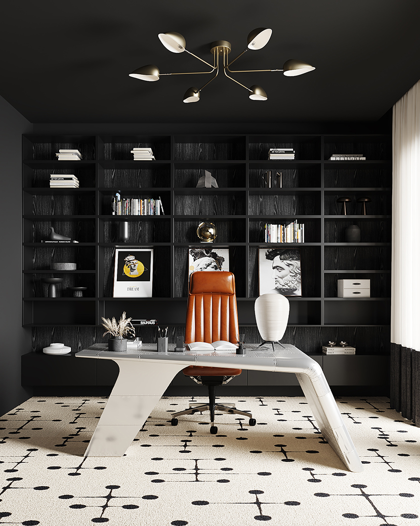 With only a few but impactful changes, Karnvir turned his interior into Oppenheimer’s office.
How did you apply the aesthetics and themes of these two different movies to your interior scene? How did they influence your choice of colors, materials, lighting, and overall composition?
Outside of the obvious differences in color and the shared approach to composition I just mentioned, choosing matching decor for both scenes was crucial. For the Barbie version, I put a simple desk but added the pink fur chair for a more delicate and playful touch. The ceiling light and the carpet both compliment the whole room. Together, these three elements are already very powerful aesthetically, so to not distract or diminish the effect most of the other objects are a lot more subdued. The desk lamp, for example, has barely any texture to it, and even the framed pictures on the shelves are minimalist.
Oppenheimer, on the other hand, has a darker, more serious tone. Visually and thematically, it is less flashy and colorful. To start with the desk once again, it is made of steel with screw riveted and welded joints; the material, the aerodynamic design, and the industrial look all express a lot of character. The same applies to the desk lamp and ceiling light, both further highlighting the more technical feeling of the room. The unique color of the leather chair is meant to complement its location at the heart of the scene. Finally, the pattern on the carpet depicts atomic structures, which was not easy to find.
What were some of the challenges you had to overcome and how long did it take you to complete the project?
The entire project proved surprisingly challenging. You might think it an easy task because of its simplicity, but sometimes, the simplest designs are the most difficult to crack. I definitely struggled more with the Oppenheimer side, since I really wanted to nail the feel within this self-imposed compositional framework. Overall, it took me around three days of working in my spare time to complete the two scenes.
What software did you use to for this project? Any plug-ins you found particularly helpful?
Just 3ds Max and Corona Renderer.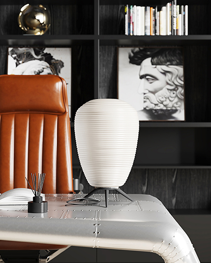 |
 |
Similar, yet different: a side by side comparison oft the two desk lamps.
Have you seen both movies yourself? If so, are you more team Barbie or team Oppenheimer?
Funnily enough, I have not seen either movie myself. Thinking about it though, the fact that I could easily recognize these distinct aesthetic identities just from trailers and promotional footage, truly speaks for the strong visual design. If I had to pick, I would choose #teamoppenheimer.
What is one thing you have learned from this project that you can share with us?
The essence of a design lies within its theme. And while maybe less profound, but every bit as true: making or finding suitable scene props is hard work!
What has the feedback been like so far and how satisfied are you with the results yourself?
People really liked it! This was of course what I was hoping for, but I was surprised by the response nonetheless.
Can you talk a bit about your experience with RebusFarm? Is there something you particularly like about our service?
All I can say is that it has been amazing and continues to be amazing.
In closing, is there anything else you want to say? Any present or upcoming projects you would like to mention?
I look forward to share more of my work with all of you soon, so please stay tuned!
Karnvir, thank you so much for your time and all the best in the future.

About the artist
Karnvir Gulati is a 3D generalist based in the Indian capital of New Delhi. After obtaining a bachelor’s degree in architecture, he worked at various architectural companies before pursuing a career as professional 3D artist. While specialized in architectural visualization, Karnvir is available for other freelance CG work as well.
