Wednesday, March 30th, 2022 by Taha Estabar
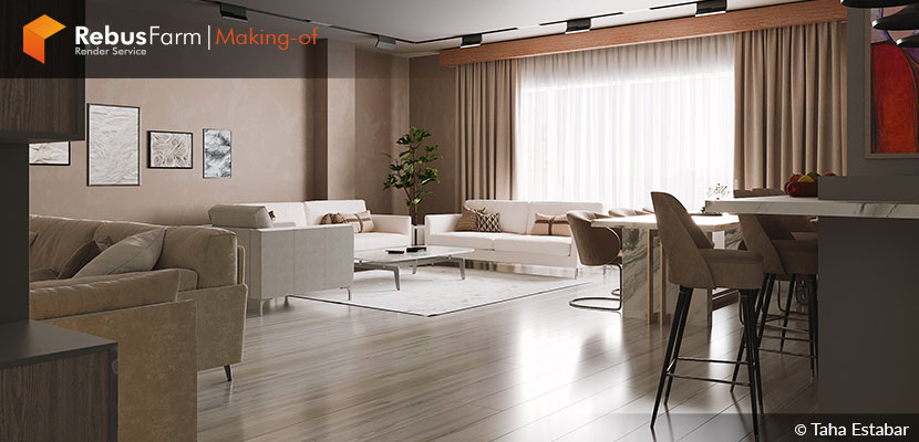
Taha Estabar sheds some light on how the use of creative techniques like the use of alternative camera lenses and 2D people can make your project different and refreshing. He tells us the story of how his client was more than pleased to receive the visualization of his home with a fresh perspective.
Let's hear some of Taha's tips.
A bit about me
First of all, and before to start introducing myself, I would like to thank the Rebus Team for inviting me for this interview. Hi, my name is Taha, I am an Architect and I've been working as an Architectural visualizer since 2020. I really love CGI, especially in the architecture field. In this field I've worked with international clients and let me tell you something, any project will give you a great experience.
Gorgan Residential
This project is designed for a family of four and my work was to visualize this project. My client told me that he wanted to see the warm space on the renderings, especially in the living room. That's the reason why I used a warm atmosphere in the shots. Also, it took 3 weeks of both modeling and rendering.
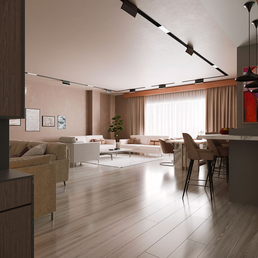 Living room with warm atmosphere.
Modeling
At first, I imported a CAD 2D file and after that, I tried to model the base floor and all of the walls in 3ds Max. Then I started to add more details in there, like statues and other models that I then imported to the scene.
There are a lot of pages where you can buy and download anything you want, like Quixel Bridge or 3dsky and many more. But it should be noted that, if you are rendering a modern space, you should try not to use classic and old models because it will show.
Camera
I tried to focus on a few different areas for each camera, after that you can show the whole area with a wide lens, but in this project, I preferred to use the Fisheye to show the whole area and my client was very happy to be able to see the whole design on it!
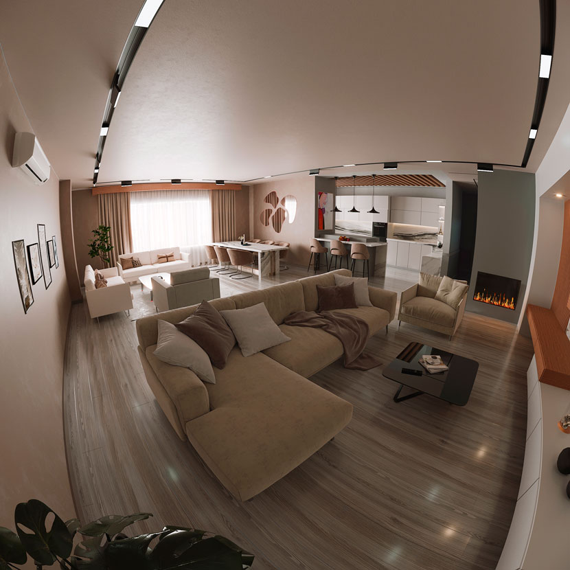 Living room with a fisheye view.
Useful tricks
1. Fireplace: As you can see in the first image, I didn't use fire in 3ds Max. I always add fire to the fireplace in Photoshop, this way makes it faster and you can control fire much better and easier so it can look more photo-realistic.
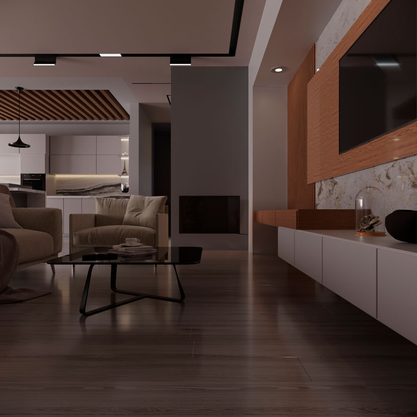 Fireplace in 3ds Max, previous to the fire.
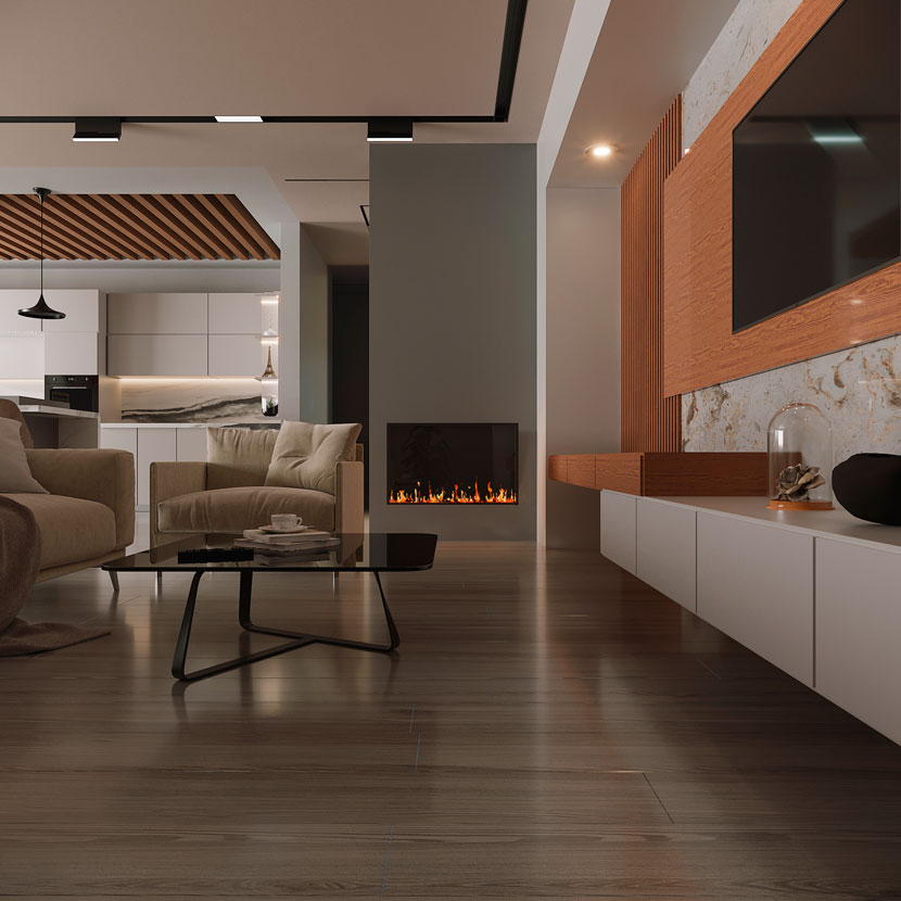 Fire added to the scene with Photoshop.
2. Usually, for my interior project's lighting, I use rectangle lights on windows. Another good trick that I use in my projects is, I use fake lights just to create great shadows or handle lighting in some parts or create a good contrast. This is very helpful too.
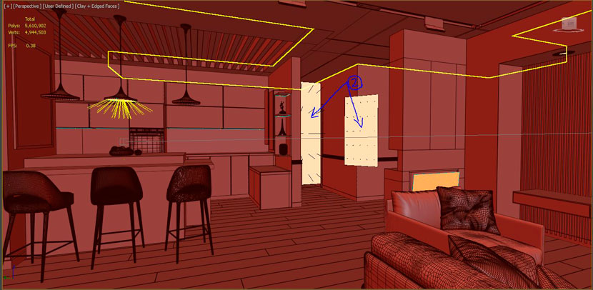 Lighting settings.
3. As you see, I use 2D people in my rendering, if they are placed correctly, they can make your render so alive.
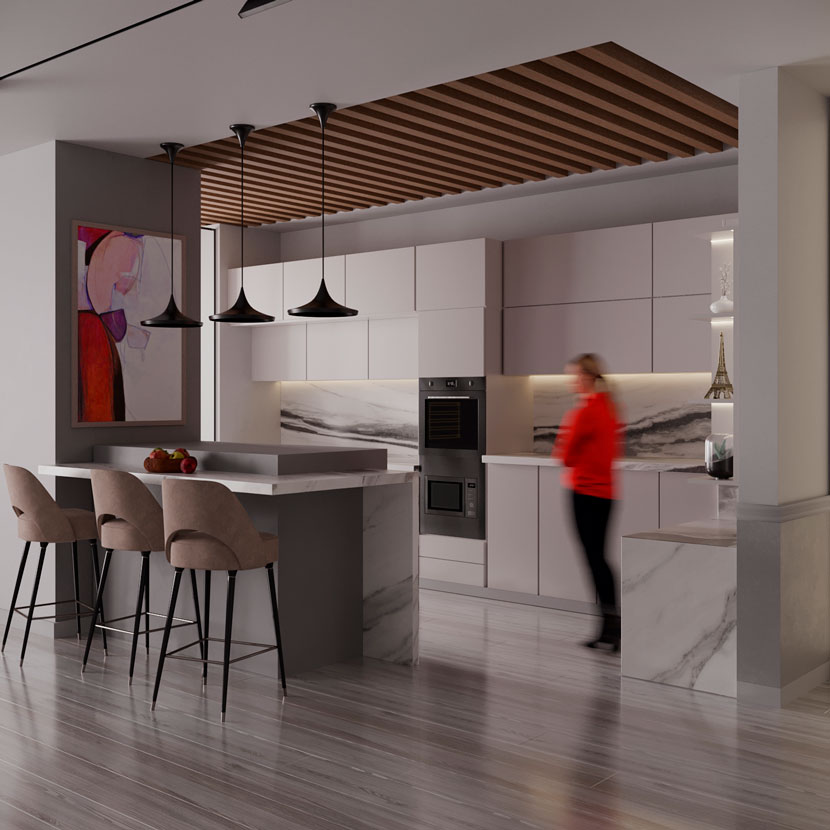 Kitchen scene with a person in 2D.
Noted, if you do not put them in the right place, they can make your great rendering look awful!
Thanks again for the opportunity RebusFarm team.
We thank Taha for sharing his project and knowledge with our Rebus community. Check out more of his work on his different channels:
Want to share your work with our community too?
Contact us at Este endereço de email está protegido contra piratas. Necessita ativar o JavaScript para o visualizar.and tell us about your favorite project.
>> Read more articles on our blog
