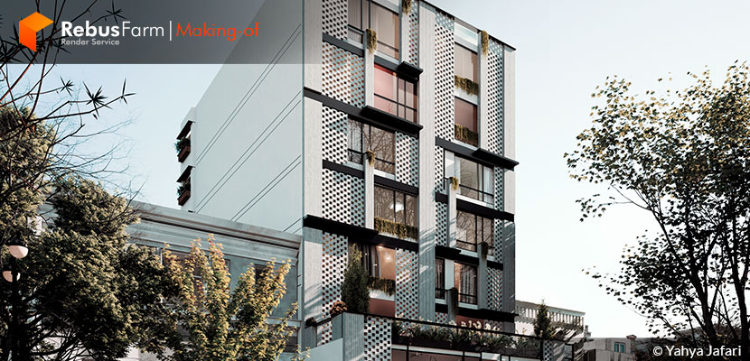
Yahya Jafar, a young architect based in Iran, with a big passion for architectural visualization shared with us his workflow, writing a making-of article for his small commercial and residential project "Golbarg". Simple techniques, tips & tricks that can help you deliver some nice images to your clients.
About me.
Hi everyone, my name is Yahya Jafari and I'm from Tehran, the capital of Iran. I studied architecture, and I'm currently a 3D artist working as a freelancer in the field of architectural visualization. In 2016, I got familiar with the world of 3D art and since then my professional life and purpose have totally changed. This beautiful 3D world sounds so fascinating to me and for that reason, I'm trying to practice more & more to become better and get experience.
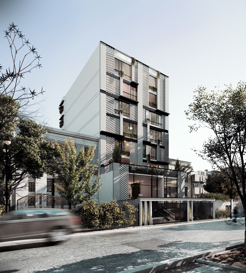
It's a huge privilege that the RebusFarm team asked me to talk about one of my commissioned projects, showcasing my workflow. In this article, I would like to present the details of the project explaining how I got the final render below.
The project.
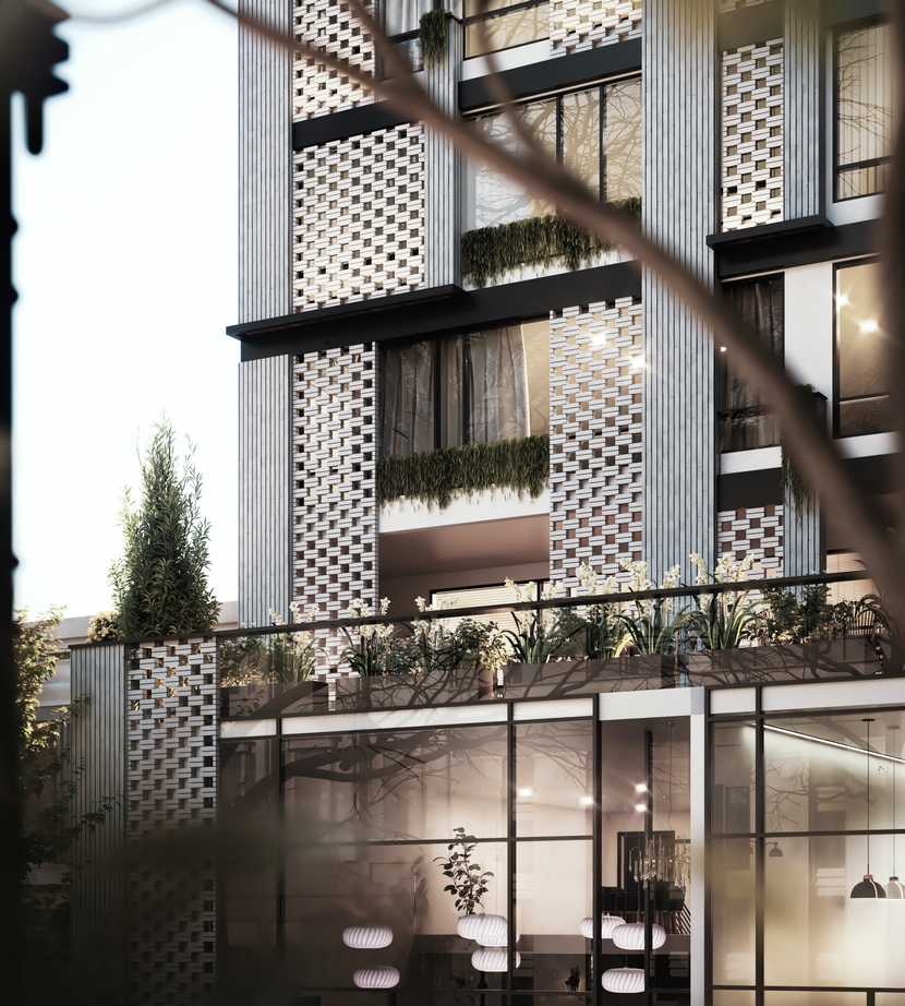
Golbarg is a commercial residential project located in Teheran, Iran. The architects, Sahar and Shabnam Bakhtiari, are currently working on it and the building is under construction. I appreciate a lot their trust and design direction.
I believe that one of the critical points for achieving a realistic render is having a good reference to start from. Therefore, before starting any project, I always collect strong references (i.e. pictures of an existing project similar to mine) to understand the nature of the materials, mood, and sense in general. This doesn't necessarily mean I have to copy the whole scene and create a very similar thing. I always get inspired by other artists' work, trying to create a unique project for my client and at the same time respect the copyrights.
The following images are an example of my references:
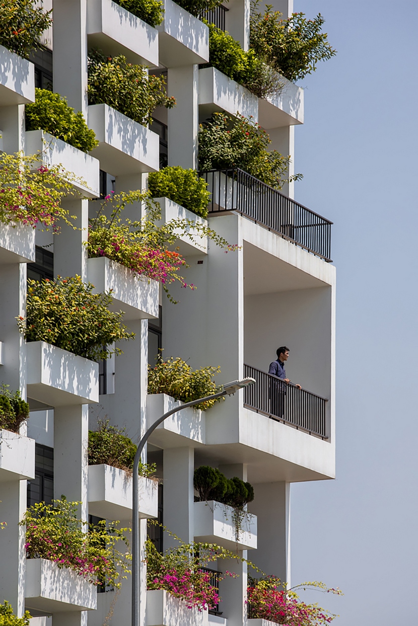
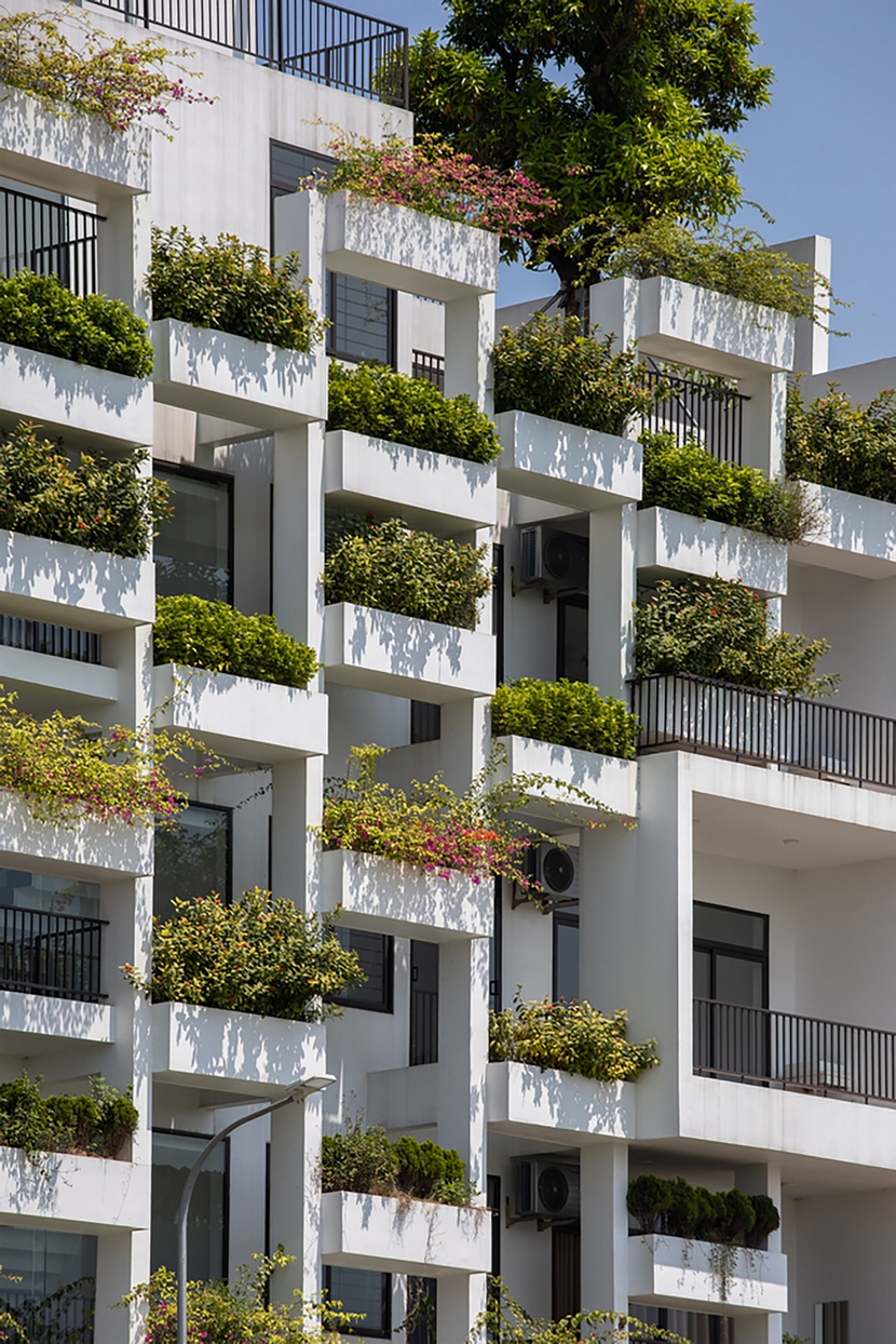
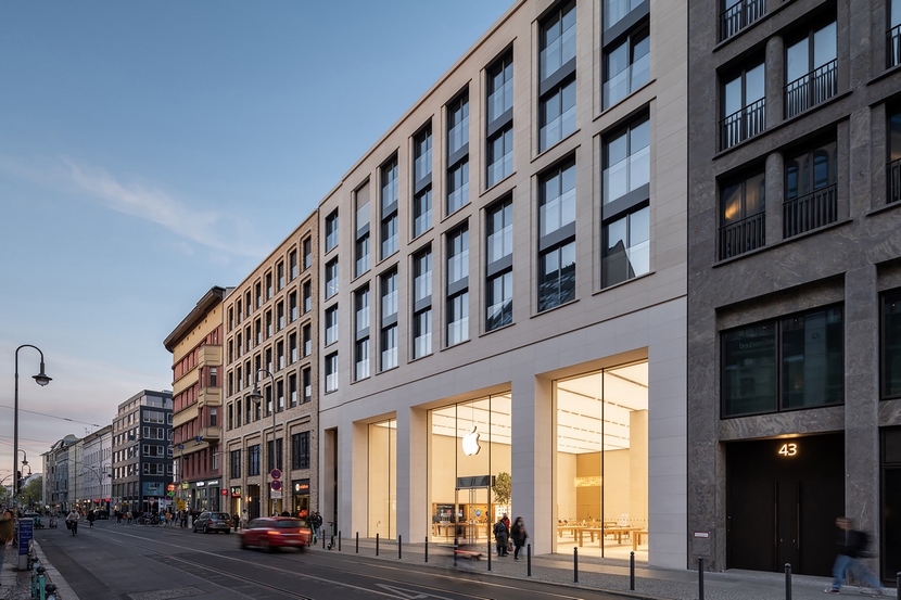
I was inspired by lighting strength, angles, camera angles, and so on. These pictures were collected from Archidaily.
Software used.
The 3D concept was modeled in Revit, the environment developed in 3DS Max 2020 and rendered with V-Ray 5.2. Also, the final editing and post-production were done in Photoshop. Further software and plug-ins used on this project are Autocad, Itoo Forest, Quixel Bridge, and FloorGenerator.
Modeling.
3D modeling is a highly crucial and fundamental part of the whole project. Revit is a very nice software that can help you to efficiently model a project easily.
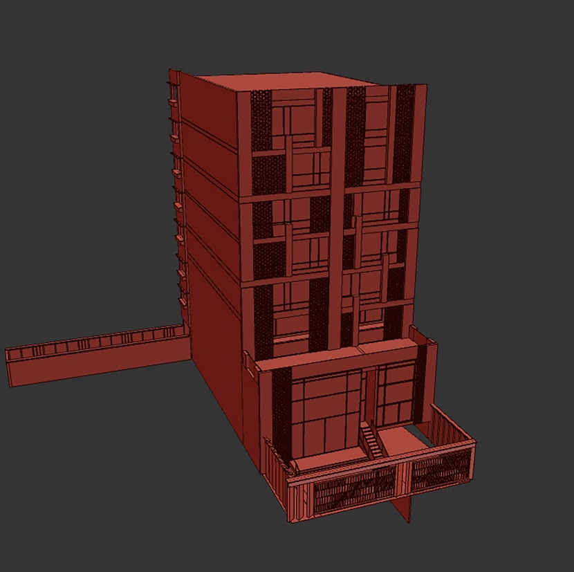
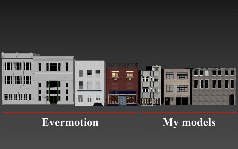
Regarding surrounding buildings, I used three pre-designed models from Evermotion's Archexterior series and I personally modeled three additional buildings from scratch.
Below you can watch a short but really helpful video tutorial about "Modeling a Modern House in Revit"
Vegetation & Assets.
For vegetation and the green environment, which covered most of the scene, I used "Maxtree" and "Evermotion" collections. Just a few 3DSky objects have been used.
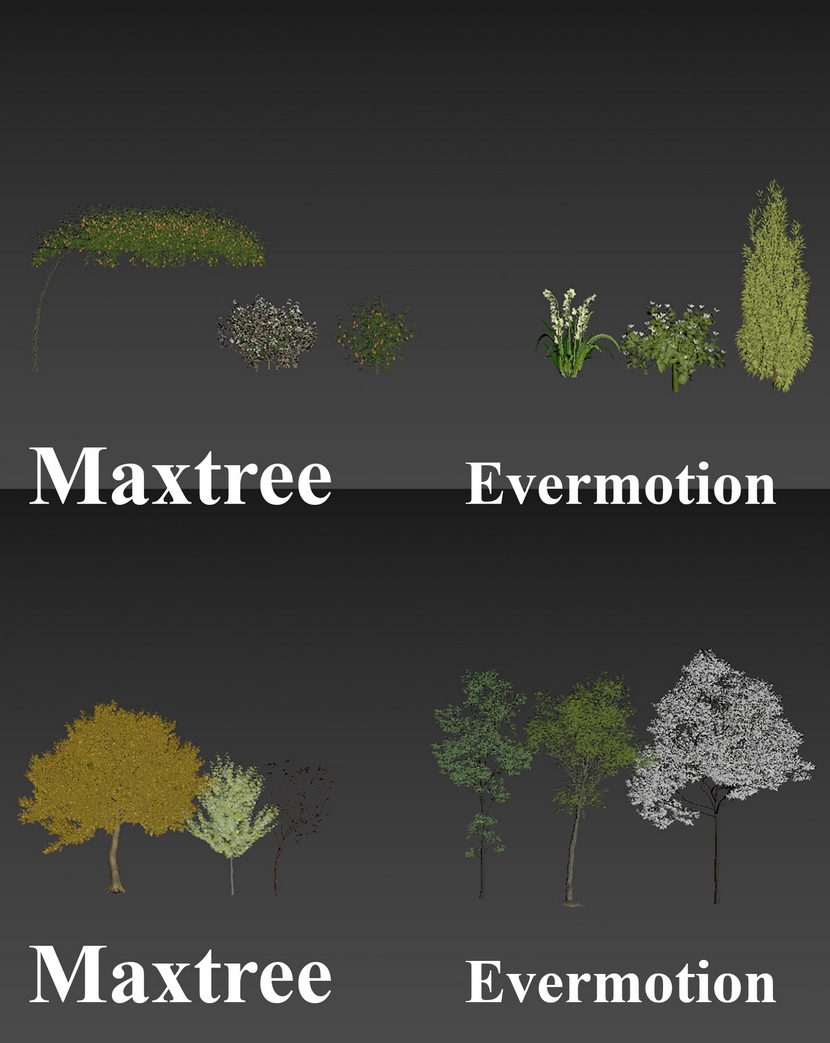
However, it's important to notice that almost every material of the greenery has been edited and modified in photoshop to achieve a better and more realistic result. Below are some very useful YouTube video tutorials that can help you improve the premade materials achieving a very photorealistic look.
Realistic Materials in V-Ray 5 for 3DS Max.
How To Create Vegetation Materials In3DS Max and V-Ray by Adan Martin.
Framing.
After modeling, the camera's position and composition are an essential part of rendering. Without reasonable framing, you cannot achieve a good shot, even though you took care of everything else. To better understand this, I will try to give you some further details.
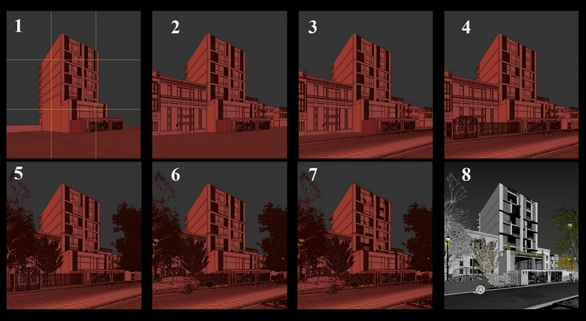
According to the architects' direction, I had to consider that this project has a long length. They specifically requested to create the proper view in order to avoid the feeling that the building looks chunky and try to give the sense that the building is taller. For that reason, I set the aspect ratio to 0.9, which means the height is relatively longer than the length; therefore, for a nice framing, I used the common "Rule of thirds" which I finally believe was a safe option. Also, a physical camera with a focal length of 32mm was used in order to avoid stretched lines and stay close to the architects' desire. Nevertheless, ground and sky have been shown equally to get a balanced framing. Some basic but pretty nice and useful tips can be found in the video below:
After fixing and positioning the cameras, for the next step I proceeded as follows:
Lighting.
All the renders for this project were created in two different lighting scenarios, day and night, by changing the angle and strength of the lighting source. One of the hidden perks if you want to create good enough daylight is to use two HDRI maps and V-Ray Sun. The first HDRI represents the global illumination, and the second one the sky background. Finally, V-Ray Sun creates some sharp shadows and a very pleasant, eye-realistic contrast.
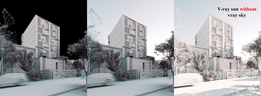
The HDRI views were inspired by "PG skies" for both day and night renders, and I adjusted the angle and strength to fit my project in a better way. V-Ray artificial light from two types of plan and disc have been used for interior lighting. The warmer color offers a more cozy and friendly environment.
For environment lighting in nighttime renders, I used a few invisible lights on the ground and a few light poles to make the scene warmer. Finally, it is worth mentioning that the LightMix in V-Ray made my life easier to adjust the illumination of my scene.
Materials.
The creation of materials was a very simple and non-complex process. The most critical materials were bricks and asphalt. For creating the asphalt, I got some important help from Quixel Bridge and Archexteriors. I easily combined one material from the Archexteriors collection with a concrete bump material from the Bridge collection to achieve my final material. I also used the same trick for the brickworks material which has been combined with a concrete bump from the “Bridge” collection.
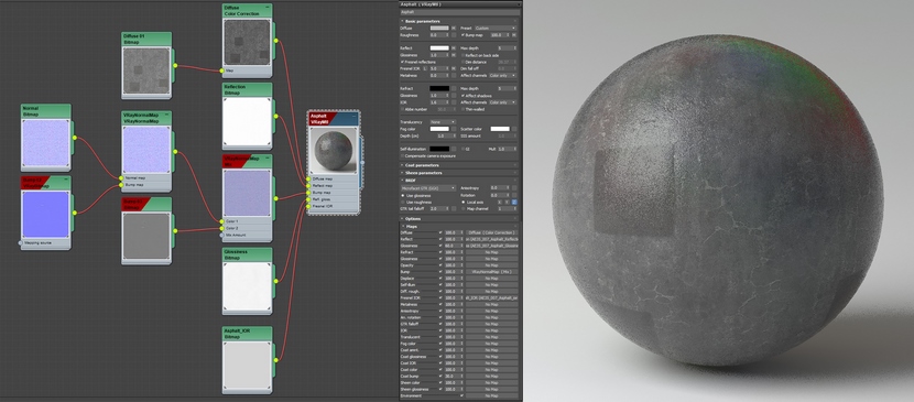
Click on the image above to enlarge.
Render setup.
In this section, most settings are left as default, and only a few numbers have been changed.
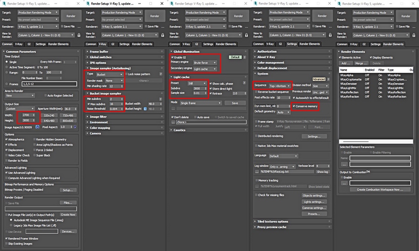 Click on the image above to enlarge.
Post-production.
Nothing special here as well. After exporting renders to .jpg format, I simply adjusted the contrast and shadows in Photoshop. Below you can see before and after post-production images.
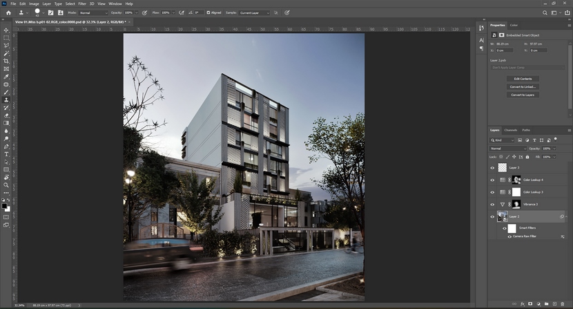
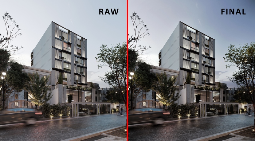
Once again, I would thank RebusFarm for giving me this opportunity to write a making-of article and presenting a part of my daily work and how I usually work on my projects. I hope you enjoyed my effort, and if you have any questions please do not hesitate to "poke" me!
With warm regards,
Yahya Jafari.
Check more of Yahya's work on these channels:
Want to share your work with our community too?
Contact us at 이 이메일 주소가 스팸봇으로부터 보호됩니다. 확인하려면 자바스크립트 활성화가 필요합니다. and tell us about your favorite project.
Get started with your own renderings
