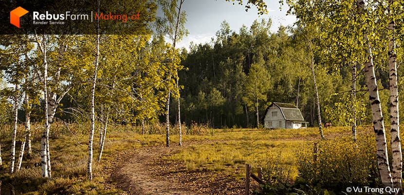
Vu Trong Quy, an architect and 3D artist from Vietnam, created a very interesting article showcasing the way he worked on his practice project. Some simple but very great composition tips for your experiments.
About me.
Hello everyone!
First of all, I would like to thank both RebusFarm and VWArtclub for giving me the opportunity to share my work and show everyone how I created this scene.
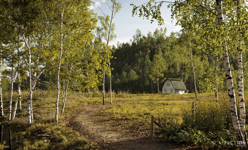
My name is Vu Trong Quy, I am an architect & 3D artist from Vietnam. As every student at university has a need to learn some 3D software to do his own projects and this is what I also did. I started with 3DS Max for the first time in 2010 but with no good results. In 2011, I followed some basic 3DS Max courses to understand how to use it. I started working professionally in the field of architectural visualization in 2014. For many years, the rendering software I used was V-Ray, until two years ago when I started using Corona Renderer and working side-by-side between the two renderers. The project “Little House on the Prairie” was completed with 3DS Max 2021 and Corona Renderer 8.
Inspiration.
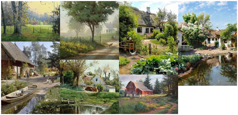
In my spare time, I often look for inspirational images, mainly on Pinterest. I usually save about 10-15 photos that I love, then filter out a few suitable photos to create a 3D scene based on my taste and emotions. I came across beautiful pictures of rural themes by chance and this was the core of my idea for this project.
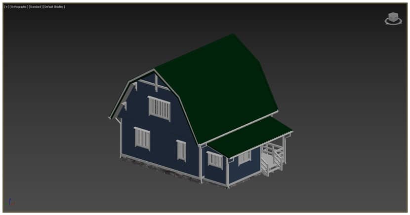
I started the scene with a house model that I bought online.
With the above references close to me, I started modeling and setting up assets to complete the scene.
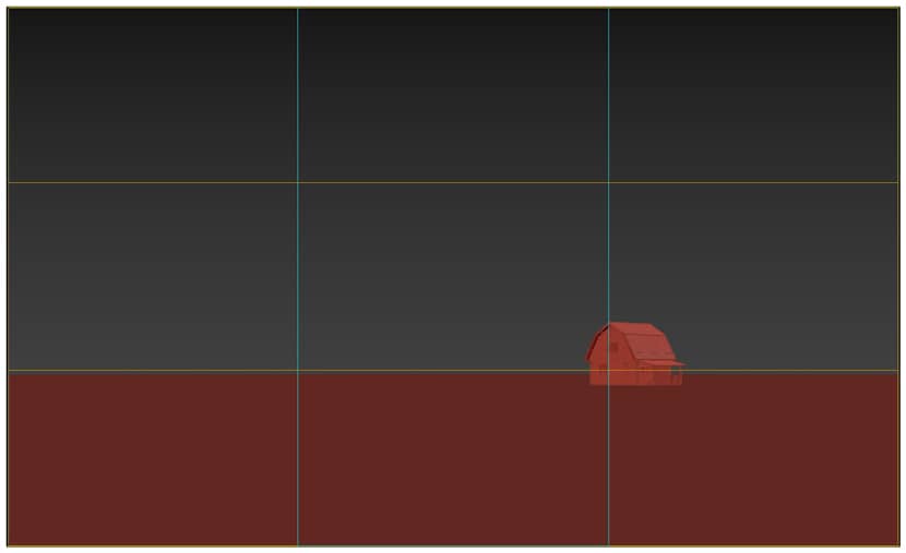
For personal and practice projects like this one, I usually get in the habit of framing the camera and subject first. I created a Plane object lining the bottom of the house for easy viewing. I then set the render ratio in F10 (Image Aspect) to 1.65 and set the 3x3 grid (Viewport Configuration à Safe Frames) for the safe frame. Next, I created a “Corona Camera” and adjusted its position + the house to create a satisfactory composition. I purposely have the camera look at the side of the house, because in this situation the side creates a better visual effect than the front.
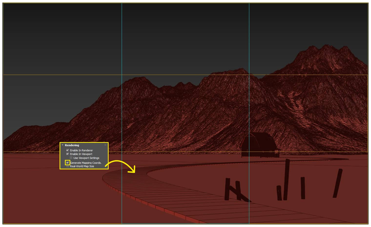
Inspired by the reference images, I envisioned a winding path leading to the house and the fence at the beginning of the path. I assumed the path was a Line object and enabled the thickness for it in the “Rendering” section. In this section I also checked the “Generate Mapping Coords”, the purpose is to make the path texture follow the curve of the Line object (adjusted with the command “UVW XForm”). Then I plugged in some old wooden pole models to make fences, intentionally arranging them to tilt in the most natural way. I also added a mountain behind the house for the background.
 Click On The Image To Maximize it.
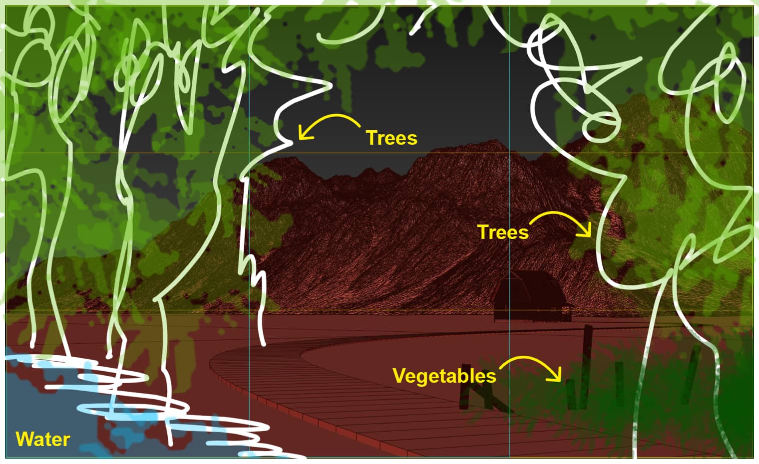
I imagined a small lake and trees close to the camera. The role of the lake is to make the landscape more special. The trees were arranged to ensure the prominence of the house. Inspired by the reference images, I also tried some vegetable plants near the fence. They both helped the landscape to become more vivid while hiding the dryness of the wooden poles.
With the above ideas, I started building the scene.
Modeling & Assets.
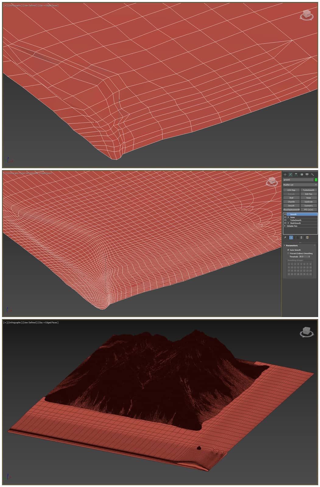
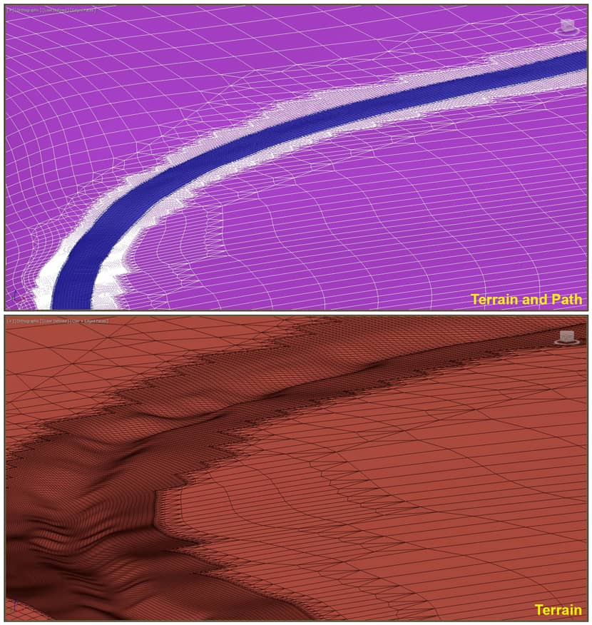
Terrain: I started from the lake, by drawing a zigzag Line object at the lakeshore position I described in the sketch above, then “Extrude” it low and “Shell” it thick towards the screen corner to shape it, then “Convert to Editable Poly” and just get the top face of this object. The next job is to divide the segment for it and drag the vertexes and segments up and down, back and forth so that the shape of the lake becomes more natural. After that I developed it into terrain and because this is a prairie, I used the commands “Soft Selection”, “Push/Pull”, adding “MeshSmooth”, “TurboSmooth”, “Noise”, “Smooth” to make the terrain more undulating. When the terrain was completed, it was higher than the original Plane object. So I repositioned the house and the wooden poles to fit the new terrain, and of course, the original Plane object was removed. I also created another Plane object for the water surface.
Path: From the original hypothetical Line object, I “Convert to Editable Poly” and just took its top face to create the path. I connect some more vertical segments so that it has a proper square grid. Now the path is flat and the terrain is undulating, the problem is that the path must follow the terrain. I used the script “111_scriptedGlue_v0.9.ms” to do this. After the path was following the terrain, I pulled its outer edge lower and plugged it into the terrain. This helped me blend it into the terrain. I also used the “Noise” command to make the path more natural. For the terrain area that touches the path, I used “MSmooth” in “Editable Poly” to make its mesh smoother and “Push/Pull” low to avoid it hitting the path.
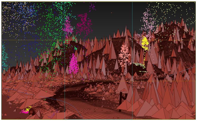
Trees and vegetation: The assets are mainly taken from Maxtree and 3dsky. I used the Forest Pack to create most of the trees and vegetation, only the ones near the camera were copied manually. Given the complexity of this scene, I had to use a total of 14 Forest objects. The most noticeable thing in this part is the creation of the leaf array on both sides of the path, in modify panel of this Forest leaf object, in the "Areas" section, I used "Falloff (global props)" to make the leaves gradually small and gradually sparse from the grass area to the inside of the path. Besides, for this Forest leaf object and some other Forest objects, I also use the "Include/Exclude" in the "Areas" section to create the desired planting effect and optimize the render. Below are the assets I used for the Forests and their origins.
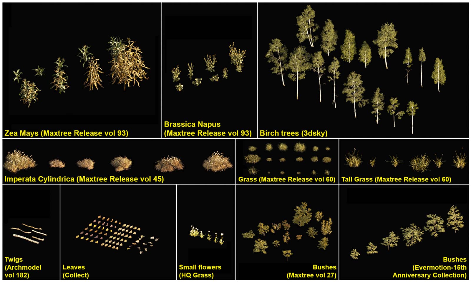 Click On The Image To Maximize it.
Horse: This is also a model that I bought online. I especially like to include it in my scenes, which adds a poetic touch to the image. I also used some other models from Quixel Megascan and Maxtree like rocks and weeds to add richness and realism to the landscape.
Materials.
This scene doesn't have too many materials to talk about or something really advanced. I mixed two different materials for the path to avoid tile texture errors and used “UVW Xform” to control the texture to follow the curve of the path. I also mixed some dirty textures for the wall and roof to make them look old and realistic enough.
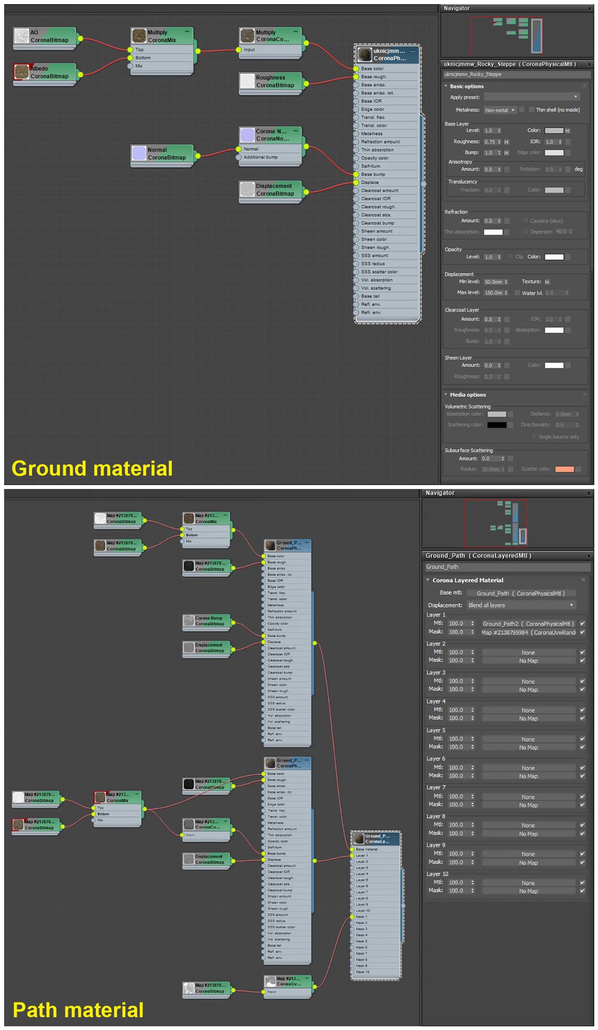 Click On The Image To Maximize it.
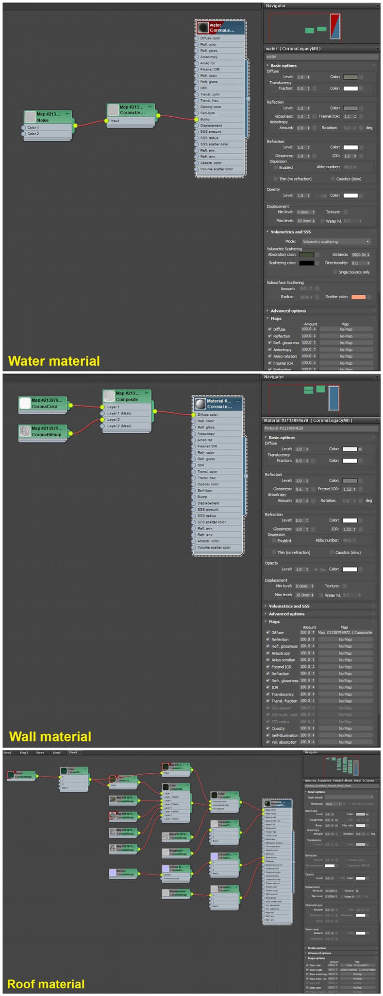 Click On The Image To Maximize it.
Lighting, Camera & Render Setup.
As you can see, this project has two versions day and sunset. I used “3DCollective_HDRi_023_1752_+8_16K.hdr” (3dCollective) + Corona Sun for the day version, “0720_v5.hdr” (Peter Guthrie) for the sunset version. I use the “Multiple maps (LightMix)” in Render Setup to be able to render only once but produce both versions.
Camera parameters are almost default.
Render Setup. In addition to using “Multiple maps (Lightmix)” to create the environment for the scene, I just set the image size to 3500 pixels wide, used “Corona High Quality” for “Denoising”, and added the elements. I added quite a few elements but only used a few of them for post-production, including some CMasking elements to aid in selection, and some more for blending which you can see in last image of this article.
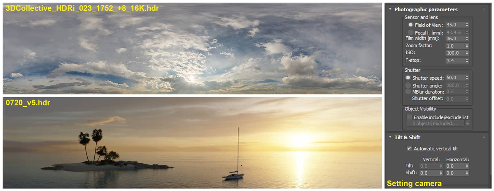 Click On The Image To Maximize it.
Post-Production.
In both versions, the post-production work is not too much because Corona has done its part too well. But in the sunset version, I used a few elements to create a different atmosphere from the original render. Probably most of the work I did was blending elements, the rest was adding a few layer filters.
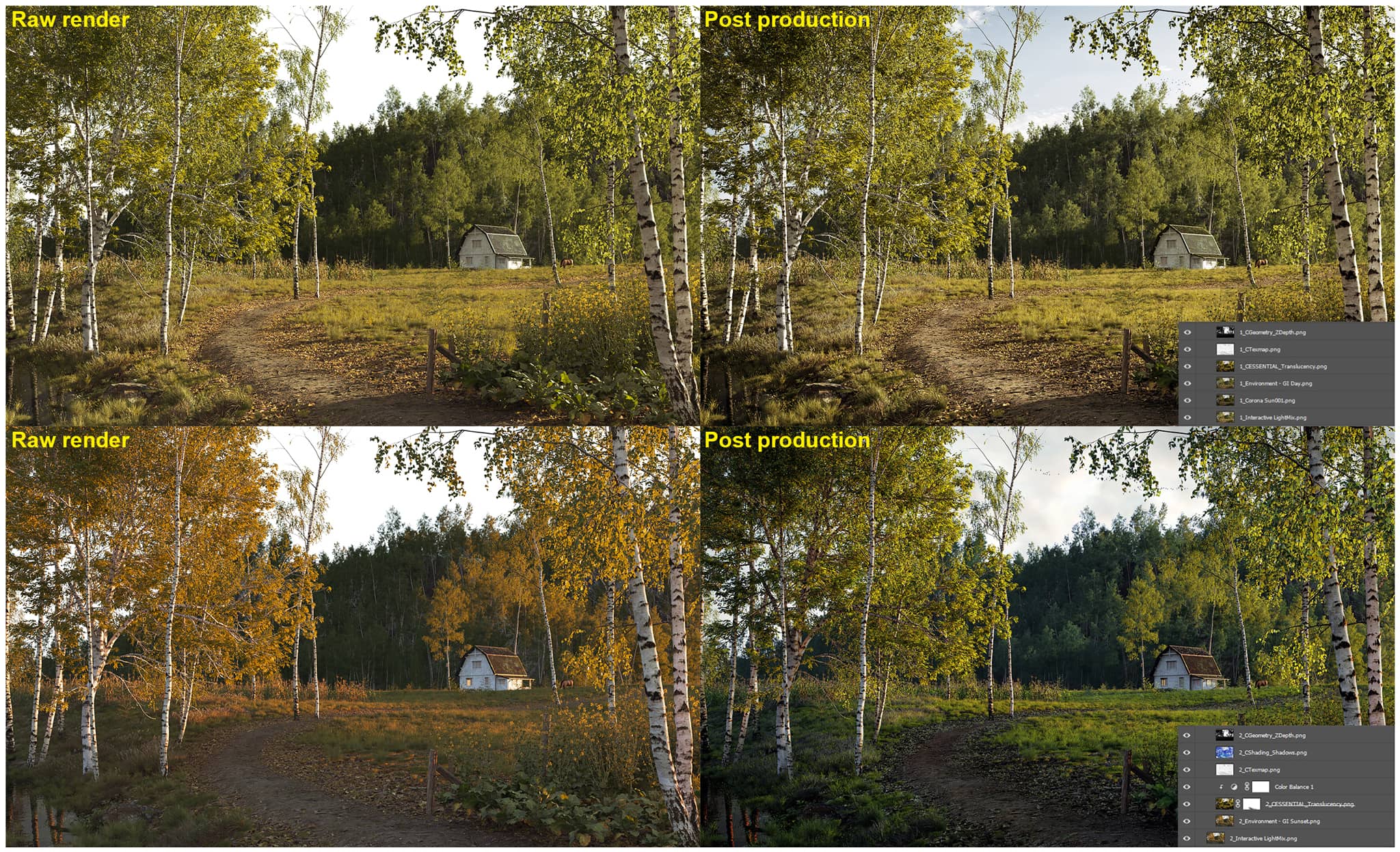 Click On The Image To Maximize it.
Final Result.

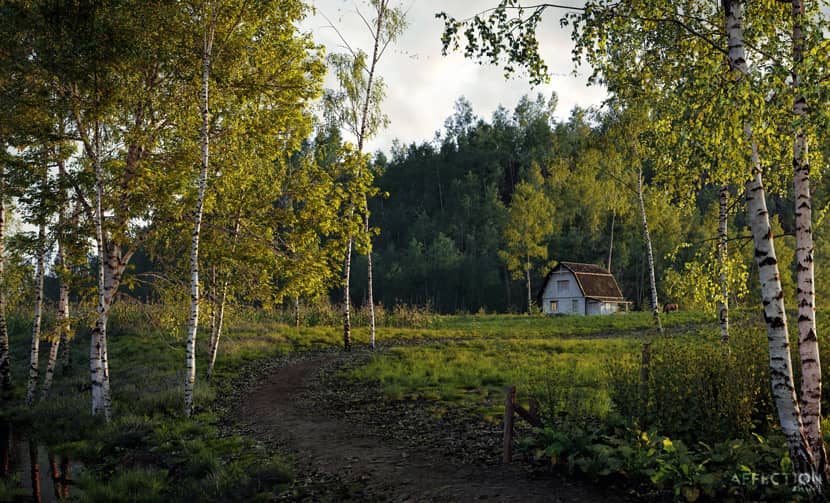
That's all! I hope what I shared with you in this article will help you somehow. Good luck and I'm always at your disposal for any possible questions you might have. Just connect with me using the links below!
Kind regards,
Vu Trong Quy.
Check more of Vu's work on these channels:
Want to share your work with our community too?
Contact us at 이 이메일 주소가 스팸봇으로부터 보호됩니다. 확인하려면 자바스크립트 활성화가 필요합니다. and tell us about your favorite project.
Get started with your own renderings
