Wednesday, April 13th, 2022 by Alvina Kravets
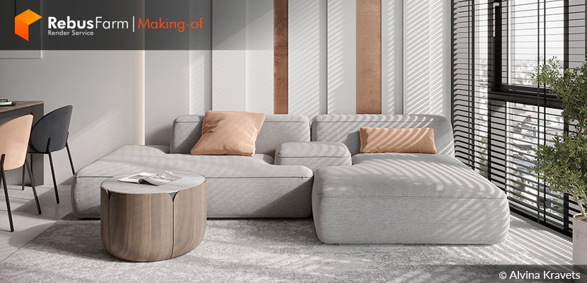
Natural colors, minimalistic design, and active textures make this visualization the perfect eye candy. Alvina Kravets, interior designer, and 3D visualizer gives us some awesome lighting, camera angles, and rendering tricks that can take your work to another level.
Let's hear more from Alvina herself.
A bit about me
Hello, my name is Alvina Kravets. I am an interior designer and 3D visualizer. Now I work in the RIKA Interior studio, and also do freelance projects.
I earned a post-secondary education in Interior Design and a master's degree in Building and Civil Engineering. For 3 years, I worked as an architect in a construction company. After that, I moved into interior design and I have been doing what I love for 2 years now. Most of all I like to create a 3d visualization - it is this stage of the design project I think is the most exciting, it allows you to realize your creative potential.
To create visualizations, I use 3ds Max + Corona Renderer. New solutions and technologies constantly appear in archviz, so this work never gets boring. It is necessary to constantly learn and practice in order to make renderings more perfect and realistic.
Fjord Apartment
Fjord Apartment is a concept I've been working on in my free time. It is located in the FJORD apartment complex in Kiev, Ukraine. I liked the architectural solution of the complex - floors in the form of cascades, the variety of planning solutions, and the presence of panoramic windows that offer great views of the city.
I began with the selection of references that reflect the stylistics and the atmosphere of the interior. I often look through architectural and interior projects on the website est living. That website is an inspiration to me personally.
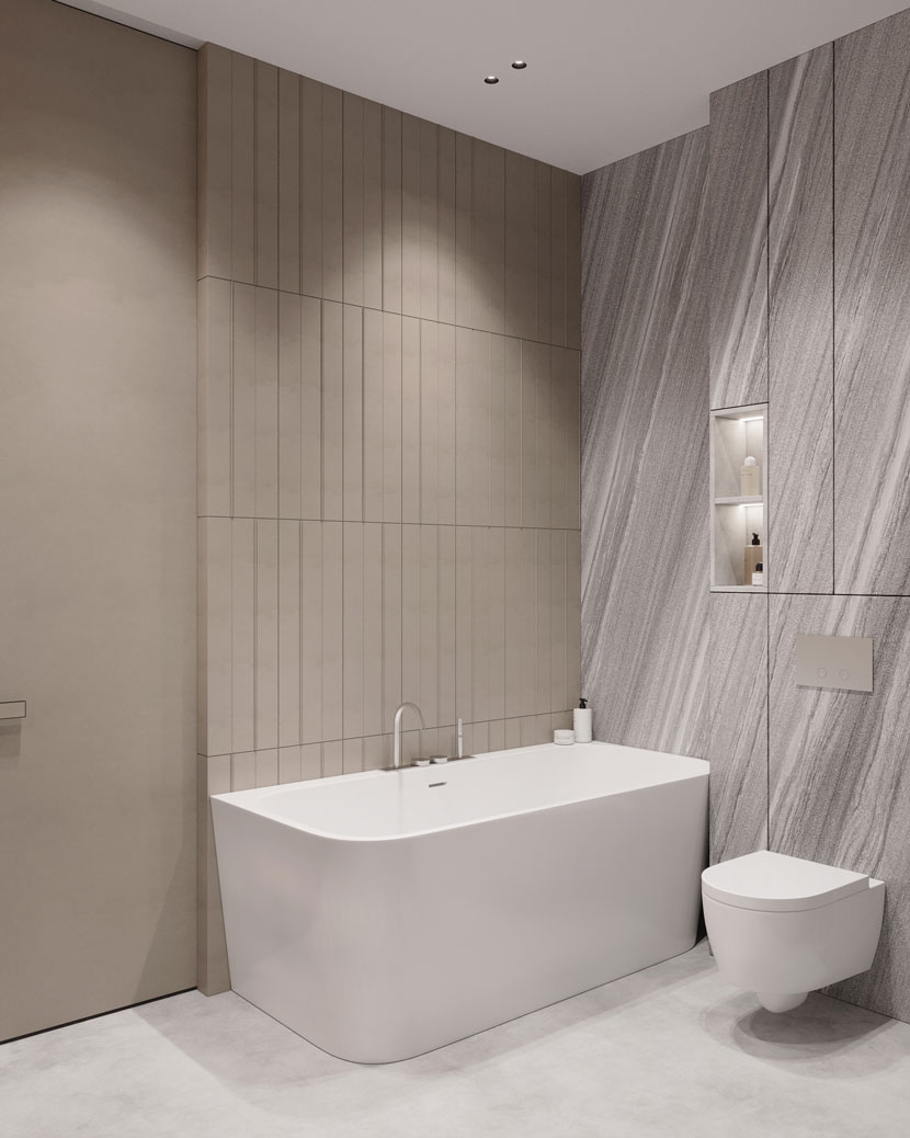
After developing several options for layouts in ArchiCAD I chose the most successful, in my opinion, and began to create the scene in 3ds Max. I used various modeling tools and ready-made 3d models. Also, plugins speed up work in the program, such as the "Floor generator" to create tiles in the bathroom.
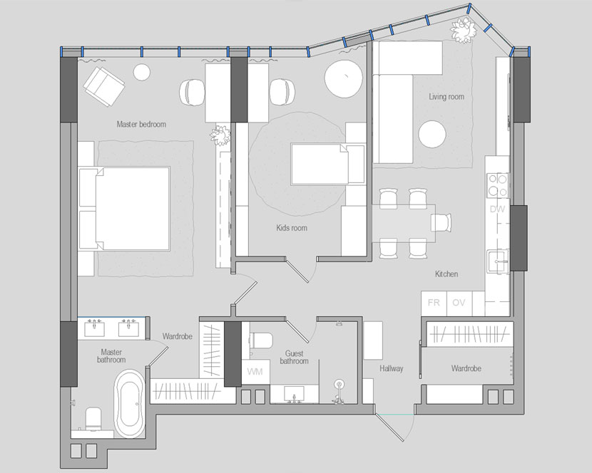 Furniture layout created with ArchiCAD.
About the scene
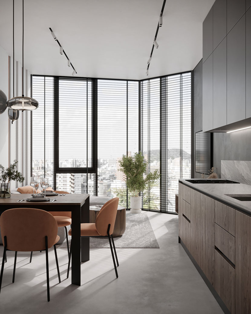
The lighting scheme is natural daylight. At this time of the day, it is possible to show the design as effectively and advantageously as possible. It is through the play of light and shadow that we sense volume.
For this kind of lighting, I used a CoronaSky environment and two CoronaSuns, one behind the other on an axis, but with a different size. A smaller sun gives accentuated, clear shadows, while a larger sun gives blurrier, softer shadows. In this way, you can easily set up beautiful modeling lighting. With the CoronaColorCorrect map, I desaturated a little the CoronaSky environment to avoid blue tones in the interior, especially on white materials. This method allows more flexibility in adjusting the lighting of the scene compared with HDRI.
The scene also uses artificial lighting in the form of LED lighting. The presence of hidden light affects the overall perception and makes the interior more interesting. The background behind the window is made in the scene with the help of a curved plane with CoronaLightMtl. This trick adds realism to the renders due to the visibility of the background in the reflections - it's just like in real life!
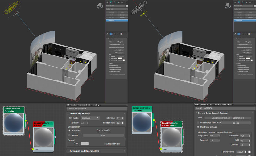 Location and setting of the suns.
Materials
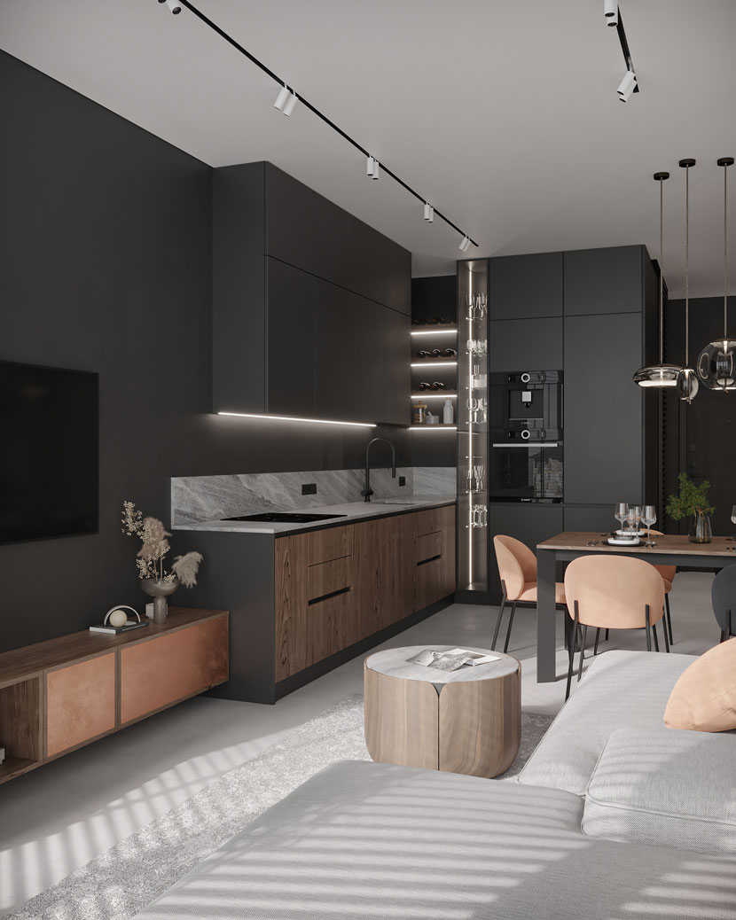
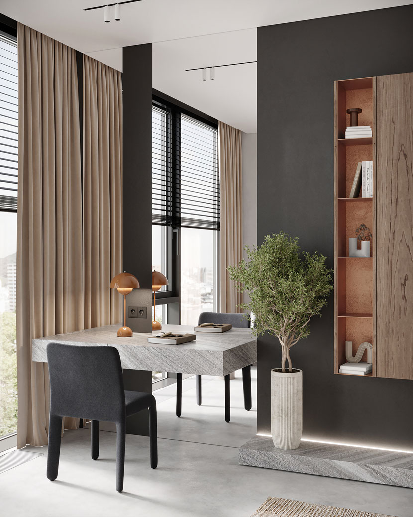
The interior of the apartment is modern and minimalist, which harmonizes with the look of the apartment complex. I chose a neutral color scheme - black, white, and gray combined with accents of copper and orange color in the furniture and decor. The materials I used are natural stone and wood with an active texture, micro cement on the floor, and glass.
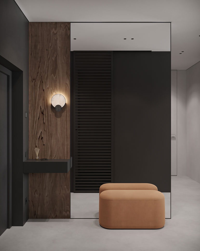
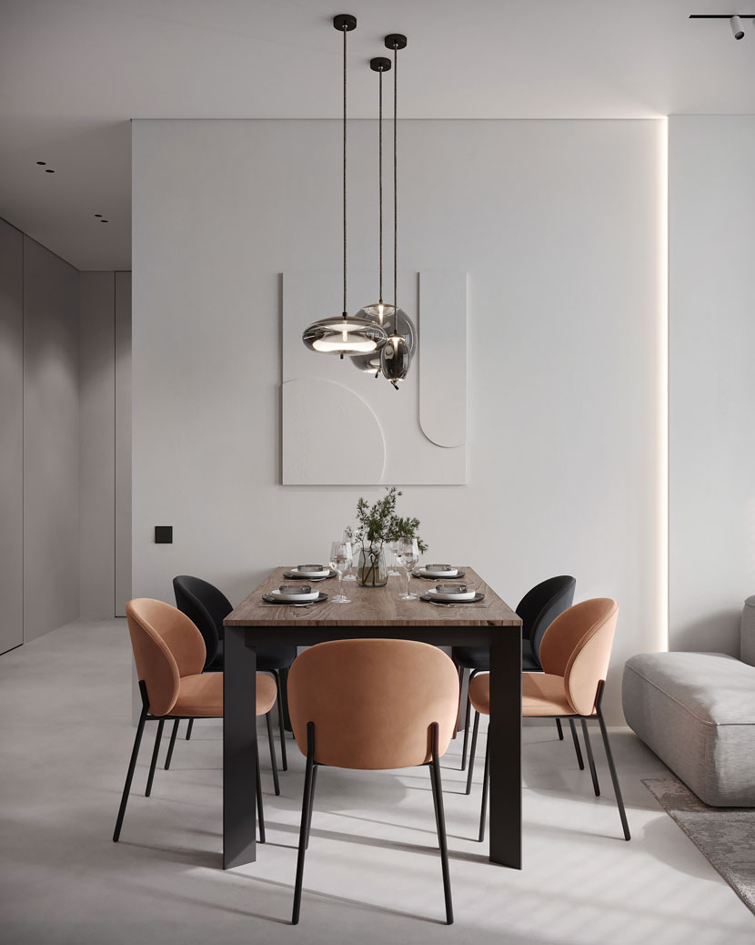
I created most of the scene materials myself, but I also used ready-to-use materials with the necessary corrections. Of the techniques that help to get a realistic render, I used the CoronaRaySwitchMtl on a few materials. These materials are black plaster, wood, copper, orange fabric, and tile. This also speeds up the process of calculating the image.
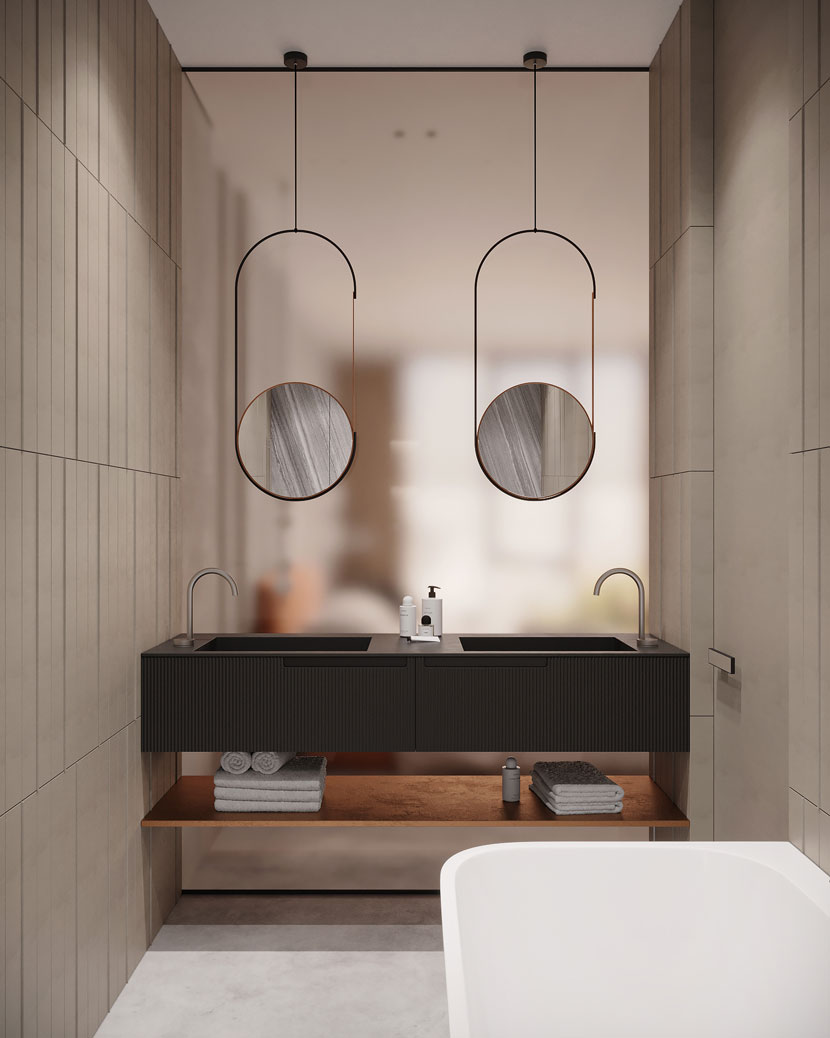
In this scene, I tried to create a fogged glass effect in the bathroom. The result turned out gorgeous!
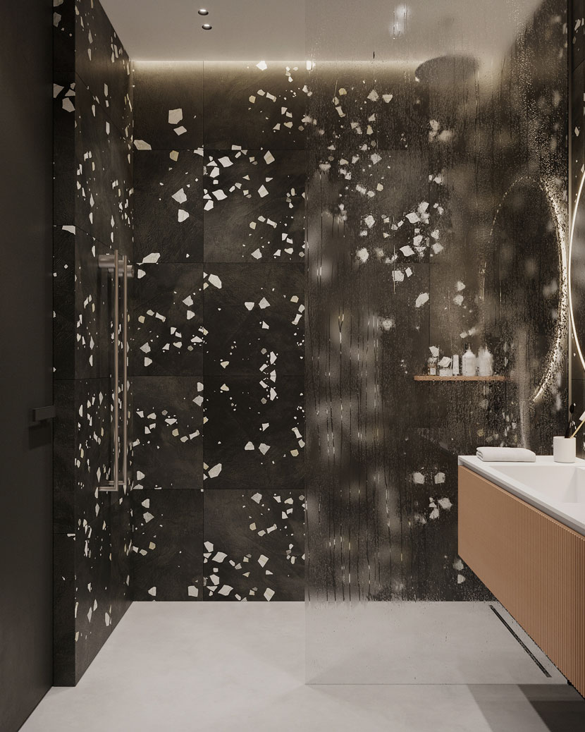
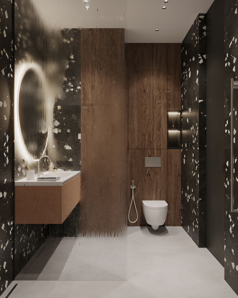 Fogged glass effect in the bathroom.
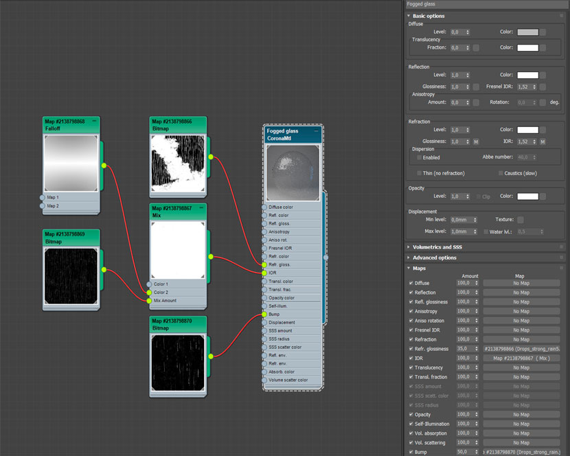 Fogged glass material.
Camera angles
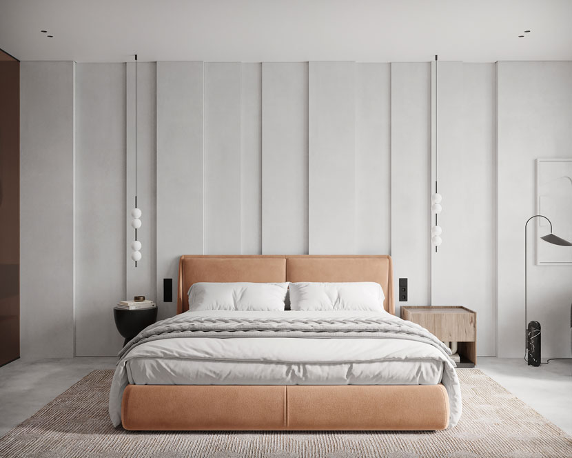
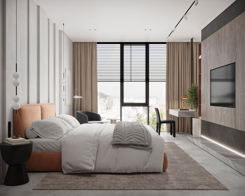
Once I had the stage assembled, lighting and materials set up, it was time to place the cameras. I mostly used frontal, straight angles, and a few corner angles. After that, I added all the cameras in Batch Render - an indispensable tool in the work of any 3D specialist. The functionality of this tool allows you to put several cameras to render at once. In the end, everything will be done without your supervision and the need for intervention.
Render Setup
Here I adjusted the exposure, and apply the LUT GroundControl_Grunge with an opacity of 30% to make the picture more contrasted. I set the noise limit to 2.5% and activated the bloom and glare effect, denoising.
Post-production
It is possible to calculate additional Render Elements in Corona Renderer with which you can improve the final picture. In each work, I mostly use these elements CESSENTIAL_Direct, CESSENTIAL_Indirect, CESSENTIAL_Reflect, CESSENTIAL_Refract, CMasking_ID, CTexmap.
I moved the final renders to Adobe Photoshop for post-processing. Also, I correct the picture with the Camera Raw filter - I add sharpening and a small vignetting, I like this kind of artistic effect.
Thanks to everyone who read my "Making-of"! I hope everyone will find some new techniques to improve their work. Thanks to RebusFarm for giving me the opportunity to share the process of making my work.
We thank Alvina for sharing her project and knowledge with our Rebus community. Check out more of his work on her different channels:
Want to share your work with our community too?
Contact us at 이 이메일 주소가 스팸봇으로부터 보호됩니다. 확인하려면 자바스크립트 활성화가 필요합니다.and tell us about your favorite project.
>> Read more articles on our blog
